4.8: Using Excel and R to Analyze Data
- Page ID
- 127563
\( \newcommand{\vecs}[1]{\overset { \scriptstyle \rightharpoonup} {\mathbf{#1}} } \)
\( \newcommand{\vecd}[1]{\overset{-\!-\!\rightharpoonup}{\vphantom{a}\smash {#1}}} \)
\( \newcommand{\id}{\mathrm{id}}\) \( \newcommand{\Span}{\mathrm{span}}\)
( \newcommand{\kernel}{\mathrm{null}\,}\) \( \newcommand{\range}{\mathrm{range}\,}\)
\( \newcommand{\RealPart}{\mathrm{Re}}\) \( \newcommand{\ImaginaryPart}{\mathrm{Im}}\)
\( \newcommand{\Argument}{\mathrm{Arg}}\) \( \newcommand{\norm}[1]{\| #1 \|}\)
\( \newcommand{\inner}[2]{\langle #1, #2 \rangle}\)
\( \newcommand{\Span}{\mathrm{span}}\)
\( \newcommand{\id}{\mathrm{id}}\)
\( \newcommand{\Span}{\mathrm{span}}\)
\( \newcommand{\kernel}{\mathrm{null}\,}\)
\( \newcommand{\range}{\mathrm{range}\,}\)
\( \newcommand{\RealPart}{\mathrm{Re}}\)
\( \newcommand{\ImaginaryPart}{\mathrm{Im}}\)
\( \newcommand{\Argument}{\mathrm{Arg}}\)
\( \newcommand{\norm}[1]{\| #1 \|}\)
\( \newcommand{\inner}[2]{\langle #1, #2 \rangle}\)
\( \newcommand{\Span}{\mathrm{span}}\) \( \newcommand{\AA}{\unicode[.8,0]{x212B}}\)
\( \newcommand{\vectorA}[1]{\vec{#1}} % arrow\)
\( \newcommand{\vectorAt}[1]{\vec{\text{#1}}} % arrow\)
\( \newcommand{\vectorB}[1]{\overset { \scriptstyle \rightharpoonup} {\mathbf{#1}} } \)
\( \newcommand{\vectorC}[1]{\textbf{#1}} \)
\( \newcommand{\vectorD}[1]{\overrightarrow{#1}} \)
\( \newcommand{\vectorDt}[1]{\overrightarrow{\text{#1}}} \)
\( \newcommand{\vectE}[1]{\overset{-\!-\!\rightharpoonup}{\vphantom{a}\smash{\mathbf {#1}}}} \)
\( \newcommand{\vecs}[1]{\overset { \scriptstyle \rightharpoonup} {\mathbf{#1}} } \)
\( \newcommand{\vecd}[1]{\overset{-\!-\!\rightharpoonup}{\vphantom{a}\smash {#1}}} \)
\(\newcommand{\avec}{\mathbf a}\) \(\newcommand{\bvec}{\mathbf b}\) \(\newcommand{\cvec}{\mathbf c}\) \(\newcommand{\dvec}{\mathbf d}\) \(\newcommand{\dtil}{\widetilde{\mathbf d}}\) \(\newcommand{\evec}{\mathbf e}\) \(\newcommand{\fvec}{\mathbf f}\) \(\newcommand{\nvec}{\mathbf n}\) \(\newcommand{\pvec}{\mathbf p}\) \(\newcommand{\qvec}{\mathbf q}\) \(\newcommand{\svec}{\mathbf s}\) \(\newcommand{\tvec}{\mathbf t}\) \(\newcommand{\uvec}{\mathbf u}\) \(\newcommand{\vvec}{\mathbf v}\) \(\newcommand{\wvec}{\mathbf w}\) \(\newcommand{\xvec}{\mathbf x}\) \(\newcommand{\yvec}{\mathbf y}\) \(\newcommand{\zvec}{\mathbf z}\) \(\newcommand{\rvec}{\mathbf r}\) \(\newcommand{\mvec}{\mathbf m}\) \(\newcommand{\zerovec}{\mathbf 0}\) \(\newcommand{\onevec}{\mathbf 1}\) \(\newcommand{\real}{\mathbb R}\) \(\newcommand{\twovec}[2]{\left[\begin{array}{r}#1 \\ #2 \end{array}\right]}\) \(\newcommand{\ctwovec}[2]{\left[\begin{array}{c}#1 \\ #2 \end{array}\right]}\) \(\newcommand{\threevec}[3]{\left[\begin{array}{r}#1 \\ #2 \\ #3 \end{array}\right]}\) \(\newcommand{\cthreevec}[3]{\left[\begin{array}{c}#1 \\ #2 \\ #3 \end{array}\right]}\) \(\newcommand{\fourvec}[4]{\left[\begin{array}{r}#1 \\ #2 \\ #3 \\ #4 \end{array}\right]}\) \(\newcommand{\cfourvec}[4]{\left[\begin{array}{c}#1 \\ #2 \\ #3 \\ #4 \end{array}\right]}\) \(\newcommand{\fivevec}[5]{\left[\begin{array}{r}#1 \\ #2 \\ #3 \\ #4 \\ #5 \\ \end{array}\right]}\) \(\newcommand{\cfivevec}[5]{\left[\begin{array}{c}#1 \\ #2 \\ #3 \\ #4 \\ #5 \\ \end{array}\right]}\) \(\newcommand{\mattwo}[4]{\left[\begin{array}{rr}#1 \amp #2 \\ #3 \amp #4 \\ \end{array}\right]}\) \(\newcommand{\laspan}[1]{\text{Span}\{#1\}}\) \(\newcommand{\bcal}{\cal B}\) \(\newcommand{\ccal}{\cal C}\) \(\newcommand{\scal}{\cal S}\) \(\newcommand{\wcal}{\cal W}\) \(\newcommand{\ecal}{\cal E}\) \(\newcommand{\coords}[2]{\left\{#1\right\}_{#2}}\) \(\newcommand{\gray}[1]{\color{gray}{#1}}\) \(\newcommand{\lgray}[1]{\color{lightgray}{#1}}\) \(\newcommand{\rank}{\operatorname{rank}}\) \(\newcommand{\row}{\text{Row}}\) \(\newcommand{\col}{\text{Col}}\) \(\renewcommand{\row}{\text{Row}}\) \(\newcommand{\nul}{\text{Nul}}\) \(\newcommand{\var}{\text{Var}}\) \(\newcommand{\corr}{\text{corr}}\) \(\newcommand{\len}[1]{\left|#1\right|}\) \(\newcommand{\bbar}{\overline{\bvec}}\) \(\newcommand{\bhat}{\widehat{\bvec}}\) \(\newcommand{\bperp}{\bvec^\perp}\) \(\newcommand{\xhat}{\widehat{\xvec}}\) \(\newcommand{\vhat}{\widehat{\vvec}}\) \(\newcommand{\uhat}{\widehat{\uvec}}\) \(\newcommand{\what}{\widehat{\wvec}}\) \(\newcommand{\Sighat}{\widehat{\Sigma}}\) \(\newcommand{\lt}{<}\) \(\newcommand{\gt}{>}\) \(\newcommand{\amp}{&}\) \(\definecolor{fillinmathshade}{gray}{0.9}\)Although the calculations in this chapter are relatively straightforward, it can be tedious to work problems using nothing more than a calculator. Both Excel and R include functions for many common statistical calculations. In addition, R provides useful functions for visualizing your data.
Excel
Excel has built-in functions that we can use to complete many of the statistical calculations covered in this chapter, including reporting descriptive statistics, such as means and variances, predicting the probability of obtaining a given outcome from a binomial distribution or a normal distribution, and carrying out significance tests. Table 4.8.1 provides the syntax for many of these functions; you can information on functions not included here by using Excel’s Help menu.
| Parameter | Excel Function |
|---|---|
| Descriptive Statistics | |
| mean | = average(data) |
| median | = median(data) |
| standard deviation for sample | = stdev.s(data) |
| standard deviation for populations | = stdev.p(data) |
| variance for sample | = var.s(data) |
| variance for population | = var.p(data) |
| maximum value | = max(data) |
| minimum value | = min(data) |
| Probability Distributions | |
| binomial distribution | = binom.dist(X, N, p, TRUE or FALSE) |
| normal distribution | = norm.dist(x, \(\mu\) \(\sigma\), TRUE or FALSE) |
| Significance Tests | |
| F-test | = f.test(data set 1, data set 2) |
| t-test | = t.test(data set 1, data set 2, tails = 1 or 2, type of t-test: 1 = paired; 2 = unpaired with equal variances; or 3 = unpaired with unequal variances) |
Descriptive Statistics
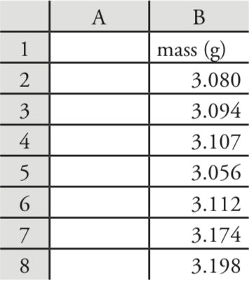
Let’s use Excel to provide a statistical summary of the data in Table 4.1.1. Enter the data into a spreadsheet, as shown in Figure 4.8.1 . To calculate the sample’s mean, for example, click on any empty cell, enter the formula
= average(b2:b8)
and press Return or Enter to replace the cell’s content with Excel’s calculation of the mean (3.117285714), which we round to 3.117. Excel does not have a function for the range, but we can use the functions that report the maximum value and the minimum value to calculate the range; thus
= max(b2:b8) – min(b2:b8)
returns 0.142 as an answer.
Probability Distributions
In Example 4.4.2 we showed that 91.10% of a manufacturer’s analgesic tablets contained between 243 and 262 mg of aspirin. We arrived at this result by calculating the deviation, z, of each limit from the population’s expected mean, \(\mu\), of 250 mg in terms of the population’s expected standard deviation, \(\sigma\), of 5 mg. After we calculated values for z, we used the table in Appendix 3 to find the area under the normal distribution curve between these two limits.
We can complete this calculation in Excel using the norm.dist function As shown in Figure 4.8.2 , the function calculates the probability of obtaining a result less than x from a normal distribution with a mean of \(\mu\) and a standard deviation of \(\sigma\). To solve Example 4.4.2 using Excel enter the following formulas into separate cells
= norm.dist(243, 250, 5, TRUE)
= norm.dist(262, 250, 5, TRUE)
obtaining results of 0.080756659 and 0.991802464. Subtracting the smaller value from the larger value and adjusting to the correct number of significant figures gives the probability as 0.9910, or 99.10%.

Excel also includes a function for working with binomial distributions. The function’s syntax is
= binom.dist(X, N, p, TRUE or FALSE)
where X is the number of times a particular outcome occurs in N trials, and p is the probability that X occurs in a single trial. Setting the function’s last term to TRUE gives the total probability for any result up to X and setting it to FALSE gives the probability for X. Using Example 4.4.1 to test this function, we use the formula
= binom.dist(0, 27, 0.0111, FALSE)
to find the probability of finding no atoms of 13C atoms in a molecule of cholesterol, C27H44O, which returns a value of 0.740 after adjusting for significant figures. Using the formula
= binom.dist(2, 27, 0.0111, TRUE)
we find that 99.7% of cholesterol molecules contain two or fewer atoms of 13C.
Significance Tests
As shown in Table 4.8.1 , Excel includes functions for the following significance tests covered in this chapter:
- an F-test of variances
- an unpaired t-test of sample means assuming equal variances
- an unpaired t-test of sample means assuming unequal variances
- a paired t-test for of sample means
Let’s use these functions to complete a t-test on the data in Table 4.4.1, which contains results for two experiments to determine the mass of a circulating U. S. penny. Enter the data from Table 4.4.1 into a spreadsheet as shown in Figure 4.8.3 .
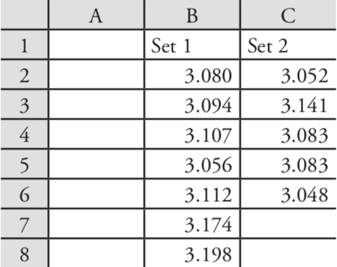
Because the data in this case are unpaired, we will use Excel to complete an unpaired t-test. Before we can complete the t-test, we use an F-test to determine whether the variances for the two data sets are equal or unequal.
To complete the F-test, we click on any empty cell, enter the formula
= f.test(b2:b8, c2:c6)
and press Return or Enter, which replaces the cell’s content with the value of \(\alpha\) for which we can reject the null hypothesis of equal variances. In this case, Excel returns an \(\alpha\) of 0.566 105 03; because this value is not less than 0.05, we retain the null hypothesis that the variances are equal. Excel’s F-test is two-tailed; for a one-tailed F-test, we use the same function, but divide the result by two; thus
= f.test(b2:b8, c2:c6)/2
Having found no evidence to suggest unequal variances, we next complete an unpaired t-test assuming equal variances, entering into any empty cell the formula
= t.test(b2:b8, c2:c6, 2, 2)
where the first 2 indicates that this is a two-tailed t-test, and the second 2 indicates that this is an unpaired t-test with equal variances. Pressing Return or Enter replaces the cell’s content with the value of \(\alpha\) for which we can reject the null hypothesis of equal means. In this case, Excel returns an \(\alpha\) of 0.211 627 646; because this value is not less than 0.05, we retain the null hypothesis that the means are equal.
See Example 4.6.3 and Example 4.6.4 for our earlier solutions to this problem.
The other significance tests in Excel work in the same format. The following practice exercise provides you with an opportunity to test yourself.
Rework Example 4.6.5 and Example 4.6.6 using Excel.
- Answer
-
You will find small differences between the values you obtain using Excel’s built in functions and the worked solutions in the chapter. These differences arise because Excel does not round off the results of intermediate calculations.
R
R is a programming environment that provides powerful capabilities for analyzing data. There are many functions built into R’s standard installation and additional packages of functions are available from the R web site (www.r-project.org). Commands in R are not available from pull down menus. Instead, you interact with R by typing in commands.
You can download the current version of R from www.r-project.org. Click on the link for Download: CRAN and find a local mirror site. Click on the link for the mirror site and then use the link for Linux, MacOS X, or Windows under the heading “Download and Install R.”
Descriptive Statistics
Let’s use R to provide a statistical summary of the data in Table 4.1.1. To do this we first need to create an object that contains the data, which we do by typing in the following command.
> penny1 = c(3.080, 3.094, 3.107, 3.056, 3.112, 3.174, 3.198)
In R, the symbol ‘>’ is a prompt, which indicates that the program is waiting for you to enter a command. When you press ‘Return’ or ‘Enter,’ R executes the command, displays the result (if there is a result to return), and returns the > prompt.
Table 4.8.2 lists some of the commands in R for calculating basic descriptive statistics. As is the case for Excel, R does not include stand alone commands for all descriptive statistics of interest to us, but we can calculate them using other commands. Using a command is easy—simply enter the appropriate code at the prompt; for example, to find the sample’s variance we enter
> var(penny1)
[1] 0.002221918
| Parameter | Excel Function |
|---|---|
| mean | mean(object) |
| median | median(object) |
| standard deviation for sample | sd(object) |
| standard deviation for populations | sd(object) * ((length(object) – 1)/length(object))^0.5 |
| variance for sample | var(object) |
| variance for population | var(object) * ((length(object) – 1)/length(object)) |
| range | max(object) – min(object) |
Probability Distributions
In Example 4.4.2 we showed that 91.10% of a manufacturer’s analgesic tablets contained between 243 and 262 mg of aspirin. We arrived at this result by calculating the deviation, z, of each limit from the population’s expected mean, \(\mu\), of 250 mg in terms of the population’s expected standard deviation, \(\sigma\), of 5 mg. After we calculated values for z, we used the table in Appendix 3 to find the area under the normal distribution curve between these two limits.
We can complete this calculation in R using the function pnorm. The function’s general format is
pnorm(\(x, \mu, \sigma\))
where x is the limit of interest, \(\mu\) is the distribution’s expected mean, and \(\sigma\) is the distribution’s expected standard deviation. The function returns the probability of obtaining a result of less than x (Figure 4.8.4 ).
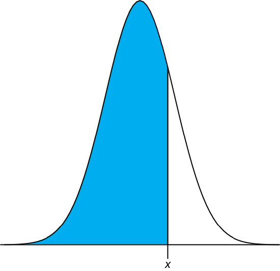
Figure 4.8.4 : Shown in blue is the area returned by the function pnorm(\(x, \mu, \sigma\)).
Here is the output of an R session for solving Example 4.4.2.
> pnorm(243, 250, 5)
[1] 0.08075666
> pnorm(262, 250, 5)
[1] 0.9918025
Subtracting the smaller value from the larger value and adjusting to the correct number of significant figures gives the probability as 0.9910, or 99.10%.
R also includes functions for binomial distributions. To find the probability of obtaining a particular outcome, X, in N trials we use the dbinom function.
dbinom(X, N, p)
where X is the number of times a particular outcome occurs in N trials, and p is the probability that X occurs in a single trial. Using Example 4.4.1 to test this function, we find that the probability of finding no atoms of 13C atoms in a molecule of cholesterol, C27H44O is
> dbinom(0, 27, 0.0111)
[1] 0.7397997
0.740 after adjusting the significant figures. To find the probability of obtaining any outcome up to a maximum value of X, we use the pbinom function.
pbinom(X, N, p)
To find the percentage of cholesterol molecules that contain 0, 1, or 2 atoms of 13C, we enter
> pbinom(2, 27, 0.0111)
[1] 0.9967226
and find that the answer is 99.7% of cholesterol molecules.
Significance Tests
R includes commands for the following significance tests covered in this chapter:
- F-test of variances
- unpaired t-test of sample means assuming equal variances
- unpaired t-test of sample means assuming unequal variances
- paired t-test for of sample means
- Dixon’s Q-test for outliers
- Grubb’s test for outliers
Let’s use these functions to complete a t-test on the data in Table 4.4.1, which contains results for two experiments to determine the mass of a circulating U. S. penny. First, enter the data from Table 4.4.1 into two objects.
> penny1 = c(3.080, 3.094, 3.107, 3.056, 3.112, 3.174, 3.198)
> penny2 = c(3.052, 3.141, 3.083, 3.083, 3.048)
Because the data in this case are unpaired, we will use R to complete an unpaired t-test. Before we can complete a t-test we use an F-test to determine whether the variances for the two data sets are equal or unequal.
To complete a two-tailed F-test in R we use the command
var.test(X, Y)
where X and Y are the objects that contain the two data sets. Figure 4.8.5 shows the output from an R session to solve this problem.
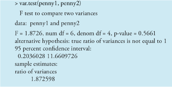
Note that R does not provide the critical value for F(0.05, 6, 4); instead it reports the 95% confidence interval for Fexp. Because this confidence interval of 0.204 to 11.661 includes the expected value for F of 1.00, we retain the null hypothesis and have no evidence for a difference between the variances. R also provides the probability of incorrectly rejecting the null hypothesis, which in this case is 0.5561.
For a one-tailed F-test the command is one of the following
var.test(X, Y, alternative = “greater”)
var.test(X, Y, alternative = “less”)
where “greater” is used when the alternative hypothesis is \(s_X^2 > s_Y^2\), and “less” is used when the alternative hypothesis is \(s_X^2 < s_Y^2\).
Having found no evidence suggesting unequal variances, we now complete an unpaired t-test assuming equal variances. The basic syntax for a two-tailed t-test is
t.test(X, Y, mu = 0, paired = FALSE, var.equal = FALSE)
where X and Y are the objects that contain the data sets. You can change the underlined terms to alter the nature of the t-test. Replacing “var.equal = FALSE” with “var.equal = TRUE” makes this a two-tailed t-test with equal variances, and replacing “paired = FALSE” with “paired = TRUE” makes this a paired t-test. The term “mu = 0” is the expected difference between the means, which for this problem is 0. You can, of course, change this to suit your needs. The underlined terms are default values; if you omit them, then R assumes you intend an unpaired two-tailed t-test of the null hypothesis that X = Y with unequal variances. Figure 4.8.6 shows the output of an R session for this problem.
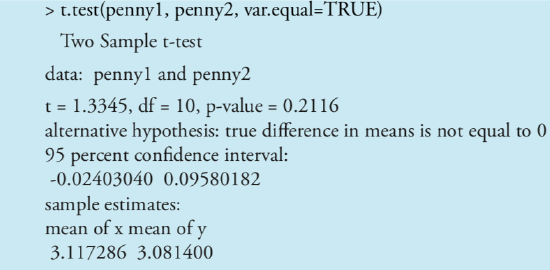
We can interpret the results of this t-test in two ways. First, the p-value of 0.2116 means there is a 21.16% probability of incorrectly rejecting the null hypothesis. Second, the 95% confidence interval of –0.024 to 0.0958 for the difference between the sample means includes the expected value of zero. Both ways of looking at the results provide no evidence for rejecting the null hypothesis; thus, we retain the null hypothesis and find no evidence for a difference between the two samples.
The other significance tests in R work in the same format. The following practice exercise provides you with an opportunity to test yourself.
Rework Example 4.6.5 and Example 4.6.6 using R.
- Answer
-
Shown here are copies of R sessions for each problem. You will find small differences between the values given here for texp and for Fexp and those values shown with the worked solutions in the chapter. These differences arise because R does not round off the results of intermediate calculations.
Example 4.6.5
> AnalystA = c(86.82, 87.04, 86.93, 87.01, 86.20, 87.00)
> AnalystB = c(81.01, 86.15, 81.73, 83.19, 80.27, 83.94)
> var.test(AnalystB, AnalystA)
F test to compare two variances
data: AnalystB and AnalystA
F = 45.6358, num df = 5, denom df = 5, p-value = 0.0007148
alternative hypothesis: true ratio of variances is not equal to 1
95 percent confidence interval:
6.385863 326.130970
sample estimates:
ratio of variances
45.63582
> t.test(AnalystA, AnalystB, var.equal=FALSE)
Welch Two Sample t-test
data: AnalystA and AnalystB
t = 4.6147, df = 5.219, p-value = 0.005177
alternative hypothesis: true difference in means is not equal to 0
95 percent confidence interval: 1.852919 6.383748
sample estimates: mean of x mean of y
86.83333 82.71500
Example 4.21
> micro = c(129.5, 89.6, 76.6, 52.2, 110.8, 50.4, 72.4, 141.4, 75.0, 34.1, 60.3)
> elect = c(132.3, 91.0, 73.6, 58.2, 104.2, 49.9, 82.1, 154.1, 73.4, 38.1, 60.1)> t.test(micro,elect,paired=TRUE)
Paired t-test
data: micro and elect
t = -1.3225, df = 10, p-value = 0.2155
alternative hypothesis: true difference in means is not equal to 0
95 percent confidence interval:
-6.028684 1.537775
sample estimates:
mean of the differences
–2.245455
Unlike Excel, R also includes functions for evaluating outliers. These functions are not part of R’s standard installation. To install them enter the following command within R (note: you will need an internet connection to download the package of functions).
> install.packages(“outliers”)
After you install the package, you must load the functions into R by using the following command (note: you need to do this step each time you begin a new R session as the package does not automatically load when you start R).
> library(“outliers”)
You need to install a package once, but you need to load the package each time you plan to use it. There are ways to configure R so that it automatically loads certain packages; see An Introduction to R for more information (click here to view a PDF version of this document).
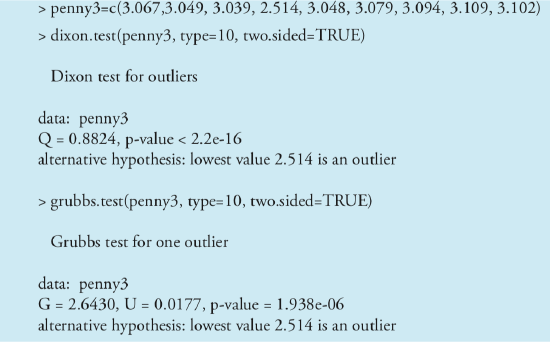
Let’s use this package to find the outlier in Table 4.6.1 using both Dixon’s Q-test and Grubb’s test. The commands for these tests are
dixon.test(X, type = 10, two.sided = TRUE)
grubbs.test(X, type = 10, two.sided = TRUE)
where X is the object that contains the data, “type = 10” specifies that we are looking for one outlier, and “two.sided = TRUE” indicates that we are using the more conservative two-tailed test. Both tests have other variants that allow for the testing of outliers on both ends of the data set (“type = 11”) or for more than one outlier (“type = 20”), but we will not consider these here. Figure 4.8.7 shows the output of a session for this problem. For both tests the very small p-value indicates that we can treat as an outlier the penny with a mass of 2.514 g.
Visualizing Data
One of R’s more useful features is the ability to visualize data. Visualizing data is important because it provides us with an intuitive feel for our data that can help us in applying and evaluating statistical tests. It is tempting to believe that a statistical analysis is foolproof, particularly if the probability for incorrectly rejecting the null hypothesis is small. Looking at a visual display of our data, however, can help us determine whether our data is normally distributed—a requirement for most of the significance tests in this chapter—and can help us identify potential outliers. There are many useful ways to look at data, four of which we consider here.
Visualizing data is important, a point we will return to in Chapter 5 when we consider the mathematical modeling of data.
To plot data in R, we will use the package “lattice,” which you will need to load using the following command.
> library(“lattice”)
To demonstrate the types of plots we can generate, we will use the object “penny,” which contains the masses of the 100 pennies in Table 4.4.3.
You do not need to use the command install.package this time because lattice was automatically installed on your computer when you downloaded R.
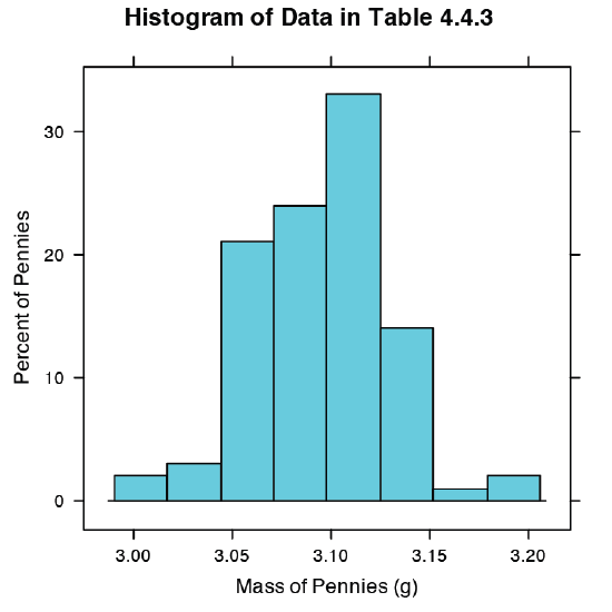
Our first visualization is a histogram. To construct the histogram we use mass to divide the pennies into bins and plot the number of pennies or the percent of pennies in each bin on the y-axis as a function of mass on the x-axis. Figure 4.8.8 shows the result of entering the command
> histogram(penny, type = “percent”, xlab = “Mass (g)”, ylab = “Percent of Pennies”, main = “Histogram of Data in Table 4.4.3”)
A histogram allows us to visualize the data’s distribution. In this example the data appear to follow a normal distribution, although the largest bin does not include the mean of 3.095 g and the distribution is not perfectly symmetric. One limitation of a histogram is that its appearance depends on how we choose to bin the data. Increasing the number of bins and centering the bins around the data’s mean gives a histogram that more closely approximates a normal distribution (Figure 4.4.5).
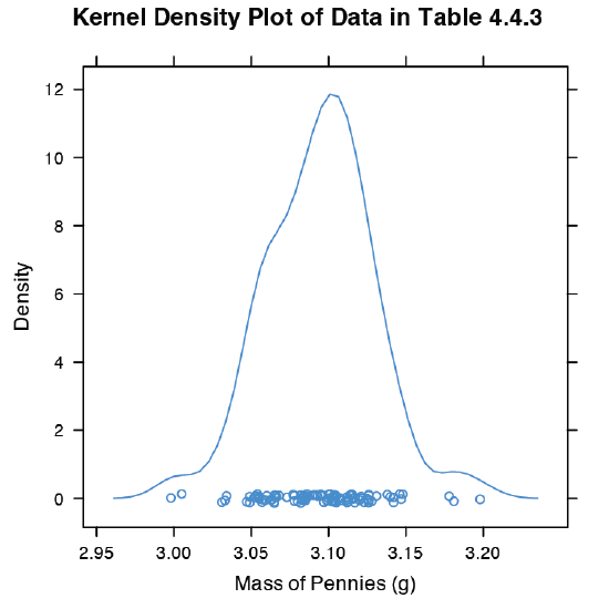
An alternative to the histogram is a kernel density plot, which basically is a smoothed histogram. In this plot each value in the data set is replaced with a normal distribution curve whose width is a function of the data set’s standard deviation and size. The resulting curve is a summation of the individual distributions. Figure 4.8.9 shows the result of entering the command
> densityplot(penny, xlab = “Mass of Pennies (g)”, main = “Kernel Density Plot of Data in Table 4.4.3”)
The circles at the bottom of the plot show the mass of each penny in the data set. This display provides a more convincing picture that the data in Table 4.4.3 are normally distributed, although we see evidence of a small clustering of pennies with a mass of approximately 3.06 g.
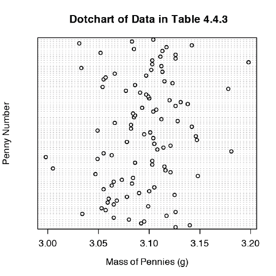
We analyze samples to characterize the parent population. To reach a meaningful conclusion about a population, the samples must be representative of the population. One important requirement is that the samples are random. A dot chart provides a simple visual display that allows us to examine the data for non-random trends. Figure 4.8.10 shows the result of entering
> dotchart(penny, xlab = “Mass of Pennies (g)”, ylab = “Penny Number”, main = “Dotchart of Data in Table 4.4.3”)
In this plot the masses of the 100 pennies are arranged along the y-axis in the order in which they were sampled. If we see a pattern in the data along the y-axis, such as a trend toward smaller masses as we move from the first penny to the last penny, then we have clear evidence of non-random sampling. Because our data do not show a pattern, we have more confidence in the quality of our data.
The last plot we will consider is a box plot, which is a useful way to identify potential outliers without making any assumptions about the data’s distribution. A box plot contains four pieces of information about a data set: the median, the middle 50% of the data, the smallest value and the largest value within a set distance of the middle 50% of the data, and possible outliers. Figure 4.8.11 shows the result of entering
> bwplot(penny, xlab = “Mass of Pennies (g)”, main = “Boxplot of Data in Table 4.4.3)”
The black dot (•) is the data set’s median. The rectangular box shows the range of masses spanning the middle 50% of the pennies. This also is known as the interquartile range, or IQR. The dashed lines, which are called “whiskers,” extend to the smallest value and the largest value that are within \(\pm 1.5 \times \text{IQR}\) of the rectangular box. Potential outliers are shown as open circles (o). For normally distributed data the median is near the center of the box and the whiskers will be equidistant from the box. As is often the case in statistics, the converse is not true—finding that a boxplot is perfectly symmetric does not prove that the data are normally distributed.
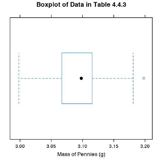
To find the interquartile range you first find the median, which divides the data in half. The median of each half provides the limits for the box. The IQR is the median of the upper half of the data minus the median for the lower half of the data. For the data in Table 4.4.3 the median is 3.098. The median for the lower half of the data is 3.068 and the median for the upper half of the data is 3.115. The IQR is 3.115 – 3.068 = 0.047. You can use the command “summary(penny)” in R to obtain these values.
The lower “whisker” extend to the first data point with a mass larger than
3.068 – 1.5 \(\times\) IQR = 3.068 – 1.5 \(\times\) 0.047 = 2.9975
which for this data is 2.998 g. The upper “whisker” extends to the last data point with a mass smaller than
3.115 + 1.5 \(\times\) IQR = 3.115 + 1.5 \(\times\) 0.047 = 3.1855
which for this data is 3.181 g.
The box plot in Figure 4.8.11 is consistent with the histogram (Figure 4.8.8 ) and the kernel density plot (Figure 4.8.9 ). Together, the three plots provide evidence that the data in Table 4.4.3 are normally distributed. The potential outlier, whose mass of 3.198 g, is not sufficiently far away from the upper whisker to be of concern, particularly as the size of the data set (n = 100) is so large. A Grubb’s test on the potential outlier does not provide evidence for treating it as an outlier.
Use R to create a data set consisting of 100 values from a uniform distribution by entering the command
> data = runif(100, min = 0, max = 100)
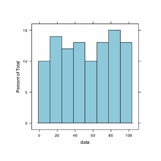
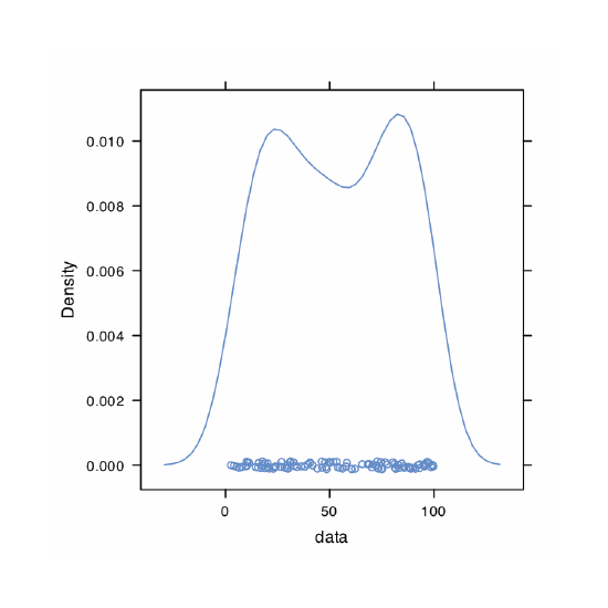
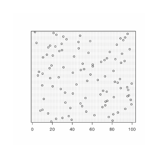
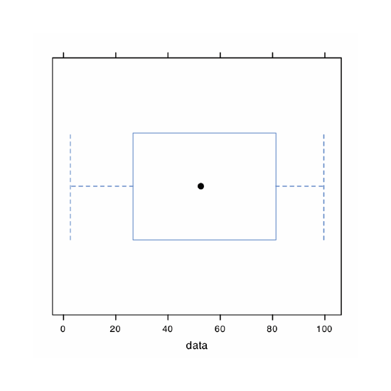
A uniform distribution is one in which every value between the minimum and the maximum is equally probable. Examine the data set by creating a histogram, a kernel density plot, a dot chart, and a box plot. Briefly comment on what the plots tell you about the your sample and its parent population.
- Answer
-
Because we are selecting a random sample of 100 members from a uniform distribution, you will see subtle differences between your plots and the plots shown as part of this answer. Here is a record of my R session and the resulting plots.
> data = runif(100, min = 0, max = 0)
> data
[1] 18.928795 80.423589 39.399693 23.757624 30.088554
[6] 76.622174 36.487084 62.186771 81.115515 15.726404
[11] 85.765317 53.994179 7.919424 10.125832 93.153308
[16] 38.079322 70.268597 49.879331 73.115203 99.329723
[21] 48.203305 33.093579 73.410984 75.128703 98.682127
[26] 11.433861 53.337359 81.705906 95.444703 96.843476
[31] 68.251721 40.567993 32.761695 74.635385 70.914957
[36] 96.054750 28.448719 88.580214 95.059215 20.316015
[41] 9.828515 44.172774 99.648405 85.593858 82.745774
[46] 54.963426 65.563743 87.820985 17.791443 26.417481
[51] 72.832037 5.518637 58.231329 10.213343 40.581266
[56] 6.584000 81.261052 48.534478 51.830513 17.214508
[61] 31.232099 60.545307 19.197450 60.485374 50.414960
[66] 88.908862 68.939084 92.515781 72.414388 83.195206
[71] 74.783176 10.643619 41.775788 20.464247 14.547841
[76] 89.887518 56.217573 77.606742 26.956787 29.641171
[81] 97.624246 46.406271 15.906540 23.007485 17.715668
[86] 84.652814 29.379712 4.093279 46.213753 57.963604
[91] 91.160366 34.278918 88.352789 93.004412 31.055807
[96] 47.822329 24.052306 95.498610 21.089686 2.629948
> histogram(data, type = “percent”)
> densityplot(data)
> dotchart(data)
> bwplot(data)
The histogram (far left) divides the data into eight bins, each of which contains between 10 and 15 members. As we expect for a uniform distribution, the histogram’s overall pattern suggests that each outcome is equally probable. In interpreting the kernel density plot (second from left), it is important to remember that it treats each data point as if it is from a normally distributed population (even though, in this case, the underlying population is uniform). Although the plot appears to suggest that there are two normally distributed populations, the individual results shown at the bottom of the plot provide further evidence for a uniform distribution. The dot chart (second from right) shows no trend along the y-axis, which indicates that the individual members of this sample were drawn at random from the population. The distribution along the x-axis also shows no pattern, as expected for a uniform distribution, Finally, the box plot (far right) shows no evidence of outliers.
