
5.6: Using Excel for a Linear Regression
- Page ID
- 219816

Although the calculations in this chapter are relatively straightforward—consisting, as they do, mostly of summations—it is tedious to work through problems using nothing more than a calculator. Excel includes functions for completing a linear regression analysis and for visually evaluating the resulting model.
Excel
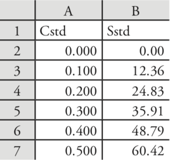
Let’s use Excel to fit the following straight-line model to the data in Example 5.4.1.
\[y = \beta_0 + \beta_1 x \nonumber\]
Enter the data into a spreadsheet, as shown in Figure \(\PageIndex{1}\). Depending upon your needs, there are many ways that you can use Excel to complete a linear regression analysis. We will consider three approaches here.
Using Excel's Built-In Functions
If all you need are values for the slope, \(\beta_1\), and the y-intercept, \(\beta_0\), you can use the following functions:
= intercept(known_y's, known_x's)
= slope(known_y's, known_x's)
where known_y’s is the range of cells that contain the signals (y), and known_x’s is the range of cells that contain the concentrations (x). For example, if you click on an empty cell and enter
= slope(B2:B7, A2:A7)
Excel returns exact calculation for the slope (120.705 714 3).
Using Excel's LINEST Function
To obtain the slope and the y-intercept, along with additional statistical details, you can use the LINEST function. The LINEST function is standard in Excel on both Macs and PC's and a version of it is available in Google docs.
Once you have your data entered in Excel, highlight a blank area of 2 columns by 5 row and type =LINEST. The syntax for the LINEST function is LINEST( known_y's, [known_x's], [const], [stats] ) where known_y's and known x's can be drag entered, the [const] can have the values of TRUE where the intercept is treated normally or FALSE where the intercept is set to have the value of 0, and the [stats] can have the values of True where a set of regression statistics is returned with the slope and intercept or FALSE where the regression statistics are not returned.
Because the LINEST function is an array function, the contents of the active cell bar on the same line above the spreadsheet to the right of the word LINEST and the symbol fx which will show something like =LINEST(C2:C7,B2:B7,TRUE,TRUE) need to be highlighted and enetered with the Cntrl, Shift and Enter keys all pressed at the same time so the results appear and the contents of of the active cell box appear in curved brackets like {=LINEST(C2:C7,B2:B7,TRUE,TRUE)}. The entry of an array function on a Mac uses the cloverleaf key instead of Cntrl.
The output of the LINEST function should appear for the sample data as the table shown below:
| 120.7057 | 0.208571 |
| 0.964065 | 0.291885 |
| 0.999745 | 0.403297 |
| 15676.3 | 4 |
| 2549.727 | 0.650594 |
Column 1, from top to bottom, shows the slope, the error in the slope, the coefficient of determination, the F statistic or F-observed value , and the the regression sum of squares ssreg). Column 2, from top to bottom, shows the intercept, the error in the intercept, the standard error in the regression or y-estimate, the degrees of freedom, and the residual sum of squares (ssresid)
Using Excel's Data Analysis Tools
To obtain the slope and the y-intercept, along with additional statistical details, you can use the data analysis tools in the Data Analysis ToolPak. The ToolPak is not a standard part of Excel’s instillation and is only available for PCs. To see if you have access to the Analysis ToolPak on your computer, select Tools from the menu bar and look for the Data Analysis... option. If you do not see Data Analysis..., select Add-ins... from the Tools menu. Check the box for the Analysis ToolPak and click on OK to install them.
Select Data Analysis... from the Tools menu, which opens the Data Analysis window. Scroll through the window, select Regression from the available options, and press OK. Place the cursor in the box for Input Y range and then click and drag over cells B1:B7. Place the cursor in the box for Input X range and click and drag over cells A1:A7. Because cells A1 and B1 contain labels, check the box for Labels.
Including labels is a good idea. Excel’s summary output uses the x-axis label to identify the slope.
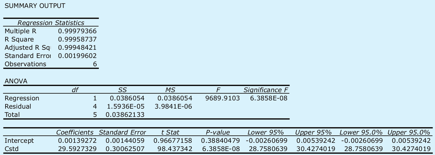
Select the radio button for Output range and click on any empty cell; this is where Excel will place the results. Clicking OK generates the information shown in Figure \(\PageIndex{2}\).
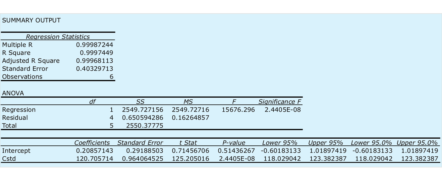
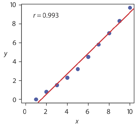
There are three parts to Excel’s summary of a regression analysis. At the top of Figure \(\PageIndex{2}\) is a table of Regression Statistics. The standard error is the standard deviation about the regression, sr. Also of interest is the value for Multiple R, which is the model’s correlation coefficient, r, a term with which you may already be familiar. The correlation coefficient is a measure of the extent to which the regression model explains the variation in y. Values of r range from –1 to +1. The closer the correlation coefficient is to ±1, the better the model is at explaining the data. A correlation coefficient of 0 means there is no relationship between x and y. In developing the calculations for linear regression, we did not consider the correlation coefficient. There is a reason for this. For most straight-line calibration curves the correlation coefficient is very close to +1, typically 0.99 or better. There is a tendency, however, to put too much faith in the correlation coefficient’s significance, and to assume that an r greater than 0.99 means the linear regression model is appropriate. Figure \(\PageIndex{3}\) provides a useful counterexample. Although the regression line has a correlation coefficient of 0.993, the data clearly is curvilinear. The take-home lesson here is simple: do not fall in love with the correlation coefficient!
The second table in Figure \(\PageIndex{2}\) is entitled ANOVA, which stands for analysis of variance. We will take a closer look at ANOVA in Chapter 14. For now, it is sufficient to understand that this part of Excel’s summary provides information on whether the linear regression model explains a significant portion of the variation in the values of y. The value for F is the result of an F-test of the following null and alternative hypotheses.
H0: the regression model does not explain the variation in y
HA: the regression model does explain the variation in y
The value in the column for Significance F is the probability for retaining the null hypothesis. In this example, the probability is \(2.5 \times 10^{-6}\%\), which is strong evidence for accepting the regression model. As is the case with the correlation coefficient, a small value for the probability is a likely outcome for any calibration curve, even when the model is inappropriate. The probability for retaining the null hypothesis for the data in Figure \(\PageIndex{3}\), for example, is \(9.0 \times 10^{-7}\%\).
See Chapter 4.6 for a review of the F-test.
The third table in Figure \(\PageIndex{2}\) provides a summary of the model itself. The values for the model’s coefficients—the slope,\(\beta_1\), and the y-intercept, \(\beta_0\)—are identified as intercept and with your label for the x-axis data, which in this example is Cstd. The standard deviations for the coefficients, \(s_{b_0}\) and \(s_{b_1}\), are in the column labeled Standard error. The column t Stat and the column P-value are for the following t-tests.
slope: \(H_0 \text{: } \beta_1 = 0 \quad H_A \text{: } \beta_1 \neq 0\)
y-intercept: \(H_0 \text{: } \beta_0 = 0 \quad H_A \text{: } \beta_0 \neq 0\)
The results of these t-tests provide convincing evidence that the slope is not zero, but there is no evidence that the y-intercept differs significantly from zero. Also shown are the 95% confidence intervals for the slope and the y-intercept (lower 95% and upper 95%).
See Chapter 4.6 for a review of the t-test.
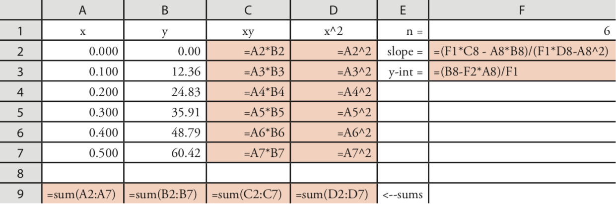
Programming the Formulas Yourself
A third approach to completing a regression analysis is to program a spreadsheet using Excel’s built-in formula for a summation
=sum(first cell:last cell)
and its ability to parse mathematical equations. The resulting spreadsheet is shown in Figure \(\PageIndex{4}\).
Using Excel to Visualize the Regression Model
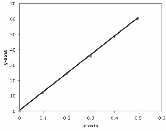
You can use Excel to examine your data and the regression line. Begin by plotting the data. Organize your data in two columns, placing the x values in the left-most column. Click and drag over the data and select Charts from the ribbon. Select Scatter, choosing the option without lines that connect the points. To add a regression line to the chart, click on the chart’s data and select Chart: Add Trendline... from the main men. Pick the straight-line model and click OK to add the line to your chart. By default, Excel displays the regression line from your first point to your last point. Figure \(\PageIndex{5}\) shows the result for the data in Figure \(\PageIndex{1}\).
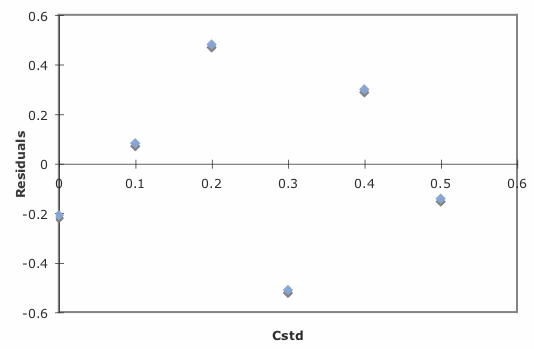
Excel also will create a plot of the regression model’s residual errors. To create the plot, build the regression model using the Analysis ToolPak, as described earlier. Clicking on the option for Residual plots creates the plot shown in Figure \(\PageIndex{6}\).
Limitations to Using Excel for a Regression Analysis
Excel’s biggest limitation for a regression analysis is that it does not provide a function to calculate the uncertainty when predicting values of x. In terms of this chapter, Excel can not calculate the uncertainty for the analyte’s concentration, CA, given the signal for a sample, Ssamp. Another limitation is that Excel does not have a built-in function for a weighted linear regression. You can, however, program a spreadsheet to handle these calculations.
Use Excel to complete the regression analysis in Exercise 5.4.1.
- Answer
-
Begin by entering the data into an Excel spreadsheet, following the format shown in Figure \(\PageIndex{1}\). Because Excel’s Data Analysis tools provide most of the information we need, we will use it here. The resulting output, which is shown below, provides the slope and the y-intercept, along with their respective 95% confidence intervals.
Excel does not provide a function for calculating the uncertainty in the analyte’s concentration, CA, given the signal for a sample, Ssamp. You must complete these calculations by hand. With an Ssamp of 0.114, we find that CA is
\[C_A = \frac {S_{samp} - b_0} {b_1} = \frac {0.114 - 0.0014} {29.59 \text{ M}^{-1}} = 3.80 \times 10^{-3} \text{ M} \nonumber\]
The standard deviation in CA is
\[s_{C_A} = \frac {1.996 \times 10^{-3}} {29.59} \sqrt{\frac {1} {3} + \frac {1} {6} + \frac {(0.114 - 0.1183)^2} {(29.59)^2 \times 4.408 \times 10^{-5})}} = 4.772 \times 10^{-5} \nonumber\]
and the 95% confidence interval is
\[\mu = C_A \pm ts_{C_A} = 3.80 \times 10^{-3} \pm \{2.78 \times (4.772 \times 10^{-5}) \} \nonumber\]
\[\mu = 3.80 \times 10^{-3} \text{ M} \pm 0.13 \times 10^{-3} \text{ M} \nonumber\]