
7. Data Analysis
- Page ID
- 248016

\( \newcommand{\vecs}[1]{\overset { \scriptstyle \rightharpoonup} {\mathbf{#1}} } \)
\( \newcommand{\vecd}[1]{\overset{-\!-\!\rightharpoonup}{\vphantom{a}\smash {#1}}} \)
\( \newcommand{\id}{\mathrm{id}}\) \( \newcommand{\Span}{\mathrm{span}}\)
( \newcommand{\kernel}{\mathrm{null}\,}\) \( \newcommand{\range}{\mathrm{range}\,}\)
\( \newcommand{\RealPart}{\mathrm{Re}}\) \( \newcommand{\ImaginaryPart}{\mathrm{Im}}\)
\( \newcommand{\Argument}{\mathrm{Arg}}\) \( \newcommand{\norm}[1]{\| #1 \|}\)
\( \newcommand{\inner}[2]{\langle #1, #2 \rangle}\)
\( \newcommand{\Span}{\mathrm{span}}\)
\( \newcommand{\id}{\mathrm{id}}\)
\( \newcommand{\Span}{\mathrm{span}}\)
\( \newcommand{\kernel}{\mathrm{null}\,}\)
\( \newcommand{\range}{\mathrm{range}\,}\)
\( \newcommand{\RealPart}{\mathrm{Re}}\)
\( \newcommand{\ImaginaryPart}{\mathrm{Im}}\)
\( \newcommand{\Argument}{\mathrm{Arg}}\)
\( \newcommand{\norm}[1]{\| #1 \|}\)
\( \newcommand{\inner}[2]{\langle #1, #2 \rangle}\)
\( \newcommand{\Span}{\mathrm{span}}\) \( \newcommand{\AA}{\unicode[.8,0]{x212B}}\)
\( \newcommand{\vectorA}[1]{\vec{#1}} % arrow\)
\( \newcommand{\vectorAt}[1]{\vec{\text{#1}}} % arrow\)
\( \newcommand{\vectorB}[1]{\overset { \scriptstyle \rightharpoonup} {\mathbf{#1}} } \)
\( \newcommand{\vectorC}[1]{\textbf{#1}} \)
\( \newcommand{\vectorD}[1]{\overrightarrow{#1}} \)
\( \newcommand{\vectorDt}[1]{\overrightarrow{\text{#1}}} \)
\( \newcommand{\vectE}[1]{\overset{-\!-\!\rightharpoonup}{\vphantom{a}\smash{\mathbf {#1}}}} \)
\( \newcommand{\vecs}[1]{\overset { \scriptstyle \rightharpoonup} {\mathbf{#1}} } \)
\( \newcommand{\vecd}[1]{\overset{-\!-\!\rightharpoonup}{\vphantom{a}\smash {#1}}} \)
\(\newcommand{\avec}{\mathbf a}\) \(\newcommand{\bvec}{\mathbf b}\) \(\newcommand{\cvec}{\mathbf c}\) \(\newcommand{\dvec}{\mathbf d}\) \(\newcommand{\dtil}{\widetilde{\mathbf d}}\) \(\newcommand{\evec}{\mathbf e}\) \(\newcommand{\fvec}{\mathbf f}\) \(\newcommand{\nvec}{\mathbf n}\) \(\newcommand{\pvec}{\mathbf p}\) \(\newcommand{\qvec}{\mathbf q}\) \(\newcommand{\svec}{\mathbf s}\) \(\newcommand{\tvec}{\mathbf t}\) \(\newcommand{\uvec}{\mathbf u}\) \(\newcommand{\vvec}{\mathbf v}\) \(\newcommand{\wvec}{\mathbf w}\) \(\newcommand{\xvec}{\mathbf x}\) \(\newcommand{\yvec}{\mathbf y}\) \(\newcommand{\zvec}{\mathbf z}\) \(\newcommand{\rvec}{\mathbf r}\) \(\newcommand{\mvec}{\mathbf m}\) \(\newcommand{\zerovec}{\mathbf 0}\) \(\newcommand{\onevec}{\mathbf 1}\) \(\newcommand{\real}{\mathbb R}\) \(\newcommand{\twovec}[2]{\left[\begin{array}{r}#1 \\ #2 \end{array}\right]}\) \(\newcommand{\ctwovec}[2]{\left[\begin{array}{c}#1 \\ #2 \end{array}\right]}\) \(\newcommand{\threevec}[3]{\left[\begin{array}{r}#1 \\ #2 \\ #3 \end{array}\right]}\) \(\newcommand{\cthreevec}[3]{\left[\begin{array}{c}#1 \\ #2 \\ #3 \end{array}\right]}\) \(\newcommand{\fourvec}[4]{\left[\begin{array}{r}#1 \\ #2 \\ #3 \\ #4 \end{array}\right]}\) \(\newcommand{\cfourvec}[4]{\left[\begin{array}{c}#1 \\ #2 \\ #3 \\ #4 \end{array}\right]}\) \(\newcommand{\fivevec}[5]{\left[\begin{array}{r}#1 \\ #2 \\ #3 \\ #4 \\ #5 \\ \end{array}\right]}\) \(\newcommand{\cfivevec}[5]{\left[\begin{array}{c}#1 \\ #2 \\ #3 \\ #4 \\ #5 \\ \end{array}\right]}\) \(\newcommand{\mattwo}[4]{\left[\begin{array}{rr}#1 \amp #2 \\ #3 \amp #4 \\ \end{array}\right]}\) \(\newcommand{\laspan}[1]{\text{Span}\{#1\}}\) \(\newcommand{\bcal}{\cal B}\) \(\newcommand{\ccal}{\cal C}\) \(\newcommand{\scal}{\cal S}\) \(\newcommand{\wcal}{\cal W}\) \(\newcommand{\ecal}{\cal E}\) \(\newcommand{\coords}[2]{\left\{#1\right\}_{#2}}\) \(\newcommand{\gray}[1]{\color{gray}{#1}}\) \(\newcommand{\lgray}[1]{\color{lightgray}{#1}}\) \(\newcommand{\rank}{\operatorname{rank}}\) \(\newcommand{\row}{\text{Row}}\) \(\newcommand{\col}{\text{Col}}\) \(\renewcommand{\row}{\text{Row}}\) \(\newcommand{\nul}{\text{Nul}}\) \(\newcommand{\var}{\text{Var}}\) \(\newcommand{\corr}{\text{corr}}\) \(\newcommand{\len}[1]{\left|#1\right|}\) \(\newcommand{\bbar}{\overline{\bvec}}\) \(\newcommand{\bhat}{\widehat{\bvec}}\) \(\newcommand{\bperp}{\bvec^\perp}\) \(\newcommand{\xhat}{\widehat{\xvec}}\) \(\newcommand{\vhat}{\widehat{\vvec}}\) \(\newcommand{\uhat}{\widehat{\uvec}}\) \(\newcommand{\what}{\widehat{\wvec}}\) \(\newcommand{\Sighat}{\widehat{\Sigma}}\) \(\newcommand{\lt}{<}\) \(\newcommand{\gt}{>}\) \(\newcommand{\amp}{&}\) \(\definecolor{fillinmathshade}{gray}{0.9}\)a) Nanoparticle size from ImageJ
Your next task is to determine the average size of the gold nanoparticles in the solution you have synthesized. Since we do not have access to a Transmission Electron Microscope, we will utilize images collected ahead of time on nanoparticle solutions previously synthesized under identical conditions.
- Double click on the ImageJ shortcut on the desktop to open the image processing software.
- Load the TEM image from the desktop that corresponds to the synthesis conditions used by your lab group. Do this by selecting “File” and then “Open”.
- The software from modern TEM instruments will embed a scale bar on the image in order to give a reference to the size of objects in the image. We will use this to tell the software how big each pixel in the digital image is, which the software can then use to calculate sizes in a more automated manner.
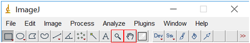
- Use the zoom tool (looks like a magnifying glass) or the + and – keys on the keyboard to enlarge the image until the scale bar in the image almost fills the screen. Pan around the image using the tool that looks like a hand.
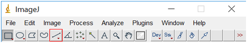
- Select the line tool from the tool bar at the top of the screen and draw a line over the scale bar (the line should extend exactly the same length as the scale bar).
- Select “Analyze” and then “Set Scale”.
- Remove any prior measurements by selecting “Click to remove scale”.
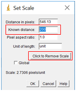
- In the box labelled “Known distance”, enter in the value on the scale bar in your image. The distance in pixels should already be filled from the line drawn. In the units box, enter the appropriate units, in this case nanometers or nm. Leave the pixel aspect ratio as the default value of 1 (this just means that the horizontal and vertical sizes of the pixels are the same). Click “OK”.
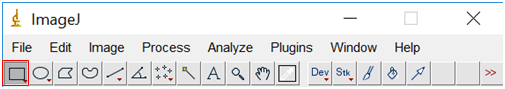
- Next be sure to zoom back out until you can see the entire image (hold control while clicking with the magnifying glass to zoom out), and then select the region of interest (where you have nanoparticles, but excluding the margins and scale bar). Do this by clicking on the rectangle tool and surrounding the area you want to use.
- Select “Image” and then “Crop”.
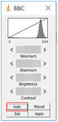
- You next need to adjust the image so that the software can readily distinguish between a nanoparticle and the background. To do this, you will first adjust the brightness/contrast of the image. Select “Image” followed by “Adjust” and then “Brightness/Contrast”. Sometimes the “Auto” feature is sufficient, but if not you can also play around with the sliding bars. Try to adjust them so that the nanoparticles really stand out and the background is mainly white, but make sure the size of the dots doesn’t change.
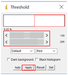
- Select “Image” followed by “Adjust” and then “Threshold”. Move the sliders until the particles you wish to analyze are red, but none of the background is red. This will set the background to be completely white to create a firm visual boundary between the nanoparticle and the background. Click “Apply”.
- Select “Process”, followed by “Binary” and then “Make Binary”.
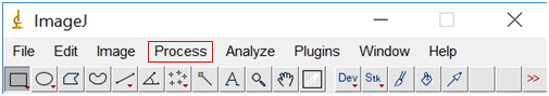
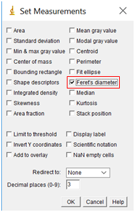
- We are about to measure the size of the particles, but first, we need to tell the software what measurements we want. Go to “Analyze” followed by “Set Measurements”. Check the box “Feret's Diameter”, but none of the others.
- Finally, we are ready to have the software measure the size of all the nanoparticles. To do this, select “Analyze” followed by “Analyze Particles”.
- Check the boxes “Display Results” and “Exclude on Edges” and “Summarize”. The default size from 0 to infinity is a good starting point, although it can be beneficial to put an upper and lower limit to prevent errant inclusions. For circularity, a range of 0.6 to 1 is typically acceptable.
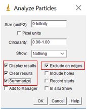
- Select OK, and two tables with your results will appear, a summary and complete table of each particle.
- Look through the results table and watch for unrealistic particle sizes (for example if the area is on the order of 1x10⁻⁴ nm2, this makes no physical sense, it results from background noise being counted as a particle). You can remove these errant points by right clicking on them and selecting “clear”.
- For each window, select “File” followed by “save as” to save the table as a spreadsheet. End your filename with “.txt”. For the summary table, either print the spreadsheet or copy the results into your lab notebook.
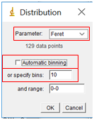
- While the complete data table is nice, it is challenging to visualize the results in table form. Instead, we will create a histogram which shows the size distribution of our particles. In the Results window, select “Results” followed by “Set Measurements”. Select the Feret’s Diameter box (you can uncheck all the others). Then select “Results” followed by “Distribution”. Under “Parameter”, select “Feret”. Uncheck “Automatic Binning” and set the number of bins to 10, and then select “OK”. Note that the binning determines how many bars are displayed on the histogram.
b) Nanoparticle Size Distribution in Excel
One shortcoming of ImageJ is that there is very limited ability to control the appearance of the graphs generated. As a result, it is often beneficial to instead work with the actual data in a more flexible program like Excel.
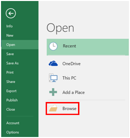
- Open Excel, and the select “File → Open” and the “Browse”.
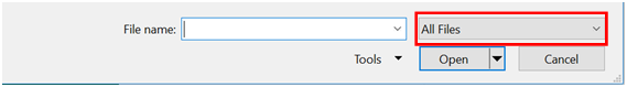
- Navigate to the folder where you saved your data, and switch the menu from Excel Files to “All Files”, at which point, you should see your results. Select the file, and click “Open”.
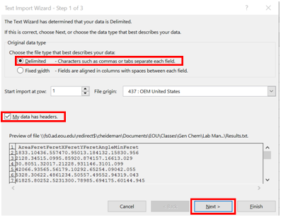
- Because your data isn’t an actual spreadsheet file, you need to give Excel some guidance so that it can open it correctly. Check the “Delimited” bullet option, and the check box “My data has headers”. Click “Next”
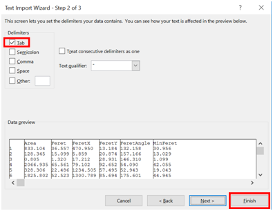
- Check the “Tab” box under Delimiters, and click “Finish”.
- Browse through your data to again verify that all of the data look reasonable.
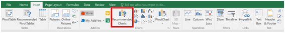
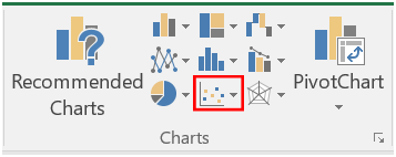
- Highlight the data under “Feret”, and then go to the “Insert” tab, and click on “Recommended Charts”.
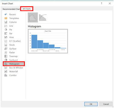
- Click the tab labelled “All Charts”, and then select histogram.
- A histogram should appear. Right click on the x-axis, and select “Format Axis”.
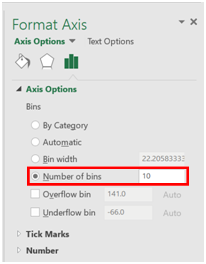
- A window will open on the right side of the screen. Set the number of bins to the same number of bars as was generated in ImageJ previously.
- Give the histogram an appropriate title, and print it.
c) Combining UV-Vis Spectra in Excel
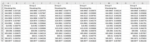
- Go to the shared google drive folder where you previously uploaded your exported visible absorbance spectrum and download all the spectra in the folder that have been collected by your classmates.
- Open each file in Excel, and copy and paste the wavelength and absorbance data into a single spreadsheet. You should have something that looks similar to the data shown below.
- Highlight the wavelength and absorbance columns for group 1, and select the “Insert” tab, and click on “Scatter with smooth lines”.
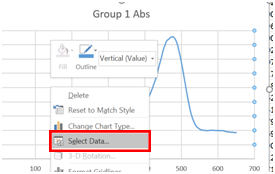
- A chart should appear on your spreadsheet. Now we need to add the rest of the data. Right click on the chart, and click on “Select Data”.
- Click on “Add”
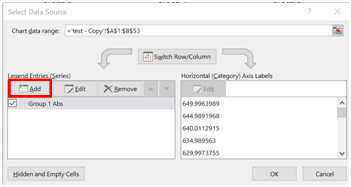
- Under Series name, type in “Group 2 Abs”.
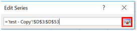
- Under Series X values, click on the box next to the text space.
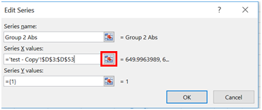
- A new window should appear. Highlight the wavelengths for Group 2 and click the box next to the text space that is now filled in.
- Repeat this for the “Series Y values”.
- Repeat steps 5-9 for each additional data set and click “OK”
- You should now have all of the plots on one graph. The last thing we need to do is to make sure everything is labelled. Left click on the graph and a + should appear. Click on the + and additional menu items should appear.

- Check the options “Axes”, “Axis Titles”, “Chart Title” and “Legend”.
- Label the Y-axis “Absorbance”.
- Label the X-axis “Wavelength (nm)”.
- Give the chart an appropriate title.
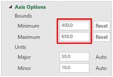
- Finally, we are going to rescale the x-axis to only cover the range of interest. Select the x-axis by clicking on it, and then right click on it and select “Format Axis”.
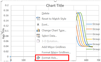
- Change the minimum bound to 400 and the maximum bound to 650.
- Print a copy of the combined graph.