
3.2: Using R to Visualize Data
- Page ID
- 218889

\( \newcommand{\vecs}[1]{\overset { \scriptstyle \rightharpoonup} {\mathbf{#1}} } \)
\( \newcommand{\vecd}[1]{\overset{-\!-\!\rightharpoonup}{\vphantom{a}\smash {#1}}} \)
\( \newcommand{\dsum}{\displaystyle\sum\limits} \)
\( \newcommand{\dint}{\displaystyle\int\limits} \)
\( \newcommand{\dlim}{\displaystyle\lim\limits} \)
\( \newcommand{\id}{\mathrm{id}}\) \( \newcommand{\Span}{\mathrm{span}}\)
( \newcommand{\kernel}{\mathrm{null}\,}\) \( \newcommand{\range}{\mathrm{range}\,}\)
\( \newcommand{\RealPart}{\mathrm{Re}}\) \( \newcommand{\ImaginaryPart}{\mathrm{Im}}\)
\( \newcommand{\Argument}{\mathrm{Arg}}\) \( \newcommand{\norm}[1]{\| #1 \|}\)
\( \newcommand{\inner}[2]{\langle #1, #2 \rangle}\)
\( \newcommand{\Span}{\mathrm{span}}\)
\( \newcommand{\id}{\mathrm{id}}\)
\( \newcommand{\Span}{\mathrm{span}}\)
\( \newcommand{\kernel}{\mathrm{null}\,}\)
\( \newcommand{\range}{\mathrm{range}\,}\)
\( \newcommand{\RealPart}{\mathrm{Re}}\)
\( \newcommand{\ImaginaryPart}{\mathrm{Im}}\)
\( \newcommand{\Argument}{\mathrm{Arg}}\)
\( \newcommand{\norm}[1]{\| #1 \|}\)
\( \newcommand{\inner}[2]{\langle #1, #2 \rangle}\)
\( \newcommand{\Span}{\mathrm{span}}\) \( \newcommand{\AA}{\unicode[.8,0]{x212B}}\)
\( \newcommand{\vectorA}[1]{\vec{#1}} % arrow\)
\( \newcommand{\vectorAt}[1]{\vec{\text{#1}}} % arrow\)
\( \newcommand{\vectorB}[1]{\overset { \scriptstyle \rightharpoonup} {\mathbf{#1}} } \)
\( \newcommand{\vectorC}[1]{\textbf{#1}} \)
\( \newcommand{\vectorD}[1]{\overrightarrow{#1}} \)
\( \newcommand{\vectorDt}[1]{\overrightarrow{\text{#1}}} \)
\( \newcommand{\vectE}[1]{\overset{-\!-\!\rightharpoonup}{\vphantom{a}\smash{\mathbf {#1}}}} \)
\( \newcommand{\vecs}[1]{\overset { \scriptstyle \rightharpoonup} {\mathbf{#1}} } \)
\(\newcommand{\longvect}{\overrightarrow}\)
\( \newcommand{\vecd}[1]{\overset{-\!-\!\rightharpoonup}{\vphantom{a}\smash {#1}}} \)
\(\newcommand{\avec}{\mathbf a}\) \(\newcommand{\bvec}{\mathbf b}\) \(\newcommand{\cvec}{\mathbf c}\) \(\newcommand{\dvec}{\mathbf d}\) \(\newcommand{\dtil}{\widetilde{\mathbf d}}\) \(\newcommand{\evec}{\mathbf e}\) \(\newcommand{\fvec}{\mathbf f}\) \(\newcommand{\nvec}{\mathbf n}\) \(\newcommand{\pvec}{\mathbf p}\) \(\newcommand{\qvec}{\mathbf q}\) \(\newcommand{\svec}{\mathbf s}\) \(\newcommand{\tvec}{\mathbf t}\) \(\newcommand{\uvec}{\mathbf u}\) \(\newcommand{\vvec}{\mathbf v}\) \(\newcommand{\wvec}{\mathbf w}\) \(\newcommand{\xvec}{\mathbf x}\) \(\newcommand{\yvec}{\mathbf y}\) \(\newcommand{\zvec}{\mathbf z}\) \(\newcommand{\rvec}{\mathbf r}\) \(\newcommand{\mvec}{\mathbf m}\) \(\newcommand{\zerovec}{\mathbf 0}\) \(\newcommand{\onevec}{\mathbf 1}\) \(\newcommand{\real}{\mathbb R}\) \(\newcommand{\twovec}[2]{\left[\begin{array}{r}#1 \\ #2 \end{array}\right]}\) \(\newcommand{\ctwovec}[2]{\left[\begin{array}{c}#1 \\ #2 \end{array}\right]}\) \(\newcommand{\threevec}[3]{\left[\begin{array}{r}#1 \\ #2 \\ #3 \end{array}\right]}\) \(\newcommand{\cthreevec}[3]{\left[\begin{array}{c}#1 \\ #2 \\ #3 \end{array}\right]}\) \(\newcommand{\fourvec}[4]{\left[\begin{array}{r}#1 \\ #2 \\ #3 \\ #4 \end{array}\right]}\) \(\newcommand{\cfourvec}[4]{\left[\begin{array}{c}#1 \\ #2 \\ #3 \\ #4 \end{array}\right]}\) \(\newcommand{\fivevec}[5]{\left[\begin{array}{r}#1 \\ #2 \\ #3 \\ #4 \\ #5 \\ \end{array}\right]}\) \(\newcommand{\cfivevec}[5]{\left[\begin{array}{c}#1 \\ #2 \\ #3 \\ #4 \\ #5 \\ \end{array}\right]}\) \(\newcommand{\mattwo}[4]{\left[\begin{array}{rr}#1 \amp #2 \\ #3 \amp #4 \\ \end{array}\right]}\) \(\newcommand{\laspan}[1]{\text{Span}\{#1\}}\) \(\newcommand{\bcal}{\cal B}\) \(\newcommand{\ccal}{\cal C}\) \(\newcommand{\scal}{\cal S}\) \(\newcommand{\wcal}{\cal W}\) \(\newcommand{\ecal}{\cal E}\) \(\newcommand{\coords}[2]{\left\{#1\right\}_{#2}}\) \(\newcommand{\gray}[1]{\color{gray}{#1}}\) \(\newcommand{\lgray}[1]{\color{lightgray}{#1}}\) \(\newcommand{\rank}{\operatorname{rank}}\) \(\newcommand{\row}{\text{Row}}\) \(\newcommand{\col}{\text{Col}}\) \(\renewcommand{\row}{\text{Row}}\) \(\newcommand{\nul}{\text{Nul}}\) \(\newcommand{\var}{\text{Var}}\) \(\newcommand{\corr}{\text{corr}}\) \(\newcommand{\len}[1]{\left|#1\right|}\) \(\newcommand{\bbar}{\overline{\bvec}}\) \(\newcommand{\bhat}{\widehat{\bvec}}\) \(\newcommand{\bperp}{\bvec^\perp}\) \(\newcommand{\xhat}{\widehat{\xvec}}\) \(\newcommand{\vhat}{\widehat{\vvec}}\) \(\newcommand{\uhat}{\widehat{\uvec}}\) \(\newcommand{\what}{\widehat{\wvec}}\) \(\newcommand{\Sighat}{\widehat{\Sigma}}\) \(\newcommand{\lt}{<}\) \(\newcommand{\gt}{>}\) \(\newcommand{\amp}{&}\) \(\definecolor{fillinmathshade}{gray}{0.9}\)One of the strengths of R is the ease with which you can plot data and the quality of the plots you can create. R has two pre-installed graphing packages: one is the graphics package, which is available to you when you launch R, and the second is the lattice package tat you can bring into your session by running library(lattice)in the console—and there are many additional graphics packages, such as ggplot2, developed by others. As our interest in this textbook is making R quickly and easily accessible, we will rely on R’s base graphics. See this chapter's resources for a list of other graphing packages.
This section uses the M&M data in Table 1 of Chapter 3.1. You can download a copy of the data as a .csv spreadsheet using this link, and save it in your working directory.
Bringing Your Data Into R
Before we can create a visualization, we need to make our data available to R. The code below uses the read.csv()function to read in the file MandM.csv as a data frame with the name mm_data. The text"MandM.csv"assumes the file is located in your working directory.
mm_data = read.csv("MandM.csv")
Creating a Dot Plot Using R
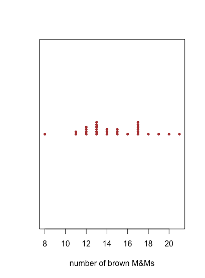
To create a dot plot in R we use the function dotchart(x,...) where x is the object that holds our data, typically a vector or a single column from a data frame, and ... is a list of optional arguments that affects what we see. In the example below, pch sets the plotting symbol (19 is an solid circle), col is the color assigned to the plotting symbol, labels identifies the samples by name along the y-axis, xlab assigns a label to the x-axis, ylab assigns a label to the y-axis, and cex controls the size of the labels and points. See the last section of this chapter for a more general introduction to creating and displaying plots using R’s base graphics.
dotchart(mm_data$brown, pch = 19, col = "brown", labels = mm_data$bag, xlab = "number of brown M&Ms", ylab = "bag id", cex = 0.5)

dotchart() function.Creating a Stripchart Using R
To create a stripchart in R we use the function stripchart(x, ...)where x is the object that holds our data, typically a vector or a column from a data frame, and ... is a list of optional arguments that affects what we see. In the example below,pchsets the plotting symbol (19 is an solid circle), col is the color assigned to the plotting symbol, method defines how points with the same value for x are displayed on the y-axis, in this case stacking them one above the other by an amount defined by an offset, and cex controls the size of the individual data points.
stripchart(mm_data$brown, pch = 19, col = "brown", method = "stack", offset = 0.5, cex = 0.6, xlab = "number of brown M&Ms")
stripchart() function.Because a stripchart does not use the y-axis to provide information, we can easily display several stripcharts at once, as shown in the following example, where we usemm_data[3:8]to identify the data for each stripchart and col to assign a color to each stripchart. Instead of stacking the individual points, they are jittered by applying a small, random offset to each point using jitter. The parameter las forces the labels to be displayed horizontally (las = 0 aligns labels parallel to the axis, las = 1 aligns labels horizontally, las = 2 aligns labels perpendicular to the axis, and las = 4 aligns labels vertically).
stripchart(mm_data[3:8], pch = 19, cex = 0.5, xlab = "number of M&MS", col = c("blue", "brown", "green", "orange", "red", "yellow"), method = "jitter", jitter = 0.2, las = 1)
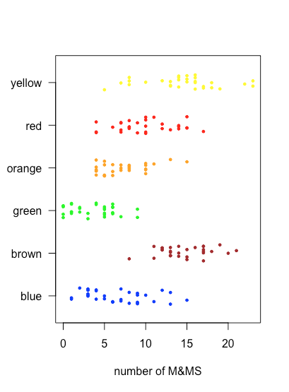
stripchart() function.Creating a Box-and-Whisker Plot Using R
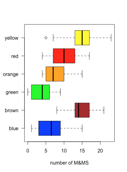
To create a box-and-whisker plot in R we use the function boxplot(x,...)where x is the object that holds our data, typically a vector or a column from a data frame, and ... is a list of optional arguments that affects what we see. In the example below, the option horizontal = TRUE overrides the default, which is to display a vertical boxplot, and range specifies the length of the whisker as a multiple of the IQR. In this example, we also show the individual values using stripchart() with the option add = TRUE to overlay the stripchart on the boxplot.
boxplot(mm_data$brown, horizontal = TRUE, range = 1.5, xlab = "number of brown M&Ms")
stripchart(mm_data$brown, method = "jitter", jitter = 0.2, add = TRUE, col = "brown", pch = 19)

boxplot() function. A stripchart of the data is overlayed on the box-and-whisker plot using the stripchart() function.Because a box and whisker plot does not use the y-axis to provide information, we can easily display several plots at once, as shown in the following example, where we use mm_data[3:8] to identify the data for each plot and col to assign a color to each plot.
boxplot(mm_data[3:8], xlab = "number of M&MS", las = 1, horizontal = TRUE, col = c("blue", "brown", "green", "orange", "red", "yellow"))
boxplot() function.In the example below, the code mm_data$yellow ~ mm_data$store is a formula, which takes the general form of y as a function of x; in this case, it uses the data in the column named store to divide the data into three groups. The option outline = FALSE in the boxplot() function suppresses the function’s default to plot an open circle for each sample that lies outside of the whiskers; by doing this we avoid plotting these points twice.
boxplot(mm_data$yellow ~ mm_data$store, horizontal = TRUE, las = 1, col = "yellow", outline = FALSE, xlab = "number of yellow M&Ms")stripchart(mm_data$yellow ~ mm_data$store, add = TRUE, pch = 19, method = "jitter", jitter = 0.2)

See Chapter 8.5 for a discussion of the use of formulas in R.
Creating a Bar Plot Using R
To create a bar plot in R we use the function barplot(x,...) where x is the object that holds our data, typically a vector or a column from a data frame and ... is a list of optional arguments that affects what we see. Unlike the previous plots, we cannot pass to barplot() our raw data that consists of the number of orange M&Ms in each bag. Instead, we have to provide the data in the form of a table that gives the number of bags that contain 0, 1, 2, . . . up to the maximum number of orange M&Ms in any bag; we accomplish this using the tabulate() function. Because tabulate() only counts the frequency of positive integers, it will ignore any bags that do not have any orange M&Ms; adding one to each count by using mm_data$orange + 1 ensures they are counted. The argument names.arg allows us to provide categorical labels for the x-axis (and correct for the fact that we increased each index by 1).
orange_table = tabulate(mm_data$orange + 1)

barplot(orange_table, col = "orange", names.arg = seq(0, max(mm_data$orange), 1), xlab = "number of orange M&Ms", ylab = "number of bags")

barplot() function.Creating a Histogram Using R
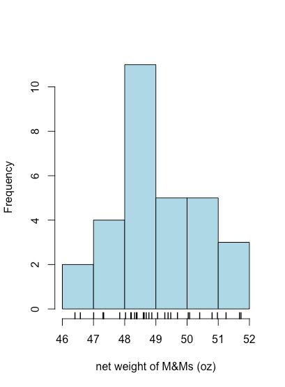
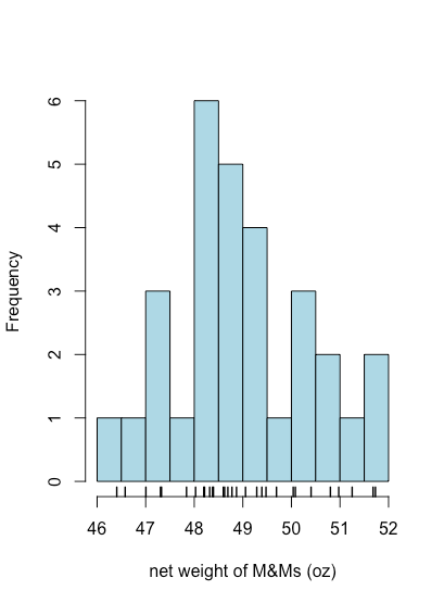
To create a histogram in R we use the function hist(x,...) where x is the object that holds our data, typically a vector or a column from a data frame, and ... is a list of optional arguments that affects what we see. In the example below, the option main = NULL suppresses the placing of a title above the plot, which otherwise is included by default. The option right = TRUE means the right-most value of a bin is included in that bin. Finally, although a histogram shows how individual values are distributed, it does not show the individual values themselves. The rug(x) function adds tick marks along the x-axis that show each individual value.
hist(mm_data$net_weight, col = "lightblue", xlab = "net weight of M&Ms (oz)", right = TRUE, main = NULL)
rug(mm_data$net_weight, lwd = 1.5)
hist() and rug() functions.By default, R uses an algorithm to determine how to set the size of bins. As shown in the following example, we can use the option breaks to specify the values of x where one bin ends and the next bin begins.
hist(mm_data$net_weight, col = "lightblue", xlab = "net weight of M&Ms (oz)", breaks = seq(46, 52, 0.5), right = TRUE, main = NULL)
rug(mm_data$net_weight, lwd = 1.5)
hist() function.