
15.4: Evaluating Quality Assurance Data
- Page ID
- 138794

\( \newcommand{\vecs}[1]{\overset { \scriptstyle \rightharpoonup} {\mathbf{#1}} } \)
\( \newcommand{\vecd}[1]{\overset{-\!-\!\rightharpoonup}{\vphantom{a}\smash {#1}}} \)
\( \newcommand{\id}{\mathrm{id}}\) \( \newcommand{\Span}{\mathrm{span}}\)
( \newcommand{\kernel}{\mathrm{null}\,}\) \( \newcommand{\range}{\mathrm{range}\,}\)
\( \newcommand{\RealPart}{\mathrm{Re}}\) \( \newcommand{\ImaginaryPart}{\mathrm{Im}}\)
\( \newcommand{\Argument}{\mathrm{Arg}}\) \( \newcommand{\norm}[1]{\| #1 \|}\)
\( \newcommand{\inner}[2]{\langle #1, #2 \rangle}\)
\( \newcommand{\Span}{\mathrm{span}}\)
\( \newcommand{\id}{\mathrm{id}}\)
\( \newcommand{\Span}{\mathrm{span}}\)
\( \newcommand{\kernel}{\mathrm{null}\,}\)
\( \newcommand{\range}{\mathrm{range}\,}\)
\( \newcommand{\RealPart}{\mathrm{Re}}\)
\( \newcommand{\ImaginaryPart}{\mathrm{Im}}\)
\( \newcommand{\Argument}{\mathrm{Arg}}\)
\( \newcommand{\norm}[1]{\| #1 \|}\)
\( \newcommand{\inner}[2]{\langle #1, #2 \rangle}\)
\( \newcommand{\Span}{\mathrm{span}}\) \( \newcommand{\AA}{\unicode[.8,0]{x212B}}\)
\( \newcommand{\vectorA}[1]{\vec{#1}} % arrow\)
\( \newcommand{\vectorAt}[1]{\vec{\text{#1}}} % arrow\)
\( \newcommand{\vectorB}[1]{\overset { \scriptstyle \rightharpoonup} {\mathbf{#1}} } \)
\( \newcommand{\vectorC}[1]{\textbf{#1}} \)
\( \newcommand{\vectorD}[1]{\overrightarrow{#1}} \)
\( \newcommand{\vectorDt}[1]{\overrightarrow{\text{#1}}} \)
\( \newcommand{\vectE}[1]{\overset{-\!-\!\rightharpoonup}{\vphantom{a}\smash{\mathbf {#1}}}} \)
\( \newcommand{\vecs}[1]{\overset { \scriptstyle \rightharpoonup} {\mathbf{#1}} } \)
\( \newcommand{\vecd}[1]{\overset{-\!-\!\rightharpoonup}{\vphantom{a}\smash {#1}}} \)
\(\newcommand{\avec}{\mathbf a}\) \(\newcommand{\bvec}{\mathbf b}\) \(\newcommand{\cvec}{\mathbf c}\) \(\newcommand{\dvec}{\mathbf d}\) \(\newcommand{\dtil}{\widetilde{\mathbf d}}\) \(\newcommand{\evec}{\mathbf e}\) \(\newcommand{\fvec}{\mathbf f}\) \(\newcommand{\nvec}{\mathbf n}\) \(\newcommand{\pvec}{\mathbf p}\) \(\newcommand{\qvec}{\mathbf q}\) \(\newcommand{\svec}{\mathbf s}\) \(\newcommand{\tvec}{\mathbf t}\) \(\newcommand{\uvec}{\mathbf u}\) \(\newcommand{\vvec}{\mathbf v}\) \(\newcommand{\wvec}{\mathbf w}\) \(\newcommand{\xvec}{\mathbf x}\) \(\newcommand{\yvec}{\mathbf y}\) \(\newcommand{\zvec}{\mathbf z}\) \(\newcommand{\rvec}{\mathbf r}\) \(\newcommand{\mvec}{\mathbf m}\) \(\newcommand{\zerovec}{\mathbf 0}\) \(\newcommand{\onevec}{\mathbf 1}\) \(\newcommand{\real}{\mathbb R}\) \(\newcommand{\twovec}[2]{\left[\begin{array}{r}#1 \\ #2 \end{array}\right]}\) \(\newcommand{\ctwovec}[2]{\left[\begin{array}{c}#1 \\ #2 \end{array}\right]}\) \(\newcommand{\threevec}[3]{\left[\begin{array}{r}#1 \\ #2 \\ #3 \end{array}\right]}\) \(\newcommand{\cthreevec}[3]{\left[\begin{array}{c}#1 \\ #2 \\ #3 \end{array}\right]}\) \(\newcommand{\fourvec}[4]{\left[\begin{array}{r}#1 \\ #2 \\ #3 \\ #4 \end{array}\right]}\) \(\newcommand{\cfourvec}[4]{\left[\begin{array}{c}#1 \\ #2 \\ #3 \\ #4 \end{array}\right]}\) \(\newcommand{\fivevec}[5]{\left[\begin{array}{r}#1 \\ #2 \\ #3 \\ #4 \\ #5 \\ \end{array}\right]}\) \(\newcommand{\cfivevec}[5]{\left[\begin{array}{c}#1 \\ #2 \\ #3 \\ #4 \\ #5 \\ \end{array}\right]}\) \(\newcommand{\mattwo}[4]{\left[\begin{array}{rr}#1 \amp #2 \\ #3 \amp #4 \\ \end{array}\right]}\) \(\newcommand{\laspan}[1]{\text{Span}\{#1\}}\) \(\newcommand{\bcal}{\cal B}\) \(\newcommand{\ccal}{\cal C}\) \(\newcommand{\scal}{\cal S}\) \(\newcommand{\wcal}{\cal W}\) \(\newcommand{\ecal}{\cal E}\) \(\newcommand{\coords}[2]{\left\{#1\right\}_{#2}}\) \(\newcommand{\gray}[1]{\color{gray}{#1}}\) \(\newcommand{\lgray}[1]{\color{lightgray}{#1}}\) \(\newcommand{\rank}{\operatorname{rank}}\) \(\newcommand{\row}{\text{Row}}\) \(\newcommand{\col}{\text{Col}}\) \(\renewcommand{\row}{\text{Row}}\) \(\newcommand{\nul}{\text{Nul}}\) \(\newcommand{\var}{\text{Var}}\) \(\newcommand{\corr}{\text{corr}}\) \(\newcommand{\len}[1]{\left|#1\right|}\) \(\newcommand{\bbar}{\overline{\bvec}}\) \(\newcommand{\bhat}{\widehat{\bvec}}\) \(\newcommand{\bperp}{\bvec^\perp}\) \(\newcommand{\xhat}{\widehat{\xvec}}\) \(\newcommand{\vhat}{\widehat{\vvec}}\) \(\newcommand{\uhat}{\widehat{\uvec}}\) \(\newcommand{\what}{\widehat{\wvec}}\) \(\newcommand{\Sighat}{\widehat{\Sigma}}\) \(\newcommand{\lt}{<}\) \(\newcommand{\gt}{>}\) \(\newcommand{\amp}{&}\) \(\definecolor{fillinmathshade}{gray}{0.9}\)In the previous section we described several internal methods of quality assessment that provide quantitative estimates of the systematic errors and the random errors in an analytical method. Now we turn our attention to how we incorporate this quality assessment data into a complete quality assurance program. There are two general approaches to developing a quality assurance program: a prescriptive approach, in which we prescribe an exact method of quality assessment, and a performance-based approach in which we can use any form of quality assessment, provided that we can demonstrate an acceptable level of statistical control [Poppiti, J. Environ. Sci. Technol. 1994, 28, 151A–152A].
Prescriptive Approach
With a prescriptive approach to quality assessment, duplicate samples, blanks, standards, and spike recoveries are measured using a specific protocol. We compare the result of each analysis to a single predetermined limit, taking an appropriate corrective action if the limit is exceeded. Prescriptive approaches to quality assurance are common for programs and laboratories subject to federal regulation. For example, the Food and Drug Administration (FDA) specifies quality assurance practices that must be followed by laboratories that analyze products regulated by the FDA.
Figure 15.4.1 provides a typical example of a prescriptive approach to quality assessment. Two samples, A and B, are collected at the sample site. Sample A is split into two equal-volume samples, A1 and A2. Sample B is also split into two equal-volume samples, one of which, BSF, is spiked in the field with a known amount of analyte. A field blank, DF, also is spiked with the same amount of analyte. All five samples (A1, A2, B, BSF, and DF) are preserved if necessary and transported to the laboratory for analysis.
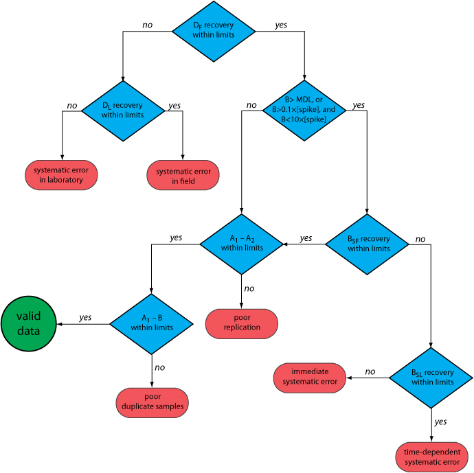
After returning to the lab, the first sample that is analyzed is the field blank. If its spike recovery is unacceptable—an indication of a systematic error in the field or in the lab—then a laboratory method blank, DL, is prepared and analyzed. If the spike recovery for the method blank is unsatisfactory, then the systematic error originated in the laboratory; this is error the analyst can find and correct before proceeding with the analysis. An acceptable spike recovery for the method blank, however, indicates that the systematic error occurred in the field or during transport to the laboratory, casting uncertainty on the quality of the samples. The only recourse is to discard the samples and return to the field to collect new samples.
If the field blank is satisfactory, then sample B is analyzed. If the result for sample B is above the method’s detection limit, or if it is within the range of 0.1 to 10 times the amount of analyte spiked into BSF, then a spike recovery for BSF is determined. An unacceptable spike recovery for BSF indicates the presence of a systematic error that involves the sample. To determine the source of the systematic error, a laboratory spike, BSL, is prepared using sample B and analyzed. If the spike recovery for BSL is acceptable, then the systematic error requires a long time to have a noticeable effect on the spike recovery. One possible explanation is that the analyte has not been preserved properly or it has been held beyond the acceptable holding time. An unacceptable spike recovery for BSL suggests an immediate systematic error, such as that due to the influence of the sample’s matrix. In either case the systematic errors are fatal and must be corrected before the sample is reanalyzed.
If the spike recovery for BSF is acceptable, or if the result for sample B is below the method’s detection limit, or outside the range of 0.1 to 10 times the amount of analyte spiked in BSF, then the duplicate samples A1 and A2 are analyzed. The results for A1 and A2 are discarded if the difference between their values is excessive. If the difference between the results for A1 and A2 is within the accepted limits, then the results for samples A1 and B are compared. Because samples collected from the same sampling site at the same time should be identical in composition, the results are discarded if the difference between their values is unsatisfactory and the results accepted if the difference is satisfactory.
The protocol in Figure 15.4.1 requires four to five evaluations of quality assessment data before the result for a single sample is accepted, a process that we must repeat for each analyte and for each sample. Other prescriptive protocols are equally demanding. For example, Figure 3.6.1 in Chapter 3 shows a portion of a quality assurance protocol for the graphite furnace atomic absorption analysis of trace metals in aqueous solutions. This protocol involves the analysis of an initial calibration verification standard and an initial calibration blank, followed by the analysis of samples in groups of ten. Each group of samples is preceded and followed by continuing calibration verification (CCV) and continuing calibration blank (CCB) quality assessment samples. Results for each group of ten samples are accepted only if both sets of CCV and CCB quality assessment samples are acceptable.
The advantage of a prescriptive approach to quality assurance is that all laboratories use a single consistent set of guideline. A significant disadvantage is that it does not take into account a laboratory’s ability to produce quality results when determining the frequency of collecting and analyzing quality assessment data. A laboratory with a record of producing high quality results is forced to spend more time and money on quality assessment than perhaps is necessary. At the same time, the frequency of quality assessment may be insufficient for a laboratory with a history of producing results of poor quality.
Performance-Based Approach
In a performance-based approach to quality assurance, a laboratory is free to use its experience to determine the best way to gather and monitor quality assessment data. The tools of quality assessment remain the same— duplicate samples, blanks, standards, and spike recoveries—because they provide the necessary information about precision and bias. What a laboratory can control is the frequency with which it analyzes quality assessment samples and the conditions it chooses to signal when an analysis no longer is in a state of statistical control.
The principal tool for performance-based quality assessment is a control chart, which provides a continuous record of quality assessment data. The fundamental assumption is that if an analysis is under statistical control, individual quality assessment results are distributed randomly around a known mean with a known standard deviation. When an analysis moves out of statistical control, the quality assessment data is influenced by additional sources of error, which increases the standard deviation or changes the mean value.
Control charts were developed in the 1920s as a quality assurance tool for the control of manufactured products [Shewhart, W. A. Economic Control of the Quality of Manufactured Products, Macmillan: London, 1931]. Although there are many types of control charts, two are common in quality assessment programs: a property control chart, in which we record single measurements or the means for several replicate measurements, and a precision control chart, in which we record ranges or standard deviations. In either case, the control chart consists of a line that represents the experimental result and two or more boundary lines whose positions are determined by the precision of the measurement process. The position of the data points about the boundary lines determines whether the analysis is in statistical control.
Constructing a Property Control Chart
The simplest property control chart is a sequence of points, each of which represents a single determination of the property we are monitoring. To construct the control chart, we analyze a minimum of 7–15 samples while the system is under statistical control. The center line (CL) of the control chart is the average of these n samples.
\[C L=\overline{X}=\frac{\sum_{i=1}^{n} X_{i}}{n} \nonumber\]
The more samples in the original control chart, the easier it is to detect when an analysis is beginning to drift out of statistical control. Building a control chart with an initial run of 30 or more samples is not an unusual choice.
Boundary lines around the center line are determined by the standard deviation, S, of the n points
\[S=\sqrt{\frac{\sum_{i=1}^{n}\left(X_{i}-\overline{X}\right)^{2}}{n-1}} \nonumber\]
The upper and lower warning limits (UWL and LWL) and the upper and lower control limits (UCL and LCL) are given by the following equations.
\[\begin{aligned} U W L &=C L+2 S \\ L W L &=C L-2 S \\ U C L &=C L+3 S \\ L C L &=C L-3 S \end{aligned} \nonumber\]
Why these limits? Examine Table 4.4.2 in Chapter 4 and consider your answer to this question. We will return to this point later in this chapter when we consider how to use a control chart.
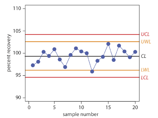
Construct a property control chart using the following spike recovery data (all values are for percentage of spike recovered).
| sample: | 1 | 2 | 3 | 4 | 5 |
| result: | 97.3 | 98.1 | 100.3 | 99.5 | 100.9 |
| sample: | 6 | 7 | 8 | 9 | 10 |
| result: | 98.6 | 96.9 | 99.6 | 101.1 | 100.4 |
| sample: | 11 | 12 | 13 | 14 | 15 |
| result: | 100.0 | 95.9 | 98.3 | 99.2 | 102.1 |
| sample: | 16 | 17 | 18 | 19 | 20 |
| result: | 98.5 | 101.7 | 100.4 | 99.1 | 100.3 |
Solution
The mean and the standard deviation for the 20 data points are 99.4% and 1.6%, respectively. Using these values, we find that the UCL is 104.2%, the UWL is 102.6%, the LWL is 96.2%, and the LCL is 94.6%. To construct the control chart, we plot the data points sequentially and draw horizontal lines for the center line and the four boundary lines. The resulting property control chart is shown in Figure 15.4.2 .
A control chart is a useful method for monitoring a glucometer’s performance over time. One approach is to use the glucometer to measure the glucose level of a standard solution. An initial analysis of the standard yields a mean value of 249.4 mg/100 mL and a standard deviation of 2.5 mg/100 mL. An analysis of the standard over 20 consecutive days gives the following results.
| day: | 1 | 2 | 3 | 4 | 5 | 6 | 7 | 8 | 9 | 10 |
| result: | 248.1 | 246.0 | 247.9 | 249.4 | 250.9 | 249.7 | 250.2 | 250.3 | 247.3 | 245.6 |
| day: | 11 | 12 | 13 | 14 | 15 | 16 | 17 | 18 | 19 | 20 |
| result: | 246.2 | 250.8 | 249.0 | 254.3 | 246.1 | 250.8 | 248.1 | 246.7 | 253.5 | 251.0 |
Construct a control chart of the glucometer’s performance.
- Answer
-
The UCL is 256.9, the UWL is 254.4, the CL is 249.4, the LWL is 244.4, and the LCL is 241.9 mg glucose/100 mL. Figure 15.4.3 shows the resulting property control plot.

We also can construct a control chart using the mean for a set of replicate determinations on each sample. The mean for the ith sample is
\[\overline{X}_{i}=\frac{\sum_{j=1}^{n_{rep}} X_{i j}}{n_{rep}} \nonumber\]
where Xij is the jth replicate and nrep is the number of replicate determinations for each sample. The control chart’s center line is
\[CL=\frac{\sum_{i=1}^{n} \overline{X}_{i}}{n} \nonumber\]
where n is the number of samples used to construct the control chart. To determine the standard deviation for the warning limits and the control limits, we first calculate the variance for each sample.
\[s_{i}^{2}=\frac{\sum_{j=1}^{n_{rep}}\left(X_{i j}-\overline{X}_{i}\right)^{2}}{n_{rep}-1} \nonumber\]
The overall standard deviation, S, is the square root of the average variance for the samples used to construct the control plot.
\[S=\sqrt{\frac{\sum_{i=1}^{n} s_{i}^{2}}{n}} \nonumber\]
The resulting warning and control limits are given by the following four equations.
\[\begin{aligned} U W L &=C L+\frac{2 S}{\sqrt{n_{rep}}} \\ L W L &=C L-\frac{2 S}{\sqrt{n_{rep}}} \\ U C L &=C L+\frac{3 S}{\sqrt{n_{rep}}} \\ L C L &=C L-\frac{3 S}{\sqrt{n_{rep}}} \end{aligned} \nonumber\]
When using means to construct a property control chart, all samples must have the same number of replicates.
Constructing a Precision Control Chart
A precision control chart shows how the precision of an analysis changes over time. The most common measure of precision is the range, R, between the largest and the smallest results for nrep analyses on a sample.
\[R=X_{\mathrm{largest}}-X_{\mathrm{smallest}} \nonumber\]
To construct the control chart, we analyze a minimum of 15–20 samples while the system is under statistical control. The center line (CL) of the control chart is the average range of these n samples.
\[\overline{R}=\frac{\sum_{i=1}^{n} R_{i}}{n} \nonumber\]
The upper warning line and the upper control line are given by the following equations
\[\begin{aligned} U W L &=f_{U W L} \times \overline{R} \\ U C L &=f_{U C L} \times \overline{R} \end{aligned} \nonumber\]
where fUWL and fUCL are statistical factors determined by the number of replicates used to determine the range. Table 15.4.1 provides representative values for fUWL and fUCL. Because the range is greater than or equal to zero, there is no lower control limit and no lower warning limit.
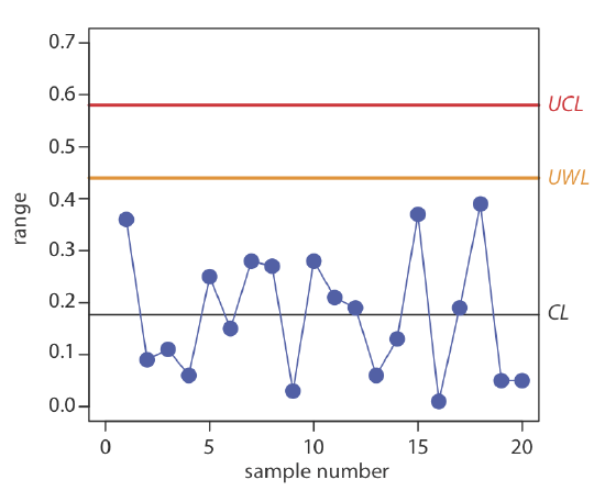
Construct a precision control chart using the following ranges, each determined from a duplicate analysis of a 10.0-ppm calibration standard.
| sample: | 1 | 2 | 3 | 4 | 5 |
| result: | 0.36 | 0.09 | 0.11 | 0.06 | 0.25 |
| sample: | 6 | 7 | 8 | 9 | 10 |
| result: | 0.15 | 0.28 | 0.27 | 0.03 | 0.28 |
| sample: | 11 | 12 | 13 | 14 | 15 |
| result: | 0.21 | 0.19 | 0.06 | 0.13 | 0.37 |
| sample: | 16 | 17 | 18 | 19 | 20 |
| result: | 0.01 | 0.19 | 0.39 | 0.05 | 0.05 |
Solution
The average range for the duplicate samples is 0.176. Because two replicates were used for each point the UWL and UCL are
\[\begin{aligned} U W L &=2.512 \times 0.176=0.44 \\ U C L &=3.267 \times 0.176=0.57 \end{aligned} \nonumber\]
The resulting property control chart is shown in Figure 15.4.4 .
The precision control chart in Figure 15.4.4 is strictly valid only for the replicate analysis of identical samples, such as a calibration standard or a standard reference material. Its use for the analysis of nonidentical samples—as often is the case in clinical analyses and environmental analyses—is complicated by the fact that the range usually is not independent of the magnitude of the measurements. For example, Table 15.4.2 shows the relationship between the average range and the concentration of chromium in 91 water samples. The significant difference in the average range for different concentrations of chromium makes impossible a single precision control chart. As shown in Figure 15.4.5 , one solution is to prepare separate precision control charts, each of which covers a range of concentrations for which \(\overline{R}\) is approximately constant.
| [Cr] (ppb) | number of duplicate samples | \(\overline{R}\) |
|---|---|---|
| 5 to \(< 10\) | 32 | 0.32 |
| 10 to \(< 25\) | 15 | 0.57 |
| 25 to \(< 50\) | 16 | 1.12 |
| 50 to \(< 150\) | 15 | 3.80 |
| 150 to \(< 500) | 8 | 5.25 |
| \(> 500\) | 5 | 76.0 |
|
Source: Environmental Monitoring and Support Laboratory, U. S. Environmental Protection Agency, “Handbook for Analytical Quality Control in Water and Wastewater Laboratories,” March 1979. |
||
Interpreting Control Charts
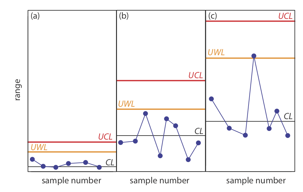
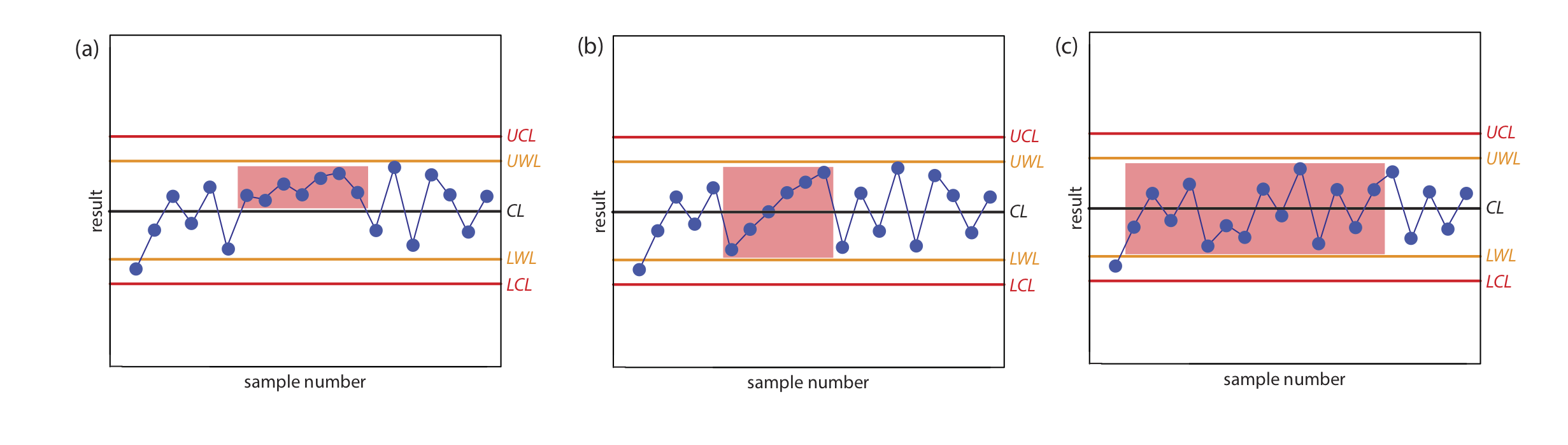
The purpose of a control chart is to determine if an analysis is in a state of statistical control. We make this determination by examining the location of individual results relative to the warning limits and the control limits, and by examining the distribution of results around the central line. If we assume that the individual results are normally distributed, then the probability of finding a point at any distance from the control limit is determined by the properties of a normal distribution [Mullins, E. Analyst, 1994, 119, 369–375.]. We set the upper and the lower control limits for a property control chart to CL \(\pm\) 3S because 99.74% of a normally distributed population falls within three standard deviations of the population’s mean. This means that there is only a 0.26% probability of obtaining a result larger than the UCL or smaller than the LCL. When a result exceeds a control limit, the most likely explanation is a systematic error in the analysis or a loss of precision. In either case, we assume that the analysis no longer is in a state of statistical control.
Rule 1. An analysis is no longer under statistical control if any single point exceeds either the UCL or the LCL.
By setting the upper and lower warning limits to CL \(\pm\) 2S, we expect that no more than 5% of the results will exceed one of these limits; thus
Rule 2. An analysis is no longer under statistical control if two out of three consecutive points are between the UWL and the UCL or between the LWL and the LCL.
If an analysis is under statistical control, then we expect a random distribution of results around the center line. The presence of an unlikely pattern in the data is another indication that the analysis is no longer under statistical control.
Rule 3. An analysis is no longer under statistical control if seven consecutive results are completely above or completely below the center line.
Rule 4. An analysis is no longer under statistical control if six consecutive results increase (or decrease) in value.
Rule 5. An analysis is no longer under statistical control if 14 consecutive results alternate up and down in value.
Rule 6. An analysis is no longer under statistical control if there is any obvious nonrandom pattern to the results.
Figure 15.4.6 shows three examples of control charts in which the results indicate that an analysis no longer is under statistical control. The same rules apply to precision control charts with the exception that there are no lower warning limits and lower control limits.
In Exercise 15.4.1 you created a property control chart for a glucometer. Examine your property control chart and evaluate the glucometer’s performance. Does your conclusion change if the next three results are 255.6, 253.9, and 255.8 mg/100 mL?
- Answer
-
Although the variation in the results appears to be greater for the second 10 samples, the results do not violate any of the six rules. There is no evidence in Figure 15.4.3 that the analysis is out of statistical control. The next three results, in which two of the three results are between the UWL and the UCL, violates the second rule. Because the analysis is no longer under statistical control, we must stop using the glucometer until we determine the source of the problem.
Using Control Charts for Quality Assurance
Control charts play an important role in a performance-based program of quality assurance because they provide an easy to interpret picture of the statistical state of an analysis. Quality assessment samples such as blanks, standards, and spike recoveries are monitored with property control charts. A precision control chart is used to monitor duplicate samples.
The first step in using a control chart is to determine the mean value and the standard deviation (or range) for the property being measured while the analysis is under statistical control. These values are established using the same conditions that will be present during subsequent analyses. Preliminary data is collected both throughout the day and over several days to account for short-term and for long-term variability. An initial control chart is prepared using this preliminary data and discrepant points identified using the rules discussed in the previous section. After eliminating questionable points, the control chart is replotted. Once the control chart is in use, the original limits are adjusted if the number of new data points is at least equivalent to the amount of data used to construct the original control chart. For example, if the original control chart includes 15 points, new limits are calculated after collecting 15 additional points. The 30 points are pooled together to calculate the new limits. A second modification is made after collecting an additional 30 points. Another indication that a control chart needs to be modified is when points rarely exceed the warning limits. In this case the new limits are recalculated using the last 20 points.
Once a control chart is in use, new quality assessment data is added at a rate sufficient to ensure that the analysis remains in statistical control. As with prescriptive approaches to quality assurance, when the analysis falls out of statistical control, all samples analyzed since the last successful verification of statistical control are reanalyzed. The advantage of a performance-based approach to quality assurance is that a laboratory may use its experience, guided by control charts, to determine the frequency for collecting quality assessment samples. When the system is stable, quality assessment samples can be acquired less frequently.