
2: Graphing
- Page ID
- 299374
\( \newcommand{\vecs}[1]{\overset { \scriptstyle \rightharpoonup} {\mathbf{#1}} } \)
\( \newcommand{\vecd}[1]{\overset{-\!-\!\rightharpoonup}{\vphantom{a}\smash {#1}}} \)
\( \newcommand{\dsum}{\displaystyle\sum\limits} \)
\( \newcommand{\dint}{\displaystyle\int\limits} \)
\( \newcommand{\dlim}{\displaystyle\lim\limits} \)
\( \newcommand{\id}{\mathrm{id}}\) \( \newcommand{\Span}{\mathrm{span}}\)
( \newcommand{\kernel}{\mathrm{null}\,}\) \( \newcommand{\range}{\mathrm{range}\,}\)
\( \newcommand{\RealPart}{\mathrm{Re}}\) \( \newcommand{\ImaginaryPart}{\mathrm{Im}}\)
\( \newcommand{\Argument}{\mathrm{Arg}}\) \( \newcommand{\norm}[1]{\| #1 \|}\)
\( \newcommand{\inner}[2]{\langle #1, #2 \rangle}\)
\( \newcommand{\Span}{\mathrm{span}}\)
\( \newcommand{\id}{\mathrm{id}}\)
\( \newcommand{\Span}{\mathrm{span}}\)
\( \newcommand{\kernel}{\mathrm{null}\,}\)
\( \newcommand{\range}{\mathrm{range}\,}\)
\( \newcommand{\RealPart}{\mathrm{Re}}\)
\( \newcommand{\ImaginaryPart}{\mathrm{Im}}\)
\( \newcommand{\Argument}{\mathrm{Arg}}\)
\( \newcommand{\norm}[1]{\| #1 \|}\)
\( \newcommand{\inner}[2]{\langle #1, #2 \rangle}\)
\( \newcommand{\Span}{\mathrm{span}}\) \( \newcommand{\AA}{\unicode[.8,0]{x212B}}\)
\( \newcommand{\vectorA}[1]{\vec{#1}} % arrow\)
\( \newcommand{\vectorAt}[1]{\vec{\text{#1}}} % arrow\)
\( \newcommand{\vectorB}[1]{\overset { \scriptstyle \rightharpoonup} {\mathbf{#1}} } \)
\( \newcommand{\vectorC}[1]{\textbf{#1}} \)
\( \newcommand{\vectorD}[1]{\overrightarrow{#1}} \)
\( \newcommand{\vectorDt}[1]{\overrightarrow{\text{#1}}} \)
\( \newcommand{\vectE}[1]{\overset{-\!-\!\rightharpoonup}{\vphantom{a}\smash{\mathbf {#1}}}} \)
\( \newcommand{\vecs}[1]{\overset { \scriptstyle \rightharpoonup} {\mathbf{#1}} } \)
\(\newcommand{\longvect}{\overrightarrow}\)
\( \newcommand{\vecd}[1]{\overset{-\!-\!\rightharpoonup}{\vphantom{a}\smash {#1}}} \)
\(\newcommand{\avec}{\mathbf a}\) \(\newcommand{\bvec}{\mathbf b}\) \(\newcommand{\cvec}{\mathbf c}\) \(\newcommand{\dvec}{\mathbf d}\) \(\newcommand{\dtil}{\widetilde{\mathbf d}}\) \(\newcommand{\evec}{\mathbf e}\) \(\newcommand{\fvec}{\mathbf f}\) \(\newcommand{\nvec}{\mathbf n}\) \(\newcommand{\pvec}{\mathbf p}\) \(\newcommand{\qvec}{\mathbf q}\) \(\newcommand{\svec}{\mathbf s}\) \(\newcommand{\tvec}{\mathbf t}\) \(\newcommand{\uvec}{\mathbf u}\) \(\newcommand{\vvec}{\mathbf v}\) \(\newcommand{\wvec}{\mathbf w}\) \(\newcommand{\xvec}{\mathbf x}\) \(\newcommand{\yvec}{\mathbf y}\) \(\newcommand{\zvec}{\mathbf z}\) \(\newcommand{\rvec}{\mathbf r}\) \(\newcommand{\mvec}{\mathbf m}\) \(\newcommand{\zerovec}{\mathbf 0}\) \(\newcommand{\onevec}{\mathbf 1}\) \(\newcommand{\real}{\mathbb R}\) \(\newcommand{\twovec}[2]{\left[\begin{array}{r}#1 \\ #2 \end{array}\right]}\) \(\newcommand{\ctwovec}[2]{\left[\begin{array}{c}#1 \\ #2 \end{array}\right]}\) \(\newcommand{\threevec}[3]{\left[\begin{array}{r}#1 \\ #2 \\ #3 \end{array}\right]}\) \(\newcommand{\cthreevec}[3]{\left[\begin{array}{c}#1 \\ #2 \\ #3 \end{array}\right]}\) \(\newcommand{\fourvec}[4]{\left[\begin{array}{r}#1 \\ #2 \\ #3 \\ #4 \end{array}\right]}\) \(\newcommand{\cfourvec}[4]{\left[\begin{array}{c}#1 \\ #2 \\ #3 \\ #4 \end{array}\right]}\) \(\newcommand{\fivevec}[5]{\left[\begin{array}{r}#1 \\ #2 \\ #3 \\ #4 \\ #5 \\ \end{array}\right]}\) \(\newcommand{\cfivevec}[5]{\left[\begin{array}{c}#1 \\ #2 \\ #3 \\ #4 \\ #5 \\ \end{array}\right]}\) \(\newcommand{\mattwo}[4]{\left[\begin{array}{rr}#1 \amp #2 \\ #3 \amp #4 \\ \end{array}\right]}\) \(\newcommand{\laspan}[1]{\text{Span}\{#1\}}\) \(\newcommand{\bcal}{\cal B}\) \(\newcommand{\ccal}{\cal C}\) \(\newcommand{\scal}{\cal S}\) \(\newcommand{\wcal}{\cal W}\) \(\newcommand{\ecal}{\cal E}\) \(\newcommand{\coords}[2]{\left\{#1\right\}_{#2}}\) \(\newcommand{\gray}[1]{\color{gray}{#1}}\) \(\newcommand{\lgray}[1]{\color{lightgray}{#1}}\) \(\newcommand{\rank}{\operatorname{rank}}\) \(\newcommand{\row}{\text{Row}}\) \(\newcommand{\col}{\text{Col}}\) \(\renewcommand{\row}{\text{Row}}\) \(\newcommand{\nul}{\text{Nul}}\) \(\newcommand{\var}{\text{Var}}\) \(\newcommand{\corr}{\text{corr}}\) \(\newcommand{\len}[1]{\left|#1\right|}\) \(\newcommand{\bbar}{\overline{\bvec}}\) \(\newcommand{\bhat}{\widehat{\bvec}}\) \(\newcommand{\bperp}{\bvec^\perp}\) \(\newcommand{\xhat}{\widehat{\xvec}}\) \(\newcommand{\vhat}{\widehat{\vvec}}\) \(\newcommand{\uhat}{\widehat{\uvec}}\) \(\newcommand{\what}{\widehat{\wvec}}\) \(\newcommand{\Sighat}{\widehat{\Sigma}}\) \(\newcommand{\lt}{<}\) \(\newcommand{\gt}{>}\) \(\newcommand{\amp}{&}\) \(\definecolor{fillinmathshade}{gray}{0.9}\)Learning Objectives
Goals:
- Become proficient with graphing in Google sheets by creating scatter-plot graphs and manipulating graph components with graphing techniques.
- Utilize this opportunity to become familiar working in collaborative documents that will be useful in many applications beyond chemistry.
By the end of this lab, students should be able to:
- design, develop and generate scatter-plot graphs.
- examine and interpret chemical graphs.
- identify the formula for the line of best fit based off of the R2 value for various trend lines.
- predict future values of a measurement based on the appropriate line of best fit.
Prior knowledge:
Background
A graph can be used to show the Relationship between two related values, the independent and the dependent variables. In this exercise we shall use graphing techniques to describe the temperature dependence of the solubility of aqueous sodium nitrate. In experiment 2b we will utilize measured values.
- Independent Variable: A measurable value that you can change during the experimental data collection process (Temperature)
- Dependent Variable: A measurable value which changes as a function of the independent variable during the data collection process (Solubility). The amount of salt which can dissolve in water depends on the temperature.
One of the objectives in graphing is to make predictions about values we have not yet measured by finding the mathematical relationship between the dependent and the independent variables, and relate this to our theoretical understanding. In so doing we derive a mathematical relationship where y is a function of x. In this statement y is the dependent variable and plotted on the ordinate (vertical) axis and x is the independent variable and plotted on the abscissa (horizontal) axis. Empirical data is collected through experimentation where x is changed and y is measured, with each data point being represented on a graph with the values (x,y). Without computational software a linear relationship can be determined and so we often mathematically manipulate our data to create linear relationships. In this course we shall look at linear, reciprocal, power and single exponential functions.
Note, a graph can explain any type of two variable relationships, even if the mathematical relationship is not known. Because the solubility of a salt is a very complex function, chemists use graphs (solubility curves) to express the temperature dependence of solubility of a salt and do not always fit the data to mathematical expressions. But since we need to know how to use these functions we will use solubility data to understand and plot linear, power and exponential functions.
Lets look at some data and fit it to different functions.
Linear Function:
\[Y=mX+b\]
Example: S= mT + b
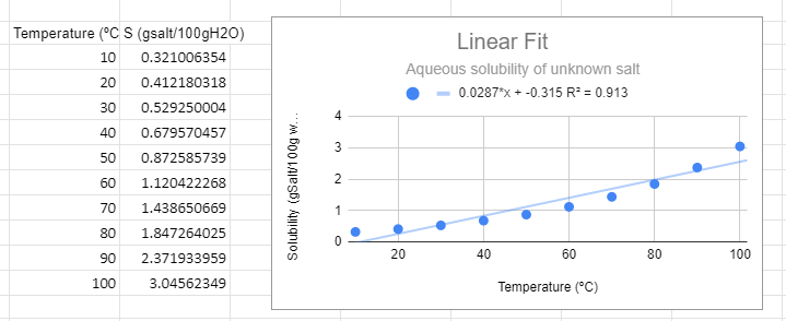 Figure \(\PageIndex{1}\): Linear graph for solubility data of an unknown salt.
There are several things to note from the graph. First, from a visual perspective the linear function not only does not fit the data, but thee is a trend where it is above the line at low and high temperature and below the line in the middle. The R2 value is not near one and most importantly, it predicts a negative solubility as the temperature approaches zero, which is nonsense. You can have a negative change in solubility, but you can never have negative solubility.
Power Function:
\[Y=aX^m\]
Example: S =aTm, which can be converted to an equation of the form of a straight line (Y=mX+b) by converting to logs.
\[\begin{align} logS & =log(aT^m) \nonumber \\ & =loga + logT^m \nonumber \\ & =loga + mlogT \nonumber \\ logS &= mlogT + loga \end{align}\]
In the following figure we used Google Sheets to convert the data to log data, and then made two plots, one using a power function fit to the raw data and the second using a linear fit with the logS vs. log T data. These two graphs are different ways of representing the same information. The slope of the second graph (m=0.983) is the m of S=ATm of the first graph and the y-intercept (-1.63)= lna from the second equation, so a=10-1.63=0.023. There is one slight of hand going on here that the estute student might catch can that is that we removed the units from the log plots. Logs can not have units, they are in effect saying how many times you multiplied (or divided) the base by itself to get the number (log10100=2 means 10 times itself 2 times equals 100). When we get to real systems we will need to transform values in exponents (or logs) to dimensionless entities). This could have been done here by dividing all solubilities by a standard solution with a numeric value of 1, and we will ignore this issue now, but logs do not have units.
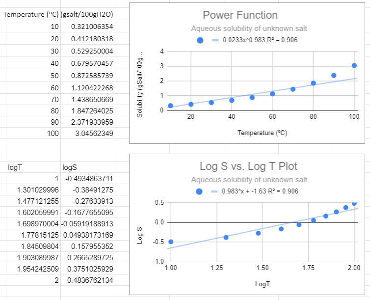 Figure \(\PageIndex{2}\): Power fit on top and the Correlated logS/logT plot on bottom,
There are several things to notice in the above graphs. First, from the top graph the solubility is forced to zero as T goes to zero and this is nonsense, as that would occur no matter what scale you use. Now students might think a negative logS is an issue, but it is not, that just means the concentration is less than one molar. The R2 value is also not close to one, and a student may notice that this power function looks like a linear line, and that is because the value of m is approaching 1 (when m=1 the power function is linear , S=aT +0)
Exponential Function
\[Y=ae^{mT} \]
Example S = aemT, which can be converted to a linear function of lnS to T (not lnT)
\[\begin{align} S & = ae^{mT} \\ lnS & =ln(ae^{mT}) \nonumber \\ & =lna + ln(e^{mT}) \nonumber \\ & =lna + mT\cancel{ln(e)} \nonumber \\ lnS &= mT + lna \end{align}\]
An exponential fit of the solubility to temperature gives the same information as a linear fit of the natural log of solubility to temperature, and so the slope of the bottom graph (m=0.025) is the value of m in the exponential function, and the y intercept of the bottom graph gives the pre-expontial, b=-1.39=lna, so a = e-1.39.
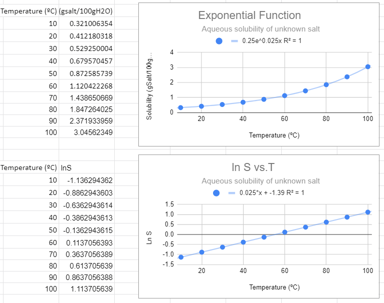
This looks like the best fit. The value of R2=1 and this function makes the most sense in explaining the data. Also note that when the independent variable (T) equals zero you have e0=1, and so the pre-exponential is the value of the solubility at T=0.
Graphing Video Tutorials
Graphing Exercise
Use the solubility data in Table 1.1 to construct seven graphs, six with Google Sheets and one by hand.
-
Follow the formatting suggested in the above videos
-
axis correctly labeled
-
major and minor grid lines are shown
-
trendline and the equation for the line of best fit is shown clearly
-
-
Create all 6 graphs on one Google sheet (not separate tabs or files for each graph)
-
Make sure your data and graph are shown side by side
-
Submit your one Google sheet to the Google classroom for this assignment by your sections' due date
test
| Temperature (oC) | Solubility (g KI / 100g H2O) | Solubility (g KNO3 / 100g H2O) |
|---|---|---|
| 30 | 179 | 46 |
| 45 | 205 | 73 |
| 60 | 230 | 109 |
| 75 | 255 | 156 |
| 90 | No data available | 205 |
Interpreting data from the above table
Proceed to Assignment A. It will ask you some questions regarding the interpretation of the table of data above.
Linear Fit Graphs
Group Activity (assignment B)
From the data in Table 1, create the following two graphs:
Graph 1: Linear Fit of Temperature vs. solubility for KI
Graph 2: Linear Fit of Temperature vs. solubility of KNO3
Things to keep in mind when making these graphs:
-
Label each graph with a title describing the graph and label all axes (don't just accept the automatic label)
-
Select the linear regression trend line (y=mx+b) and make sure that you select to show the equation for the line. Move the equation and adjust size so it is clearly visible
Note: a linear fit will only be a good fit (R2 value close to 1) for one of these salts. Once you identify which one is a good fit, you have now created an equation that will allow you to predict the solubility of that salt at another temperature!
Power and Exponential Fit Graphs
Individual Activity (graphs 3-6 in assignment C)
For the salt that does not have a linear relationship between temperature and solubility, you will now make two more graphs (3 & 4).
Make sure you take the data that you need, copy the data (ctrl-C) and then paste it (ctrl-V) below to an empty part of the spreadsheet where you can make your next graphs.
Graph 3: Power function trend line (y=axb) for the nonlinear graph
Graph 4: Exponential trend line (y=aemx) fit for the nonlinear graph.
-
Write the appropriate equation on all graphs.
-
Determine which fit is best.
Graphing Logarithmic Data
Individual Activity (C)
For graphs 5 & 6 make another copy of the data you used for graphs 3 and 4. Paste it below your 4 graphs. You will now need to create a new column in the graph that calculates the log or ln of the values.
Graph 5: Find then make a plot of log S vs. log T plot (eq. 1.3 or 1.4) and run a linear fit on this graph. Be sure you can relate graph 5 to graph 3 as described in section 1.2 (figures 1.2 & 1.3).
-
Show that the slope of a straight line in this graph is equal to the power (m) in graph 3.
-
Mathematically show how the y intercept of this graph can be used to determine the pre-exponential term (A) in graph 3
Graph 6: Make a plot of ln S vs. T and run a linear fit on this graph. Be sure you can relate graph 6 to graph 4 as described in section 1.3 (figures 1.4 & 1.5)
-
Show that the slope of a straight line in this graph is equal to the power (m) in graph 4.
-
Mathematically show how the y intercept of this graph can be used to determine the pre-exponential term (A) in graph 4
Return to Assignment A and complete the second half of the questions.
TIPs:
-
Use these as templates for future graphs by simply copying the graph, then changing the source data and labeling.
-
Hence, you'll want to remember where you saved this file so for future labs you can come back and use the template you already created (saving you time)!
Assessment (self-check):
-
Do you know the difference between a dependent and independent variable?
-
Do you know where to place the dependent variable on graph? Independent variable?
-
Can you title a graph properly?
-
Can you label all graph components properly?
-
Can you use Google sheets to convert data values to logarithm form?
-
Do you know when to and when not to include units?
-
Do you know how to add and evaluate a trend line (line of best fit) and correlation magnitude (R2)?
Checklist for submitted report (Google Sheet):
-
Appropriate Title of the Document, and at the top of the sheet (identifying it as your work).
-
All 6 graphs are on one sheet.
-
Beside each graph is the data used to create that graph.
-
One image of a hand drawn graph at the bottom of your sheet, corresponding to data that was used to make graph 6.
-
You must state the connection between Graphs 3 & 5 and Graphs 4 & 6. This can be described in a sentence or can be shown algebraically.