
35.1: Evaluation of Analytical Data
- Page ID
- 363066

\( \newcommand{\vecs}[1]{\overset { \scriptstyle \rightharpoonup} {\mathbf{#1}} } \)
\( \newcommand{\vecd}[1]{\overset{-\!-\!\rightharpoonup}{\vphantom{a}\smash {#1}}} \)
\( \newcommand{\dsum}{\displaystyle\sum\limits} \)
\( \newcommand{\dint}{\displaystyle\int\limits} \)
\( \newcommand{\dlim}{\displaystyle\lim\limits} \)
\( \newcommand{\id}{\mathrm{id}}\) \( \newcommand{\Span}{\mathrm{span}}\)
( \newcommand{\kernel}{\mathrm{null}\,}\) \( \newcommand{\range}{\mathrm{range}\,}\)
\( \newcommand{\RealPart}{\mathrm{Re}}\) \( \newcommand{\ImaginaryPart}{\mathrm{Im}}\)
\( \newcommand{\Argument}{\mathrm{Arg}}\) \( \newcommand{\norm}[1]{\| #1 \|}\)
\( \newcommand{\inner}[2]{\langle #1, #2 \rangle}\)
\( \newcommand{\Span}{\mathrm{span}}\)
\( \newcommand{\id}{\mathrm{id}}\)
\( \newcommand{\Span}{\mathrm{span}}\)
\( \newcommand{\kernel}{\mathrm{null}\,}\)
\( \newcommand{\range}{\mathrm{range}\,}\)
\( \newcommand{\RealPart}{\mathrm{Re}}\)
\( \newcommand{\ImaginaryPart}{\mathrm{Im}}\)
\( \newcommand{\Argument}{\mathrm{Arg}}\)
\( \newcommand{\norm}[1]{\| #1 \|}\)
\( \newcommand{\inner}[2]{\langle #1, #2 \rangle}\)
\( \newcommand{\Span}{\mathrm{span}}\) \( \newcommand{\AA}{\unicode[.8,0]{x212B}}\)
\( \newcommand{\vectorA}[1]{\vec{#1}} % arrow\)
\( \newcommand{\vectorAt}[1]{\vec{\text{#1}}} % arrow\)
\( \newcommand{\vectorB}[1]{\overset { \scriptstyle \rightharpoonup} {\mathbf{#1}} } \)
\( \newcommand{\vectorC}[1]{\textbf{#1}} \)
\( \newcommand{\vectorD}[1]{\overrightarrow{#1}} \)
\( \newcommand{\vectorDt}[1]{\overrightarrow{\text{#1}}} \)
\( \newcommand{\vectE}[1]{\overset{-\!-\!\rightharpoonup}{\vphantom{a}\smash{\mathbf {#1}}}} \)
\( \newcommand{\vecs}[1]{\overset { \scriptstyle \rightharpoonup} {\mathbf{#1}} } \)
\(\newcommand{\longvect}{\overrightarrow}\)
\( \newcommand{\vecd}[1]{\overset{-\!-\!\rightharpoonup}{\vphantom{a}\smash {#1}}} \)
\(\newcommand{\avec}{\mathbf a}\) \(\newcommand{\bvec}{\mathbf b}\) \(\newcommand{\cvec}{\mathbf c}\) \(\newcommand{\dvec}{\mathbf d}\) \(\newcommand{\dtil}{\widetilde{\mathbf d}}\) \(\newcommand{\evec}{\mathbf e}\) \(\newcommand{\fvec}{\mathbf f}\) \(\newcommand{\nvec}{\mathbf n}\) \(\newcommand{\pvec}{\mathbf p}\) \(\newcommand{\qvec}{\mathbf q}\) \(\newcommand{\svec}{\mathbf s}\) \(\newcommand{\tvec}{\mathbf t}\) \(\newcommand{\uvec}{\mathbf u}\) \(\newcommand{\vvec}{\mathbf v}\) \(\newcommand{\wvec}{\mathbf w}\) \(\newcommand{\xvec}{\mathbf x}\) \(\newcommand{\yvec}{\mathbf y}\) \(\newcommand{\zvec}{\mathbf z}\) \(\newcommand{\rvec}{\mathbf r}\) \(\newcommand{\mvec}{\mathbf m}\) \(\newcommand{\zerovec}{\mathbf 0}\) \(\newcommand{\onevec}{\mathbf 1}\) \(\newcommand{\real}{\mathbb R}\) \(\newcommand{\twovec}[2]{\left[\begin{array}{r}#1 \\ #2 \end{array}\right]}\) \(\newcommand{\ctwovec}[2]{\left[\begin{array}{c}#1 \\ #2 \end{array}\right]}\) \(\newcommand{\threevec}[3]{\left[\begin{array}{r}#1 \\ #2 \\ #3 \end{array}\right]}\) \(\newcommand{\cthreevec}[3]{\left[\begin{array}{c}#1 \\ #2 \\ #3 \end{array}\right]}\) \(\newcommand{\fourvec}[4]{\left[\begin{array}{r}#1 \\ #2 \\ #3 \\ #4 \end{array}\right]}\) \(\newcommand{\cfourvec}[4]{\left[\begin{array}{c}#1 \\ #2 \\ #3 \\ #4 \end{array}\right]}\) \(\newcommand{\fivevec}[5]{\left[\begin{array}{r}#1 \\ #2 \\ #3 \\ #4 \\ #5 \\ \end{array}\right]}\) \(\newcommand{\cfivevec}[5]{\left[\begin{array}{c}#1 \\ #2 \\ #3 \\ #4 \\ #5 \\ \end{array}\right]}\) \(\newcommand{\mattwo}[4]{\left[\begin{array}{rr}#1 \amp #2 \\ #3 \amp #4 \\ \end{array}\right]}\) \(\newcommand{\laspan}[1]{\text{Span}\{#1\}}\) \(\newcommand{\bcal}{\cal B}\) \(\newcommand{\ccal}{\cal C}\) \(\newcommand{\scal}{\cal S}\) \(\newcommand{\wcal}{\cal W}\) \(\newcommand{\ecal}{\cal E}\) \(\newcommand{\coords}[2]{\left\{#1\right\}_{#2}}\) \(\newcommand{\gray}[1]{\color{gray}{#1}}\) \(\newcommand{\lgray}[1]{\color{lightgray}{#1}}\) \(\newcommand{\rank}{\operatorname{rank}}\) \(\newcommand{\row}{\text{Row}}\) \(\newcommand{\col}{\text{Col}}\) \(\renewcommand{\row}{\text{Row}}\) \(\newcommand{\nul}{\text{Nul}}\) \(\newcommand{\var}{\text{Var}}\) \(\newcommand{\corr}{\text{corr}}\) \(\newcommand{\len}[1]{\left|#1\right|}\) \(\newcommand{\bbar}{\overline{\bvec}}\) \(\newcommand{\bhat}{\widehat{\bvec}}\) \(\newcommand{\bperp}{\bvec^\perp}\) \(\newcommand{\xhat}{\widehat{\xvec}}\) \(\newcommand{\vhat}{\widehat{\vvec}}\) \(\newcommand{\uhat}{\widehat{\uvec}}\) \(\newcommand{\what}{\widehat{\wvec}}\) \(\newcommand{\Sighat}{\widehat{\Sigma}}\) \(\newcommand{\lt}{<}\) \(\newcommand{\gt}{>}\) \(\newcommand{\amp}{&}\) \(\definecolor{fillinmathshade}{gray}{0.9}\)The material in this appendix is adapted from the textbook Chemometrics Using R, which is available through LibreTexts using this link. In addition to the material here, the textbook contains instructions on how to use the statistical programming language R to carry out the calculations.
Types of Data
At the heart of any analysis is data. Sometimes our data describes a category and sometimes it is numerical; sometimes our data conveys order and sometimes it does not; sometimes our data has an absolute reference and sometimes it has an arbitrary reference; and sometimes our data takes on discrete values and sometimes it takes on continuous values. Whatever its form, when we gather data our intent is to extract from it information that can help us solve a problem.
Ways to Describe Data
If we are to consider how to describe data, then we need some data with which we can work. Ideally, we want data that is easy to gather and easy to understand. It also is helpful if you can gather similar data on your own so you can repeat what we cover here. A simple system that meets these criteria is to analyze the contents of bags of M&Ms. Although this system may seem trivial, keep in mind that reporting the percentage of yellow M&Ms in a bag is analogous to reporting the concentration of Cu2+ in a sample of an ore or water: both express the amount of an analyte present in a unit of its matrix.
At the beginning of this chapter we identified four contrasting ways to describe data: categorical vs. numerical, ordered vs. unordered, absolute reference vs. arbitrary reference, and discrete vs. continuous. To give meaning to these descriptive terms, let’s consider the data in Table \(\PageIndex{1}\), which includes the year the bag was purchased and analyzed, the weight listed on the package, the type of M&Ms, the number of yellow M&Ms in the bag, the percentage of the M&Ms that were red, the total number of M&Ms in the bag and their corresponding ranks.
| bag id | year | weight (oz) | type | number yellow | % red | total M&Ms | rank (for total) |
|---|---|---|---|---|---|---|---|
| a | 2006 | 1.74 | peanut | 2 | 27.8 | 18 | sixth |
| b | 2006 | 1.74 | peanut | 3 | 4.35 | 23 | fourth |
| c | 2000 | 0.80 | plain | 1 | 22.7 | 22 | fifth |
| d | 2000 | 0.80 | plain | 5 | 20.8 | 24 | third |
| e | 1994 | 10.0 | plain | 56 | 23.0 | 331 | second |
| f | 1994 | 10.0 | plain | 63 | 21.9 | 333 | first |
The entries in Table \(\PageIndex{1}\) are organized by column and by row. The first row—sometimes called the header row—identifies the variables that make up the data. Each additional row is the record for one sample and each entry in a sample’s record provides information about one of its variables; thus, the data in the table lists the result for each variable and for each sample.
Categorical vs. Numerical Data
Of the variables included in Table \(\PageIndex{1}\), some are categorical and some are numerical. A categorical variable provides qualitative information that we can use to describe the samples relative to each other, or that we can use to organize the samples into groups (or categories). For the data in Table \(\PageIndex{1}\), bag id, type, and rank are categorical variables.
A numerical variable provides quantitative information that we can use in a meaningful calculation; for example, we can use the number of yellow M&Ms and the total number of M&Ms to calculate a new variable that reports the percentage of M&Ms that are yellow. For the data in Table \(\PageIndex{1}\), year, weight (oz), number yellow, % red M&Ms, and total M&Ms are numerical variables.
We can also use a numerical variable to assign samples to groups. For example, we can divide the plain M&Ms in Table \(\PageIndex{1}\) into two groups based on the sample’s weight. What makes a numerical variable more interesting, however, is that we can use it to make quantitative comparisons between samples; thus, we can report that there are \(14.4 \times\) as many plain M&Ms in a 10-oz. bag as there are in a 0.8-oz. bag.
\[\frac{333 + 331}{24 + 22} = \frac{664}{46} = 14.4 \nonumber \]
Although we could classify year as a categorical variable—not an unreasonable choice as it could serve as a useful way to group samples—we list it here as a numerical variable because it can serve as a useful predictive variable in a regression analysis. On the other hand rank is not a numerical variable—even if we rewrite the ranks as numerals—as there are no meaningful calculations we can complete using this variable.
Nominal vs. Ordinal Data
Categorical variables are described as nominal or ordinal. A nominal categorical variable does not imply a particular order; an ordinal categorical variable, on the other hand, coveys a meaningful sense of order. For the categorical variables in Table \(\PageIndex{1}\), bag id and type are nominal variables, and rank is an ordinal variable.
Ratio vs. Interval Data
A numerical variable is described as either ratio or interval depending on whether it has (ratio) or does not have (interval) an absolute reference. Although we can complete meaningful calculations using any numerical variable, the type of calculation we can perform depends on whether or not the variable’s values have an absolute reference.
A numerical variable has an absolute reference if it has a meaningful zero—that is, a zero that means a measured quantity of none—against which we reference all other measurements of that variable. For the numerical variables in Table \(\PageIndex{1}\), weight (oz), number yellow, % red, and total M&Ms are ratio variables because each has a meaningful zero; year is an interval variable because its scale is referenced to an arbitrary point in time, 1 BCE, and not to the beginning of time.
For a ratio variable, we can make meaningful absolute and relative comparisons between two results, but only meaningful absolute comparisons for an interval variable. For example, consider sample e, which was collected in 1994 and has 331 M&Ms, and sample d, which was collected in 2000 and has 24 M&Ms. We can report a meaningful absolute comparison for both variables: sample e is six years older than sample d and sample e has 307 more M&Ms than sample d. We also can report a meaningful relative comparison for the total number of M&Ms—there are
\[\frac{331}{24} = 13.8 \times \nonumber \]
as many M&Ms in sample e as in sample d—but we cannot report a meaningful relative comparison for year because a sample collected in 2000 is not
\[\frac{2000}{1994} = 1.003 \times \nonumber \]
older than a sample collected in 1994.
Discrete vs. Continuous Data
Finally, the granularity of a numerical variable provides one more way to describe our data. For example, we can describe a numerical variable as discrete or continuous. A numerical variable is discrete if it can take on only specific values—typically, but not always, an integer value—between its limits; a continuous variable can take on any possible value within its limits. For the numerical data in Table \(\PageIndex{1}\), year, number yellow, and total M&Ms are discrete in that each is limited to integer values. The numerical variables weight (oz) and % red, on the other hand, are continuous variables. Note that weight is a continuous variable even if the device we use to measure weight yields discrete values.
Visualizing Data
The old saying that "a picture is worth a 1000 words" may not be universally true, but it true when it comes to the analysis of data. A good visualization of data, for example, allows us to see patterns and relationships that are less evident when we look at data arranged in a table, and it provides a powerful way to tell our data's story. Suppose we want to study the composition of 1.69-oz (47.9-g) packages of plain M&Ms. We obtain 30 bags of M&Ms (ten from each of three stores) and remove the M&Ms from each bag one-by-one, recording the number of blue, brown, green, orange, red, and yellow M&Ms. We also record the number of yellow M&Ms in the first five candies drawn from each bag, and record the actual net weight of the M&Ms in each bag. Table \(\PageIndex{2}\) summarizes the data collected on these samples. The bag id identifies the order in which the bags were opened and analyzed.
| bag | store | blue | brown | green | orange | red | yellow | yellow_first_five | net_weight |
|---|---|---|---|---|---|---|---|---|---|
| 1 | CVS | 3 | 18 | 1 | 5 | 7 | 23 | 2 | 49.287 |
| 2 | CVS | 3 | 14 | 9 | 7 | 8 | 15 | 0 | 48.870 |
| 3 | Target | 4 | 14 | 5 | 10 | 10 | 16 | 1 | 51.250 |
| 4 | Kroger | 3 | 13 | 5 | 4 | 15 | 16 | 0 | 48.692 |
| 5 | Kroger | 3 | 16 | 5 | 7 | 8 | 18 | 1 | 48.777 |
| 6 | Kroger | 2 | 12 | 6 | 10 | 17 | 7 | 1 | 46.405 |
| 7 | CVS | 13 | 11 | 2 | 8 | 6 | 17 | 1 | 49.693 |
| 8 | CVS | 13 | 12 | 7 | 10 | 7 | 8 | 2 | 49.391 |
| 9 | Kroger | 6 | 17 | 5 | 4 | 8 | 16 | 1 | 48.196 |
| 10 | Kroger | 8 | 13 | 2 | 5 | 10 | 17 | 1 | 47.326 |
| 11 | Target | 9 | 20 | 1 | 4 | 12 | 13 | 3 | 50.974 |
| 12 | Target | 11 | 12 | 0 | 8 | 4 | 23 | 0 | 50.081 |
| 13 | CVS | 3 | 15 | 4 | 6 | 14 | 13 | 2 | 47.841 |
| 14 | Kroger | 4 | 17 | 5 | 6 | 14 | 10 | 2 | 48.377 |
| 15 | Kroger | 9 | 13 | 3 | 8 | 14 | 8 | 0 | 47.004 |
| 16 | CVS | 8 | 15 | 1 | 10 | 9 | 15 | 1 | 50.037 |
| 17 | CVS | 10 | 11 | 5 | 10 | 7 | 13 | 2 | 48.599 |
| 18 | Kroger | 1 | 17 | 6 | 7 | 11 | 14 | 1 | 48.625 |
| 19 | Target | 7 | 17 | 2 | 8 | 4 | 18 | 1 | 48.395 |
| 20 | Kroger | 9 | 13 | 1 | 8 | 7 | 22 | 1 | 51.730 |
| 21 | Target | 7 | 17 | 0 | 15 | 4 | 15 | 3 | 50.405 |
| 22 | CVS | 12 | 14 | 4 | 11 | 9 | 5 | 2 | 47.305 |
| 23 | Target | 9 | 19 | 0 | 5 | 12 | 12 | 0 | 49.477 |
| 24 | Target | 5 | 13 | 3 | 4 | 15 | 16 | 0 | 48.027 |
| 25 | CVS | 7 | 13 | 0 | 4 | 15 | 16 | 2 | 48.212 |
| 26 | Target | 6 | 15 | 1 | 13 | 10 | 14 | 1 | 51.682 |
| 27 | CVS | 5 | 17 | 6 | 4 | 8 | 19 | 1 | 50.802 |
| 28 | Kroger | 1 | 21 | 6 | 5 | 10 | 14 | 0 | 49.055 |
| 29 | Target | 4 | 12 | 6 | 5 | 13 | 14 | 2 | 46.577 |
| 30 | Target | 15 | 8 | 9 | 6 | 10 | 8 | 1 | 48.317 |
Having collected our data, we next examine it for possible problems, such as missing values (Did we forget to record the number of brown M&Ms in any of our samples?), for errors introduced when we recorded the data (Is the decimal point recorded incorrectly for any of the net weights?), or for unusual results (Is it really the case that this bag has only yellow M&M?). We also examine our data to identify interesting observations that we may wish to explore (It appears that most net weights are greater than the net weight listed on the individual packages. Why might this be? Is the difference significant?) When our data set is small we usually can identify possible problems and interesting observations without much difficulty; however, for a large data set, this becomes a challenge. Instead of trying to examine individual values, we can look at our results visually. While it may be difficult to find a single, odd data point when we have to individually review 1000 samples, it often jumps out when we look at the data using one or more of the approaches we will explore in this chapter.
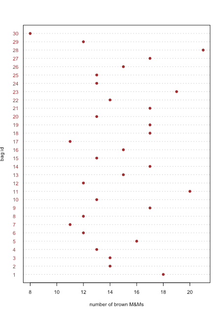
Dot Plots
A dot plot displays data for one variable, with each sample’s value plotted on the x-axis. The individual points are organized along the y-axis with the first sample at the bottom and the last sample at the top. Figure \(\PageIndex{1}\) shows a dot plot for the number of brown M&Ms in the 30 bags of M&Ms from Table \(\PageIndex{2}\). The distribution of points appears random as there is no correlation between the sample id and the number of brown M&Ms. We would be surprised if we discovered that the points were arranged from the lower-left to the upper-right as this implies that the order in which we open the bags determines whether they have many or a few brown M&Ms.
Stripcharts
A dot plot provides a quick way to give us confidence that our data are free from unusual patterns, but at the cost of space because we use the y-axis to include the sample id as a variable. A stripchart uses the same x-axis as a dot plot, but does not use the y-axis to distinguish between samples. Because all samples with the same number of brown M&Ms will appear in the same place—making it impossible to distinguish them from each other—we stack the points vertically to spread them out, as shown in Figure \(\PageIndex{2}\).
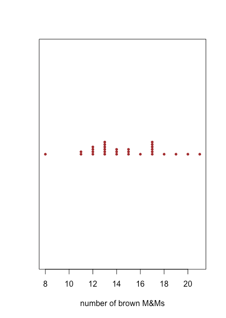
Both the dot plot in Figure \(\PageIndex{1}\) and the stripchart in Figure \(\PageIndex{2}\) suggest that there is a smaller density of points at the lower limit and the upper limit of our results. We see, for example, that there is just one bag each with 8, 16, 18, 19, 20, and 21 brown M&Ms, but there are six bags each with 13 and 17 brown M&Ms.
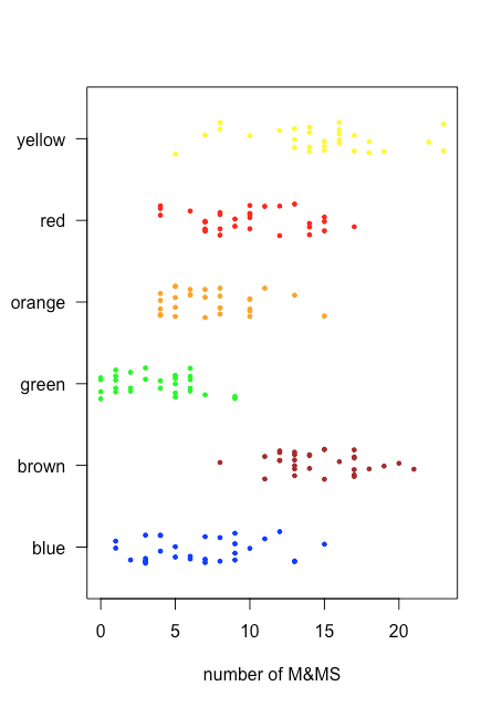
Because a stripchart does not use the y-axis to provide meaningful categorical information, we can easily display several stripcharts at once. Figure \(\PageIndex{3}\) shows this for the data in Table \(\PageIndex{2}\). Instead of stacking the individual points, we jitter them by applying a small, random offset to each point. Among the things we learn from this stripchart are that only brown and yellow M&Ms have counts of greater than 20 and that only blue and green M&Ms have counts of three or fewer M&Ms.
Box and Whisker Plots
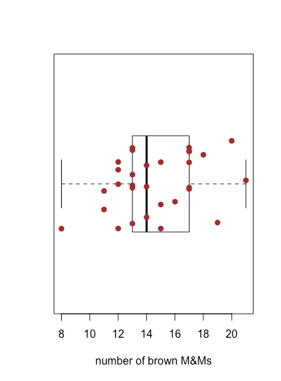
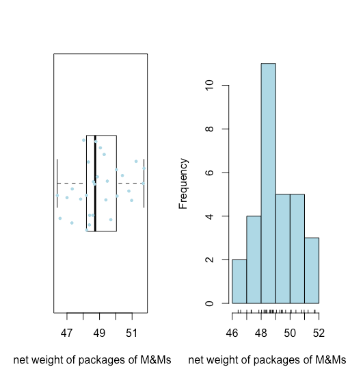
The stripchart in Figure \(\PageIndex{3}\) is easy for us to examine because the number of samples, 30 bags, and the number of M&Ms per bag is sufficiently small that we can see the individual points. As the density of points becomes greater, a stripchart becomes less useful. A box and whisker plot provides a similar view but focuses on the data in terms of the range of values that encompass the middle 50% of the data.
Figure \(\PageIndex{4}\) shows the box and whisker plot for brown M&Ms using the data in Table \(\PageIndex{2}\). The 30 individual samples are superimposed as a stripchart. The central box divides the x-axis into three regions: bags with fewer than 13 brown M&Ms (seven samples), bags with between 13 and 17 brown M&Ms (19 samples), and bags with more than 17 brown M&Ms (four samples). The box's limits are set so that it includes at least the middle 50% of our data. In this case, the box contains 19 of the 30 samples (63%) of the bags, because moving either end of the box toward the middle results in a box that includes less than 50% of the samples. The difference between the box's upper limit (19) and its lower limit (13) is called the interquartile range (IQR). The thick line in the box is the median, or middle value (more on this and the IQR in the next chapter). The dashed lines at either end of the box are called whiskers, and they extend to the largest or the smallest result that is within \(\pm 1.5 \times \text{IQR}\) of the box's right or left edge, respectively.
Because a box and whisker plot does not use the y-axis to provide meaningful categorical information, we can easily display several plots in the same frame. Figure \(\PageIndex{5}\) shows this for the data in Table \(\PageIndex{2}\). Note that when a value falls outside of a whisker, as is the case here for yellow M&Ms, it is flagged by displaying it as an open circle.
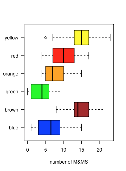
One use of a box and whisker plot is to examine the distribution of the individual samples, particularly with respect to symmetry. With the exception of the single sample that falls outside of the whiskers, the distribution of yellow M&Ms appears symmetrical: the median is near the center of the box and the whiskers extend equally in both directions. The distribution of the orange M&Ms is asymmetrical: half of the samples have 4–7 M&Ms (just four possible outcomes) and half have 7–15 M&Ms (nine possible outcomes), suggesting that the distribution is skewed toward higher numbers of orange M&Ms (see Chapter 5 for more information about the distribution of samples).
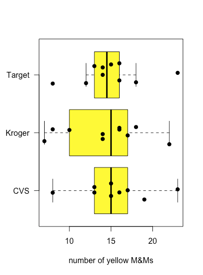
Figure \(\PageIndex{6}\) shows box-and-whisker plots for yellow M&Ms grouped according to the store where the bags of M&Ms were purchased. Although the box and whisker plots are quite different in terms of the relative sizes of the boxes and the relative length of the whiskers, the dot plots suggest that the distribution of the underlying data is relatively similar in that most bags contain 12–18 yellow M&Ms and just a few bags deviate from these limits. These observations are reassuring because we do not expect the choice of store to affect the composition of bags of M&Ms. If we saw evidence that the choice of store affected our results, then we would look more closely at the bags themselves for evidence of a poorly controlled variable, such as type (Did we accidentally purchase bags of peanut butter M&Ms from one store?) or the product’s lot number (Did the manufacturer change the composition of colors between lots?).
Bar Plots
Although a dot plot, a stripchart and a box-and-whisker plot provide some qualitative evidence of how a variable’s values are distributed—we will have more to say about the distribution of data in Chapter 5—they are less useful when we need a more quantitative picture of the distribution. For this we can use a bar plot that displays a count of each discrete outcome. Figure \(\PageIndex{7}\) shows bar plots for orange and for yellow M&Ms using the data in Table \(\PageIndex{2}\).
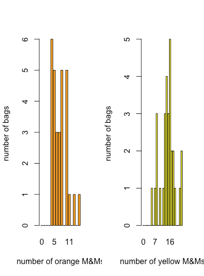
Here we see that the most common number of orange M&Ms per bag is four, which is also the smallest number of orange M&Ms per bag, and that there is a general decrease in the number of bags as the number of orange M&M per bag increases. For the yellow M&Ms, the most common number of M&Ms per bag is 16, which falls near the middle of the range of yellow M&Ms.
Histograms
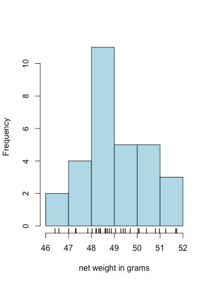
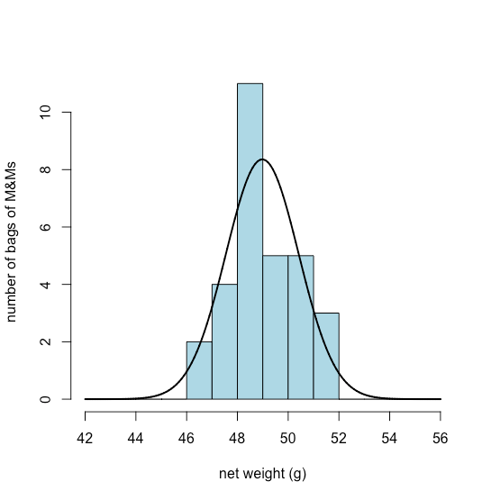
A bar plot is a useful way to look at the distribution of discrete results, such as the counts of orange or yellow M&Ms, but it is not useful for continuous data where each result is unique. A histogram, in which we display the number of results that fall within a sequence of equally spaced bins, provides a view that is similar to that of a bar plot but that works with continuous data. Figure \(\PageIndex{8}\), for example, shows a histogram for the net weights of the 30 bags of M&Ms in Table \(\PageIndex{2}\). Individual values are shown by the vertical hash marks at the bottom of the histogram.
Summarizing Data
In the last section we used data collected from 30 bags of M&Ms to explore different ways to visualize data. In this section we consider several ways to summarize data using the net weights of the same bags of M&Ms. Here is the raw data.
| 49.287 | 48.870 | 51.250 | 48.692 | 48.777 | 46.405 |
| 49.693 | 49.391 | 48.196 | 47.326 | 50.974 | 50.081 |
| 47.841 | 48.377 | 47.004 | 50.037 | 48.599 | 48.625 |
| 48.395 | 51.730 | 50.405 | 47.305 | 49.477 | 48.027 |
| 48.212 | 51.682 | 50.802 | 49.055 | 46.577 | 48.317 |
Without completing any calculations, what conclusions can we make by just looking at this data? Here are a few:
- All net weights are greater than 46 g and less than 52 g.
- As we see in Figure \(\PageIndex{9}\), a box-and-whisker plot (overlaid with a stripchart) and a histogram suggest that the distribution of the net weights is reasonably symmetric.
- The absence of any points beyond the whiskers of the box-and-whisker plot suggests that there are no unusually large or unsually small net weights.
Both visualizations provide a good qualitative picture of the data, suggesting that the individual results are scattered around some central value with more results closer to that central value that at distance from it. Neither visualization, however, describes the data quantitatively. What we need is a convenient way to summarize the data by reporting where the data is centered and how varied the individual results are around that center.
Where is the Center?
There are two common ways to report the center of a data set: the mean and the median.
The mean, \(\overline{Y}\), is the numerical average obtained by adding together the results for all n observations and dividing by the number of observations
\[\overline{Y} = \frac{ \sum_{i = 1}^n Y_{i} } {n} = \frac{49.287 + 48.870 + \cdots + 48.317} {30} = 48.980 \text{ g} \nonumber \]
The median, \(\widetilde{Y}\), is the middle value after we order our observations from smallest-to-largest, as we show here for our data.
| 46.405 | 46.577 | 47.004 | 47.305 | 47.326 | 47.841 |
| 48.027 | 48.196 | 48.212 | 48.317 | 48.377 | 48.395 |
| 48.599 | 48.625 | 48.692 | 48.777 | 48.870 | 49.055 |
| 49.287 | 49.391 | 49.477 | 49.693 | 50.037 | 50.081 |
| 50.405 | 50.802 | 50.974 | 51.250 | 51.682 | 51.730 |
If we have an odd number of samples, then the median is simply the middle value, or
\[\widetilde{Y} = Y_{\frac{n + 1}{2}} \nonumber \]
where n is the number of samples. If, as is the case here, n is even, then
\[\widetilde{Y} = \frac {Y_{\frac{n}{2}} + Y_{\frac{n}{2}+1}} {2} = \frac {48.692 + 48.777}{2} = 48.734 \text{ g} \nonumber \]
When our data has a symmetrical distribution, as we believe is the case here, then the mean and the median will have similar values.
What is the Variation of the Data About the Center?
There are five common measures of the variation of data about its center: the variance, the standard deviation, the range, the interquartile range, and the median average difference.
The variance, s2, is an average squared deviation of the individual observations relative to the mean
\[s^{2} = \frac { \sum_{i = 1}^n \big(Y_{i} - \overline{Y} \big)^{2} } {n - 1} = \frac { \big(49.287 - 48.980\big)^{2} + \cdots + \big(48.317 - 48.980\big)^{2} } {30 - 1} = 2.052 \nonumber \]
and the standard deviation, s, is the square root of the variance, which gives it the same units as the mean.
\[s = \sqrt{\frac { \sum_{i = 1}^n \big(Y_{i} - \overline{Y} \big)^{2} } {n - 1}} = \sqrt{\frac { \big(49.287 - 48.980\big)^{2} + \cdots + \big(48.317 - 48.980\big)^{2} } {30 - 1}} = 1.432 \nonumber \]
The range, w, is the difference between the largest and the smallest value in our data set.
\[w = 51.730 \text{ g} - 46.405 \text{ g} = 5.325 \text{ g} \nonumber \]
The interquartile range, IQR, is the difference between the median of the bottom 25% of observations and the median of the top 25% of observations; that is, it provides a measure of the range of values that spans the middle 50% of observations. There is no single, standard formula for calculating the IQR, and different algorithms yield slightly different results. We will adopt the algorithm described here:
1. Divide the sorted data set in half; if there is an odd number of values, then remove the median for the complete data set. For our data, the lower half is
| 46.405 | 46.577 | 47.004 | 47.305 | 47.326 |
| 47.841 | 48.027 | 48.196 | 48.212 | 48.317 |
| 48.377 | 48.395 | 48.599 | 48.625 | 48.692 |
and the upper half is
| 48.777 | 48.870 | 49.055 | 49.287 | 49.391 |
| 49.477 | 49.693 | 50.037 | 50.081 | 50.405 |
| 50.802 | 50.974 | 51.250 | 51.682 | 51.730 |
2. Find FL, the median for the lower half of the data, which for our data is 48.196 g.
3. Find FU , the median for the upper half of the data, which for our data is 50.037 g.
4. The IQR is the difference between FU and FL.
\[F_{U} - F_{L} = 50.037 \text{ g} - 48.196 \text{ g} = 1.841 \text{ g} \nonumber \]
The median absolute deviation, MAD, is the median of the absolute deviations of each observation from the median of all observations. To find the MAD for our set of 30 net weights, we first subtract the median from each sample in Table \(\PageIndex{3}\).
| 0.5525 | 0.1355 | 2.5155 | -0.0425 | 0.0425 | -2.3295 |
| 0.9585 | 0.6565 | -0.5385 | -1.4085 | 2.2395 | 1.3465 |
| -0.8935 | -0.3575 | -1.7305 | 1.3025 | -0.1355 | -0.1095 |
| -0.3395 | 2.9955 | 1.6705 | -1.4295 | 0.7425 | -0.7075 |
| -0.5225 | 2.9475 | 2.0675 | 0.3205 | -2.1575 | -0.4175 |
Next we take the absolute value of each difference and sort them from smallest-to-largest.
| 0.0425 | 0.0425 | 0.1095 | 0.1355 | 0.1355 | 0.3205 |
| 0.3395 | 0.3575 | 0.4175 | 0.5225 | 0.5385 | 0.5525 |
| 0.6565 | 0.7075 | 0.7425 | 0.8935 | 0.9585 | 1.3025 |
| 1.3465 | 1.4085 | 1.4295 | 1.6705 | 1.7305 | 2.0675 |
| 2.1575 | 2.2395 | 2.3295 | 2.5155 | 2.9475 | 2.9955 |
Finally, we report the median for these sorted values as
\[\frac{0.7425 + 0.8935}{2} = 0.818 \nonumber \]
Robust vs. Non-Robust Measures of The Center and Variation About the Center
A good question to ask is why we might desire more than one way to report the center of our data and the variation in our data about the center. Suppose that the result for the last of our 30 samples was reported as 483.17 instead of 48.317. Whether this is an accidental shifting of the decimal point or a true result is not relevant to us here; what matters is its effect on what we report. Here is a summary of the effect of this one value on each of our ways of summarizing our data.
| statistic | original data | new data |
|---|---|---|
| mean | 48.980 | 63.475 |
| median | 48.734 | 48.824 |
| variance | 2.052 | 6285.938 |
| standard deviation | 1.433 | 79.280 |
| range | 5.325 | 436.765 |
| IQR | 1.841 | 1.885 |
| MAD | 0.818 | 0.926 |
Note that the mean, the variance, the standard deviation, and the range are very sensitive to the change in the last result, but the median, the IQR, and the MAD are not. The median, the IQR, and the MAD are considered robust statistics because they are less sensitive to an unusual result; the others are, of course, non-robust statistics. Both types of statistics have value to us, a point we will return to from time-to-time.
The Distribution of Data
When we measure something, such as the percentage of yellow M&Ms in a bag of M&Ms, we expect two things:
- that there is an underlying “true” value that our measurements should approximate, and
- that the results of individual measurements will show some variation about that "true" value
Visualizations of data—such as dot plots, stripcharts, boxplot-and-whisker plots, bar plots, histograms, and scatterplots—often suggest there is an underlying structure to our data. For example, we have seen that the distribution of yellow M&Ms in bags of M&Ms is more or less symmetrical around its median, while the distribution of orange M&Ms was skewed toward higher values. This underlying structure, or distribution, of our data as it effects how we choose to analyze our data. In this chapter we will take a closer look at several ways in which data are distributed.
Terminology
Before we consider different types of distributions, let's define some key terms. You may wish, as well, to review the discussion of different types of data in Chapter 2.
Populations and Samples
A population includes every possible measurement we could make on a system, while a sample is the subset of a population on which we actually make measurements. These definitions are fluid. A single bag of M&Ms is a population if we are interested only in that specific bag, but it is but one sample from a box that contains a gross (144) of individual bags. That box, itself, can be a population, or it can be one sample from a much larger production lot. And so on.
Discrete Distributions and Continuous Distributions
In a discrete distribution the possible results take on a limited set of specific values that are independent of how we make our measurements. When we determine the number of yellow M&Ms in a bag, the results are limited to integer values. We may find 13 yellow M&Ms or 24 yellow M&Ms, but we cannot obtain a result of 15.43 yellow M&Ms.
For a continuous distribution the result of a measurement can take on any possible value between a lower limit and an upper limit, even though our measuring device has a limited precision; thus, when we weigh a bag of M&Ms on a three-digit balance and obtain a result of 49.287 g we know that its true mass is greater than 49.2865... g and less than 49.2875... g.
Theoretical Models for the Distribution of Data
There are four important types of distributions that we will consider in this chapter: the uniform distribution, the binomial distribution, the Poisson distribution, and the normal, or Gaussian, distribution. In the previous sections we used the analysis of bags of M&Ms to explore ways to visualize data and to summarize data. Here we will use the same data set to explore the distribution of data.
Uniform Distribution
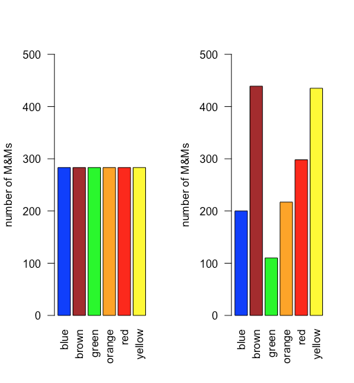
In a uniform distribution, all outcomes are equally probable. Suppose the population of M&Ms has a uniform distribution. If this is the case, then, with six colors, we expect each color to appear with a probability of 1/6 or 16.7%. Figure \(\PageIndex{10}\) shows a comparison of the theoretical results if we draw 1699 M&Ms—the total number of M&Ms in our sample of 30 bags—from a population with a uniform distribution (on the left) to the actual distribution of the 1699 M&Ms in our sample (on the right). It seems unlikely that the population of M&Ms has a uniform distribution of colors!
Binomial Distribution
A binomial distribution shows the probability of obtaining a particular result in a fixed number of trials, where the odds of that result happening in a single trial are known. Mathematically, a binomial distribution is defined by the equation
\[P(X, N) = \frac {N!} {X! (N - X)!} \times p^{X} \times (1 - p)^{N - X} \nonumber \]
where P(X,N) is the probability that the event happens X times in N trials, and where p is the probability that the event happens in a single trial. The binomial distribution has a theoretical mean, \(\mu\), and a theoretical variance, \(\sigma^2\), of
\[\mu = Np \quad \quad \quad \sigma^2 = Np(1 - p) \nonumber \]
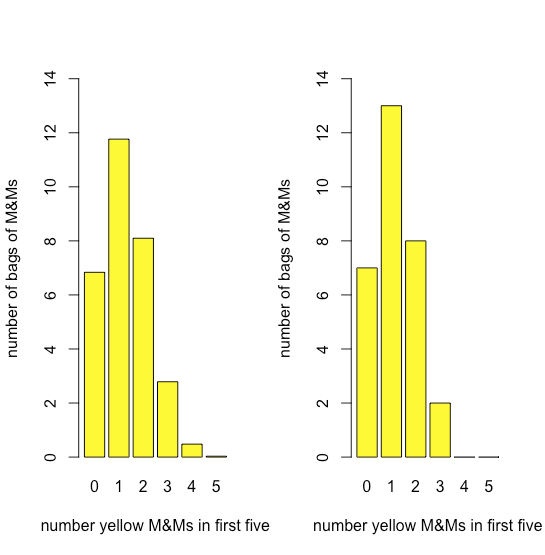
Figure \(\PageIndex{11}\) compares the expected binomial distribution for drawing 0, 1, 2, 3, 4, or 5 yellow M&Ms in the first five M&Ms—assuming that the probability of drawing a yellow M&M is 435/1699, the ratio of the number of yellow M&Ms and the total number of M&Ms—to the actual distribution of results. The similarity between the theoretical and the actual results seems evident; in a later section we will consider ways to test this claim.
Poisson Distribution
The binomial distribution is useful if we wish to model the probability of finding a fixed number of yellow M&Ms in a sample of M&Ms of fixed size—such as the first five M&Ms that we draw from a bag—but not the probability of finding a fixed number of yellow M&Ms in a single bag because there is some variability in the total number of M&Ms per bag.
A Poisson distribution gives the probability that a given number of events will occur in a fixed interval in time or space if the event has a known average rate and if each new event is independent of the preceding event. Mathematically a Poisson distribution is defined by the equation
\[P(X, \lambda) = \frac {e^{-\lambda} \lambda^X} {X !} \nonumber \]
where \(P(X, \lambda)\) is the probability that an event happens X times given the event’s average rate, \(\lambda\). The Poisson distribution has a theoretical mean, \(\mu\), and a theoretical variance, \(\sigma^2\), that are each equal to \(\lambda\).
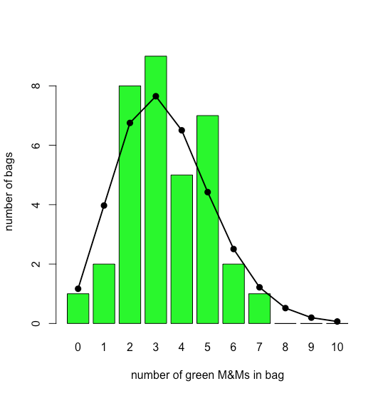
The bar plot in Figure \(\PageIndex{12}\) shows the actual distribution of green M&Ms in 35 small bags of M&Ms (as reported by M. A. Xu-Friedman “Illustrating concepts of quantal analysis with an intuitive classroom model,” Adv. Physiol. Educ. 2013, 37, 112–116). Superimposed on the bar plot is the theoretical Poisson distribution based on their reported average rate of 3.4 green M&Ms per bag. The similarity between the theoretical and the actual results seems evident; in Chapter 6 we will consider ways to test this claim.
Normal Distribution
A uniform distribution, a binomial distribution, and a Poisson distribution predict the probability of a discrete event, such as the probability of finding exactly two green M&Ms in the next bag of M&Ms that we open. Not all of the data we collect is discrete. The net weights of bags of M&Ms is an example of continuous data as the mass of an individual bag is not restricted to a discrete set of allowed values. In many cases we can model continuous data using a normal (or Gaussian) distribution, which gives the probability of obtaining a particular outcome, P(x), from a population with a known mean, \(\mu\), and a known variance, \(\sigma^2\). Mathematically a normal distribution is defined by the equation
\[P(x) = \frac {1} {\sqrt{2 \pi \sigma^2}} e^{-(x - \mu)^2/(2 \sigma^2)} \nonumber \]
Figure \(\PageIndex{13}\) shows the expected normal distribution for the net weights of our sample of 30 bags of M&Ms if we assume that their mean, \(\overline{X}\), of 48.98 g and standard deviation, s, of 1.433 g are good predictors of the population’s mean, \(\mu\), and standard deviation, \(\sigma\). Given the small sample of 30 bags, the agreement between the model and the data seems reasonable.
The Central Limit Theorem
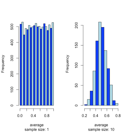
Suppose we have a population for which one of its properties has a uniform distribution where every result between 0 and 1 is equally probable. If we analyze 10,000 samples we should not be surprised to find that the distribution of these 10000 results looks uniform, as shown by the histogram on the left side of Figure \(\PageIndex{14}\). If we collect 1000 pooled samples—each of which consists of 10 individual samples for a total of 10,000 individual samples—and report the average results for these 1000 pooled samples, we see something interesting as their distribution, as shown by the histogram on the right, looks remarkably like a normal distribution. When we draw single samples from a uniform distribution, each possible outcome is equally likely, which is why we see the distribution on the left. When we draw a pooled sample that consists of 10 individual samples, however, the average values are more likely to be near the middle of the distribution’s range, as we see on the right, because the pooled sample likely includes values drawn from both the lower half and the upper half of the uniform distribution.
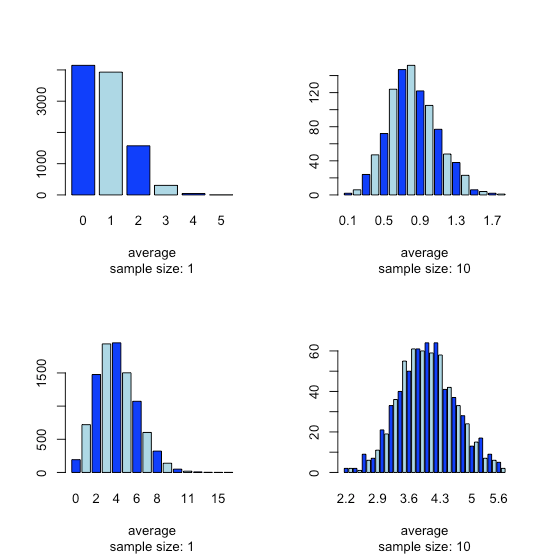
This tendency for a normal distribution to emerge when we pool samples is known as the central limit theorem. As shown in Figure \(\PageIndex{15}\), we see a similar effect with populations that follow a binomial distribution or a Poisson distribution.
You might reasonably ask whether the central limit theorem is important as it is unlikely that we will complete 1000 analyses, each of which is the average of 10 individual trials. This is deceiving. When we acquire a sample of soil, for example, it consists of many individual particles each of which is an individual sample of the soil. Our analysis of this sample, therefore, is the mean for a large number of individual soil particles. Because of this, the central limit theorem is relevant.
Uncertainty of Data
In the last section we examined four ways in which the individual samples we collect and analyze are distributed about a central value: a uniform distribution, a binomial distribution, a Poisson distribution, and a normal distribution. We also learned that regardless of how individual samples are distributed, the distribution of averages for multiple samples often follows a normal distribution. This tendency for a normal distribution to emerge when we report averages for multiple samples is known as the central limit theorem. In this chapter we look more closely at the normal distribution—examining some of its properties—and consider how we can use these properties to say something more meaningful about our data than simply reporting a mean and a standard deviation.
Properties of a Normal Distribution
Mathematically a normal distribution is defined by the equation
\[P(x) = \frac {1} {\sqrt{2 \pi \sigma^2}} e^{-(x - \mu)^2/(2 \sigma^2)} \nonumber \]
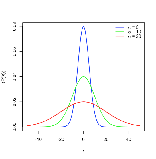
where \(P(x)\) is the probability of obtaining a result, \(x\), from a population with a known mean, \(\mu\), and a known standard deviation, \(\sigma\). Figure \(\PageIndex{16}\) shows the normal distribution curves for \(\mu = 0\) with standard deviations of 5, 10, and 20.
Because the equation for a normal distribution depends solely on the population’s mean, \(\mu\), and its standard deviation, \(\sigma\), the probability that a sample drawn from a population has a value between any two arbitrary limits is the same for all populations. For example, Figure \(\PageIndex{17}\) shows that 68.26% of all samples drawn from a normally distributed population have values within the range \(\mu \pm 1\sigma\), and only 0.14% have values greater than \(\mu + 3\sigma\).
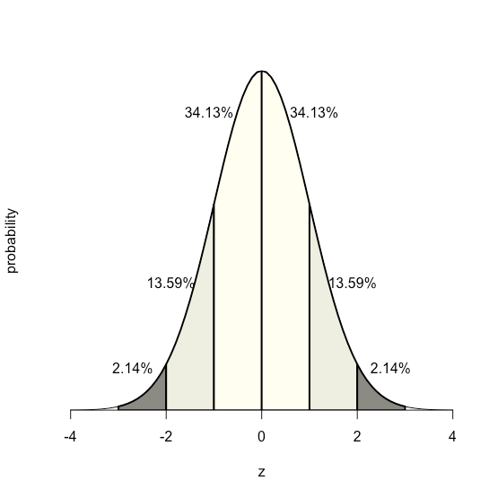
This feature of a normal distribution—that the area under the curve is the same for all values of \(\sigma\)—allows us to create a probability table (see Appendix 2) based on the relative deviation, \(z\), between a limit, x, and the mean, \(\mu\).
\[z = \frac {x - \mu} {\sigma} \nonumber \]
The value of \(z\) gives the area under the curve between that limit and the distribution’s closest tail, as shown in Figure \(\PageIndex{18}\).
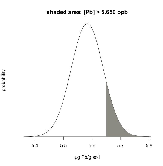
Suppose we know that \(\mu\) is 5.5833 ppb Pb and that \(\sigma\) is 0.0558 ppb Pb for a particular standard reference material (SRM). What is the probability that we will obtain a result that is greater than 5.650 ppb if we analyze a single, random sample drawn from the SRM?
Solution
Figure \(\PageIndex{19}\) shows the normal distribution curve given values of 5.5833 ppb Pb for \(\mu\) and of 0.0558 ppb Pb \(\sigma\). The shaded area in the figures is the probability of obtaining a sample with a concentration of Pb greater than 5.650 ppm. To determine the probability, we first calculate \(z\)
\[z = \frac {x - \mu} {\sigma} = \frac {5.650 - 5.5833} {0.0558} = 1.195 \nonumber \]
Next, we look up the probability in Appendix 2 for this value of \(z\), which is the average of 0.1170 (for \(z = 1.19\)) and 0.1151 (for \(z = 1.20\)), or a probability of 0.1160; thus, we expect that 11.60% of samples will provide a result greater than 5.650 ppb Pb.
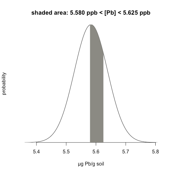
Example \(\PageIndex{1}\) considers a single limit—the probability that a result exceeds a single value. But what if we want to determine the probability that a sample has between 5.580 g Pb and 5.625 g Pb?
Solution
In this case we are interested in the shaded area shown in Figure \(\PageIndex{20}\). First, we calculate \(z\) for the upper limit
\[z = \frac {5.625 - 5.5833} {0.0558} = 0.747 \nonumber \]
and then we calculate \(z\) for the lower limit
\[z = \frac {5.580 - 5.5833} {0.0558} = -0.059 \nonumber \]
Then, we look up the probability in Appendix 2 that a result will exceed our upper limit of 5.625, which is 0.2275, or 22.75%, and the probability that a result will be less than our lower limit of 5.580, which is 0.4765, or 47.65%. The total unshaded area is 71.4% of the total area, so the shaded area corresponds to a probability of
\[100.00 - 22.75 - 47.65 = 100.00 - 71.40 = 29.6 \% \nonumber \]
Confidence Intervals
In the previous section, we learned how to predict the probability of obtaining a particular outcome if our data are normally distributed with a known \(\mu\) and a known \(\sigma\). For example, we estimated that 11.60% of samples drawn at random from a standard reference material will have a concentration of Pb greater than 5.650 ppb given a \(\mu\) of 5.5833 ppb and a \(\sigma\) of 0.0558 ppb. In essence, we determined how many standard deviations 5.650 is from \(\mu\) and used this to define the probability given the standard area under a normal distribution curve.
We can look at this in a different way by asking the following question: If we collect a single sample at random from a population with a known \(\mu\) and a known \(\sigma\), within what range of values might we reasonably expect to find the sample’s result 95% of the time? Rearranging the equation
\[z = \frac {x - \mu} {\sigma} \nonumber \]
and solving for \(x\) gives
\[x = \mu \pm z \sigma = 5.5833 \pm (1.96)(0.0558) = 5.5833 \pm 0.1094 \nonumber \]
where a \(z\) of 1.96 corresponds to 95% of the area under the curve; we call this a 95% confidence interval for a single sample.
It generally is a poor idea to draw a conclusion from the result of a single experiment; instead, we usually collect several samples and ask the question this way: If we collect \(n\) random samples from a population with a known \(\mu\) and a known \(\sigma\), within what range of values might we reasonably expect to find the mean of these samples 95% of the time?
We might reasonably expect that the standard deviation for the mean of several samples is smaller than the standard deviation for a set of individual samples; indeed it is and it is given as
\[\sigma_{\bar{x}} = \frac {\sigma} {\sqrt{n}} \nonumber \]
where \(\frac {\sigma} {\sqrt{n}}\) is called the standard error of the mean. For example, if we collect three samples from the standard reference material described above, then we expect that the mean for these three samples will fall within a range
\[\bar{x} = \mu \pm z \sigma_{\bar{X}} = \mu \pm \frac {z \sigma} {\sqrt{n}} = 5.5833 \pm \frac{(1.96)(0.0558)} {\sqrt{3}} = 5.5833 \pm 0.0631 \nonumber \]
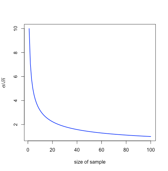
that is \(\pm 0.0631\) ppb around \(\mu\), a range that is smaller than that of \(\pm 0.1094\) ppb when we analyze individual samples. Note that the relative value to us of increasing the sample’s size diminishes as \(n\) increases because of the square root term, as shown in Figure \(\PageIndex{21}\).
Our treatment thus far assumes we know \(\mu\) and \(\sigma\) for the parent population, but we rarely know these values; instead, we examine samples drawn from the parent population and ask the following question: Given the sample’s mean, \(\bar{x}\), and its standard deviation, \(s\), what is our best estimate of the population’s mean, \(\mu\), and its standard deviation, \(\sigma\).
To make this estimate, we replace the population’s standard deviation, \(\sigma\), with the standard deviation, \(s\), for our samples, replace the population’s mean, \(\mu\), with the mean, \(\bar{x}\), for our samples, replace \(z\) with \(t\), where the value of \(t\) depends on the number of samples, \(n\)
\[\bar{x} = \mu \pm \frac{ts}{\sqrt{n}} \nonumber \]
and then rearrange the equation to solve for \(\mu\).
\[\mu = \bar{x} \pm \frac {ts} {\sqrt{n}} \nonumber \]
We call this a confidence interval. Values for \(t\) are available in tables (see Appendix 3) and depend on the probability level, \(\alpha\), where \((1 − \alpha) \times 100\) is the confidence level, and the degrees of freedom, \(n − 1\); note that for any probability level, \(t \longrightarrow z\) as \(n \longrightarrow \infty\).
We need to give special attention to what this confidence interval means and to what it does not mean:
- It does not mean that there is a 95% probability that the population’s mean is in the range \(\mu = \bar{x} \pm ts\) because our measurements may be biased or the normal distribution may be inappropriate for our system.
- It does provide our best estimate of the population’s mean, \(\mu\) given our analysis of \(n\) samples drawn at random from the parent population; a different sample, however, will give a different confidence interval and, therefore, a different estimate for \(\mu\).
Testing the Significance of Data
A confidence interval is a useful way to report the result of an analysis because it sets limits on the expected result. In the absence of determinate error, or bias, a confidence interval based on a sample’s mean indicates the range of values in which we expect to find the population’s mean. When we report a 95% confidence interval for the mass of a penny as 3.117 g ± 0.047 g, for example, we are stating that there is only a 5% probability that the penny’s expected mass is less than 3.070 g or more than 3.164 g.
Because a confidence interval is a statement of probability, it allows us to consider comparative questions, such as these:
“Are the results for a newly developed method to determine cholesterol in blood significantly different from those obtained using a standard method?”
“Is there a significant variation in the composition of rainwater collected at different sites downwind from a coal-burning utility plant?”
In this chapter we introduce a general approach that uses experimental data to ask and answer such questions, an approach we call significance testing.
The reliability of significance testing recently has received much attention—see Nuzzo, R. “Scientific Method: Statistical Errors,” Nature, 2014, 506, 150–152 for a general discussion of the issues—so it is appropriate to begin this chapter by noting the need to ensure that our data and our research question are compatible so that we do not read more into a statistical analysis than our data allows; see Leek, J. T.; Peng, R. D. “What is the Question? Science, 2015, 347, 1314-1315 for a useful discussion of six common research questions.
In the context of analytical chemistry, significance testing often accompanies an exploratory data analysis
"Is there a reason to suspect that there is a difference between these two analytical methods when applied to a common sample?"
or an inferential data analysis.
"Is there a reason to suspect that there is a relationship between these two independent measurements?"
A statistically significant result for these types of analytical research questions generally leads to the design of additional experiments that are better suited to making predictions or to explaining an underlying causal relationship. A significance test is the first step toward building a greater understanding of an analytical problem, not the final answer to that problem!
Significance Testing
Let’s consider the following problem. To determine if a medication is effective in lowering blood glucose concentrations, we collect two sets of blood samples from a patient. We collect one set of samples immediately before we administer the medication, and we collect the second set of samples several hours later. After we analyze the samples, we report their respective means and variances. How do we decide if the medication was successful in lowering the patient’s concentration of blood glucose?
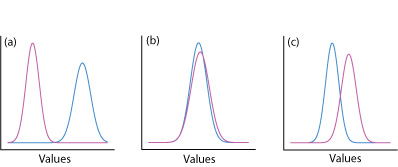
One way to answer this question is to construct a normal distribution curve for each sample, and to compare the two curves to each other. Three possible outcomes are shown in Figure \(\PageIndex{22}\). In Figure \(\PageIndex{22a}\), there is a complete separation of the two normal distribution curves, which suggests the two samples are significantly different from each other. In Figure \(\PageIndex{22b}\), the normal distribution curves for the two samples almost completely overlap each other, which suggests the difference between the samples is insignificant. Figure \(\PageIndex{22c}\), however, presents us with a dilemma. Although the means for the two samples seem different, the overlap of their normal distribution curves suggests that a significant number of possible outcomes could belong to either distribution. In this case the best we can do is to make a statement about the probability that the samples are significantly different from each other.
The process by which we determine the probability that there is a significant difference between two samples is called significance testing or hypothesis testing. Before we discuss specific examples let's first establish a general approach to conducting and interpreting a significance test.
Constructing a Significance Test
The purpose of a significance test is to determine whether the difference between two or more results is sufficiently large that we are comfortable stating that the difference cannot be explained by indeterminate errors. The first step in constructing a significance test is to state the problem as a yes or no question, such as
“Is this medication effective at lowering a patient’s blood glucose levels?”
A null hypothesis and an alternative hypothesis define the two possible answers to our yes or no question. The null hypothesis, H0, is that indeterminate errors are sufficient to explain any differences between our results. The alternative hypothesis, HA, is that the differences in our results are too great to be explained by random error and that they must be determinate in nature. We test the null hypothesis, which we either retain or reject. If we reject the null hypothesis, then we must accept the alternative hypothesis and conclude that the difference is significant.
Failing to reject a null hypothesis is not the same as accepting it. We retain a null hypothesis because we have insufficient evidence to prove it incorrect. It is impossible to prove that a null hypothesis is true. This is an important point and one that is easy to forget. To appreciate this point let’s use this data for the mass of 100 circulating United States pennies.
| Penny | Weight (g) | Penny | Weight (g) | Penny | Weight (g) | Penny | Weight (g) |
|---|---|---|---|---|---|---|---|
| 1 | 3.126 | 26 | 3.073 | 51 | 3.101 | 76 | 3.086 |
| 2 | 3.140 | 27 | 3.084 | 52 | 3.049 | 77 | 3.123 |
| 3 | 3.092 | 28 | 3.148 | 53 | 3.082 | 78 | 3.115 |
| 4 | 3.095 | 29 | 3.047 | 54 | 3.142 | 79 | 3.055 |
| 5 | 3.080 | 30 | 3.121 | 55 | 3.082 | 80 | 3.057 |
| 6 | 3.065 | 31 | 3.116 | 56 | 3.066 | 81 | 3.097 |
| 7 | 3.117 | 32 | 3.005 | 57 | 3.128 | 82 | 3.066 |
| 8 | 3.034 | 33 | 3.115 | 58 | 3.112 | 83 | 3.113 |
| 9 | 3.126 | 34 | 3.103 | 59 | 3.085 | 84 | 3.102 |
| 10 | 3.057 | 35 | 3.086 | 60 | 3.086 | 85 | 3.033 |
| 11 | 3.053 | 36 | 3.103 | 61 | 3.084 | 86 | 3.112 |
| 12 | 3.099 | 37 | 3.049 | 62 | 3.104 | 87 | 3.103 |
| 13 | 3.065 | 38 | 2.998 | 63 | 3.107 | 88 | 3.198 |
| 14 | 3.059 | 39 | 3.063 | 64 | 3.093 | 89 | 3.103 |
| 15 | 3.068 | 40 | 3.055 | 65 | 3.126 | 90 | 3.126 |
| 16 | 3.060 | 41 | 3.181 | 66 | 3.138 | 91 | 3.111 |
| 17 | 3.078 | 42 | 3.108 | 67 | 3.131 | 92 | 3.126 |
| 18 | 3.125 | 43 | 3.114 | 68 | 3.120 | 93 | 3.052 |
| 19 | 3.090 | 44 | 3.121 | 69 | 3.100 | 94 | 3.113 |
| 20 | 3.100 | 45 | 3.105 | 70 | 3.099 | 95 | 3.085 |
| 21 | 3.055 | 46 | 3.078 | 71 | 3.097 | 96 | 3.117 |
| 22 | 3.105 | 47 | 3.147 | 72 | 3.091 | 97 | 3.142 |
| 23 | 3.063 | 48 | 3.104 | 73 | 3.077 | 98 | 3.031 |
| 24 | 3.083 | 49 | 3.146 | 74 | 3.178 | 99 | 3.083 |
| 25 | 3.065 | 50 | 3.095 | 75 | 3.054 | 100 | 3.104 |
After looking at the data we might propose the following null and alternative hypotheses.
H0: The mass of a circulating U.S. penny is between 2.900 g and 3.200 g
HA: The mass of a circulating U.S. penny may be less than 2.900 g or more than 3.200 g
To test the null hypothesis we find a penny and determine its mass. If the penny’s mass is 2.512 g then we can reject the null hypothesis and accept the alternative hypothesis. Suppose that the penny’s mass is 3.162 g. Although this result increases our confidence in the null hypothesis, it does not prove that the null hypothesis is correct because the next penny we sample might weigh less than 2.900 g or more than 3.200 g.
After we state the null and the alternative hypotheses, the second step is to choose a confidence level for the analysis. The confidence level defines the probability that we will incorrectly reject the null hypothesis when it is, in fact, true. We can express this as our confidence that we are correct in rejecting the null hypothesis (e.g. 95%), or as the probability that we are incorrect in rejecting the null hypothesis. For the latter, the confidence level is given as \(\alpha\), where
\[\alpha = 1 - \frac {\text{confidence interval (%)}} {100} \nonumber \]
For a 95% confidence level, \(\alpha\) is 0.05.
The third step is to calculate an appropriate test statistic and to compare it to a critical value. The test statistic’s critical value defines a breakpoint between values that lead us to reject or to retain the null hypothesis, which is the fourth, and final, step of a significance test. As we will see in the sections that follow, how we calculate the test statistic depends on what we are comparing.
The four steps for a statistical analysis of data using a significance test:
- Pose a question, and state the null hypothesis, H0, and the alternative hypothesis, HA.
- Choose a confidence level for the statistical analysis.
- Calculate an appropriate test statistic and compare it to a critical value.
- Either retain the null hypothesis, or reject it and accept the alternative hypothesis.
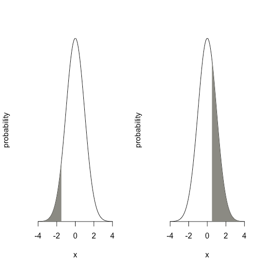
One-Tailed and Two-tailed Significance Tests
Suppose we want to evaluate the accuracy of a new analytical method. We might use the method to analyze a Standard Reference Material that contains a known concentration of analyte, \(\mu\). We analyze the standard several times, obtaining a mean value, \(\overline{X}\), for the analyte’s concentration. Our null hypothesis is that there is no difference between \(\overline{X}\) and \(\mu\)
\[H_0 \text{: } \overline{X} = \mu \nonumber \]
If we conduct the significance test at \(\alpha = 0.05\), then we retain the null hypothesis if a 95% confidence interval around \(\overline{X}\) contains \(\mu\). If the alternative hypothesis is
\[H_\text{A} \text{: } \overline{X} \neq \mu \nonumber \]
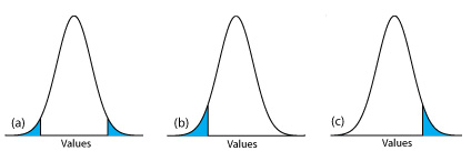
then we reject the null hypothesis and accept the alternative hypothesis if \(\mu\) lies in the shaded areas at either end of the sample’s probability distribution curve (Figure \(\PageIndex{23a}\)). Each of the shaded areas accounts for 2.5% of the area under the probability distribution curve, for a total of 5%. This is a two-tailed significance test because we reject the null hypothesis for values of \(\mu\) at either extreme of the sample’s probability distribution curve.
We can write the alternative hypothesis in two additional ways
\[H_\text{A} \text{: } \overline{X} > \mu \nonumber \]
\[H_\text{A} \text{: } \overline{X} < \mu \nonumber \]
rejecting the null hypothesis if \(\mu\) falls within the shaded areas shown in Figure \(\PageIndex{23b}\) or Figure \(\PageIndex{23c}\), respectively. In each case the shaded area represents 5% of the area under the probability distribution curve. These are examples of a one-tailed significance test.
For a fixed confidence level, a two-tailed significance test is the more conservative test because rejecting the null hypothesis requires a larger difference between the results we are comparing. In most situations we have no particular reason to expect that one result must be larger (or must be smaller) than the other result. This is the case, for example, when we evaluate the accuracy of a new analytical method. A two-tailed significance test, therefore, usually is the appropriate choice.
We reserve a one-tailed significance test for a situation where we specifically are interested in whether one result is larger (or smaller) than the other result. For example, a one-tailed significance test is appropriate if we are evaluating a medication’s ability to lower blood glucose levels. In this case we are interested only in whether the glucose levels after we administer the medication are less than the glucose levels before we initiated treatment. If a patient’s blood glucose level is greater after we administer the medication, then we know the answer—the medication did not work—and we do not need to conduct a statistical analysis.
Errors in Significance Testing
Because a significance test relies on probability, its interpretation is subject to error. In a significance test, \(\alpha\) defines the probability of rejecting a null hypothesis that is true. When we conduct a significance test at \(\alpha = 0.05\), there is a 5% probability that we will incorrectly reject the null hypothesis. This is known as a type 1 error, and its risk is always equivalent to \(\alpha\). A type 1 error in a two-tailed or a one-tailed significance tests corresponds to the shaded areas under the probability distribution curves in Figure \(\PageIndex{23}\).
A second type of error occurs when we retain a null hypothesis even though it is false. This is a type 2 error, and the probability of its occurrence is \(\beta\). Unfortunately, in most cases we cannot calculate or estimate the value for \(\beta\). The probability of a type 2 error, however, is inversely proportional to the probability of a type 1 error.
Minimizing a type 1 error by decreasing \(\alpha\) increases the likelihood of a type 2 error. When we choose a value for \(\alpha\) we must compromise between these two types of error. Most of the examples in this text use a 95% confidence level (\(\alpha = 0.05\)) because this usually is a reasonable compromise between type 1 and type 2 errors for analytical work. It is not unusual, however, to use a more stringent (e.g. \(\alpha = 0.01\)) or a more lenient (e.g. \(\alpha = 0.10\)) confidence level when the situation calls for it.
Significance Tests for Normal Distributions
A normal distribution is the most common distribution for the data we collect. Because the area between any two limits of a normal distribution curve is well defined, it is straightforward to construct and evaluate significance tests.
Comparing \(\overline{X}\) to \(\mu\)
One way to validate a new analytical method is to analyze a sample that contains a known amount of analyte, \(\mu\). To judge the method’s accuracy we analyze several portions of the sample, determine the average amount of analyte in the sample, \(\overline{X}\), and use a significance test to compare \(\overline{X}\) to \(\mu\). The null hypothesis is that the difference between \(\overline{X}\) and \(\mu\) is explained by indeterminate errors that affect our determination of \(\overline{X}\). The alternative hypothesis is that the difference between \(\overline{X}\) and \(\mu\) is too large to be explained by indeterminate error.
\[H_0 \text{: } \overline{X} = \mu \nonumber \]
\[H_A \text{: } \overline{X} \neq \mu \nonumber \]
The test statistic is texp, which we substitute into the confidence interval for \(\mu\)
\[\mu = \overline{X} \pm \frac {t_\text{exp} s} {\sqrt{n}} \nonumber \]
Rearranging this equation and solving for \(t_\text{exp}\)
\[t_\text{exp} = \frac {|\mu - \overline{X}| \sqrt{n}} {s} \nonumber \]
gives the value for \(t_\text{exp}\) when \(\mu\) is at either the right edge or the left edge of the sample's confidence interval (Figure \(\PageIndex{24a}\)).
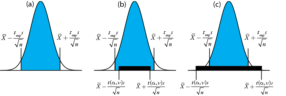
To determine if we should retain or reject the null hypothesis, we compare the value of texp to a critical value, \(t(\alpha, \nu)\), where \(\alpha\) is the confidence level and \(\nu\) is the degrees of freedom for the sample. The critical value \(t(\alpha, \nu)\) defines the largest confidence interval explained by indeterminate error. If \(t_\text{exp} > t(\alpha, \nu)\), then our sample’s confidence interval is greater than that explained by indeterminate errors (Figure \(\PageIndex{24}\)b). In this case, we reject the null hypothesis and accept the alternative hypothesis. If \(t_\text{exp} \leq t(\alpha, \nu)\), then our sample’s confidence interval is smaller than that explained by indeterminate error, and we retain the null hypothesis (Figure \(\PageIndex{24}\)c). Example \(\PageIndex{24}\) provides a typical application of this significance test, which is known as a t-test of \(\overline{X}\) to \(\mu\). You will find values for \(t(\alpha, \nu)\) in Appendix 3.
Before determining the amount of Na2CO3 in a sample, you decide to check your procedure by analyzing a standard sample that is 98.76% w/w Na2CO3. Five replicate determinations of the %w/w Na2CO3 in the standard gives the following results
\(98.71 \% \quad 98.59 \% \quad 98.62 \% \quad 98.44 \% \quad 98.58 \%\)
Using \(\alpha = 0.05\), is there any evidence that the analysis is giving inaccurate results?
Solution
The mean and standard deviation for the five trials are
\[\overline{X} = 98.59 \quad \quad \quad s = 0.0973 \nonumber \]
Because there is no reason to believe that the results for the standard must be larger or smaller than \(\mu\), a two-tailed t-test is appropriate. The null hypothesis and alternative hypothesis are
\[H_0 \text{: } \overline{X} = \mu \quad \quad \quad H_\text{A} \text{: } \overline{X} \neq \mu \nonumber \]
The test statistic, texp, is
\[t_\text{exp} = \frac {|\mu - \overline{X}|\sqrt{n}} {2} = \frac {|98.76 - 98.59| \sqrt{5}} {0.0973} = 3.91 \nonumber \]
The critical value for t(0.05, 4) from Appendix 3 is 2.78. Since texp is greater than t(0.05, 4), we reject the null hypothesis and accept the alternative hypothesis. At the 95% confidence level the difference between \(\overline{X}\) and \(\mu\) is too large to be explained by indeterminate sources of error, which suggests there is a determinate source of error that affects the analysis.
There is another way to interpret the result of this t-test. Knowing that texp is 3.91 and that there are 4 degrees of freedom, we use Appendix 3 to estimate the value of \(\alpha\) that corresponds to a t(\(\alpha\), 4) of 3.91. From Appendix 3, t(0.02, 4) is 3.75 and t(0.01, 4) is 4.60. Although we can reject the null hypothesis at the 98% confidence level, we cannot reject it at the 99% confidence level. For a discussion of the advantages of this approach, see J. A. C. Sterne and G. D. Smith “Sifting the evidence—what’s wrong with significance tests?” BMJ 2001, 322, 226–231.
Earlier we made the point that we must exercise caution when we interpret the result of a statistical analysis. We will keep returning to this point because it is an important one. Having determined that a result is inaccurate, as we did in Example \(\PageIndex{3}\), the next step is to identify and to correct the error. Before we expend time and money on this, however, we first should critically examine our data. For example, the smaller the value of s, the larger the value of texp. If the standard deviation for our analysis is unrealistically small, then the probability of a type 2 error increases. Including a few additional replicate analyses of the standard and reevaluating the t-test may strengthen our evidence for a determinate error, or it may show us that there is no evidence for a determinate error.
Comparing \(s^2\) to \(\sigma^2\)
If we analyze regularly a particular sample, we may be able to establish an expected variance, \(\sigma^2\), for the analysis. This often is the case, for example, in a clinical lab that analyzes hundreds of blood samples each day. A few replicate analyses of a single sample gives a sample variance, s2, whose value may or may not differ significantly from \(\sigma^2\).
We can use an F-test to evaluate whether a difference between s2 and \(\sigma^2\) is significant. The null hypothesis is \(H_0 \text{: } s^2 = \sigma^2\) and the alternative hypothesis is \(H_\text{A} \text{: } s^2 \neq \sigma^2\). The test statistic for evaluating the null hypothesis is Fexp, which is given as either
\[F_\text{exp} = \frac {s^2} {\sigma^2} \text{ if } s^2 > \sigma^2 \text{ or } F_\text{exp} = \frac {\sigma^2} {s^2} \text{ if } \sigma^2 > s^2 \nonumber \]
depending on whether s2 is larger or smaller than \(\sigma^2\). This way of defining Fexp ensures that its value is always greater than or equal to one.
If the null hypothesis is true, then Fexp should equal one; however, because of indeterminate errors, Fexp, usually is greater than one. A critical value, \(F(\alpha, \nu_\text{num}, \nu_\text{den})\), is the largest value of Fexp that we can attribute to indeterminate error given the specified significance level, \(\alpha\), and the degrees of freedom for the variance in the numerator, \(\nu_\text{num}\), and the variance in the denominator, \(\nu_\text{den}\). The degrees of freedom for s2 is n – 1, where n is the number of replicates used to determine the sample’s variance, and the degrees of freedom for \(\sigma^2\) is defined as infinity, \(\infty\). Critical values of F for \(\alpha = 0.05\) are listed in Appendix 4 for both one-tailed and two-tailed F-tests.
A manufacturer’s process for analyzing aspirin tablets has a known variance of 25. A sample of 10 aspirin tablets is selected and analyzed for the amount of aspirin, yielding the following results in mg aspirin/tablet.
\(254 \quad 249 \quad 252 \quad 252 \quad 249 \quad 249 \quad 250 \quad 247 \quad 251 \quad 252\)
Determine whether there is evidence of a significant difference between the sample’s variance and the expected variance at \(\alpha = 0.05\).
Solution
The variance for the sample of 10 tablets is 4.3. The null hypothesis and alternative hypotheses are
\[H_0 \text{: } s^2 = \sigma^2 \quad \quad \quad H_\text{A} \text{: } s^2 \neq \sigma^2 \nonumber \]
and the value for Fexp is
\[F_\text{exp} = \frac {\sigma^2} {s^2} = \frac {25} {4.3} = 5.8 \nonumber \]
The critical value for F(0.05, \(\infty\), 9) from Appendix 4 is 3.333. Since Fexp is greater than F(0.05, \(\infty\), 9), we reject the null hypothesis and accept the alternative hypothesis that there is a significant difference between the sample’s variance and the expected variance. One explanation for the difference might be that the aspirin tablets were not selected randomly.
Comparing Variances for Two Samples
We can extend the F-test to compare the variances for two samples, A and B, by rewriting our equation for Fexp as
\[F_\text{exp} = \frac {s_A^2} {s_B^2} \nonumber \]
defining A and B so that the value of Fexp is greater than or equal to 1.
The table below shows results for two experiments to determine the mass of a circulating U.S. penny. Determine whether there is a difference in the variances of these analyses at \(\alpha = 0.05\).
| First Experiment | Second Experiment | ||
|---|---|---|---|
| Penny | Mass (g) | Penny | Mass (g) |
| 1 | 3.080 | 1 | 3.052 |
| 2 | 3.094 | 2 | 3.141 |
| 3 | 3.107 | 3 | 3.083 |
| 4 | 3.056 | 4 | 3.083 |
| 5 | 3.112 | 5 | 3.048 |
| 6 | 3.174 | ||
| 7 | 3.198 | ||
Solution
The standard deviations for the two experiments are 0.051 for the first experiment (A) and 0.037 for the second experiment (B). The null and alternative hypotheses are
\[H_0 \text{: } s_A^2 = s_B^2 \quad \quad \quad H_\text{A} \text{: } s_A^2 \neq s_B^2 \nonumber \]
and the value of Fexp is
\[F_\text{exp} = \frac {s_A^2} {s_B^2} = \frac {(0.051)^2} {(0.037)^2} = \frac {0.00260} {0.00137} = 1.90 \nonumber \]
From Appendix 4 the critical value for F(0.05, 6, 4) is 9.197. Because Fexp < F(0.05, 6, 4), we retain the null hypothesis. There is no evidence at \(\alpha = 0.05\) to suggest that the difference in variances is significant.
Comparing Means for Two Samples
Three factors influence the result of an analysis: the method, the sample, and the analyst. We can study the influence of these factors by conducting experiments in which we change one factor while holding constant the other factors. For example, to compare two analytical methods we can have the same analyst apply each method to the same sample and then examine the resulting means. In a similar fashion, we can design experiments to compare two analysts or to compare two samples.
Before we consider the significance tests for comparing the means of two samples, we need to understand the difference between unpaired data and paired data. This is a critical distinction and learning to distinguish between these two types of data is important. Here are two simple examples that highlight the difference between unpaired data and paired data. In each example the goal is to compare two balances by weighing pennies.
- Example 1: We collect 10 pennies and weigh each penny on each balance. This is an example of paired data because we use the same 10 pennies to evaluate each balance.
- Example 2: We collect 10 pennies and divide them into two groups of five pennies each. We weigh the pennies in the first group on one balance and we weigh the second group of pennies on the other balance. Note that no penny is weighed on both balances. This is an example of unpaired data because we evaluate each balance using a different sample of pennies.
In both examples the samples of 10 pennies were drawn from the same population; the difference is how we sampled that population. We will learn why this distinction is important when we review the significance test for paired data; first, however, we present the significance test for unpaired data.
One simple test for determining whether data are paired or unpaired is to look at the size of each sample. If the samples are of different size, then the data must be unpaired. The converse is not true. If two samples are of equal size, they may be paired or unpaired.
Unpaired Data
Consider two analyses, A and B, with means of \(\overline{X}_A\) and \(\overline{X}_B\), and standard deviations of sA and sB. The confidence intervals for \(\mu_A\) and for \(\mu_B\) are
\[\mu_A = \overline{X}_A \pm \frac {t s_A} {\sqrt{n_A}} \nonumber \]
\[\mu_B = \overline{X}_B \pm \frac {t s_B} {\sqrt{n_B}} \nonumber \]
where nA and nB are the sample sizes for A and for B. Our null hypothesis, \(H_0 \text{: } \mu_A = \mu_B\), is that any difference between \(\mu_A\) and \(\mu_B\) is the result of indeterminate errors that affect the analyses. The alternative hypothesis, \(H_A \text{: } \mu_A \neq \mu_B\), is that the difference between \(\mu_A\)and \(\mu_B\) is too large to be explained by indeterminate error.
To derive an equation for texp, we assume that \(\mu_A\) equals \(\mu_B\), and combine the equations for the two confidence intervals
\[\overline{X}_A \pm \frac {t_\text{exp} s_A} {\sqrt{n_A}} = \overline{X}_B \pm \frac {t_\text{exp} s_B} {\sqrt{n_B}} \nonumber \]
Solving for \(|\overline{X}_A - \overline{X}_B|\) and using a propagation of uncertainty, gives
\[|\overline{X}_A - \overline{X}_B| = t_\text{exp} \times \sqrt{\frac {s_A^2} {n_A} + \frac {s_B^2} {n_B}} \nonumber \]
Finally, we solve for texp
\[t_\text{exp} = \frac {|\overline{X}_A - \overline{X}_B|} {\sqrt{\frac {s_A^2} {n_A} + \frac {s_B^2} {n_B}}} \nonumber \]
and compare it to a critical value, \(t(\alpha, \nu)\), where \(\alpha\) is the probability of a type 1 error, and \(\nu\) is the degrees of freedom.
Thus far our development of this t-test is similar to that for comparing \(\overline{X}\) to \(\mu\), and yet we do not have enough information to evaluate the t-test. Do you see the problem? With two independent sets of data it is unclear how many degrees of freedom we have.
Suppose that the variances \(s_A^2\) and \(s_B^2\) provide estimates of the same \(\sigma^2\). In this case we can replace \(s_A^2\) and \(s_B^2\) with a pooled variance, \(s_\text{pool}^2\), that is a better estimate for the variance. Thus, our equation for \(t_\text{exp}\) becomes
\[t_\text{exp} = \frac {|\overline{X}_A - \overline{X}_B|} {s_\text{pool} \times \sqrt{\frac {1} {n_A} + \frac {1} {n_B}}} = \frac {|\overline{X}_A - \overline{X}_B|} {s_\text{pool}} \times \sqrt{\frac {n_A n_B} {n_A + n_B}} \nonumber \]
where spool, the pooled standard deviation, is
\[s_\text{pool} = \sqrt{\frac {(n_A - 1) s_A^2 + (n_B - 1)s_B^2} {n_A + n_B - 2}} \nonumber \]
The denominator of this equation shows us that the degrees of freedom for a pooled standard deviation is \(n_A + n_B - 2\), which also is the degrees of freedom for the t-test. Note that we lose two degrees of freedom because the calculations for \(s_A^2\) and \(s_B^2\) require the prior calculation of \(\overline{X}_A\) amd \(\overline{X}_B\).
So how do you determine if it is okay to pool the variances? Use an F-test.
If \(s_A^2\) and \(s_B^2\) are significantly different, then we calculate texp using the following equation. In this case, we find the degrees of freedom using the following imposing equation.
\[\nu = \frac {\left( \frac {s_A^2} {n_A} + \frac {s_B^2} {n_B} \right)^2} {\frac {\left( \frac {s_A^2} {n_A} \right)^2} {n_A + 1} + \frac {\left( \frac {s_B^2} {n_B} \right)^2} {n_B + 1}} - 2 \nonumber \]
Because the degrees of freedom must be an integer, we round to the nearest integer the value of \(\nu\) obtained from this equation.
The equation above for the degrees of freedom is from Miller, J.C.; Miller, J.N. Statistics for Analytical Chemistry, 2nd Ed., Ellis-Horward: Chichester, UK, 1988. In the 6th Edition, the authors note that several different equations have been suggested for the number of degrees of freedom for t when sA and sB differ, reflecting the fact that the determination of degrees of freedom an approximation. An alternative equation—which is used by statistical software packages, such as R, Minitab, Excel—is
\[\nu = \frac {\left( \frac {s_A^2} {n_A} + \frac {s_B^2} {n_B} \right)^2} {\frac {\left( \frac {s_A^2} {n_A} \right)^2} {n_A - 1} + \frac {\left( \frac {s_B^2} {n_B} \right)^2} {n_B - 1}} = \frac {\left( \frac {s_A^2} {n_A} + \frac {s_B^2} {n_B} \right)^2} {\frac {s_A^4} {n_A^2(n_A - 1)} + \frac {s_B^4} {n_B^2(n_B - 1)}} \nonumber \]
For typical problems in analytical chemistry, the calculated degrees of freedom is reasonably insensitive to the choice of equation.
Regardless of whether how we calculate texp, we reject the null hypothesis if texp is greater than \(t(\alpha, \nu)\) and retain the null hypothesis if texp is less than or equal to \(t(\alpha, \nu)\).
Example \(\PageIndex{3}\) provides results for two experiments to determine the mass of a circulating U.S. penny. Determine whether there is a difference in the means of these analyses at \(\alpha = 0.05\).
Solution
First we use an F-test to determine whether we can pool the variances. We completed this analysis in Example \(\PageIndex{5}\), finding no evidence of a significant difference, which means we can pool the standard deviations, obtaining
\[s_\text{pool} = \sqrt{\frac {(7 - 1)(0.051)^2 + (5 - 1)(0.037)^2} {7 + 5 - 2}} = 0.0459 \nonumber \]
with 10 degrees of freedom. To compare the means we use the following null hypothesis and alternative hypotheses
\[H_0 \text{: } \mu_A = \mu_B \quad \quad \quad H_A \text{: } \mu_A \neq \mu_B \nonumber \]
Because we are using the pooled standard deviation, we calculate texp as
\[t_\text{exp} = \frac {|3.117 - 3.081|} {0.0459} \times \sqrt{\frac {7 \times 5} {7 + 5}} = 1.34 \nonumber \]
The critical value for t(0.05, 10), from Appendix 3, is 2.23. Because texp is less than t(0.05, 10) we retain the null hypothesis. For \(\alpha = 0.05\) we do not have evidence that the two sets of pennies are significantly different.
One method for determining the %w/w Na2CO3 in soda ash is to use an acid–base titration. When two analysts analyze the same sample of soda ash they obtain the results shown here.
Analyst A: \(86.82 \% \quad 87.04 \% \quad 86.93 \% \quad 87.01 \% \quad 86.20 \% \quad 87.00 \%\)
Analyst B: \(81.01 \% \quad 86.15 \% \quad 81.73 \% \quad 83.19 \% \quad 80.27 \% \quad 83.93 \% \quad\)
Determine whether the difference in the mean values is significant at \(\alpha = 0.05\).
Solution
We begin by reporting the mean and standard deviation for each analyst.
\[\overline{X}_A = 86.83\% \quad \quad s_A = 0.32\% \nonumber \]
\[\overline{X}_B = 82.71\% \quad \quad s_B = 2.16\% \nonumber \]
To determine whether we can use a pooled standard deviation, we first complete an F-test using the following null and alternative hypotheses.
\[H_0 \text{: } s_A^2 = s_B^2 \quad \quad \quad H_A \text{: } s_A^2 \neq s_B^2 \nonumber \]
Calculating Fexp, we obtain a value of
\[F_\text{exp} = \frac {(2.16)^2} {(0.32)^2} = 45.6 \nonumber \]
Because Fexp is larger than the critical value of 7.15 for F(0.05, 5, 5) from Appendix 4, we reject the null hypothesis and accept the alternative hypothesis that there is a significant difference between the variances; thus, we cannot calculate a pooled standard deviation.
To compare the means for the two analysts we use the following null and alternative hypotheses.
\[H_0 \text{: } \overline{X}_A = \overline{X}_B \quad \quad \quad H_A \text{: } \overline{X}_A \neq \overline{X}_B \nonumber \]
Because we cannot pool the standard deviations, we calculate texp as
\[t_\text{exp} = \frac {|86.83 - 82.71|} {\sqrt{\frac {(0.32)^2} {6} + \frac {(2.16)^2} {6}}} = 4.62 \nonumber \]
and calculate the degrees of freedom as
\[\nu = \frac {\left( \frac {(0.32)^2} {6} + \frac {(2.16)^2} {6} \right)^2} {\frac {\left( \frac {(0.32)^2} {6} \right)^2} {6 + 1} + \frac {\left( \frac {(2.16)^2} {6} \right)^2} {6 + 1}} - 2 = 5.3 \approx 5 \nonumber \]
From Appendix 3, the critical value for t(0.05, 5) is 2.57. Because texp is greater than t(0.05, 5) we reject the null hypothesis and accept the alternative hypothesis that the means for the two analysts are significantly different at \(\alpha = 0.05\).
Paired Data
Suppose we are evaluating a new method for monitoring blood glucose concentrations in patients. An important part of evaluating a new method is to compare it to an established method. What is the best way to gather data for this study? Because the variation in the blood glucose levels amongst patients is large we may be unable to detect a small, but significant difference between the methods if we use different patients to gather data for each method. Using paired data, in which the we analyze each patient’s blood using both methods, prevents a large variance within a population from adversely affecting a t-test of means.
Typical blood glucose levels for most non-diabetic individuals ranges between 80–120 mg/dL (4.4–6.7 mM), rising to as high as 140 mg/dL (7.8 mM) shortly after eating. Higher levels are common for individuals who are pre-diabetic or diabetic.
When we use paired data we first calculate the individual differences, di, between each sample's paired resykts. Using these individual differences, we then calculate the average difference, \(\overline{d}\), and the standard deviation of the differences, sd. The null hypothesis, \(H_0 \text{: } d = 0\), is that there is no difference between the two samples, and the alternative hypothesis, \(H_A \text{: } d \neq 0\), is that the difference between the two samples is significant.
The test statistic, texp, is derived from a confidence interval around \(\overline{d}\)
\[t_\text{exp} = \frac {|\overline{d}| \sqrt{n}} {s_d} \nonumber \]
where n is the number of paired samples. As is true for other forms of the t-test, we compare texp to \(t(\alpha, \nu)\), where the degrees of freedom, \(\nu\), is n – 1. If texp is greater than \(t(\alpha, \nu)\), then we reject the null hypothesis and accept the alternative hypothesis. We retain the null hypothesis if texp is less than or equal to t(a, o). This is known as a paired t-test.
Marecek et. al. developed a new electrochemical method for the rapid determination of the concentration of the antibiotic monensin in fermentation vats [Marecek, V.; Janchenova, H.; Brezina, M.; Betti, M. Anal. Chim. Acta 1991, 244, 15–19]. The standard method for the analysis is a test for microbiological activity, which is both difficult to complete and time-consuming. Samples were collected from the fermentation vats at various times during production and analyzed for the concentration of monensin using both methods. The results, in parts per thousand (ppt), are reported in the following table.
| Sample | Microbiological | Electrochemical |
|---|---|---|
| 1 | 129.5 | 132.3 |
| 2 | 89.6 | 91.0 |
| 3 | 76.6 | 73.6 |
| 4 | 52.2 | 58.2 |
| 5 | 110.8 | 104.2 |
| 6 | 50.4 | 49.9 |
| 7 | 72.4 | 82.1 |
| 8 | 141.4 | 154.1 |
| 9 | 75.0 | 73.4 |
| 10 | 34.1 | 38.1 |
| 11 | 60.3 | 60.1 |
Is there a significant difference between the methods at \(\alpha = 0.05\)?
Solution
Acquiring samples over an extended period of time introduces a substantial time-dependent change in the concentration of monensin. Because the variation in concentration between samples is so large, we use a paired t-test with the following null and alternative hypotheses.
\[H_0 \text{: } \overline{d} = 0 \quad \quad \quad H_A \text{: } \overline{d} \neq 0 \nonumber \]
Defining the difference between the methods as
\[d_i = (X_\text{elect})_i - (X_\text{micro})_i \nonumber \]
we calculate the difference for each sample.
| sample | 1 | 2 | 3 | 4 | 5 | 6 | 7 | 8 | 9 | 10 | 11 |
| \(d_i\) | 2.8 | 1.4 | –3.0 | 6.0 | –6.6 | –0.5 | 9.7 | 12.7 | –1.6 | 4.0 | –0.2 |
The mean and the standard deviation for the differences are, respectively, 2.25 ppt and 5.63 ppt. The value of texp is
\[t_\text{exp} = \frac {|2.25| \sqrt{11}} {5.63} = 1.33 \nonumber \]
which is smaller than the critical value of 2.23 for t(0.05, 10) from Appendix 3. We retain the null hypothesis and find no evidence for a significant difference in the methods at \(\alpha = 0.05\).
One important requirement for a paired t-test is that the determinate and the indeterminate errors that affect the analysis must be independent of the analyte’s concentration. If this is not the case, then a sample with an unusually high concentration of analyte will have an unusually large di. Including this sample in the calculation of \(\overline{d}\) and sd gives a biased estimate for the expected mean and standard deviation. This rarely is a problem for samples that span a limited range of analyte concentrations, such as those in Example \(\PageIndex{6}\) or Exercise \(\PageIndex{8}\). When paired data span a wide range of concentrations, however, the magnitude of the determinate and indeterminate sources of error may not be independent of the analyte’s concentration; when true, a paired t-test may give misleading results because the paired data with the largest absolute determinate and indeterminate errors will dominate \(\overline{d}\). In this situation a regression analysis, which is the subject of the next chapter, is more appropriate method for comparing the data.
The importance of distinguishing between paired and unpaired data is worth examining more closely. The following is data from some work I completed with a colleague in which we were looking at concentration of Zn in Lake Erie at the air-water interface and the sediment-water interface.
| sample site | ppm Zn at air-water interface | ppm Zn at the sediment-water interface |
| 1 | 0.430 | 0.415 |
| 2 | 0.266 | 0.238 |
| 3 | 0.457 | 0.390 |
| 4 | 0.531 | 0.410 |
| 5 | 0.707 | 0.605 |
| 6 | 0.716 | 0.609 |
The mean and the standard deviation for the ppm Zn at the air-water interface are 0.5178 ppm and 0.01732 ppm, and the mean and the standard deviation for the ppm Zn at the sediment-water interface are 0.4445 ppm and 0.1418 ppm. We can use these values to draw normal distributions for both by letting the means and the standard deviations for the samples, \(\overline{X}\) and \(s\), serve as estimates for the means and the standard deviations for the population, \(\mu\) and \(\sigma\). As we see in the following figure
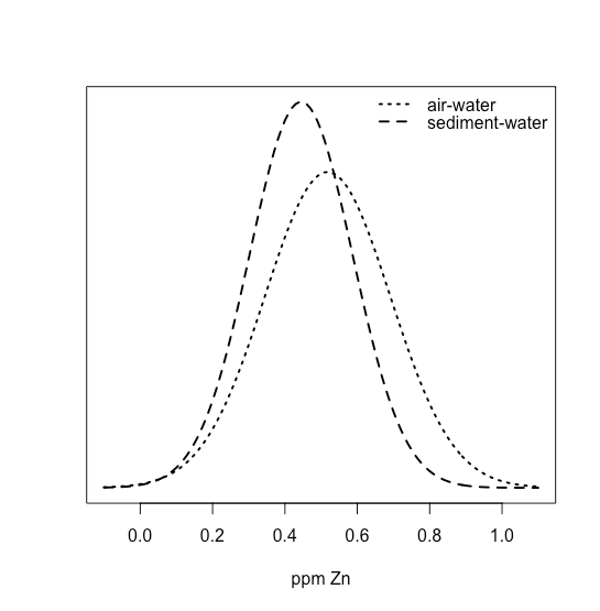
the two distributions overlap strongly, suggesting that a t-test of their means is not likely to find evidence of a difference. And yet, we also see that for each site, the concentration of Zn at the sediment-water interface is less than that at the air-water interface. In this case, the difference between the concentration of Zn at individual sites is sufficiently large that it masks our ability to see the difference between the two interfaces.
If we take the differences between the air-water and sediment-water interfaces, we have values of 0.015, 0.028, 0.067, 0.121, 0.102, and 0.107 ppm Zn, with a mean of 0.07333 ppm Zn and a standard deviation of 0.04410 ppm Zn. Superimposing all three normal distributions
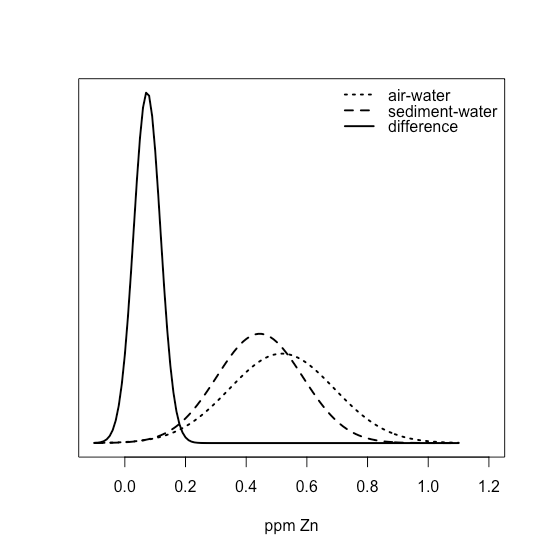
shows clearly that most of the normal distribution for the differences lies above zero, suggesting that a t-test might show evidence that the difference is significant.
Outliers
Table \(\PageIndex{11}\) provides one more data set giving the masses for a sample of pennies. Do you notice anything unusual in this data? Of the 100 pennies included in our earlier table, no penny has a mass of less than 3 g. In this table, however, the mass of one penny is less than 3 g. We might ask whether this penny’s mass is so different from the other pennies that it is in error.
| 3.067 | 2.514 | 3.094 |
| 3.049 | 3.048 | 3.109 |
| 3.039 | 3.079 | 3.102 |
A measurement that is not consistent with other measurements is called an outlier. An outlier might exist for many reasons: the outlier might belong to a different population
Is this a Canadian penny?
or the outlier might be a contaminated or an otherwise altered sample
Is the penny damaged or unusually dirty?
or the outlier may result from an error in the analysis
Did we forget to tare the balance?
Regardless of its source, the presence of an outlier compromises any meaningful analysis of our data. There are many significance tests that we can use to identify a potential outlier, three of which we present here.
Dixon's Q-Test
One of the most common significance tests for identifying an outlier is Dixon’s Q-test. The null hypothesis is that there are no outliers, and the alternative hypothesis is that there is an outlier. The Q-test compares the gap between the suspected outlier and its nearest numerical neighbor to the range of the entire data set (Figure \(\PageIndex{25}\)).
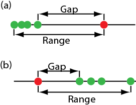
The test statistic, Qexp, is
\[Q_\text{exp} = \frac {\text{gap}} {\text{range}} = \frac {|\text{outlier's value} - \text{nearest value}|} {\text{largest value} - \text{smallest value}} \nonumber \]
This equation is appropriate for evaluating a single outlier. Other forms of Dixon’s Q-test allow its extension to detecting multiple outliers [Rorabacher, D. B. Anal. Chem. 1991, 63, 139–146].
The value of Qexp is compared to a critical value, \(Q(\alpha, n)\), where \(\alpha\) is the probability that we will reject a valid data point (a type 1 error) and n is the total number of data points. To protect against rejecting a valid data point, usually we apply the more conservative two-tailed Q-test, even though the possible outlier is the smallest or the largest value in the data set. If Qexp is greater than \(Q(\alpha, n)\), then we reject the null hypothesis and may exclude the outlier. We retain the possible outlier when Qexp is less than or equal to \(Q(\alpha, n)\). Table \(\PageIndex{12}\) provides values for \(Q(\alpha, n)\) for a data set that has 3–10 values. A more extensive table is in Appendix 5. Values for \(Q(\alpha, n)\) assume an underlying normal distribution.
| n | Q(0.05, n) |
|---|---|
| 3 | 0.970 |
| 4 | 0.829 |
| 5 | 0.710 |
| 6 | 0.625 |
| 7 | 0.568 |
| 8 | 0.526 |
| 9 | 0.493 |
| 10 | 0.466 |
Grubb's Test
Although Dixon’s Q-test is a common method for evaluating outliers, it is no longer favored by the International Standards Organization (ISO), which recommends the Grubb’s test. There are several versions of Grubb’s test depending on the number of potential outliers. Here we will consider the case where there is a single suspected outlier.
For details on this recommendation, see International Standards ISO Guide 5752-2 “Accuracy (trueness and precision) of measurement methods and results–Part 2: basic methods for the determination of repeatability and reproducibility of a standard measurement method,” 1994.
The test statistic for Grubb’s test, Gexp, is the distance between the sample’s mean, \(\overline{X}\), and the potential outlier, \(X_\text{out}\), in terms of the sample’s standard deviation, s.
\[G_\text{exp} = \frac {|X_\text{out} - \overline{X}|} {s} \nonumber \]
We compare the value of Gexp to a critical value \(G(\alpha, n)\), where \(\alpha\) is the probability that we will reject a valid data point and n is the number of data points in the sample. If Gexp is greater than \(G(\alpha, n)\), then we may reject the data point as an outlier, otherwise we retain the data point as part of the sample. Table \(\PageIndex{13}\) provides values for G(0.05, n) for a sample containing 3–10 values. A more extensive table is in Appendix 6. Values for \(G(\alpha, n)\) assume an underlying normal distribution.
| n | G(0.05, n) |
|---|---|
| 3 | 1.115 |
| 4 | 1.481 |
| 5 | 1.715 |
| 6 | 1.887 |
| 7 | 2.020 |
| 8 | 2.126 |
| 9 | 2.215 |
| 10 | 2.290 |
Chauvenet's Criterion
Our final method for identifying an outlier is Chauvenet’s criterion. Unlike Dixon’s Q-Test and Grubb’s test, you can apply this method to any distribution as long as you know how to calculate the probability for a particular outcome. Chauvenet’s criterion states that we can reject a data point if the probability of obtaining the data point’s value is less than \((2n^{-1})\), where n is the size of the sample. For example, if n = 10, a result with a probability of less than \((2 \times 10)^{-1}\), or 0.05, is considered an outlier.
To calculate a potential outlier’s probability we first calculate its standardized deviation, z
\[z = \frac {|X_\text{out} - \overline{X}|} {s} \nonumber \]
where \(X_\text{out}\) is the potential outlier, \(\overline{X}\) is the sample’s mean and s is the sample’s standard deviation. Note that this equation is identical to the equation for Gexp in the Grubb’s test. For a normal distribution, we can find the probability of obtaining a value of z using the probability table in Appendix 2.
Table \(\PageIndex{11}\) contains the masses for nine circulating United States pennies. One entry, 2.514 g, appears to be an outlier. Determine if this penny is an outlier using a Q-test, Grubb’s test, and Chauvenet’s criterion. For the Q-test and Grubb’s test, let \(\alpha = 0.05\).
Solution
For the Q-test the value for \(Q_\text{exp}\) is
\[Q_\text{exp} = \frac {|2.514 - 3.039|} {3.109 - 2.514} = 0.882 \nonumber \]
From Table \(\PageIndex{12}\), the critical value for Q(0.05, 9) is 0.493. Because Qexp is greater than Q(0.05, 9), we can assume the penny with a mass of 2.514 g likely is an outlier.
For Grubb’s test we first need the mean and the standard deviation, which are 3.011 g and 0.188 g, respectively. The value for Gexp is
\[G_\text{exp} = \frac {|2.514 - 3.011|} {0.188} = 2.64 \nonumber \]
Using Table \(\PageIndex{13}\), we find that the critical value for G(0.05, 9) is 2.215. Because Gexp is greater than G(0.05, 9), we can assume that the penny with a mass of 2.514 g likely is an outlier.
For Chauvenet’s criterion, the critical probability is \((2 \times 9)^{-1}\), or 0.0556. The value of z is the same as Gexp, or 2.64. Using Appendix 1, the probability for z = 2.64 is 0.00415. Because the probability of obtaining a mass of 0.2514 g is less than the critical probability, we can assume the penny with a mass of 2.514 g likely is an outlier.
You should exercise caution when using a significance test for outliers because there is a chance you will reject a valid result. In addition, you should avoid rejecting an outlier if it leads to a precision that is much better than expected based on a propagation of uncertainty. Given these concerns it is not surprising that some statisticians caution against the removal of outliers [Deming, W. E. Statistical Analysis of Data; Wiley: New York, 1943 (republished by Dover: New York, 1961); p. 171].
You also can adopt a more stringent requirement for rejecting data. When using the Grubb’s test, for example, the ISO 5752 guidelines suggest retaining a value if the probability for rejecting it is greater than \(\alpha = 0.05\), and flagging a value as a “straggler” if the probability for rejecting it is between \(\alpha = 0.05\) and \(\alpha = 0.01\). A “straggler” is retained unless there is compelling reason for its rejection. The guidelines recommend using \(\alpha = 0.01\) as the minimum criterion for rejecting a possible outlier.
On the other hand, testing for outliers can provide useful information if we try to understand the source of the suspected outlier. For example, the outlier in Table \(\PageIndex{11}\) represents a significant change in the mass of a penny (an approximately 17% decrease in mass), which is the result of a change in the composition of the U.S. penny. In 1982 the composition of a U.S. penny changed from a brass alloy that was 95% w/w Cu and 5% w/w Zn (with a nominal mass of 3.1 g), to a pure zinc core covered with copper (with a nominal mass of 2.5 g) [Richardson, T. H. J. Chem. Educ. 1991, 68, 310–311]. The pennies in Table \(\PageIndex{11}\), therefore, were drawn from different populations.
Calibrating Data
A calibration curve is one of the most important tools in analytical chemistry as it allows us to determine the concentration of an analyte in a sample by measuring the signal it generates when placed in an instrument, such as a spectrophotometer. To determine the analyte's concentration we must know the relationship between the signal we measure , \(S\), and the analyte's concentration, \(C_A\), which we can write as
\[S = k_A C_A + S_{blank} \nonumber \]
where \(k_A\) is the calibration curve's sensitivity and \(S_{blank}\) is the signal in the absence of analyte.
How do we find the best estimate for this relationship between the signal and the concentration of analyte? When a calibration curve is a straight-line, we represent it using the following mathematical model
\[y = \beta_0 + \beta_1 x \nonumber \]
where y is the analyte’s measured signal, S, and x is the analyte’s known concentration, \(C_A\), in a series of standard solutions. The constants \(\beta_0\) and \(\beta_1\) are, respectively, the calibration curve’s expected y-intercept and its expected slope. Because of uncertainty in our measurements, the best we can do is to estimate values for \(\beta_0\) and \(\beta_1\), which we represent as b0 and b1. The goal of a linear regression analysis is to determine the best estimates for b0 and b1.
Unweighted Linear Regression With Errors in y
The most common method for completing a linear regression makes three assumptions:
- the difference between our experimental data and the calculated regression line is the result of indeterminate errors that affect y
- any indeterminate errors that affect y are normally distributed
- that indeterminate errors in y are independent of the value of x
Because we assume that the indeterminate errors are the same for all standards, each standard contributes equally in our estimate of the slope and the y-intercept. For this reason the result is considered an unweighted linear regression.
The second assumption generally is true because of the central limit theorem, which we considered earlier. The validity of the two remaining assumptions is less obvious and you should evaluate them before you accept the results of a linear regression. In particular the first assumption is always suspect because there certainly is some indeterminate error in the measurement of x. When we prepare a calibration curve, however, it is not unusual to find that the uncertainty in the signal, S, is significantly greater than the uncertainty in the analyte’s concentration, \(C_A\). In such circumstances the first assumption usually is reasonable.
How a Linear Regression Works
To understand the logic of a linear regression consider the example in Figure \(\PageIndex{26}\), which shows three data points and two possible straight-lines that might reasonably explain the data. How do we decide how well these straight-lines fit the data, and how do we determine which, if either, is the best straight-line?
Let’s focus on the solid line in Figure \(\PageIndex{26}\). The equation for this line is
\[\hat{y} = b_0 + b_1 x \nonumber \]
where b0 and b1 are estimates for the y-intercept and the slope, and \(\hat{y}\) is the predicted value of y for any value of x. Because we assume that all uncertainty is the result of indeterminate errors in y, the difference between y and \(\hat{y}\) for each value of x is the residual error, r, in our mathematical model.
\[r_i = (y_i - \hat{y}_i) \nonumber \]
Figure \(\PageIndex{27}\) shows the residual errors for the three data points. The smaller the total residual error, R, which we define as
\[R = \sum_{i = 1}^{n} (y_i - \hat{y}_i)^2 \nonumber \]
the better the fit between the straight-line and the data. In a linear regression analysis, we seek values of b0 and b1 that give the smallest total residual error.
The reason for squaring the individual residual errors is to prevent a positive residual error from canceling out a negative residual error. You have seen this before in the equations for the sample and population standard deviations introduced in Chapter 4. You also can see from this equation why a linear regression is sometimes called the method of least squares.
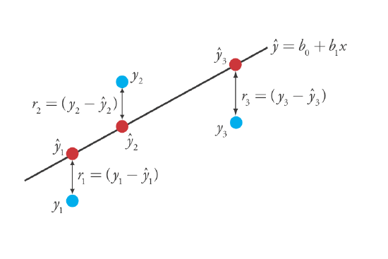
Finding the Slope and y-Intercept for the Regression Model
Although we will not formally develop the mathematical equations for a linear regression analysis, you can find the derivations in many standard statistical texts [ See, for example, Draper, N. R.; Smith, H. Applied Regression Analysis, 3rd ed.; Wiley: New York, 1998]. The resulting equation for the slope, b1, is
\[b_1 = \frac {n \sum_{i = 1}^{n} x_i y_i - \sum_{i = 1}^{n} x_i \sum_{i = 1}^{n} y_i} {n \sum_{i = 1}^{n} x_i^2 - \left( \sum_{i = 1}^{n} x_i \right)^2} \nonumber \]
and the equation for the y-intercept, b0, is
\[b_0 = \frac {\sum_{i = 1}^{n} y_i - b_1 \sum_{i = 1}^{n} x_i} {n} \nonumber \]
Although these equations appear formidable, it is necessary only to evaluate the following four summations
\[\sum_{i = 1}^{n} x_i \quad \sum_{i = 1}^{n} y_i \quad \sum_{i = 1}^{n} x_i y_i \quad \sum_{i = 1}^{n} x_i^2 \nonumber \]
Many calculators, spreadsheets, and other statistical software packages are capable of performing a linear regression analysis based on this model; see Section 8.5 for details on completing a linear regression analysis using R. For illustrative purposes the necessary calculations are shown in detail in the following example.
Using the calibration data in the following table, determine the relationship between the signal, \(y_i\), and the analyte's concentration, \(x_i\), using an unweighted linear regression.
Solution
We begin by setting up a table to help us organize the calculation.
| \(x_i\) | \(y_i\) | \(x_i y_i\) | \(x_i^2\) |
|---|---|---|---|
| 0.000 | 0.00 | 0.000 | 0.000 |
| 0.100 | 12.36 | 1.236 | 0.010 |
| 0.200 | 24.83 | 4.966 | 0.040 |
| 0.300 | 35.91 | 10.773 | 0.090 |
| 0.400 | 48.79 | 19.516 | 0.160 |
| 0.500 | 60.42 | 30.210 | 0.250 |
Adding the values in each column gives
\[\sum_{i = 1}^{n} x_i = 1.500 \quad \sum_{i = 1}^{n} y_i = 182.31 \quad \sum_{i = 1}^{n} x_i y_i = 66.701 \quad \sum_{i = 1}^{n} x_i^2 = 0.550 \nonumber \]
Substituting these values into the equations for the slope and the y-intercept gives
\[b_1 = \frac {(6 \times 66.701) - (1.500 \times 182.31)} {(6 \times 0.550) - (1.500)^2} = 120.706 \approx 120.71 \nonumber \]
\[b_0 = \frac {182.31 - (120.706 \times 1.500)} {6} = 0.209 \approx 0.21 \nonumber \]
The relationship between the signal, \(S\), and the analyte's concentration, \(C_A\), therefore, is
\[S = 120.71 \times C_A + 0.21 \nonumber \]
For now we keep two decimal places to match the number of decimal places in the signal. The resulting calibration curve is shown in Figure \(\PageIndex{28}\).
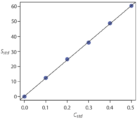
Uncertainty in the Regression Model
As we see in Figure \(\PageIndex{28}\), because of indeterminate errors in the signal, the regression line does not pass through the exact center of each data point. The cumulative deviation of our data from the regression line—the total residual error—is proportional to the uncertainty in the regression. We call this uncertainty the standard deviation about the regression, sr, which is equal to
\[s_r = \sqrt{\frac {\sum_{i = 1}^{n} \left( y_i - \hat{y}_i \right)^2} {n - 2}} \nonumber \]
where yi is the ith experimental value, and \(\hat{y}_i\) is the corresponding value predicted by the regression equation \(\hat{y} = b_0 + b_1 x\). Note that the denominator indicates that our regression analysis has n – 2 degrees of freedom—we lose two degree of freedom because we use two parameters, the slope and the y-intercept, to calculate \(\hat{y}_i\).
A more useful representation of the uncertainty in our regression analysis is to consider the effect of indeterminate errors on the slope, b1, and the y-intercept, b0, which we express as standard deviations.
\[s_{b_1} = \sqrt{\frac {n s_r^2} {n \sum_{i = 1}^{n} x_i^2 - \left( \sum_{i = 1}^{n} x_i \right)^2}} = \sqrt{\frac {s_r^2} {\sum_{i = 1}^{n} \left( x_i - \overline{x} \right)^2}} \nonumber \]
\[s_{b_0} = \sqrt{\frac {s_r^2 \sum_{i = 1}^{n} x_i^2} {n \sum_{i = 1}^{n} x_i^2 - \left( \sum_{i = 1}^{n} x_i \right)^2}} = \sqrt{\frac {s_r^2 \sum_{i = 1}^{n} x_i^2} {n \sum_{i = 1}^{n} \left( x_i - \overline{x} \right)^2}} \nonumber \]
We use these standard deviations to establish confidence intervals for the expected slope, \(\beta_1\), and the expected y-intercept, \(\beta_0\)
\[\beta_1 = b_1 \pm t s_{b_1} \nonumber \]
\[\beta_0 = b_0 \pm t s_{b_0} \nonumber \]
where we select t for a significance level of \(\alpha\) and for n – 2 degrees of freedom. Note that these equations do not contain the factor of \((\sqrt{n})^{-1}\) seen in the confidence intervals for \(\mu\) because the confidence interval here is based on a single regression line.
Calculate the 95% confidence intervals for the slope and y-intercept from Example \(\PageIndex{10}\).
Solution
We begin by calculating the standard deviation about the regression. To do this we must calculate the predicted signals, \(\hat{y}_i\) , using the slope and the y-intercept from Example \(\PageIndex{10}\), and the squares of the residual error, \((y_i - \hat{y}_i)^2\). Using the last standard as an example, we find that the predicted signal is
\[\hat{y}_6 = b_0 + b_1 x_6 = 0.209 + (120.706 \times 0.500) = 60.562 \nonumber \]
and that the square of the residual error is
\[(y_i - \hat{y}_i)^2 = (60.42 - 60.562)^2 = 0.2016 \approx 0.202 \nonumber \]
The following table displays the results for all six solutions.
| \(x_i\) | \(y_i\) | \(\hat{y}_i\) | \(\left( y_i - \hat{y}_i \right)^2\) |
|---|---|---|---|
| 0.000 | 0.00 | 0.209 | 0.0437 |
| 0.100 | 12.36 | 12.280 | 0.0064 |
| 0.200 | 24.83 | 24.350 | 0.2304 |
| 0.300 | 35.91 | 36.421 | 0.2611 |
| 0.400 | 48.79 | 48.491 | 0.0894 |
| 0.500 | 60.42 | 60.562 | 0.0202 |
Adding together the data in the last column gives the numerator in the equation for the standard deviation about the regression; thus
\[s_r = \sqrt{\frac {0.6512} {6 - 2}} = 0.4035 \nonumber \]
Next we calculate the standard deviations for the slope and the y-intercept. The values for the summation terms are from Example \(\PageIndex{10}\).
\[s_{b_1} = \sqrt{\frac {6 \times (0.4035)^2} {(6 \times 0.550) - (1.500)^2}} = 0.965 \nonumber \]
\[s_{b_0} = \sqrt{\frac {(0.4035)^2 \times 0.550} {(6 \times 0.550) - (1.500)^2}} = 0.292 \nonumber \]
Finally, the 95% confidence intervals (\(\alpha = 0.05\), 4 degrees of freedom) for the slope and y-intercept are
\[\beta_1 = b_1 \pm ts_{b_1} = 120.706 \pm (2.78 \times 0.965) = 120.7 \pm 2.7 \nonumber \]
\[\beta_0 = b_0 \pm ts_{b_0} = 0.209 \pm (2.78 \times 0.292) = 0.2 \pm 0.80 \nonumber \]
where t(0.05, 4) from Appendix 3 is 2.78. The standard deviation about the regression, sr, suggests that the signal, Sstd, is precise to one decimal place. For this reason we report the slope and the y-intercept to a single decimal place.
Using the Regression Model to Determine a Value for x Given a Value for y
Once we have our regression equation, it is easy to determine the concentration of analyte in a sample. When we use a normal calibration curve, for example, we measure the signal for our sample, Ssamp, and calculate the analyte’s concentration, CA, using the regression equation.
\[C_A = \frac {S_{samp} - b_0} {b_1} \nonumber \]
What is less obvious is how to report a confidence interval for CA that expresses the uncertainty in our analysis. To calculate a confidence interval we need to know the standard deviation in the analyte’s concentration, \(s_{C_A}\), which is given by the following equation
\[s_{C_A} = \frac {s_r} {b_1} \sqrt{\frac {1} {m} + \frac {1} {n} + \frac {\left( \overline{S}_{samp} - \overline{S}_{std} \right)^2} {(b_1)^2 \sum_{i = 1}^{n} \left( C_{std_i} - \overline{C}_{std} \right)^2}} \nonumber \]
where m is the number of replicates we use to establish the sample’s average signal, Ssamp, n is the number of calibration standards, Sstd is the average signal for the calibration standards, and \(C_{std_i}\) and \(\overline{C}_{std}\) are the individual and the mean concentrations for the calibration standards. Knowing the value of \(s_{C_A}\), the confidence interval for the analyte’s concentration is
\[\mu_{C_A} = C_A \pm t s_{C_A} \nonumber \]
where \(\mu_{C_A}\) is the expected value of CA in the absence of determinate errors, and with the value of t is based on the desired level of confidence and n – 2 degrees of freedom.
A close examination of these equations should convince you that we can decrease the uncertainty in the predicted concentration of analyte, \(C_A\) if we increase the number of standards, \(n\), increase the number of replicate samples that we analyze, \(m\), and if the sample’s average signal, \(\overline{S}_{samp}\), is equal to the average signal for the standards, \(\overline{S}_{std}\). When practical, you should plan your calibration curve so that Ssamp falls in the middle of the calibration curve. For more information about these regression equations see (a) Miller, J. N. Analyst 1991, 116, 3–14; (b) Sharaf, M. A.; Illman, D. L.; Kowalski, B. R. Chemometrics, Wiley-Interscience: New York, 1986, pp. 126-127; (c) Analytical Methods Committee “Uncertainties in concentrations estimated from calibration experiments,” AMC Technical Brief, March 2006.
The equation for the standard deviation in the analyte's concentration is written in terms of a calibration experiment. A more general form of the equation, written in terms of x and y, is given here.
\[s_{x} = \frac {s_r} {b_1} \sqrt{\frac {1} {m} + \frac {1} {n} + \frac {\left( \overline{Y} - \overline{y} \right)^2} {(b_1)^2 \sum_{i = 1}^{n} \left( x_i - \overline{x} \right)^2}} \nonumber \]
Three replicate analyses for a sample that contains an unknown concentration of analyte, yields values for Ssamp of 29.32, 29.16 and 29.51 (arbitrary units). Using the results from Example \(\PageIndex{10}\) and Example \(\PageIndex{11}\), determine the analyte’s concentration, CA, and its 95% confidence interval.
Solution
The average signal, \(\overline{S}_{samp}\), is 29.33, which, using the slope and the y-intercept from Example \(\PageIndex{10}\), gives the analyte’s concentration as
\[C_A = \frac {\overline{S}_{samp} - b_0} {b_1} = \frac {29.33 - 0.209} {120.706} = 0.241 \nonumber \]
To calculate the standard deviation for the analyte’s concentration we must determine the values for \(\overline{S}_{std}\) and for \(\sum_{i = 1}^{2} (C_{std_i} - \overline{C}_{std})^2\). The former is just the average signal for the calibration standards, which, using the data in Table \(\PageIndex{10}\), is 30.385. Calculating \(\sum_{i = 1}^{2} (C_{std_i} - \overline{C}_{std})^2\) looks formidable, but we can simplify its calculation by recognizing that this sum-of-squares is the numerator in a standard deviation equation; thus,
\[\sum_{i = 1}^{n} (C_{std_i} - \overline{C}_{std})^2 = (s_{C_{std}})^2 \times (n - 1) \nonumber \]
where \(s_{C_{std}}\) is the standard deviation for the concentration of analyte in the calibration standards. Using the data in Table \(\PageIndex{10}\) we find that \(s_{C_{std}}\) is 0.1871 and
\[\sum_{i = 1}^{n} (C_{std_i} - \overline{C}_{std})^2 = (0.1872)^2 \times (6 - 1) = 0.175 \nonumber \]
Substituting known values into the equation for \(s_{C_A}\) gives
\[s_{C_A} = \frac {0.4035} {120.706} \sqrt{\frac {1} {3} + \frac {1} {6} + \frac {(29.33 - 30.385)^2} {(120.706)^2 \times 0.175}} = 0.0024 \nonumber \]
Finally, the 95% confidence interval for 4 degrees of freedom is
\[\mu_{C_A} = C_A \pm ts_{C_A} = 0.241 \pm (2.78 \times 0.0024) = 0.241 \pm 0.007 \nonumber \]
Figure \(\PageIndex{29}\) shows the calibration curve with curves showing the 95% confidence interval for CA.
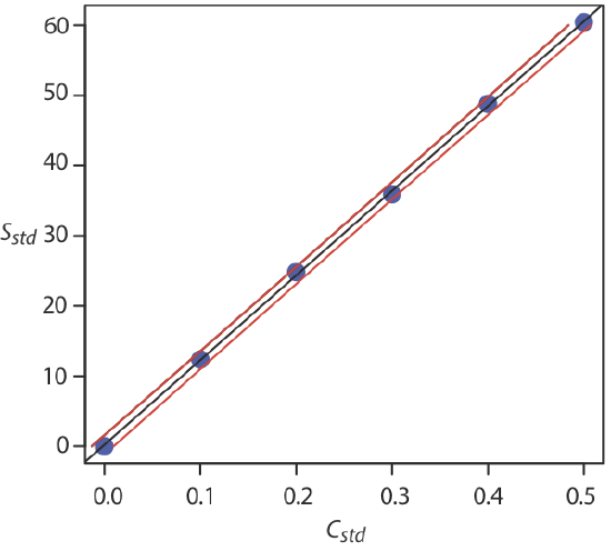
Evaluating a Regression Model
You should never accept the result of a linear regression analysis without evaluating the validity of the model. Perhaps the simplest way to evaluate a regression analysis is to examine the residual errors. As we saw earlier, the residual error for a single calibration standard, ri, is
\[r_i = (y_i - \hat{y}_i) \nonumber \]
If the regression model is valid, then the residual errors should be distributed randomly about an average residual error of zero, with no apparent trend toward either smaller or larger residual errors (Figure \(\PageIndex{30a}\)). Trends such as those in Figure \(\PageIndex{30b}\) and Figure \(\PageIndex{30c}\) provide evidence that at least one of the model’s assumptions is incorrect. For example, a trend toward larger residual errors at higher concentrations, Figure \(\PageIndex{30b}\), suggests that the indeterminate errors affecting the signal are not independent of the analyte’s concentration. In Figure \(\PageIndex{30c}\), the residual errors are not random, which suggests we cannot model the data using a straight-line relationship. Regression methods for the latter two cases are discussed in the following sections.
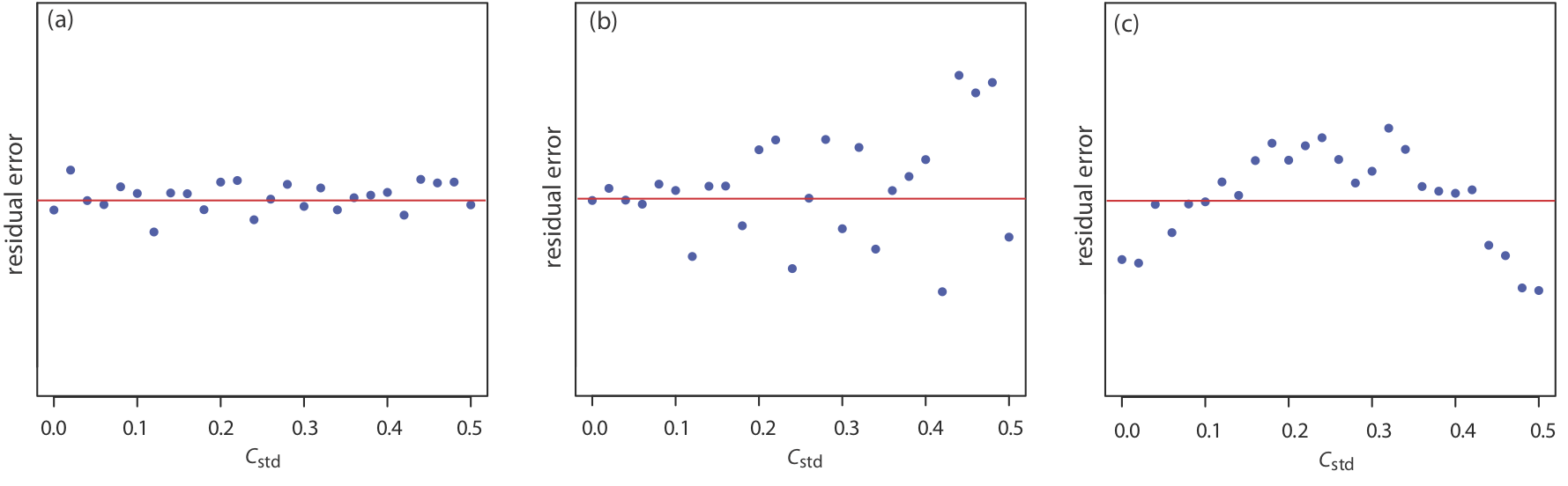
Use your results from Exercise \(\PageIndex{10}\) to construct a residual plot and explain its significance.
Solution
To create a residual plot, we need to calculate the residual error for each standard. The following table contains the relevant information.
| \(x_i\) | \(y_i\) | \(\hat{y}_i\) | \(y_i - \hat{y}_i\) |
|---|---|---|---|
| 0.000 | 0.000 | 0.0015 | –0.0015 |
| \(1.55 \times 10^{-3}\) | 0.050 | 0.0473 | 0.0027 |
| \(3.16 \times 10^{-3}\) | 0.093 | 0.0949 | –0.0019 |
| \(4.74 \times 10^{-3}\) | 0.143 | 0.1417 | 0.0013 |
| \(6.34 \times 10^{-3}\) | 0.188 | 0.1890 | –0.0010 |
| \(7.92 \times 10^{-3}\) | 0.236 | 0.2357 | 0.0003 |
The figure below shows a plot of the resulting residual errors. The residual errors appear random, although they do alternate in sign, and they do not show any significant dependence on the analyte’s concentration. Taken together, these observations suggest that our regression model is appropriate.
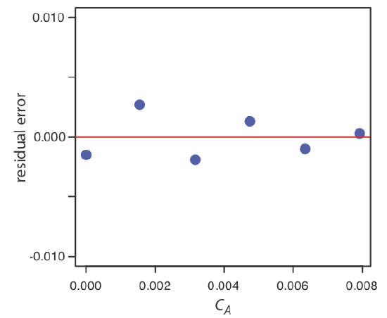
Weighted Linear Regression With Errors in y
Our treatment of linear regression to this point assumes that any indeterminate errors that affect y are independent of the value of x. If this assumption is false, then we must include the variance for each value of y in our determination of the y-intercept, b0, and the slope, b1; thus
\[b_0 = \frac {\sum_{i = 1}^{n} w_i y_i - b_1 \sum_{i = 1}^{n} w_i x_i} {n} \nonumber \]
\[b_1 = \frac {n \sum_{i = 1}^{n} w_i x_i y_i - \sum_{i = 1}^{n} w_i x_i \sum_{i = 1}^{n} w_i y_i} {n \sum_{i =1}^{n} w_i x_i^2 - \left( \sum_{i = 1}^{n} w_i x_i \right)^2} \nonumber \]
where wi is a weighting factor that accounts for the variance in yi
\[w_i = \frac {n (s_{y_i})^{-2}} {\sum_{i = 1}^{n} (s_{y_i})^{-2}} \nonumber \]
and \(s_{y_i}\) is the standard deviation for yi. In a weighted linear regression, each xy-pair’s contribution to the regression line is inversely proportional to the precision of yi; that is, the more precise the value of y, the greater its contribution to the regression.
Shown here are data for an external standardization in which sstd is the standard deviation for three replicate determination of the signal.
| \(C_{std}\) (arbitrary units) | \(S_{std}\) (arbitrary units) | \(s_{std}\) |
|---|---|---|
| 0.000 | 0.00 | 0.02 |
| 0.100 | 12.36 | 0.02 |
| 0.200 | 24.83 | 0.07 |
| 0.300 | 35.91 | 0.13 |
| 0.400 | 48.79 | 0.22 |
| 0.500 | 60.42 | 0.33 |
Determine the calibration curve’s equation using a weighted linear regression. As you work through this example, remember that x corresponds to Cstd, and that y corresponds to Sstd.
Solution
We begin by setting up a table to aid in calculating the weighting factors.
| \(C_{std}\) (arbitrary units) | \(S_{std}\) (arbitrary units) | \(s_{std}\) | \((s_{y_i})^{-2}\) | \(w_i\) |
|---|---|---|---|---|
| 0.000 | 0.00 | 0.02 | 2500.00 | 2.8339 |
| 0.100 | 12.36 | 0.02 | 250.00 | 2.8339 |
| 0.200 | 24.83 | 0.07 | 204.08 | 0.2313 |
| 0.300 | 35.91 | 0.13 | 59.17 | 0.0671 |
| 0.400 | 48.79 | 0.22 | 20.66 | 0.0234 |
| 0.500 | 60.42 | 0.33 | 9.18 | 0.0104 |
Adding together the values in the fourth column gives
\[\sum_{i = 1}^{n} (s_{y_i})^{-2} \nonumber \]
which we use to calculate the individual weights in the last column. As a check on your calculations, the sum of the individual weights must equal the number of calibration standards, n. The sum of the entries in the last column is 6.0000, so all is well. After we calculate the individual weights, we use a second table to aid in calculating the four summation terms in the equations for the slope, \(b_1\), and the y-intercept, \(b_0\).
| \(x_i\) | \(y_i\) | \(w_i\) | \(w_i x_i\) | \(w_i y_i\) | \(w_i x_i^2\) | \(w_i x_i y_i\) |
|---|---|---|---|---|---|---|
| 0.000 | 0.00 | 2.8339 | 0.0000 | 0.0000 | 0.0000 | 0.0000 |
| 0.100 | 12.36 | 2.8339 | 0.2834 | 35.0270 | 0.0283 | 3.5027 |
| 0.200 | 24.83 | 0.2313 | 0.0463 | 5.7432 | 0.0093 | 1.1486 |
| 0.300 | 35.91 | 0.0671 | 0.0201 | 2.4096 | 0.0060 | 0.7229 |
| 0.400 | 48.79 | 0.0234 | 0.0094 | 1.1417 | 0.0037 | 0.4567 |
| 0.500 | 60.42 | 0.0104 | 0.0052 | 0.6284 | 0.0026 | 0.3142 |
Adding the values in the last four columns gives
\[\sum_{i = 1}^{n} w_i x_i = 0.3644 \quad \sum_{i = 1}^{n} w_i y_i = 44.9499 \quad \sum_{i = 1}^{n} w_i x_i^2 = 0.0499 \quad \sum_{i = 1}^{n} w_i x_i y_i = 6.1451 \nonumber \]
which gives the estimated slope and the estimated y-intercept as
\[b_1 = \frac {(6 \times 6.1451) - (0.3644 \times 44.9499)} {(6 \times 0.0499) - (0.3644)^2} = 122.985 \nonumber \]
\[b_0 = \frac{44.9499 - (122.985 \times 0.3644)} {6} = 0.0224 \nonumber \]
The calibration equation is
\[S_{std} = 122.98 \times C_{std} + 0.2 \nonumber \]
Figure \(\PageIndex{31}\) shows the calibration curve for the weighted regression determined here and the calibration curve for the unweighted regression. Although the two calibration curves are very similar, there are slight differences in the slope and in the y-intercept. Most notably, the y-intercept for the weighted linear regression is closer to the expected value of zero. Because the standard deviation for the signal, Sstd, is smaller for smaller concentrations of analyte, Cstd, a weighted linear regression gives more emphasis to these standards, allowing for a better estimate of the y-intercept.
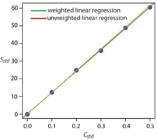
Equations for calculating confidence intervals for the slope, the y-intercept, and the concentration of analyte when using a weighted linear regression are not as easy to define as for an unweighted linear regression [Bonate, P. J. Anal. Chem. 1993, 65, 1367–1372]. The confidence interval for the analyte’s concentration, however, is at its optimum value when the analyte’s signal is near the weighted centroid, yc , of the calibration curve.
\[y_c = \frac {1} {n} \sum_{i = 1}^{n} w_i x_i \nonumber \]
Weighted Linear Regression With Errors in x and y
If we remove our assumption that indeterminate errors affecting a calibration curve are present only in the signal (y), then we also must factor into the regression model the indeterminate errors that affect the analyte’s concentration in the calibration standards (x). The solution for the resulting regression line is computationally more involved than that for either the unweighted or weighted regression lines. Although we will not consider the details in this textbook, you should be aware that neglecting the presence of indeterminate errors in x can bias the results of a linear regression.
See, for example, Analytical Methods Committee, “Fitting a linear functional relationship to data with error on both variable,” AMC Technical Brief, March, 2002), as well as this chapter’s Additional Resources.
Curvilinear, Multivariable, and Multivariate Regression
A straight-line regression model, despite its apparent complexity, is the simplest functional relationship between two variables. What do we do if our calibration curve is curvilinear—that is, if it is a curved-line instead of a straight-line? One approach is to try transforming the data into a straight-line. Logarithms, exponentials, reciprocals, square roots, and trigonometric functions have been used in this way. A plot of log(y) versus x is a typical example. Such transformations are not without complications, of which the most obvious is that data with a uniform variance in y will not maintain that uniform variance after it is transformed.
It is worth noting here that the term “linear” does not mean a straight-line. A linear function may contain more than one additive term, but each such term has one and only one adjustable multiplicative parameter. The function
\[y = ax + bx^2 \nonumber \]
is an example of a linear function because the terms x and x2 each include a single multiplicative parameter, a and b, respectively. The function
\[y = x^b \nonumber \]
is nonlinear because b is not a multiplicative parameter; it is, instead, a power. This is why you can use linear regression to fit a polynomial equation to your data.
Sometimes it is possible to transform a nonlinear function into a linear function. For example, taking the log of both sides of the nonlinear function above gives a linear function.
\[\log(y) = b \log(x) \nonumber \]
Another approach to developing a linear regression model is to fit a polynomial equation to the data, such as \(y = a + b x + c x^2\). You can use linear regression to calculate the parameters a, b, and c, although the equations are different than those for the linear regression of a straight-line. If you cannot fit your data using a single polynomial equation, it may be possible to fit separate polynomial equations to short segments of the calibration curve. The result is a single continuous calibration curve known as a spline function. The use of R for curvilinear regression is included in Chapter 8.5.
For details about curvilinear regression, see (a) Sharaf, M. A.; Illman, D. L.; Kowalski, B. R. Chemometrics, Wiley-Interscience: New York, 1986; (b) Deming, S. N.; Morgan, S. L. Experimental Design: A Chemometric Approach, Elsevier: Amsterdam, 1987.
The regression models in this chapter apply only to functions that contain a single dependent variable and a single independent variable. One example is the simplest form of Beer's law in which the absorbance, \(A\), of a sample at a single wavelength, \(\lambda\), depends upon the concentration of a single analyte, \(C_A\)
\[A_{\lambda} = \epsilon_{\lambda, A} b C_A \nonumber \]
where \(\epsilon_{\lambda, A}\) is the analyte's molar absorptivity at the selected wavelength and \(b\) is the pathlength through the sample. In the presence of an interferent, \(I\), however, the signal may depend on the concentrations of both the analyte and the interferent
\[A_{\lambda} = \epsilon_{\lambda, A} b C_A + \epsilon_{\lambda, I} b C_I \nonumber \]
where \(\epsilon_{\lambda, I}\) is the interferent’s molar absorptivity and CI is the interferent’s concentration. This is an example of multivariable regression, which is covered in more detail in Chapter 9 when we consider the optimization of experiments where there is a single dependent variable and two or more independent variables.
In multivariate regression we have both multiple dependent variables, such as the absorbance of samples at two or more wavelengths, and multiple independent variables, such as the concentrations of two or more analytes in the samples. As discussed in Chapter 0.2, we can represent this using matrix notation
\[\begin{bmatrix} \cdots & \cdots & \cdots \\ \vdots & A & \vdots \\ \cdots & \cdots & \cdots \end{bmatrix}_{r \times c} = \begin{bmatrix} \cdots & \cdots & \cdots \\ \vdots & \epsilon b & \vdots \\ \cdots & \cdots & \cdots \end{bmatrix}_{r \times n} \times \begin{bmatrix} \cdots & \cdots & \cdots \\ \vdots & C & \vdots \\ \cdots & \cdots & \cdots \end{bmatrix}_{n \times c} \nonumber \]
where there are \(r\) wavelengths, \(c\) samples, and \(n\) analytes. Each column in the \(\epsilon b\) matrix, for example, holds the \(\epsilon b\) value for a different analyte at one of \(r\) wavelengths, and each row in the \(C\) matrix is the concentration of one of the \(n\) analytes in one of the \(c\) samples. We will consider this approach in more detail in Chapter 11.
For a nice discussion of the difference between multivariable regression and multivariate regression, see Hidalgo, B.; Goodman, M. "Multivariate or Multivariable Regression," Am. J. Public Health, 2013, 103, 39-40.