
Choosing the Right Graph
- Page ID
- 279151

\( \newcommand{\vecs}[1]{\overset { \scriptstyle \rightharpoonup} {\mathbf{#1}} } \)
\( \newcommand{\vecd}[1]{\overset{-\!-\!\rightharpoonup}{\vphantom{a}\smash {#1}}} \)
\( \newcommand{\dsum}{\displaystyle\sum\limits} \)
\( \newcommand{\dint}{\displaystyle\int\limits} \)
\( \newcommand{\dlim}{\displaystyle\lim\limits} \)
\( \newcommand{\id}{\mathrm{id}}\) \( \newcommand{\Span}{\mathrm{span}}\)
( \newcommand{\kernel}{\mathrm{null}\,}\) \( \newcommand{\range}{\mathrm{range}\,}\)
\( \newcommand{\RealPart}{\mathrm{Re}}\) \( \newcommand{\ImaginaryPart}{\mathrm{Im}}\)
\( \newcommand{\Argument}{\mathrm{Arg}}\) \( \newcommand{\norm}[1]{\| #1 \|}\)
\( \newcommand{\inner}[2]{\langle #1, #2 \rangle}\)
\( \newcommand{\Span}{\mathrm{span}}\)
\( \newcommand{\id}{\mathrm{id}}\)
\( \newcommand{\Span}{\mathrm{span}}\)
\( \newcommand{\kernel}{\mathrm{null}\,}\)
\( \newcommand{\range}{\mathrm{range}\,}\)
\( \newcommand{\RealPart}{\mathrm{Re}}\)
\( \newcommand{\ImaginaryPart}{\mathrm{Im}}\)
\( \newcommand{\Argument}{\mathrm{Arg}}\)
\( \newcommand{\norm}[1]{\| #1 \|}\)
\( \newcommand{\inner}[2]{\langle #1, #2 \rangle}\)
\( \newcommand{\Span}{\mathrm{span}}\) \( \newcommand{\AA}{\unicode[.8,0]{x212B}}\)
\( \newcommand{\vectorA}[1]{\vec{#1}} % arrow\)
\( \newcommand{\vectorAt}[1]{\vec{\text{#1}}} % arrow\)
\( \newcommand{\vectorB}[1]{\overset { \scriptstyle \rightharpoonup} {\mathbf{#1}} } \)
\( \newcommand{\vectorC}[1]{\textbf{#1}} \)
\( \newcommand{\vectorD}[1]{\overrightarrow{#1}} \)
\( \newcommand{\vectorDt}[1]{\overrightarrow{\text{#1}}} \)
\( \newcommand{\vectE}[1]{\overset{-\!-\!\rightharpoonup}{\vphantom{a}\smash{\mathbf {#1}}}} \)
\( \newcommand{\vecs}[1]{\overset { \scriptstyle \rightharpoonup} {\mathbf{#1}} } \)
\(\newcommand{\longvect}{\overrightarrow}\)
\( \newcommand{\vecd}[1]{\overset{-\!-\!\rightharpoonup}{\vphantom{a}\smash {#1}}} \)
\(\newcommand{\avec}{\mathbf a}\) \(\newcommand{\bvec}{\mathbf b}\) \(\newcommand{\cvec}{\mathbf c}\) \(\newcommand{\dvec}{\mathbf d}\) \(\newcommand{\dtil}{\widetilde{\mathbf d}}\) \(\newcommand{\evec}{\mathbf e}\) \(\newcommand{\fvec}{\mathbf f}\) \(\newcommand{\nvec}{\mathbf n}\) \(\newcommand{\pvec}{\mathbf p}\) \(\newcommand{\qvec}{\mathbf q}\) \(\newcommand{\svec}{\mathbf s}\) \(\newcommand{\tvec}{\mathbf t}\) \(\newcommand{\uvec}{\mathbf u}\) \(\newcommand{\vvec}{\mathbf v}\) \(\newcommand{\wvec}{\mathbf w}\) \(\newcommand{\xvec}{\mathbf x}\) \(\newcommand{\yvec}{\mathbf y}\) \(\newcommand{\zvec}{\mathbf z}\) \(\newcommand{\rvec}{\mathbf r}\) \(\newcommand{\mvec}{\mathbf m}\) \(\newcommand{\zerovec}{\mathbf 0}\) \(\newcommand{\onevec}{\mathbf 1}\) \(\newcommand{\real}{\mathbb R}\) \(\newcommand{\twovec}[2]{\left[\begin{array}{r}#1 \\ #2 \end{array}\right]}\) \(\newcommand{\ctwovec}[2]{\left[\begin{array}{c}#1 \\ #2 \end{array}\right]}\) \(\newcommand{\threevec}[3]{\left[\begin{array}{r}#1 \\ #2 \\ #3 \end{array}\right]}\) \(\newcommand{\cthreevec}[3]{\left[\begin{array}{c}#1 \\ #2 \\ #3 \end{array}\right]}\) \(\newcommand{\fourvec}[4]{\left[\begin{array}{r}#1 \\ #2 \\ #3 \\ #4 \end{array}\right]}\) \(\newcommand{\cfourvec}[4]{\left[\begin{array}{c}#1 \\ #2 \\ #3 \\ #4 \end{array}\right]}\) \(\newcommand{\fivevec}[5]{\left[\begin{array}{r}#1 \\ #2 \\ #3 \\ #4 \\ #5 \\ \end{array}\right]}\) \(\newcommand{\cfivevec}[5]{\left[\begin{array}{c}#1 \\ #2 \\ #3 \\ #4 \\ #5 \\ \end{array}\right]}\) \(\newcommand{\mattwo}[4]{\left[\begin{array}{rr}#1 \amp #2 \\ #3 \amp #4 \\ \end{array}\right]}\) \(\newcommand{\laspan}[1]{\text{Span}\{#1\}}\) \(\newcommand{\bcal}{\cal B}\) \(\newcommand{\ccal}{\cal C}\) \(\newcommand{\scal}{\cal S}\) \(\newcommand{\wcal}{\cal W}\) \(\newcommand{\ecal}{\cal E}\) \(\newcommand{\coords}[2]{\left\{#1\right\}_{#2}}\) \(\newcommand{\gray}[1]{\color{gray}{#1}}\) \(\newcommand{\lgray}[1]{\color{lightgray}{#1}}\) \(\newcommand{\rank}{\operatorname{rank}}\) \(\newcommand{\row}{\text{Row}}\) \(\newcommand{\col}{\text{Col}}\) \(\renewcommand{\row}{\text{Row}}\) \(\newcommand{\nul}{\text{Nul}}\) \(\newcommand{\var}{\text{Var}}\) \(\newcommand{\corr}{\text{corr}}\) \(\newcommand{\len}[1]{\left|#1\right|}\) \(\newcommand{\bbar}{\overline{\bvec}}\) \(\newcommand{\bhat}{\widehat{\bvec}}\) \(\newcommand{\bperp}{\bvec^\perp}\) \(\newcommand{\xhat}{\widehat{\xvec}}\) \(\newcommand{\vhat}{\widehat{\vvec}}\) \(\newcommand{\uhat}{\widehat{\uvec}}\) \(\newcommand{\what}{\widehat{\wvec}}\) \(\newcommand{\Sighat}{\widehat{\Sigma}}\) \(\newcommand{\lt}{<}\) \(\newcommand{\gt}{>}\) \(\newcommand{\amp}{&}\) \(\definecolor{fillinmathshade}{gray}{0.9}\)Data presentation is an important skill in analytical chemistry. At a minimum graphs and tables should present data clearly and completely. Publication worthy figures should be designed to emphasize important points of scientific discussion. A good graph will make the reader instantly learn something about the data or theory before he/she reads the accompanying text. Sloppy graphs cause confusion and minimize the scientific impact. It is RARE that the “default” settings on a graphing program such as Microsoft Excel will generate an optimized image suitable for scientific publication. This activity will illustrate multiple ways of presenting the same data and allow students to explore the pros and cons of each. Students should try to approach each of these discussions as a reader who knows nothing about the data -- how does a particular graph help draw on an individual’s scientific foundations for interpretation?
Objectives for Choosing the Right Graph
By the end of this activity students should be able to:
- Recognize the shortcomings of “default” graphs in a software program.
- Be able to articulate why a particular graph is problematic for formal publication.
- Recognize that complex experiments often contain more than one variable requiring choices about how to present the data.
- Articulate how figure formatting can alter the focus of the scientific presentation.
- Outline how your personal work within lab reports meets or falls short of ACS requirements as outlined in author instructions within the ACS Style Guide.
Note: This activity is designed for small group work with group white board; but it could be easily modified for in-class paper handouts.
Advanced Readings: ACS Style Guide, Chapter 15: Figures
1.1 Designing a Graph for Lab Reports (Default Graphs)
Suppose you have collected the following data during lab: The experiment compared the standard curves generated by testing five-standards and one-unknown on two different hand-held Raman Spectrophotometers.
Table 1:
|
wt% K2CO3 |
Instrument #1 (Metrohm, Mira-M1) |
Instrument #2 (SnowyRange,CBEx) |
|---|---|---|
|
6.0 |
580.0 |
539.2 |
|
10.0 |
1,804.0 |
837.5 |
|
15.0 |
4,090.5 |
917.5 |
|
25.2 |
6,385.5 |
1,816.4 |
|
35.7 |
12,718.5 |
2,312.0 |
|
Unknown Sample |
12,520.3 |
1,334.9 |
ACTION: As an individual graph both data series on a single figure using the default settings in Excel. Should this be an “XY Scatter” plot or a “Line” plot? If you do not have your laptop with you consider the default graph below:
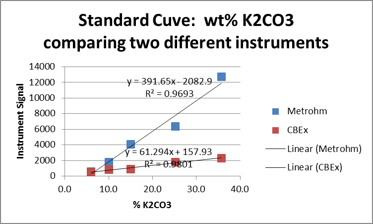
SMALL GROUP DISCUSSION: Consider the default graph generated by the software program. Compile a table with two columns listing STRENGTHS and WEAKNESSES of this figure (record on your whiteboard).
STOP
1.2 Designing a Graph for Lab Reports (Default Graphs)
SMALL GROUP DISCUSSION: Now consider a modified graph of the same data. Again, make a list of STRENGTHS and WEAKNESSES. Are there particular aspects of the graph that you like / don’t like?
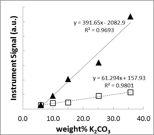
Figure 1: Comparison of the standard curves from two different Raman Spectroscopy Instruments.
(▲) Metrohm Mira-M1. (◻) SnowyRange CBEx.
STOP
1.3 Designing a Graph for Lab Reports (Default Graphs)
SMALL GROUP DISCUSSION: Keep in mind scientific journals are typically printed in a two column format. Next consider the two graphs side by side.
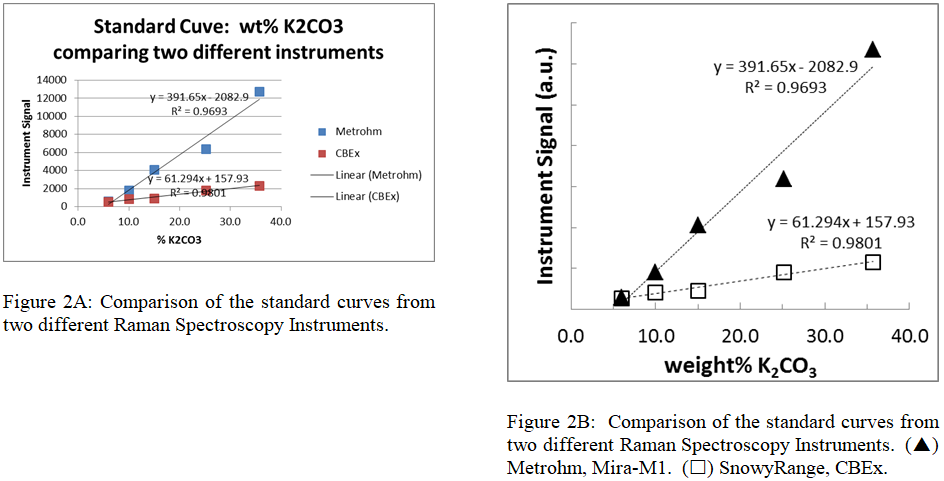
- Are there any new issues an author must keep in mind when designing a figure to fit within a double column format?
- How does the author decide what should / should not be included in the caption?
STOP
2.1 Designing a Graph to Emphasize a Scientific Idea
There are many graphs beyond the simple standard curve. Often the data collected on a particular experiment will reveal some fundamental information about the system. It is important to stay focused on the important ideas that you need to convey when designing a figure. Some questions you should ask yourself when presenting data are:
- What story am I trying to tell with my data?
- What is the best way to tell this story?
- Are there any problems with the way I am telling this story? If yes, how can I fix the problems?
BACKGROUND: A vibrating bond can be approximated by the motion of two weights attached to a Newtonian spring. One such approximation used during our Raman Spectroscopy Experiment states that the natural frequency of an oscillating bond can be written as
\[\nu_m = \dfrac{1}{2\pi}\sqrt{\dfrac{k}{m_{effective}}}\nonumber\]
Where νm is the natural frequency of the mechanical oscillator, k is the force constant modelling the chemical bond as a Newtonian spring, and m is the effective mass of the two attached chemical species.
During lab a student use the Raman Spectrophotometer to monitor the symmetrical vibration frequency of an oxyanion series. He/she then used the equation above to calculate a force constant for each oxyanion.
Table 2: Spectroscopic Analysis of Oxyanion Salts
|
Ion |
Compound |
Literature Wavenumber (cm-1) |
|---|---|---|
|
Carbonate |
K2CO3 |
1063 |
|
Nitrate |
KNO3 |
1060 |
|
Phosphate |
KH2PO4 |
938 |
|
Sulfate |
(NH4)2SO4 |
983 |
|
Chromate |
K2CrO4 |
846 |
|
Iodate |
KIO4 |
791 |
There are LOTS of ways to present the collected data. Consider the equation and the following figures. What is the important message of each?
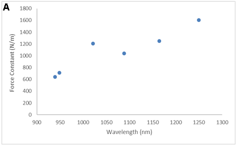
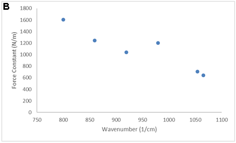
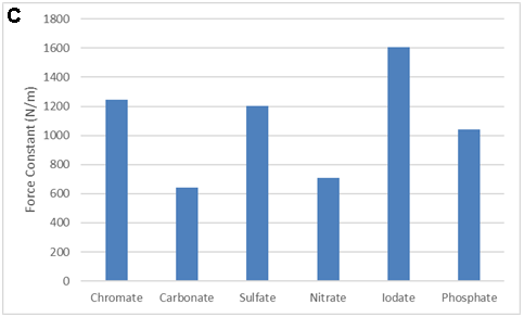
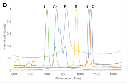
SMALL GROUP DISCUSSION: Consider the figures above:
- What story is each figure trying to tell? (Quantitative information, qualitative information? Both? Neither?)
- What works? What does not work for some of these figures?
- Can you propose of a modification that would be even better? (crudely sketch it)
STOP
2.2 Designing a Graph to Emphasize a Scientific Idea
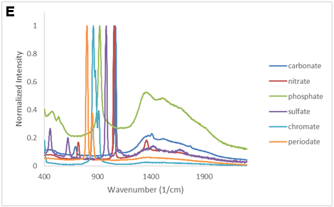
Similar to the previous section, Raman spectroscopy can be used to probe the force constant for a series of Period-4 metal nitrates.
\[\nu_m = \dfrac{1}{2\pi}\sqrt{\dfrac{k}{m_{effective}}}\nonumber\]
SMALL GROUP DISCUSSION: Consider the figures below:
- What story is each figure trying to tell?
- What works? What does not work for some of these figures?
- Is there a limit to how many different spectra you should put on one figure? (hint, check the ACS style guide for advice)
- Can you propose of a modification that would be even better? (crudely sketch it)

STOP
3.1 Self Evaluation
Review your two most recent lab reports. Evaluate the graphs you presented in your report based on what you learned in this activity.
|
Figure # _______ |
|---|
|
What “story” were you trying to tell?
|
|
In what ways were you successful?
|
|
In what ways did you fall short?
|
|
How can you improve the figure?
|
|
Figure # _______ |
|
What “story” were you trying to tell?
|
|
In what ways were you successful?
|
|
In what ways did you fall short?
|
|
How can you improve the figure?
|
END
Contributors and Attributions
- Jennifer Monahan (Jennifer.monahan@slu.edu) and John B. Coulton, Saint Louis University
- This short activity is intended as a resource on the ASDL website. It is aimed at Junior and Senior Chemistry Majors who are writing full laboratory reports in the style of an ACS Journal publication.