
1.3 Graphing Lab Activity
- Page ID
- 455880
\( \newcommand{\vecs}[1]{\overset { \scriptstyle \rightharpoonup} {\mathbf{#1}} } \)
\( \newcommand{\vecd}[1]{\overset{-\!-\!\rightharpoonup}{\vphantom{a}\smash {#1}}} \)
\( \newcommand{\id}{\mathrm{id}}\) \( \newcommand{\Span}{\mathrm{span}}\)
( \newcommand{\kernel}{\mathrm{null}\,}\) \( \newcommand{\range}{\mathrm{range}\,}\)
\( \newcommand{\RealPart}{\mathrm{Re}}\) \( \newcommand{\ImaginaryPart}{\mathrm{Im}}\)
\( \newcommand{\Argument}{\mathrm{Arg}}\) \( \newcommand{\norm}[1]{\| #1 \|}\)
\( \newcommand{\inner}[2]{\langle #1, #2 \rangle}\)
\( \newcommand{\Span}{\mathrm{span}}\)
\( \newcommand{\id}{\mathrm{id}}\)
\( \newcommand{\Span}{\mathrm{span}}\)
\( \newcommand{\kernel}{\mathrm{null}\,}\)
\( \newcommand{\range}{\mathrm{range}\,}\)
\( \newcommand{\RealPart}{\mathrm{Re}}\)
\( \newcommand{\ImaginaryPart}{\mathrm{Im}}\)
\( \newcommand{\Argument}{\mathrm{Arg}}\)
\( \newcommand{\norm}[1]{\| #1 \|}\)
\( \newcommand{\inner}[2]{\langle #1, #2 \rangle}\)
\( \newcommand{\Span}{\mathrm{span}}\) \( \newcommand{\AA}{\unicode[.8,0]{x212B}}\)
\( \newcommand{\vectorA}[1]{\vec{#1}} % arrow\)
\( \newcommand{\vectorAt}[1]{\vec{\text{#1}}} % arrow\)
\( \newcommand{\vectorB}[1]{\overset { \scriptstyle \rightharpoonup} {\mathbf{#1}} } \)
\( \newcommand{\vectorC}[1]{\textbf{#1}} \)
\( \newcommand{\vectorD}[1]{\overrightarrow{#1}} \)
\( \newcommand{\vectorDt}[1]{\overrightarrow{\text{#1}}} \)
\( \newcommand{\vectE}[1]{\overset{-\!-\!\rightharpoonup}{\vphantom{a}\smash{\mathbf {#1}}}} \)
\( \newcommand{\vecs}[1]{\overset { \scriptstyle \rightharpoonup} {\mathbf{#1}} } \)
\( \newcommand{\vecd}[1]{\overset{-\!-\!\rightharpoonup}{\vphantom{a}\smash {#1}}} \)
Graphing Lab Activity
Part 1: Using a Workbook Template
Graphing Lab Report Links
Google Sheet Template: this link makes a copy of the lab template that you use to develop your Google Lab Workbook
Google Form: for registering your workbook with your instructor
Click Spreadsheet above to get a copy of the spreadsheet. Once that is done click Share Spreadsheet with Instructor, click the link to the Form for your lab and lab section.
Part 2: Linking Workbook with Instructor
Share Spreadsheet
Sheet Skills
How to turn on link sharing to give Instructor Access and Submit Spreadsheet
- Instructions
-
To turn in your spreadsheet we need to enable link sharing. Your sheet may look slightly different depending on your university but the steps will still be the same.
Open the form your instructor sent you and your copy of the spreadsheet.
- On your Spreadsheet Click Share in the top Right Corner (Figure 1)
- Go down to Get Link and click Change link (Figure 1)
- Change permissions to Editor (Figure 2)
- Press Copy Link (Figure 2)
- Go to the form and fill out your email and Name
- When it asks for your Link to Spreadsheet paste the link we copied in step 4.
- Submit your form
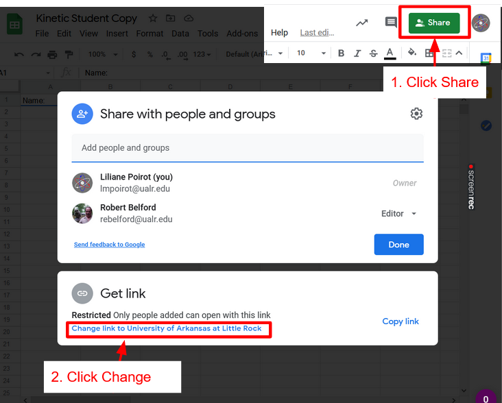
Figure \(\PageIndex{1}\): Click Share at the top Right of your spreadsheet. Then click change link (Poirot) 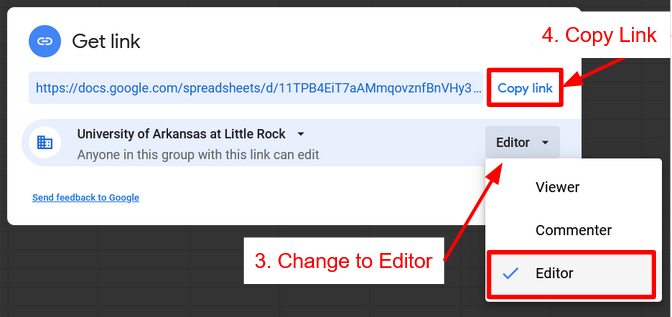
Figure \(\PageIndex{2}\): Change permissions to Editor then Copy Link (Poirot)
Part 3: Entering Data into a Workbook
What are some ways to enter data into Google Sheets?
How can copy paste be helpful?
1. Enter the data from Table 1 to a new tab on in your Google Workbook (How to make a new tab)
2. Try copying data using Ctrl+V and Ctrl+Shift+V. What is the difference between these two keyboard shortcuts?
Table 1. Solubility Data showing the maximum amount of various salts which can be dissolved in water at specified temperatures.
| Temperature (oC) | Solubility Unknown A (g / 100g H2O) | Solubility Unknown B (g / 100g H2O) |
|---|---|---|
| 30 | 50.8 | 179 |
| 45 | 72.7 | 205 |
| 60 | 104.0 | 230 |
| 75 | 148.9 | 255 |
| 90 | 213.1 | No data available |
Part 4: Creating a Scatter Plot Graph
In this section, you will create a linear graph that illustrates the relationship between temperature and solubility for Salt A using the data from Table 1.
How to with video tutorials
Make a Scatter Plot Graph
- Select the range of data in columns A and B, including the headers. (Tip select the letters at the top of the column to highlight the whole column)
- Go to the "Insert" menu at the top and choose "Chart."
- In the Chart Editor that appears on the right, under the "Chart type" section, choose "Scatter chart."
- Manually edit the axis labels by clicking on the text boxes for the horizontal and vertical axes and typing "Temperature (°C)" and "Solubility (g/100mL)" respectively.
Adding a Line of Best Fit
- In the Chart Editor, go to the "Series" tab.
- Click on the dropdown arrow next to the data series (dots on the graph) and select "Add trendline."
- Choose "Linear" as the trendline type.
- Check the box next to "Show equation on chart." The equation of the linear regression line will appear on your graph.
Hint for Dynamic Data Inclusion:
To make your graph dynamic and include any new data automatically, set your data range as the entire column (e.g., A:B) instead of specifying a fixed range (e.g., A1:B6). This way, any new data you add will be included in the graph.
Remember that clear labeling, precise data entry, and appropriate adjustments to the graph elements are important to convey your findings effectively. This graph will help you visualize and analyze the relationship between temperature and solubility for Salt A.
Tab 3: Duplicate this tab (Duplicate a Tab) and use it to create a graph of Salt B. Remember to check you Labels!
Tab 4: Comparison Linear Graph Salt A&B
Create a Chart to compare the two sets of data by creating a multiple series chart.
Tutorial for this multiple series chart
Design Requirements
- Smoothline chart with dashed lines and data points
- Linear regression trendlines for both series with equation and R
Note: a linear fit will only be a good fit (R2 value close to 1) for one of these salts. Once you identify which one is a good fit, you have now created an equation that will allow you to predict the solubility of that salt at another temperature!
Copy and Paste this chart to the Coverpage.
Compare the two graphs
Which graph is more linear?
How do we know?
On your coverpage enter in which is more linear.
Part 5: Using Formulas to Analyze Data
Now we have one graph with a best fit. We will analyze the other set of data to find which chart will work best.
In this section, you will create two graphs to explore the non-linear relationship between temperature and solubility for the salt. Duplicate the tab of the data you need and follow the instructions below to create Graphs 4 and 5:
In your group, discuss:
How can formulas help us analyze data in a spreadsheet?
How can formulas automate tasks in data analysis?
Graph 4: Power Function
- After selecting your nonlinear graph, duplicate the tab of the nonlinear graph to make tab 5
- Select your chart for tab 5 and open the chart editor
- Change the trendline type to "Power"
- Ensure that the equation for the power function (y=ax^m) is shown on the graph.
How does the trendline change when you change the line type?
How does the fit change?
Graph 5: Converting Power Function Chart to Linear Chart
Individually:
- In cell C1 and D1 add a label to each column.
- In cell C2, use a formula to find Log T (Formulas and Logarithms)
Protip What happens when you click and drag the handle (blue square at the bottom of the cell) down to the cell below?
What happens when you click and drag the handle to the cell to the right?
What happens when you double click the handle?
- Use the formulas to also find the Log S
- Select the new log temperature data (Column C) and the log solubility data (Column D), including the headers. (Press and hold shift key then click on column labels)
- Follow steps in Part 4 to make a scatter chart with a linear graph
- Ensure that the equation for the linear function (y=mx+b) is shown on the graph
Are these values new data or the same data in another format? Why?
Use Exercise 1.1.1 to help prove if the charts are the same or different, use this for question 2 on your coverpage
- Show that the slope of a straight line in this graph is equal to the power (m) in graph 4.
- Mathematically show how the y intercept of this graph can be used to determine the pre-exponential term (A) in graph 4
In your own words explain how graph 4&5 are connected. (Coverpage Question 3)
Graph 6 Exponential Function:
In this section, you will create two more graphs to explore the exponential relationship between temperature and solubility for the same data used in Graph 4. Duplicate the tab of the data and follow the instructions below to create Graphs 6 and 7:
- Follow the steps for Graph 4, but this time use an "Exponential Fit"
- Ensure that the equation for the exponential function (y=aemx) is shown on the graph.
Graph 7: Converting Exponential Function Chart to Linear Chart
Individually:
- In cell C1 add a label in the header.
- In cell C2, use a formula to find LN S (Careful! is LN the same as LOG?)
- Select the temperature data (Column A) and the ln solubility data (Column C), including the headers. (Press and hold shift key then click on column labels)
- Follow steps in Part 4 to make a scatter chart with a linear graph
- Ensure that the equation for the linear function (y=mx+b) is shown on the graph
Are these values new data or the same data in another format? Why?
Use Exercise 1.1.2 to help prove if the charts are the same or different, use this for question 4 on your coverpage
- Show that the slope of a straight line in this graph is equal to the power (m) in graph 6.
- Mathematically show how the y intercept of this graph can be used to determine the pre-exponential term (A) in graph 5
In your own words explain how graph 6&7 are connected. (Coverpage Question 5)
Part 6: Summarizing and Visualizing Data Insights
Copy charts over to the Coverpage.
Take a look at Charts 3, 5, and 7.
Out of these charts, which one has the best fit to the trendline?
On each chart (3-7) go into the chart editor and under series check "Show R2"
What is the highest and lowest R2 value?
How does the R2 value compare to "fit" of the data?
Select the type of fit (Linear graph 3, Power Graph 4&5, Exponential Graph 6&7) that fits best with the data and answer the last question.