
2501 Using Excel for Graphical Analysis of Data
- Page ID
- 440567
\( \newcommand{\vecs}[1]{\overset { \scriptstyle \rightharpoonup} {\mathbf{#1}} } \)
\( \newcommand{\vecd}[1]{\overset{-\!-\!\rightharpoonup}{\vphantom{a}\smash {#1}}} \)
\( \newcommand{\id}{\mathrm{id}}\) \( \newcommand{\Span}{\mathrm{span}}\)
( \newcommand{\kernel}{\mathrm{null}\,}\) \( \newcommand{\range}{\mathrm{range}\,}\)
\( \newcommand{\RealPart}{\mathrm{Re}}\) \( \newcommand{\ImaginaryPart}{\mathrm{Im}}\)
\( \newcommand{\Argument}{\mathrm{Arg}}\) \( \newcommand{\norm}[1]{\| #1 \|}\)
\( \newcommand{\inner}[2]{\langle #1, #2 \rangle}\)
\( \newcommand{\Span}{\mathrm{span}}\)
\( \newcommand{\id}{\mathrm{id}}\)
\( \newcommand{\Span}{\mathrm{span}}\)
\( \newcommand{\kernel}{\mathrm{null}\,}\)
\( \newcommand{\range}{\mathrm{range}\,}\)
\( \newcommand{\RealPart}{\mathrm{Re}}\)
\( \newcommand{\ImaginaryPart}{\mathrm{Im}}\)
\( \newcommand{\Argument}{\mathrm{Arg}}\)
\( \newcommand{\norm}[1]{\| #1 \|}\)
\( \newcommand{\inner}[2]{\langle #1, #2 \rangle}\)
\( \newcommand{\Span}{\mathrm{span}}\) \( \newcommand{\AA}{\unicode[.8,0]{x212B}}\)
\( \newcommand{\vectorA}[1]{\vec{#1}} % arrow\)
\( \newcommand{\vectorAt}[1]{\vec{\text{#1}}} % arrow\)
\( \newcommand{\vectorB}[1]{\overset { \scriptstyle \rightharpoonup} {\mathbf{#1}} } \)
\( \newcommand{\vectorC}[1]{\textbf{#1}} \)
\( \newcommand{\vectorD}[1]{\overrightarrow{#1}} \)
\( \newcommand{\vectorDt}[1]{\overrightarrow{\text{#1}}} \)
\( \newcommand{\vectE}[1]{\overset{-\!-\!\rightharpoonup}{\vphantom{a}\smash{\mathbf {#1}}}} \)
\( \newcommand{\vecs}[1]{\overset { \scriptstyle \rightharpoonup} {\mathbf{#1}} } \)
\( \newcommand{\vecd}[1]{\overset{-\!-\!\rightharpoonup}{\vphantom{a}\smash {#1}}} \)
\(\newcommand{\avec}{\mathbf a}\) \(\newcommand{\bvec}{\mathbf b}\) \(\newcommand{\cvec}{\mathbf c}\) \(\newcommand{\dvec}{\mathbf d}\) \(\newcommand{\dtil}{\widetilde{\mathbf d}}\) \(\newcommand{\evec}{\mathbf e}\) \(\newcommand{\fvec}{\mathbf f}\) \(\newcommand{\nvec}{\mathbf n}\) \(\newcommand{\pvec}{\mathbf p}\) \(\newcommand{\qvec}{\mathbf q}\) \(\newcommand{\svec}{\mathbf s}\) \(\newcommand{\tvec}{\mathbf t}\) \(\newcommand{\uvec}{\mathbf u}\) \(\newcommand{\vvec}{\mathbf v}\) \(\newcommand{\wvec}{\mathbf w}\) \(\newcommand{\xvec}{\mathbf x}\) \(\newcommand{\yvec}{\mathbf y}\) \(\newcommand{\zvec}{\mathbf z}\) \(\newcommand{\rvec}{\mathbf r}\) \(\newcommand{\mvec}{\mathbf m}\) \(\newcommand{\zerovec}{\mathbf 0}\) \(\newcommand{\onevec}{\mathbf 1}\) \(\newcommand{\real}{\mathbb R}\) \(\newcommand{\twovec}[2]{\left[\begin{array}{r}#1 \\ #2 \end{array}\right]}\) \(\newcommand{\ctwovec}[2]{\left[\begin{array}{c}#1 \\ #2 \end{array}\right]}\) \(\newcommand{\threevec}[3]{\left[\begin{array}{r}#1 \\ #2 \\ #3 \end{array}\right]}\) \(\newcommand{\cthreevec}[3]{\left[\begin{array}{c}#1 \\ #2 \\ #3 \end{array}\right]}\) \(\newcommand{\fourvec}[4]{\left[\begin{array}{r}#1 \\ #2 \\ #3 \\ #4 \end{array}\right]}\) \(\newcommand{\cfourvec}[4]{\left[\begin{array}{c}#1 \\ #2 \\ #3 \\ #4 \end{array}\right]}\) \(\newcommand{\fivevec}[5]{\left[\begin{array}{r}#1 \\ #2 \\ #3 \\ #4 \\ #5 \\ \end{array}\right]}\) \(\newcommand{\cfivevec}[5]{\left[\begin{array}{c}#1 \\ #2 \\ #3 \\ #4 \\ #5 \\ \end{array}\right]}\) \(\newcommand{\mattwo}[4]{\left[\begin{array}{rr}#1 \amp #2 \\ #3 \amp #4 \\ \end{array}\right]}\) \(\newcommand{\laspan}[1]{\text{Span}\{#1\}}\) \(\newcommand{\bcal}{\cal B}\) \(\newcommand{\ccal}{\cal C}\) \(\newcommand{\scal}{\cal S}\) \(\newcommand{\wcal}{\cal W}\) \(\newcommand{\ecal}{\cal E}\) \(\newcommand{\coords}[2]{\left\{#1\right\}_{#2}}\) \(\newcommand{\gray}[1]{\color{gray}{#1}}\) \(\newcommand{\lgray}[1]{\color{lightgray}{#1}}\) \(\newcommand{\rank}{\operatorname{rank}}\) \(\newcommand{\row}{\text{Row}}\) \(\newcommand{\col}{\text{Col}}\) \(\renewcommand{\row}{\text{Row}}\) \(\newcommand{\nul}{\text{Nul}}\) \(\newcommand{\var}{\text{Var}}\) \(\newcommand{\corr}{\text{corr}}\) \(\newcommand{\len}[1]{\left|#1\right|}\) \(\newcommand{\bbar}{\overline{\bvec}}\) \(\newcommand{\bhat}{\widehat{\bvec}}\) \(\newcommand{\bperp}{\bvec^\perp}\) \(\newcommand{\xhat}{\widehat{\xvec}}\) \(\newcommand{\vhat}{\widehat{\vvec}}\) \(\newcommand{\uhat}{\widehat{\uvec}}\) \(\newcommand{\what}{\widehat{\wvec}}\) \(\newcommand{\Sighat}{\widehat{\Sigma}}\) \(\newcommand{\lt}{<}\) \(\newcommand{\gt}{>}\) \(\newcommand{\amp}{&}\) \(\definecolor{fillinmathshade}{gray}{0.9}\)Using Excel for Graphical Analysis of Data
|
Last Name |
First Name |
Partner Name(s) |
Date |
1.0 INTRODUCTION
In several upcoming labs, a primary goal will be to determine the mathematical relationship between two variable physical parameters. Graphs are useful tools that can elucidate such relationships. First, plotting a graph provides a visual image of data and any trends therein. Second, using appropriate analysis, graphs provide us with the ability to predict the results of any changes to the system.
An important technique in graphical analysis is the transformation of experimental data to produce a straight line. If there is a direct, linear relationship between two variables, the data may be fitted to the equation of a line with the familiar form y = mx + b through a technique known as linear regression. Here m represents the slope of the line, and b represents the y-intercept, as shown in the figure below. This equation expresses the mathematical relationship between the two variables plotted and allows for the prediction of unknown values within the parameters.
Computer spreadsheets are powerful tools for manipulating and graphing quantitative data. In this exercise, the spreadsheet program Microsoft Excel© will be used for this purpose. Students will learn to use Excel in order to explore a number of linear graphical relationships. Please note that although Excel can fit curves to nonlinear data sets, this form of analysis is usually not as accurate as linear regression.
NOTE: The navigation prompts (commands) below are based on using MS Excel for PC (downloaded version).
2.0 PROCEDURE
Part A. Simple Linear Plot
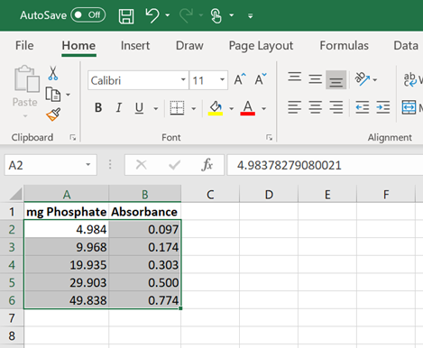
Experimental Data: Different phosphate concentrations are analyzed using colorimetric analysis and the following data are generated.
|
mg Phosphate |
Absorbance |
|
4.984 |
0.097 |
|
9.968 |
0.174 |
|
19.935 |
0.303 |
|
29.903 |
0.500 |
|
49.838 |
0.774 |
1. Launch the program Microsoft Excel© in your computer. Go to the ‘Start’ button (at the bottom left or top right on the screen), then click Programs, followed by Microsoft Excel or look for this icon:

2. Select ‘Blank Workbook’ and enter the above data into the first two columns in the spreadsheet.
· Reserve the first row for column labels.
· The x values must be entered to the left of the y values in the spreadsheet. Remember that the independent variable (the one that you, as the experimenter, have control of) goes on the x-axis while the dependent variable (the measured data) goes on the y-axis.
3. Highlight the set of data (not the column labels) that you wish to plot (Figure 1). Click and drag your mouse from the top-left corner of the data set (e.g. cell A2) to the bottom right corner.
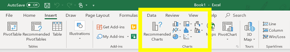
4. Click on ‘Insert’. It’s one of the tabs near the top of the Excel window. A toolbar below the ‘Insert’ tab should open (Figure 2).
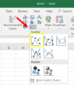
In the Recommended Charts, select the ‘Scatter’ graph that shows data points only, with no connecting lines (Figure 3).
You should now see a scatter plot on your Excel workbook, which provides a preview of your graph (Figure 4).

5. If all looks well, you can now add title and label the axes of your graph.
a) To add title, click inside the chart; switch to the Design tab, and click Add Chart Element > Chart Title > Above Chart (Figure 5)
Note: The graph should be given a meaningful, explanatory title that starts out “Y versus X” followed by a description of your system.
b) To label the axes of your graph, click on Axis Titles > select Primary Horizontal Axis Title and > Primary Vertical Axis Title (Figure 6).
Note: It is important to label axes with both the measurement and the units used.
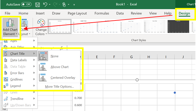
Figure 5
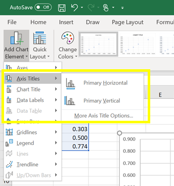
Figure 6
· To change the titles, click the text box for each title, highlight the text and type in your new title (Figure 7).
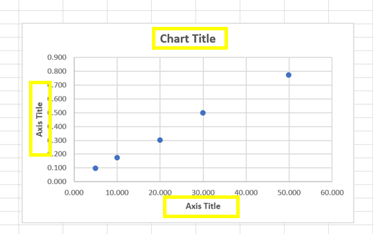
Figure 7
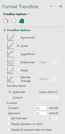
6. Your next step is to add a trendline to the plotted data points. A trendline represents the best possible linear fit to your data. To do this, "activate" the graph by clicking on any one of the data points. When you do this, all the data points will appear highlighted.
· Click the Chart Elements button next to the upper-right corner of the chart.
· Check the ‘Trendline’ box.
· Click ‘More Options’. This will display the options shown in Figure 8. Notice that the ‘Linear’ button is already selected.
· If you like to see the algebraic equation of the trendline, select the ‘Display Equation’ option. The equation (in the form y = mx + b) should appear on your graph.
· If you like to know how well the data is fit by the equation, select the ‘Display R-squared value’ option. The closer the R2 value is to 1, the better the fit.
· Note that the program will always fit a trendline to the data no matter how good or awful the data is. You must judge the quality of the fit and the suitability of this type of fit to your data set.
7. Print a full-sized copy of your prepared graph and attach to your data recording sheet. Then, record the following information on the data recording sheet.
· The equation of the best-fit trendline to your data
· The slope of the trendline
· The y-intercept of the trendline
· Whether the fit of the line to the data is good or bad, and why.
8. The graph contains a visual representation of the relationship (the graph) of the dependent and independent variables in your data and a mathematical expression of the relationship (the equation). It can now be used to make certain predictions.
For example, using the data above, you are asked to determine the phosphate concentration, in mg, in a different water sample. You used the same spectrometer and recorded an absorbance of 0.487. How can you find the concentration of phosphate in the water sample?
You can plug this value into the equation of the trendline and solve for the unknown concentration. Calculate and record your answer into your report. Note that this calculation will generally give a more precise value than inserting the data point (also called interpolating) and ‘eyeballing’ from the graph.
Part B. Two Data Sets with Overlay
Experimental Data: Two sets metal slugs of different sizes are measured. The masses and volumes are recorded, and the two sets of data collected are presented in the table below:
|
Metal A |
Metal B |
||
|
Volume (cm3) |
Mass (g) |
Volume (cm3) |
Mass (g) |
|
1.00 |
11.87 |
1.20 |
7.64 |
|
2.50 |
21.66 |
4.00 |
8.71 |
|
4.25 |
32.27 |
5.00 |
15.72 |
|
5.00 |
41.69 |
6.00 |
19.93 |
|
7.00 |
54.47 |
7.00 |
15.75 |
|
8.00 |
59.46 |
8.50 |
23.88 |
You would like to see how these two sets of data relate to each other. To do this you will have to place both sets of data, as independent relationships, on the same graph. Note that this process only works when you have the same axis values and magnitudes.
1. Enter this new data on a new worksheet (Sheet 2) in Excel. Be sure to label your data columns A and B. Again, remember to enter the x values to the left of the y values.
2. First, plot data for Metal A only as an XY Scatter plot (the same way you did with the data in Part A). Fit a trendline to this data using linear regression and obtain the equation of this line.
3. Now you need to add data for Metal B to this graph.
· Activate the graph by clicking on one of the data points, or anywhere on the chart.
· Right-click the chart, and then choose ‘Select Data’ from the drop-down menu. The Select Data Source box appears on the worksheet with the source data of the chart.
· Click the ‘Add’ tab and type “Metal B” for the Series Name.
· Click on the box under Series X values, then highlight the x-axis values of Metal B. Press enter, then repeat this procedure for the Series Y Values, highlighting the y-axis values of Metal B. For each of these steps, you should see a display similar to what is shown in Figure 9. Note that slight differences may appear due to the version of Microsoft Excel installed on your computer.

Figure 9
· Click ‘OK’ twice to return to the main Excel window.
· At this point, you should see the new data points as shown in Figure 10. You can now independently analyze the second dataset by inserting a trendline as before.
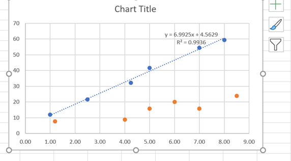
Figure 10
4. Print a full-sized copy of your prepared graph and attach to your data recording sheet. Then, record the following information on the data recording sheet.
· The equation of the best-fit trendline for Metal A
· The equation of the best-fit trendline for Metal B
· If these trendlines were extrapolated, they would intersect. Determine the values of x and y for the point of intersection using simultaneous equations.
Part C: Statistical Analysis
When many independent measurements are made for one variable, there is inevitably some scatter (noise) in the data. This is usually the result of random errors over which the experimenter has little control.
Experimental Data: Ten different students at two different colleges each measure the sulfate ion concentration in a sample of tap water:
|
College #1 |
35.9 ppm |
43.2 ppm |
33.5 ppm |
35.1 ppm |
32.8 ppm |
37.6 ppm |
31.9 ppm |
36.6 ppm |
35.0 ppm |
32.0 ppm |
|
College #2 |
45.1 ppm |
34.2 ppm |
36.8 ppm |
31.0 ppm |
40.7 ppm |
29.6 ppm |
35.4 ppm |
32.5 ppm |
43.5 ppm |
38.8 ppm |
Simple statistical analyses of these datasets might include calculations of the mean and median concentration, and the standard deviation. The mean () is simply the average value, defined as the sum (å) of each of the measurements (![]() ) in a data set divided by the number of measurements (
) in a data set divided by the number of measurements (![]() ).
).
The median (![]() ) is the midpoint value of a numerically ordered dataset, where half of the measurements are above the median and half are below. The median location of N measurements can be found using:
) is the midpoint value of a numerically ordered dataset, where half of the measurements are above the median and half are below. The median location of N measurements can be found using:
![]()
Standard deviation (s) is a measure of the variation in a dataset and is defined as the square root of the sum of squares divided by the number of measurements minus one.

While the mean, median and standard deviation can be calculated by hand using the above equations, it is often more convenient to use a calculator or computer to determine these values. Microsoft Excel© is particularly well suited for such statistical analyses, especially on large datasets.
1. Enter the data acquired by the students from College #1 (only) into a single column of cells (e.g. column A) on a new worksheet (Sheet 3) in Excel. Then, click on any empty cell (usually one close to the data cells) to enter the mean, median, or standard deviation for the data set.
2. Select the ‘Formulas’ tab on the top menu and click on ‘Insert Function’ button to perform the required functions on the data.
3. To compute the mean or average of the data entered in cells A1 through A10, on the box below ‘Search for a function’, type ‘average’ and then click ‘Go’. Select ‘average’ under ‘Select a function’ and then click ‘OK’.
Similarly, to compute the median, type ‘median’ and to obtain the standard deviation, type ‘stdev’.
4. Record on your data recording sheet the mean, median, and standard deviation for the College #1 data set.
Rejecting Outliers
Do all the measurements in the College #1 data set look equally good to you, or are there any values that do not seem to fit with the others? If so, are you allowed to reject these measurements?
Outliers are data points which lie far outside the range defined by the rest of the measurements and may skew your results to a great extent. If you determine that an outlier resulted from an obvious experimental error (e.g., you incorrectly read an instrument or prepared a solution), you may reject the point without hesitation. If, however, none of these errors is evident, you must use caution in making your decision to keep or reject a point. One rough criterion for rejecting a data point is if it lies beyond two standard deviations from the mean or average.
5. Using the above criteria, determine if there are any outliers in the College #1 dataset.
· Record these outlier measurements (if any) on your data recording sheet.
· Then, excluding the outliers, re-calculate the mean, median and standard deviation of this data set.
6. Repeat steps 1 – 5 to analyze the data from College #2.
Important Note: Rejecting data points cannot be done just because you want your results to look better. If you choose to reject an outlier for any reason, you must always include documentation in your lab report which clearly states:
· that you did reject a point
· which point you rejected
· why you rejected it
Failure to disclose this could constitute scientific fraud.
3.0 DATA RECORDING SHEET
Attach the graphs you made for Parts A and B in this assignment. For each graph, make sure the following components are in the printout:
· Graph Title
· Labels for x and y axes (along with appropriate units when applicable)
· Best-fit line equation and R2 when appropriate
Part A. Simple Linear Plot
1. Which set of data is plotted on the y-axis? ______________________
the x-axis? ______________________
2. From the graph:
Equation of the fitted trendline ______________________
Value of the slope of this line ______________________
Value of the y-intercept of this line ______________________
3. Is the fit of the trendline to your data good (circle one)? Yes / No
Explain why you think the line is a good fit to the data.
4. Determine the concentration of phosphate in the water sample with a recorded absorbance of 0.487 using
a) Interpolation and “eyeballing” ______________________
b) The equation of the trendline ______________________
Show your calculations for b) below.
Part B. Two Data Sets and Overlay
1. From the graph:
Equation of the trendline for Metal A data set ______________________
Equation of the trendline for Metal B data set ______________________
2. Perform a simultaneous equations calculation to determine the x and y values for the point of intersection between these lines. Show your work below.
Part C. Statistical Analysis
1. For the College #1 data set, record the following values:
the mean SO42- concentration ______________________
the median SO42- concentration ______________________
the standard deviation in the data set ______________________
2. Are there any outliers in the College #1 data set (circle one)? Yes / No
If yes, which measurements are the outliers? ______________________
Show the calculations you used to identify the outliers (or, if none, how you determined that there were none).
3. Re-calculate the following values (using Excel) excluding the outliers:
the mean SO42- concentration ______________________
the median SO42- concentration ______________________
the standard deviation in the data set ______________________
4. For the College #2 data set, record the following values:
the mean SO42- concentration ______________________
the median SO42- concentration ______________________
the standard deviation in the data set ______________________
5. Are there any outliers in the College #2 data set (circle one)? Yes / No
If yes, which measurements are the outliers? ______________________
Show the calculations you used to identify the outliers (or, if none, how you determined that there were none).
6. For College #2 data set, re-calculate the following values (using Excel) excluding the outliers:
the mean SO42- concentration ______________________
the median SO42- concentration ______________________
the standard deviation in the data set ______________________
7. Which data set give the more precise measurements? ___________________
How do you know?