3: Workbooks
- Page ID
- 305734
\( \newcommand{\vecs}[1]{\overset { \scriptstyle \rightharpoonup} {\mathbf{#1}} } \)
\( \newcommand{\vecd}[1]{\overset{-\!-\!\rightharpoonup}{\vphantom{a}\smash {#1}}} \)
\( \newcommand{\id}{\mathrm{id}}\) \( \newcommand{\Span}{\mathrm{span}}\)
( \newcommand{\kernel}{\mathrm{null}\,}\) \( \newcommand{\range}{\mathrm{range}\,}\)
\( \newcommand{\RealPart}{\mathrm{Re}}\) \( \newcommand{\ImaginaryPart}{\mathrm{Im}}\)
\( \newcommand{\Argument}{\mathrm{Arg}}\) \( \newcommand{\norm}[1]{\| #1 \|}\)
\( \newcommand{\inner}[2]{\langle #1, #2 \rangle}\)
\( \newcommand{\Span}{\mathrm{span}}\)
\( \newcommand{\id}{\mathrm{id}}\)
\( \newcommand{\Span}{\mathrm{span}}\)
\( \newcommand{\kernel}{\mathrm{null}\,}\)
\( \newcommand{\range}{\mathrm{range}\,}\)
\( \newcommand{\RealPart}{\mathrm{Re}}\)
\( \newcommand{\ImaginaryPart}{\mathrm{Im}}\)
\( \newcommand{\Argument}{\mathrm{Arg}}\)
\( \newcommand{\norm}[1]{\| #1 \|}\)
\( \newcommand{\inner}[2]{\langle #1, #2 \rangle}\)
\( \newcommand{\Span}{\mathrm{span}}\) \( \newcommand{\AA}{\unicode[.8,0]{x212B}}\)
\( \newcommand{\vectorA}[1]{\vec{#1}} % arrow\)
\( \newcommand{\vectorAt}[1]{\vec{\text{#1}}} % arrow\)
\( \newcommand{\vectorB}[1]{\overset { \scriptstyle \rightharpoonup} {\mathbf{#1}} } \)
\( \newcommand{\vectorC}[1]{\textbf{#1}} \)
\( \newcommand{\vectorD}[1]{\overrightarrow{#1}} \)
\( \newcommand{\vectorDt}[1]{\overrightarrow{\text{#1}}} \)
\( \newcommand{\vectE}[1]{\overset{-\!-\!\rightharpoonup}{\vphantom{a}\smash{\mathbf {#1}}}} \)
\( \newcommand{\vecs}[1]{\overset { \scriptstyle \rightharpoonup} {\mathbf{#1}} } \)
\( \newcommand{\vecd}[1]{\overset{-\!-\!\rightharpoonup}{\vphantom{a}\smash {#1}}} \)
\(\newcommand{\avec}{\mathbf a}\) \(\newcommand{\bvec}{\mathbf b}\) \(\newcommand{\cvec}{\mathbf c}\) \(\newcommand{\dvec}{\mathbf d}\) \(\newcommand{\dtil}{\widetilde{\mathbf d}}\) \(\newcommand{\evec}{\mathbf e}\) \(\newcommand{\fvec}{\mathbf f}\) \(\newcommand{\nvec}{\mathbf n}\) \(\newcommand{\pvec}{\mathbf p}\) \(\newcommand{\qvec}{\mathbf q}\) \(\newcommand{\svec}{\mathbf s}\) \(\newcommand{\tvec}{\mathbf t}\) \(\newcommand{\uvec}{\mathbf u}\) \(\newcommand{\vvec}{\mathbf v}\) \(\newcommand{\wvec}{\mathbf w}\) \(\newcommand{\xvec}{\mathbf x}\) \(\newcommand{\yvec}{\mathbf y}\) \(\newcommand{\zvec}{\mathbf z}\) \(\newcommand{\rvec}{\mathbf r}\) \(\newcommand{\mvec}{\mathbf m}\) \(\newcommand{\zerovec}{\mathbf 0}\) \(\newcommand{\onevec}{\mathbf 1}\) \(\newcommand{\real}{\mathbb R}\) \(\newcommand{\twovec}[2]{\left[\begin{array}{r}#1 \\ #2 \end{array}\right]}\) \(\newcommand{\ctwovec}[2]{\left[\begin{array}{c}#1 \\ #2 \end{array}\right]}\) \(\newcommand{\threevec}[3]{\left[\begin{array}{r}#1 \\ #2 \\ #3 \end{array}\right]}\) \(\newcommand{\cthreevec}[3]{\left[\begin{array}{c}#1 \\ #2 \\ #3 \end{array}\right]}\) \(\newcommand{\fourvec}[4]{\left[\begin{array}{r}#1 \\ #2 \\ #3 \\ #4 \end{array}\right]}\) \(\newcommand{\cfourvec}[4]{\left[\begin{array}{c}#1 \\ #2 \\ #3 \\ #4 \end{array}\right]}\) \(\newcommand{\fivevec}[5]{\left[\begin{array}{r}#1 \\ #2 \\ #3 \\ #4 \\ #5 \\ \end{array}\right]}\) \(\newcommand{\cfivevec}[5]{\left[\begin{array}{c}#1 \\ #2 \\ #3 \\ #4 \\ #5 \\ \end{array}\right]}\) \(\newcommand{\mattwo}[4]{\left[\begin{array}{rr}#1 \amp #2 \\ #3 \amp #4 \\ \end{array}\right]}\) \(\newcommand{\laspan}[1]{\text{Span}\{#1\}}\) \(\newcommand{\bcal}{\cal B}\) \(\newcommand{\ccal}{\cal C}\) \(\newcommand{\scal}{\cal S}\) \(\newcommand{\wcal}{\cal W}\) \(\newcommand{\ecal}{\cal E}\) \(\newcommand{\coords}[2]{\left\{#1\right\}_{#2}}\) \(\newcommand{\gray}[1]{\color{gray}{#1}}\) \(\newcommand{\lgray}[1]{\color{lightgray}{#1}}\) \(\newcommand{\rank}{\operatorname{rank}}\) \(\newcommand{\row}{\text{Row}}\) \(\newcommand{\col}{\text{Col}}\) \(\renewcommand{\row}{\text{Row}}\) \(\newcommand{\nul}{\text{Nul}}\) \(\newcommand{\var}{\text{Var}}\) \(\newcommand{\corr}{\text{corr}}\) \(\newcommand{\len}[1]{\left|#1\right|}\) \(\newcommand{\bbar}{\overline{\bvec}}\) \(\newcommand{\bhat}{\widehat{\bvec}}\) \(\newcommand{\bperp}{\bvec^\perp}\) \(\newcommand{\xhat}{\widehat{\xvec}}\) \(\newcommand{\vhat}{\widehat{\vvec}}\) \(\newcommand{\uhat}{\widehat{\uvec}}\) \(\newcommand{\what}{\widehat{\wvec}}\) \(\newcommand{\Sighat}{\widehat{\Sigma}}\) \(\newcommand{\lt}{<}\) \(\newcommand{\gt}{>}\) \(\newcommand{\amp}{&}\) \(\definecolor{fillinmathshade}{gray}{0.9}\)Workbooks
Video \(\PageIndex{1}\): 2:47 video on dashboards in a workbook developed by Lilian Poirot (https://youtu.be/37GQkl-Ao_Y)
Workbooks are a way of organizing your google sheet. A workbook has a tab for each section of data and a dashboard to summarize the results. This helps to be able to understand your data at a glance, while also keeping it all in the same place.
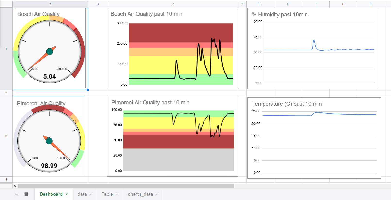
Dashboard
The Dashboard You can see at a glance the important information from your workbook. This is an especially powerful tool when used with a live stream of data to your sheet. All the calculations and data can be behind the scenes in tabs, with your dashboard giving all the info you need at a glance.
Tabs
The basics of tabs is covered in Google Sheets Basics 4.1-3. Each Tab (also called sheet) can have a section of data or calculations. This is where the real work is being done in the sheet. One of the benefits of using tabs over having everything in the same tab is this allows you to build for future data. If everything is in one tab you most likely will put several things in the same column or row. This works for that project but if you want to add more data theres no place to add it.
Building workbook template from other sheet
You may thing of a sheet as something you use once for a project, then it will sit in your drive to never be used again. But even if a certain project is over doesn't mean you're done with that sheet! It can be used to build a template to be used in another project.
Set up a sheet to be a template:
Google Basics 4.1-3 goes in depth on tabs but for a quick overview is at TimeStamp: Video 2: 0:15
To copy and paste data, click and drag to highlight the range. You can right click then select copy or press ctrl+c on your keyboard. Click the cell the first cell where you want to move the data and paste. (right click paste or ctrl+v) You can paste without formatting (fonts or colors, etc) by using ctrl+shift+v or right click, paste special, paste values only TimeStamp: Video 2: 0:22
You can set the Header by clicking and dragging the gray bar in the top right corner. This freezes the first row so it stays at the top as you scroll through data. It also tells the sheet that the first row is our labels, not data. TimeStamp: Video 2: 0:40
Tips for building for future data
Keep one type of data or calculation per column.
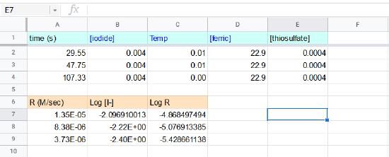
In Figure 2 there are two headers in multiple columns. While this works for some projects where a compact view is most important, to add more data you would have to add more rows and rearrange the whole sheet. Also any charts used would have to be altered for the new range.
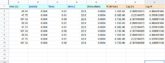
Figure 3 shows a sheet where everything has a unique column. This also has the benefit of being able to label the first row as header. This is useful for charts because it will automatically label this row as the labels. Also when set up this way you can select the entire column as the range for the chart so any new data will automatically be graphed
Fill Down Square
The fill down square is the blue square you see in the bottom right corner of your select cell. You can click and drag this to copy and paste faster.
A single click then drag will quickly autofill the column based on the pre-existing pattern. Drag to highlight all of the cells you want to repeat the data or formula.
If you have data in an adjacent column you can double click the blue square instead of clicking and dragging and it will fill in the cells that have something next to it.
Video \(\PageIndex{2}\): 4:43 video on how build a template from another sheet developed by Liliane Poirot (https://youtu.be/STpyDTTLS38)
Conditional Formatting
Conditional formatting is one of my favorite tools in google sheets. You can set the sheet up to change text or background color of a cell based on a set of conditions. This makes a google sheet easy to read at a glance. Once you understand the basics of using conditional formatting its fairly easy to find a lot of new ways to use it.
Video \(\PageIndex{3}\): 4:58 video on conditional formatting developed by Liliane Poirot (https://youtu.be/J9Xmp20jEZM)
Access Conditional Formatting
- Highlight the cells or column you want to format
- On the menu select format then conditional formatting
- This will open the toolbar to the right of your screen
Using Conditional Formatting Toolbar
There are two types of "rules" in conditional formatting
Single Color
This rule is used to highlight all cells that follow the condition you set.
- First check or set the range you want to apply the rule to under Apply to range. (To set an entire column don't include numbers, for example B:B)
- Next we set the format rules. The dropdown for "Format cells if..." has lots of options for rules to set and ways to make custom formulas.
- Formatting style is how the cell will change if it follows the rule. You can highlight the cell by clicking the paint can and change the font color by clicking the A drop down.
- Choose colors that will be readable and accessible for anyone using your sheet. Carnegie Museum's guidelines is a great overview to get you started.
- Press Done to save your rule or click add another rule to make another rule on the same range
Color Scale
This rule can be used to visually compare a set of cells. You can apply a gradient of colors to a range. This is very useful for large amounts of data or where you want to track changes.
- First check or set the range you want to apply the rule to under Apply to range. (To set an entire column don't include numbers, for example B:B)
- Next we set the format rules, click the colored box under preview to choose from the default color scales.
- The default settings (Min value for Minpoint and Max value for Maxpoint) will automatically detect the min and max of your data and assign the color scale based on the range.
- You can change the colors from the default by clicking the paint buckets next to the point boxes.
- The first two rows of options let you do a gradient of two colors. After selecting your colors sheets will automatically generate the other three middle colors. The last row of options lets you make a gradient of three colors.
- One criticism I have for google is that the default colors for the three colors are not accessible. The US Standards Website reports that approximately 4.5% of the total population have some kind of color insensitivity. Red/green color blindness is the most common form color insensitivity. That is a large amount of people who would be unable to read your sheet! Blue/Orange is generally a good choice. Venngage is another great resource with visuals on what colors look like under different forms of color blindness and some sample color palettes to use.
- Press Done to save your rule or click add another rule to make another rule on the same range
Charts
Charts are very useful in google sheets.
Video \(\PageIndex{2}\): 3:49 video developed by Liliane Poirot on inserting and editing a chart (https://youtu.be/201tlRiHmw0)
Insert a Chart
To insert a chart first highlight the cells you want in your chart
If you highlight the columns this will use all data in those columns which is useful if you add more later
Next click Insert then Chart
Edit a Chart
To edit a chart click the three dots in the right hand corner of the chart, this will open the chart tool bar to the right.
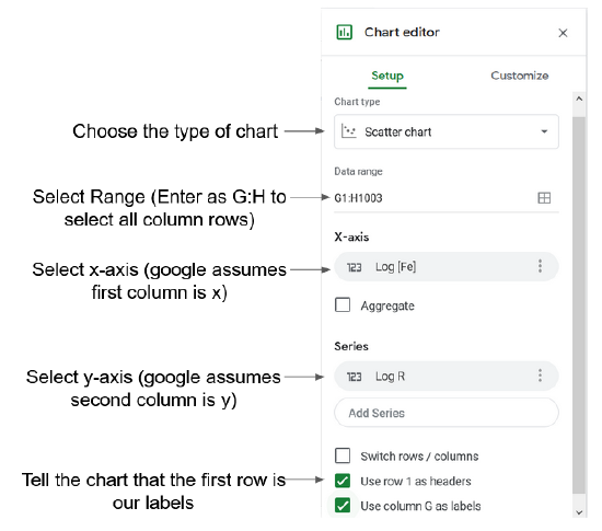
Setup lets you choose the type of chart and the other basic set up for the chart. Figure 1 below explains the different options in the setup menu.
You can also customize a chart using the customize tab. This lets you change the look of a chart.
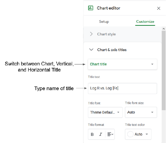
Chart & Axis Titles
You can change the title of the chart or the x and y axis of a chart. If you have Use row 1 as headers checked the sheet should automatically use your first row as the title for the axis.
To change the title you can go to the chart toolbar then customize and select Chart & Axis Titles.
You can switch between the Chart Title, the Horizontal Axis (x), and the Vertical Axis (y) and change the title text.
Alternatively you can change the text by double clicking on the title you want to change
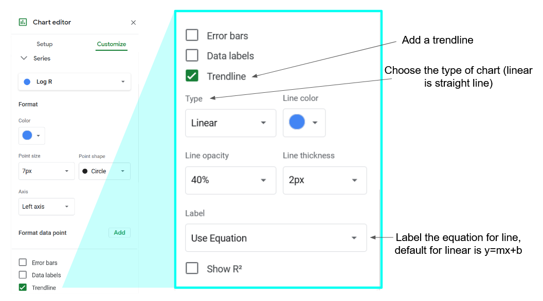
Equation of a Chart
You can add a trendline to get the equation for your graph. To add a trendline go to the chart toolbar then customize and select series.
Scroll down and check off trendline. Use type to select the type of chart then go to label and select Use Equation.
| Type | Description | Equation |
|---|---|---|
| Linear | For data that closely follows a straight line. | \(y = mx+b \) |
| Exponential | For data that rises and falls proportional to its current value. | \(y = A*e^{Bx} \) |
| Polynomial | For data that varies | \( ax^{n} + bx^{(n-1)} + … + zx^{0} \) |
| Logarithmic | For data that rises or falls at a fast rate and then flattens out. | \( y = A*ln(x) + B\) |
| Power series | For data that rises or falls proportional to its current value at the same rate | \( y = A*x^{b} \) |