
3.4: Graphs
- Page ID
- 250488
\( \newcommand{\vecs}[1]{\overset { \scriptstyle \rightharpoonup} {\mathbf{#1}} } \)
\( \newcommand{\vecd}[1]{\overset{-\!-\!\rightharpoonup}{\vphantom{a}\smash {#1}}} \)
\( \newcommand{\id}{\mathrm{id}}\) \( \newcommand{\Span}{\mathrm{span}}\)
( \newcommand{\kernel}{\mathrm{null}\,}\) \( \newcommand{\range}{\mathrm{range}\,}\)
\( \newcommand{\RealPart}{\mathrm{Re}}\) \( \newcommand{\ImaginaryPart}{\mathrm{Im}}\)
\( \newcommand{\Argument}{\mathrm{Arg}}\) \( \newcommand{\norm}[1]{\| #1 \|}\)
\( \newcommand{\inner}[2]{\langle #1, #2 \rangle}\)
\( \newcommand{\Span}{\mathrm{span}}\)
\( \newcommand{\id}{\mathrm{id}}\)
\( \newcommand{\Span}{\mathrm{span}}\)
\( \newcommand{\kernel}{\mathrm{null}\,}\)
\( \newcommand{\range}{\mathrm{range}\,}\)
\( \newcommand{\RealPart}{\mathrm{Re}}\)
\( \newcommand{\ImaginaryPart}{\mathrm{Im}}\)
\( \newcommand{\Argument}{\mathrm{Arg}}\)
\( \newcommand{\norm}[1]{\| #1 \|}\)
\( \newcommand{\inner}[2]{\langle #1, #2 \rangle}\)
\( \newcommand{\Span}{\mathrm{span}}\) \( \newcommand{\AA}{\unicode[.8,0]{x212B}}\)
\( \newcommand{\vectorA}[1]{\vec{#1}} % arrow\)
\( \newcommand{\vectorAt}[1]{\vec{\text{#1}}} % arrow\)
\( \newcommand{\vectorB}[1]{\overset { \scriptstyle \rightharpoonup} {\mathbf{#1}} } \)
\( \newcommand{\vectorC}[1]{\textbf{#1}} \)
\( \newcommand{\vectorD}[1]{\overrightarrow{#1}} \)
\( \newcommand{\vectorDt}[1]{\overrightarrow{\text{#1}}} \)
\( \newcommand{\vectE}[1]{\overset{-\!-\!\rightharpoonup}{\vphantom{a}\smash{\mathbf {#1}}}} \)
\( \newcommand{\vecs}[1]{\overset { \scriptstyle \rightharpoonup} {\mathbf{#1}} } \)
\( \newcommand{\vecd}[1]{\overset{-\!-\!\rightharpoonup}{\vphantom{a}\smash {#1}}} \)
Making and Using Graphs
A graph enables us to visualize the relationship between two variables. To make a graph, set two lines perpendicular to each other:
- The horizontal line is called the x -axis.
- The vertical line is called the y -axis.
- The common zero point is called the origin .
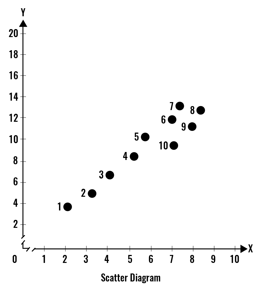
Scatter diagram is a graph of the value of one variable against the value of another variable. (1)
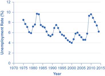
Time-series graph is a graph that measures time on the x-axis and the variable or variables in which we are interested on the y -axis. (1)
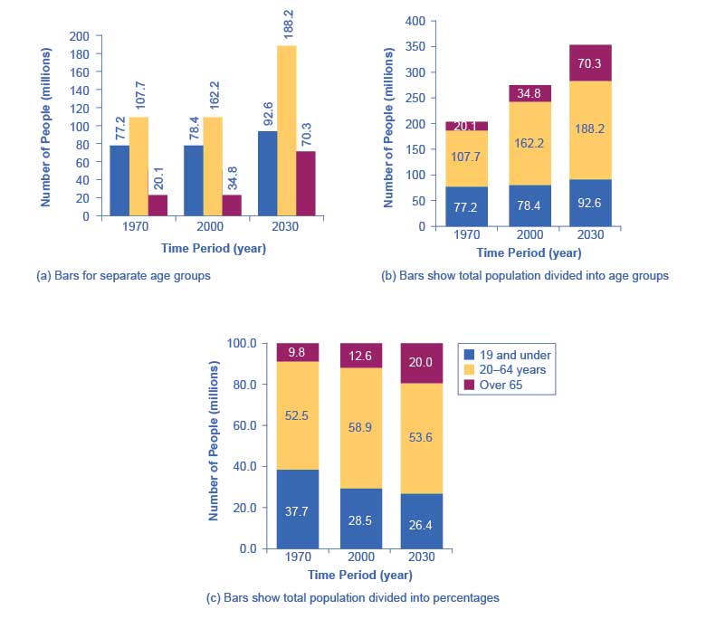
Cross-section graph is a graph that shows the values of an economic variable for different groups in a population at a point in time. (1)
How Graphs Can Be Misleading
Graphs not only reveal patterns; they can also alter how patterns are perceived. To see some of the ways this can be done, consider the line graphs on this page. These graphs all illustrate the unemployment rate—but from different perspectives.
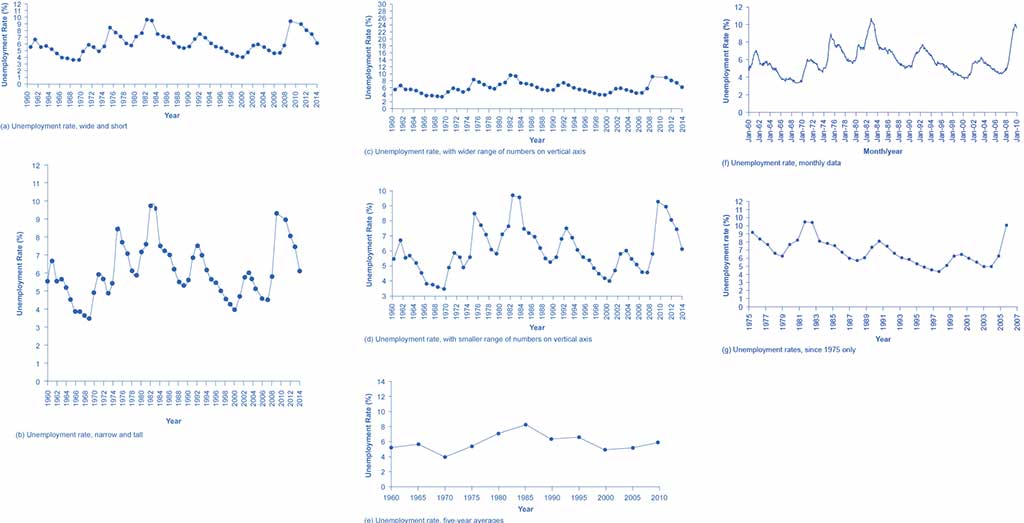
All figures on this page represent the unemployment rates in different ways. All of them are accurate, but by simply changing the width and height of the area in which data is displayed, one may alter the reader’s perception of the data.
Data should not deceive, and economic graphs should represent the economic relationships in a simple and straightforward manner. Being able to read graphs is an essential skill both in economics and in life. A graph is just one perspective or point of view, shaped by choices such as those discussed in this section. Do not always believe the first quick impression from a graph. View with caution. (3)
Interpreting Graphs Used in Economic Models
Positive relationship or direct relationship is a relationship between two variables that move in the same direction. Negative relationship or indirect relationship is a relationship between two variables that move in the opposite direction.
Linear relationship is a relationship that graphs as a straight line. A non-linear relationship graphs as a curve, which may take various shapes. (1)
Explaining the Rate of Increase/Decrease
The graph in Figure 1.6 shows a positive (direct) relationship, which is becoming weaker (less steep).
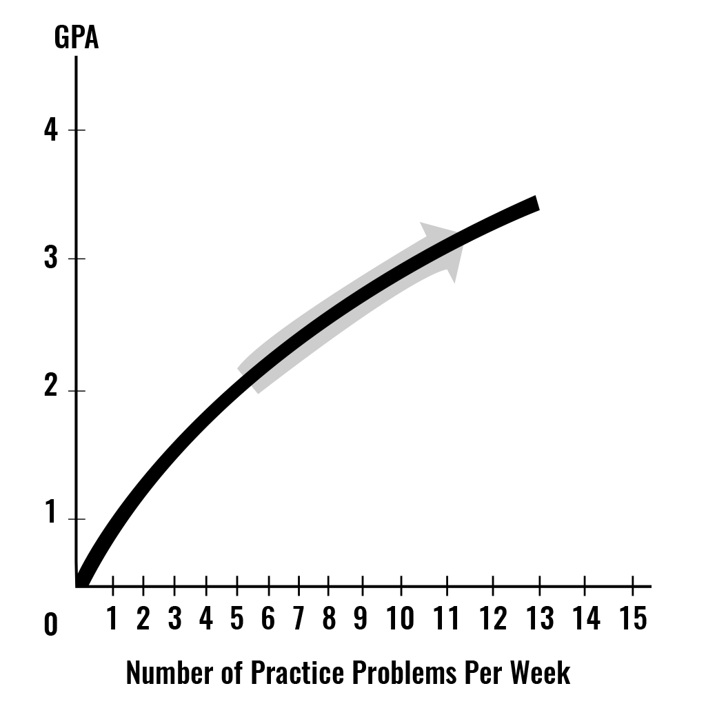
As number of practice problems worked increases in Figure 1.6, the GPA increases. But during the 10th and 11th problem worked, the increase in the GPA is the smallest, so the curve becomes flatter as number of practice problems worked increases. In this case, we say that the variable Y increases at a decreasing rate because the curve gets flatter as the variable X increases. (1)
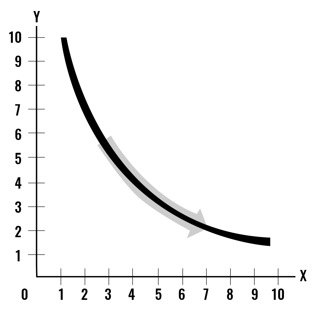
The graph in Figure 1.7 shows a negative (inverse) relationship, which is becoming weaker (less steep).
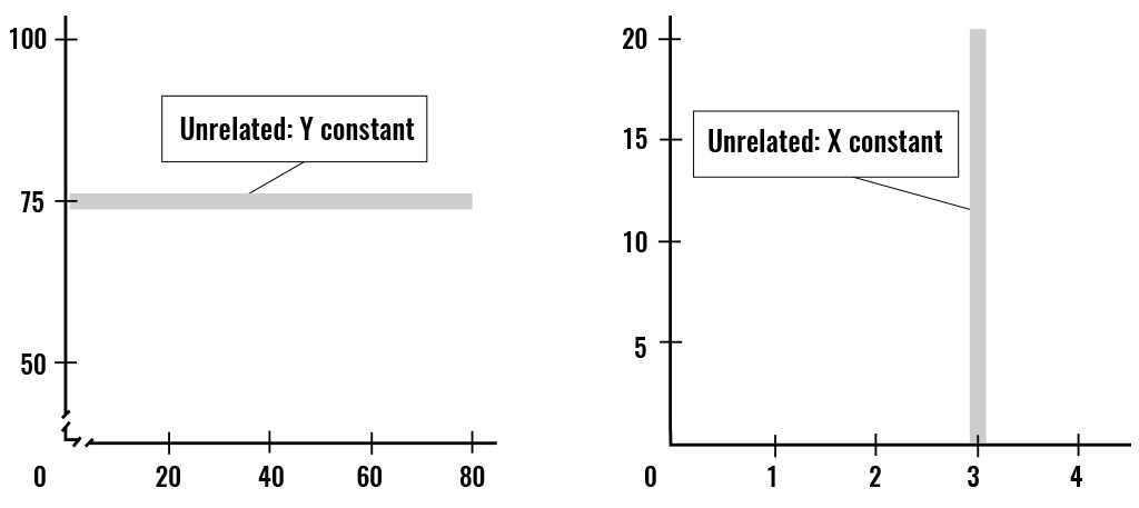
Unrelated Variables
Figures 1.8a and 1.8b show variables that are unrelated. If two variables are unrelated, either a perfectly vertical or perfectly horizontal line would represent the lack of relationship, depending on whether the Y variable or the X variable remains constant when the other variable changes. (1)
The Slope
Slope equals the change in the value of the variable measured on the y-axis divided by the change in the value of the variable measured on the x-axis.
Slope = δ y ÷ δ x
Notice that slope can be either a positive or a negative number. It can also be zero, if the straight line is perfectly horizontal, in which case the change in Y = 0. (1)
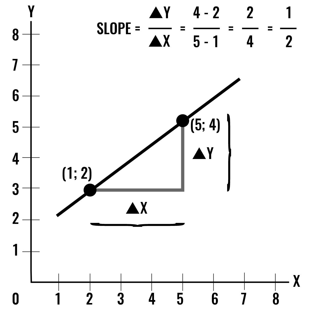
The figure 1.9 shows a positve slope. (1)
- When δ x is 4
- δ y is 2
- Slope (δ y ÷ δ x ) is 2/4 = ½ = 0.5
- Authored by: Florida State College at Jacksonville. License: CC BY: Attribution
- Principles of Macroeconomics. Authored by: OpenStax. Located at: http://cnx.org/contents/4061c832-098e-4b3c-a1d9-7eb593a2cb31@11.11. License: CC BY: Attribution