
1.2: Graphing Lab
- Page ID
- 323007

Learning Objectives
Goals:
- Become proficient with spreadsheets by creating scatter-plot graphs and manipulating graph components with graphing techniques.
- Use Google Sheets to make a Workbook
- Link your Workbook to Instructors Workbook via Google Form
- Convert the Workbook to a PDF and upload assignment through LibreText LabManual
By the end of this lab, students should be able to:
- Use Google Sheets to generate scatter-plot graphs for
- linear functions
- power functions
- exponential functions.
- Use formulas to generate log and ln data
- Correlate linear functions of log/log and natural log plots to power and exponential fits.
- Relate the three different functions to experimental data and justify which fit is the best.
Prior knowledge:
Background
A graph can be used to show the relationship between two related values, the independent and the dependent variables. In this exercise we shall use graphing techniques to describe the temperature dependence of the solubility of aqueous sodium nitrate. By solubility we mean the maximum amount of salt that can dissolve, which forms a saturated solutions. In experiment 3 we will make actual measurements of solubility data for different salts.
- Independent Variable: A measurable value that you can change during the experimental data collection process (Temperature)
- Dependent Variable: A measurable value (solubility) that changes as a function of the independent variable during the data collection process.
Note that if you change the temperature the amount of salt that can dissolve changes, but if you add salt to a saturated solution it does not change the temperature, the excess salt just precipitates out.
One of the objectives in graphing is to make predictions about values we have not yet measured by finding the mathematical relationship between the dependent and the independent variables, and relate this to our theoretical understanding. In so doing we derive a mathematical relationship where y is a function of x.
\[y=\text{function of x} \\ or \\ y=f(x)\]
In this statement y is the dependent variable and plotted on the ordinate (vertical) axis and x is the independent variable and plotted on the abscissa (horizontal) axis. Empirical data is collected through experimentation where x is changed and y is measured, with each data point being represented on a graph with the values (x,y). In this course we shall look at linear, reciprocal, power and single exponential functions.
\[\begin{align} y &=mx+b && \text{(linear function)} \\ y &= m \frac{1}{x} + b && \text{(reciprocal function)} \\ y &= Ax^m && \text{(power function)} \\ y &= Ae^{mx} && \text{(exponential function)} \end{align}\]
Each of the above equations has two variables (x,y) and two constants (m,b) or (m,A) and you should already know how to calculate the constants m(slope) and b (y-intercept) for a straight line. Review section 1B.5: Graphing from general chemistry 1 if needed.
Our goals are three fold:
- Use a spreadsheet to calculate the values of m and A for power and exponential functions.
- Manipulate the data associated with power and exponential functions so they follow a linear plot and calculate the values of m & A without using a spreadsheet.
- Become familiar with log and exponential functions.
In the process of the second goal we will also become familiar with logarithms (third goal), and this is a very important activity as we will be using logarithms throughout this class.
It is also important to understand spreadsheets and regression analysis algorithms. Spreadsheets use various types of regression analysis to fit data to a function and report R2, which is the square of the correlation coefficient (R). When R2=1 the equation correctly predicts the independent variable and the data follows the equation. When it is zero the equation provides no correlation between the dependent and independent variable.
Do not blindly make predictions based on the value of R2. You must always look at the phenomena you are studying, for example the y intercept of the line in figure \(\PageIndex{1}\) is -0.315 and that is nonsense, as you can not have a negative solubility. You can have a negative change, but you can not reduce the concentration to less than zero. It should also be realized that many functions in science are bounded, that is the equation describes a functional relationship over a range of values for the independent variable. The solubility of a salt in liquid water is such a function, and the relationship does not work below the freezing point, where water become ice, or above the boiling point, where it becomes steam.
Lets look at some data and fit it to different functions.
Linear Function:
\[Y=mX+b\]
Example: S= mT + b
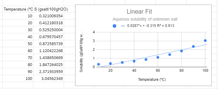 Figure \(\PageIndex{1}\): Linear graph for solubility data of an unknown salt.
There are several things to note from the graph. First, from a visual perspective the linear function not only does not fit the data, but there is a trend where it is above the line at low and high temperature and below the line in the middle. The R2 value is not near one and most importantly, it predicts a negative solubility as the temperature approaches zero, which is nonsense.
Power Function:
\[Y=aX^m\]
Example: S =aTm, which can be converted to an equation of the form of a straight line (Y=mX+b) by converting to logs.
\[\begin{align} logS & =log(aT^m) && \text{power function} \nonumber \\ & =loga + logT^m \nonumber \\ & =loga + mlogT \nonumber \\ logS &= mlogT + loga && \text{linear function} \nonumber \\ y' &= mx' +b' && \text{where y'=logy, x'=logx and b'=logb} \end{align}\]
In the following figure we used Google Sheets to convert the data to log data, and then made two plots, one using a power function fit to the raw data (S,T) and the second using a linear fit with the logS vs. log T data. These two graphs are different ways of representing the same information. The slope of the second graph (m=0.983) is the m of S=ATm of the first graph and the y-intercept (-1.63)= lna from the second equation, so a=10-1.63=0.023.
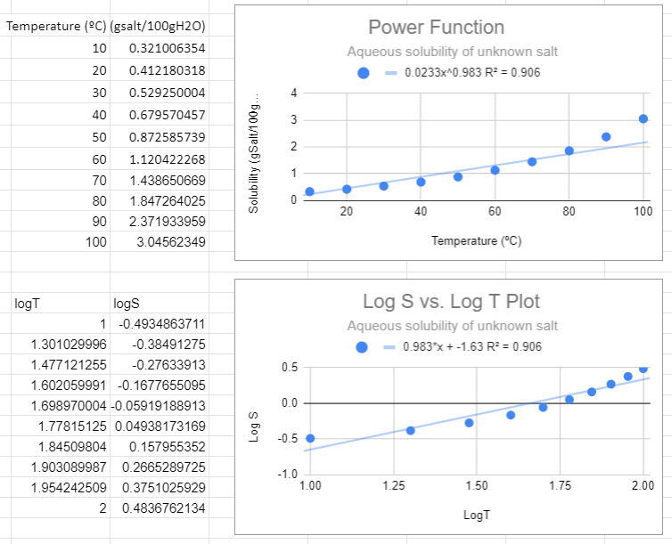 Figure \(\PageIndex{2}\): Power fit on top and the Correlated logS/logT plot on bottom,
There are several things to notice in the above graphs. First, from the top graph the solubility is forced to zero as T goes to zero and this is nonsense, as that would occur no matter what scale you use. Now students might think a negative logS is an issue, but it is not, that just means the concentration is less than one molar. The R2 value is also not close to one, and a student may notice that this power function looks like a linear line, and that is because the value of m is approaching 1 (when m=1 the power function is linear , S=aT +0)
There is one slight of hand going on here that the astute student might catch and that is that we removed the units from the log plots. Logs can not have units, they are in effect saying how many times you multiplied (or divided) the base by itself to get the number (log10100=2 means 10 times itself 2 times equals 100). When we get to real systems we will need to transform values in exponents (or logs) to dimensionless entities. This could have been done here by dividing all solubilities by a standard solution with a numeric value of 1 and we will ignore this issue now, but logs do not have units.
Exponential Function
\[Y=ae^{mT} \]
Example S = aemT, which can be converted to a linear function of lnS to T (not lnT)
\[\begin{align} S & = ae^{mT} && \text{exponential function}\\ lnS & =ln(ae^{mT}) \nonumber \\ & =lna + ln(e^{mT}) \nonumber \\ & =lna + mT\cancel{ln(e)} \nonumber \\ lnS &= mT + lna \\ y'' &= mx +b'' && \text{where y'=logy, x=x and b''=lna} \end{align}\]
An exponential fit of the solubility to temperature gives the same information as a linear fit of the natural log of solubility to temperature, and so the slope of the bottom graph (m=0.025) is the value of m in the exponential function, and the y intercept of the bottom graph gives the pre-expontial, b=-1.39=lna, so a = e-1.39.=0.249=0.25.
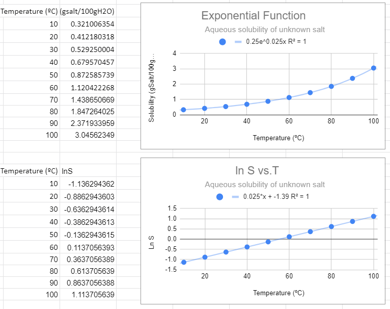
This looks like the best fit. The value of R2=1 and this function makes the most sense in explaining the data. Also note that when the independent variable (T) equals zero you have e0=1, and so the pre-exponential is the value of the solubility at T=0.
Graphing Tutorials and Videos
If you are unsure how to do something in this lab, try the resources in Google Workspace
Graphing Exercise Procedures
Downloads & Forms
Google Sheet Template - this link makes a copy of the lab template that you use to develop your Google Lab Workbook
Google Form - Use the form associated with your lab to submit the URL of your Google Lab Workbook to your instructor through this form
| Chem140311L Form (Tues) | Chem140312L Form (Wed) |
| https://forms.gle/e9qYgZ17FApzKDX48 | https://forms.gle/qqSQCyYaRnMYeqEH6 |
Click Spreadsheet above to get a copy of the spreadsheet. Once that is done click Share Spreadsheet with Instructor, click the link to the Form for your lab and lab section.
Share Spreadsheet
Sheet Skills
How to turn on link sharing to give Instructor Access and Submit Spreadsheet
- Instructions
-
To turn in your spreadsheet we need to enable link sharing. Your sheet may look slightly different depending on your university but the steps will still be the same.
Open the form your instructor sent you and your copy of the spreadsheet.
- On your Spreadsheet Click Share in the top Right Corner (Figure 1)
- Go down to Get Link and click Change link (Figure 1)
- Change permissions to Editor (Figure 2)
- Press Copy Link (Figure 2)
- Go to the form and fill out your email and Name
- When it asks for your Link to Spreadsheet paste the link we copied in step 4.
- Submit your form
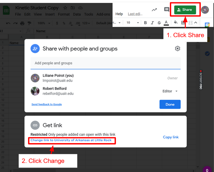
Figure \(\PageIndex{1}\): Click Share at the top Right of your spreadsheet. Then click change link (Poirot) 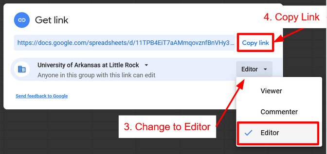
Figure \(\PageIndex{2}\): Change permissions to Editor then Copy Link (Poirot)
Instructions
- Use the solubility data in Table 1.1 to construct seven graphs with Google Sheets
- Follow the formatting suggested in the above videos and tutorials
- axis correctly labeled
- major and minor grid lines are shown
- trendline and the equation for the line of best fit is shown clearly
- Make sure your data and graph are shown side by side
- Submit your Workbook to Adapt by your sections' due date
| Temperature (oC) | Solubility Unknown A (g / 100g H2O) | Solubility Unknown B (g / 100g H2O) |
|---|---|---|
| 30 | 50.8 | 179 |
| 45 | 72.7 | 205 |
| 60 | 104.0 | 230 |
| 75 | 148.9 | 255 |
| 90 | 213.1 | No data available |
Tab 1: Cover Page
- The cover page summarizes all your results and data.
- Fill out your personal information before proceeding to the rest of the lab
- When you are done with each tab you will copy and paste the graphs and resize them to fit in the appropriate box.
- Make sure any orange highlighted cells are filled out before submitting work. These will be graded.
Tab 2: Linear Graph Salt A
From the data in Table 1, create the following graph:
Graph 1: Linear Fit of Temperature vs. solubility for Salt A
Things to keep in mind when making these graphs:
- Label each graph with a title describing the graph and label all axes (don't just accept the automatic label)
- Select the linear regression trend line (y=mx+b) and make sure that you select to show the equation for the line. Move the equation and adjust size so it is clearly visible
Hint! If you set your data range as the entire column (for example A:B instead of A1:B6) your graph will automatically include any new data
Tab 3: Linear Graph Salt B
Duplicate Tab 2 and replace with data from Salt B to make Graph 2: Linear Fit of Temperature vs. solubility for Salt B
Things to keep in mind when making these graphs:
- Check that the labels for your data and on the graph are correct, google doesn't always automatically update them
- Pay attention to the range on your axes, does it fit your data?
Tab 4: Comparison Linear Graph Salt A&B
Create a Chart to compare the two sets of data by creating a multiple series chart.
Design Requirements
- Smoothline chart with dashed lines and data points
- Linear regression trendlines for both series with equation and R
Note: a linear fit will only be a good fit (R2 value close to 1) for one of these salts. Once you identify which one is a good fit, you have now created an equation that will allow you to predict the solubility of that salt at another temperature!
Copy and Paste this chart to the Coverpage and size it to fit the correct box. Identify which one is a good fit
Tab 5: Power Functions
For the salt that does not have a linear relationship between temperature and solubility, you will now make graph 4 & 5.
Duplicate the tab of the data you need so you can make your next graphs.
Graph 4: Power function trend line (y=axb) for the nonlinear graph
(You will now need to create a new column in the graph that calculates the log of the values.)
Graph 5: Find then make a plot of log S vs. log T plot (eq. 1.3 or 1.4) and run a linear fit on this graph. Be sure you can relate graph 5 to graph 4 as described in section 1.2 (figures 1.2 & 1.3).
- Show that the slope of a straight line in this graph is equal to the power (m) in graph 4.
- Mathematically show how the y intercept of this graph can be used to determine the pre-exponential term (A) in graph 4
Tab 6: Exponential Functions
For graphs 6 & 7 make another copy of the data you used for graph 4. You will now need to create a new column in the graph that calculates the ln of the values.
Graph 6: Exponential trend line (y=aemx) fit for the nonlinear graph.
- Write the appropriate equation on all graphs.
- Determine which fit is best.
Graph 7: Make a plot of ln S vs. T and run a linear fit on this graph. Be sure you can relate graph 7 to graph 6 as described in section 1.3 (figures 1.4 & 1.5)
- Show that the slope of a straight line in this graph is equal to the power (m) in graph 6.
- Mathematically show how the y intercept of this graph can be used to determine the pre-exponential term (A) in graph 5
TIPs:
- Use these as templates for future graphs by simply copying the graph, then changing the source data and labeling.
- Hence, you'll want to remember where you saved this file so for future labs you can come back and use the template you already created (saving you time)!
Assessment (self-check):
- Do you know the difference between a dependent and independent variable?
- Do you know where to place the dependent variable on graph? Independent variable?
- Can you title a graph properly?
- Can you label all graph components properly?
- Can you use Google sheets to convert data values to logarithm form?
- Do you know when to and when not to include units?
- Do you know how to add and evaluate a trend line (line of best fit) and correlation magnitude (R2)?
- Can you determine the constants of a power function from a linear plot of the appropriate log data values?
- Can you determine the constants of an exponential function from a linear plot of the appropriate data and ln data values?