
17.17: Reading- Measuring Income Inequality
- Page ID
- 249518
HOW DO YOU SEPARATE POVERTY AND INCOME INEQUALITY?
Poverty levels can be subjective based on the overall income levels of a country; typically poverty is measured based on a percentage of the median income. Income inequality, however, has to do with the distribution of that income, in terms of which group receives the most or the least income. Income inequality involves comparing those with high incomes, middle incomes, and low incomes—not just looking at those below or near the poverty line. In turn, measuring income inequality means dividing up the population into various groups and then comparing the groups, a task that can be carried out in several ways.
Poverty can change even when inequality does not move at all. Imagine a situation in which income for everyone in the population declines by 10%. Poverty would rise, since a greater share of the population would now fall below the poverty line. However, inequality would be the same, because everyone suffered the same proportional loss. Conversely, a general rise in income levels over time would keep inequality the same, but reduce poverty.
It is also possible for income inequality to change without affecting the poverty rate. Imagine a situation in which a large number of people who already have high incomes increase their incomes by even more. Inequality would rise as a result—but the number of people below the poverty line would remain unchanged.
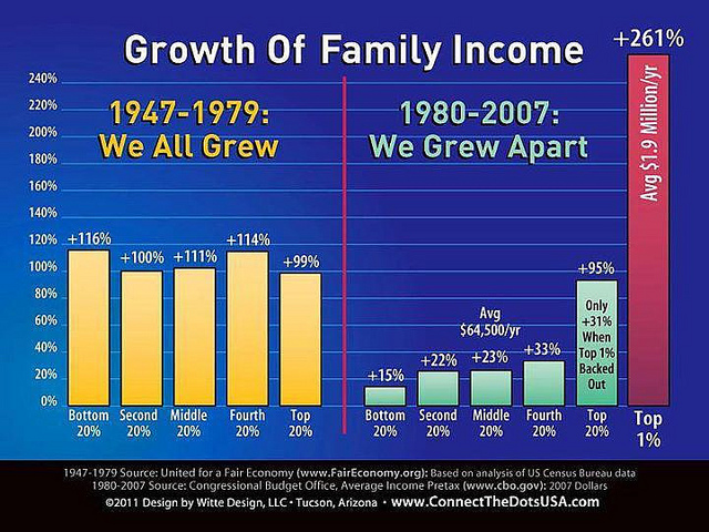
Why did inequality of household income increase in the United States in recent decades? Indeed, a trend toward greater income inequality has occurred in many countries around the world, although the effect has been more powerful in the U.S. economy. Economists have focused their explanations for the increasing inequality on two factors that changed more or less continually from the 1970s into the 2000s. One set of explanations focuses on the changing shape of American households; the other focuses on greater inequality of wages, what some economists call “winner take all” labor marketsHome. We will begin with how we measure inequality, and then consider the explanations for growing inequality in the United States.
Measuring Income Distribution by Quintiles
One common way of measuring income inequality is to rank all households by income, from lowest to highest, and then to divide all households into five groups with equal numbers of people, known as quintilesHome. This calculation allows for measuring the distribution of income among the five groups compared to the total. The first quintile is the lowest fifth or 20%, the second quintile is the next lowest, and so on. Income inequality can be measured by comparing what share of the total income is earned by each quintile.
U.S. income distribution by quintile appears in Table 14.5. In 2011, for example, the bottom quintile of the income distribution received 3.2% of income; the second quintile received 8.4%; the third quintile, 14.3%; the fourth quintile, 23.0%; and the top quintile, 51.14%. The final column of Table 14.5 shows what share of income went to households in the top 5% of the income distribution: 22.3% in 2011. Over time, from the late 1960s to the early 1980s, the top fifth of the income distribution typically received between about 43% to 44% of all income. The share of income that the top fifth received then begins to rise. According to the Census Bureau, much of this increase in the share of income going to the top fifth can be traced to an increase in the share of income going to the top 5%. The quintile measure shows how income inequality has increased in recent decades.
| Year | Lowest Quintile | Second Quintile | Third Quintile | Fourth Quintile | Highest Quintile | Top 5% |
|---|---|---|---|---|---|---|
| 1967 | 4.0 | 10.8 | 17.3 | 24.2 | 43.6 | 17.2 |
| 1970 | 4.1 | 10.8 | 17.4 | 24.5 | 43.3 | 16.6 |
| 1975 | 4.3 | 10.4 | 17.0 | 24.7 | 43.6 | 16.5 |
| 1980 | 4.2 | 10.2 | 16.8 | 24.7 | 44.1 | 16.5 |
| 1985 | 3.9 | 9.8 | 16.2 | 24.4 | 45.6 | 17.6 |
| 1990 | 3.8 | 9.6 | 15.9 | 24.0 | 46.6 | 18.5 |
| 1995 | 3.7 | 9.1 | 15.2 | 23.3 | 48.7 | 21.0 |
| 2000 | 3.6 | 8.9 | 14.8 | 23.0 | 49.8 | 22.1 |
| 2005 | 3.4 | 8.6 | 14.6 | 23.0 | 50.4 | 22.2 |
| 2010 | 3.3 | 8.5 | 14.6 | 23.4 | 50.3 | 21.3 |
| 2011 | 3.2 | 8.4 | 14.3 | 23.0 | 51.1 | 22.3 |
It can also be useful to divide the income distribution in ways other than quintiles; for example, into tenths or even into percentiles (that is, hundredths). A more detailed breakdown can provide additional insights. For example, the last column of Table 14.5 shows the income received by the top 5% percent of the income distribution. Between 1980 and 2011, the share of income going to the top 5% increased by 5.8 percentage points (from 16.5% in 1980 to 22.3% in 2011). From 1980 to 2011 the share of income going to the top quintile increased by 7.0 percentage points (from 44.1% in 1980 to 51.1% in 2011). Thus, the top 20% of householders (the fifth quintile) received over half (51.1%) of all the income in the United States in 2011.
Measuring Income Inequality
The U.S. economy has a relatively high degree of income inequality by global standards. As Table 14.7 shows, based on a variety of national surveys done for a selection of years in the last five years of the 2000s (with the exception of Germany, and adjusted to make the measures more comparable), the U.S. economy has greater inequality than Germany (along with most Western European countries). The region of the world with the highest level of income inequality is Latin America, illustrated in the numbers for Brazil and Mexico. The level of inequality in the United States is lower than in some of the low-income countries of the world, like China and Nigeria, or some middle-income countries like the Russian Federation. However, not all poor countries have highly unequal income distributions; India provides a counterexample.
| Country | Survey Year | First Quintile | Second Quintile | Third Quintile | Fourth Quintile | Fifth Quintile |
|---|---|---|---|---|---|---|
| United States | 2011 | 3.2% | 8.4% | 14.3% | 23.0% | 51.1% |
| Germany | 2000 | 8.5% | 13.7% | 17.8% | 23.1% | 36.9% |
| Brazil | 2009 | 2.9% | 7.1% | 12.4% | 19.0% | 58.6% |
| Mexico | 2010 | 4.9% | 8.8% | 13.3% | 20.2% | 52.8% |
| China | 2009 | 4.7% | 9.7% | 15.3% | 23.2% | 47.1% |
| India | 2010 | 8.5% | 12.1% | 15.7% | 20.8% | 42.8% |
| Russia | 2009 | 6.1% | 10.4% | 14.8% | 21.3% | 47.1% |
| Nigeria | 2010 | 4.4% | 8.3% | 13.0% | 20.3% | 54.0% |
Link It Up
Visit this website to watch a video of wealth inequality across the world.
Lorenz Curve
The data on income inequality can be presented in various ways. For example, you could draw a bar graph that showed the share of income going to each fifth of the income distribution. Figure 14.8 presents an alternative way of showing inequality data in what is called a Lorenz curve. The Lorenz curve shows the cumulative share of population on the horizontal axis and the cumulative percentage of total income received on the vertical axis.

Every Lorenz curve diagram begins with a line sloping up at a 45-degree angle, shown as a dashed line in Figure 14.8. The points along this line show what perfect equality of the income distribution looks like. It would mean, for example, that the bottom 20% of the income distribution receives 20% of the total income, the bottom 40% gets 40% of total income, and so on. The other lines reflect actual U.S. data on inequality for 1980 and 2011.
The trick in graphing a Lorenz curve is that you must change the shares of income for each specific quintile, which are shown in the first column of numbers in Table 14.6, into cumulative income, shown in the second column of numbers. For example, the bottom 40% of the cumulative income distribution will be the sum of the first and second quintiles; the bottom 60% of the cumulative income distribution will be the sum of the first, second, and third quintiles, and so on. The final entry in the cumulative income column needs to be 100%, because by definition, 100% of the population receives 100% of the income.
| Income Category | Share of Income in 1980 (%) | Cumulative Share of Income in 1980 (%) | Share of Income in 2011 (%) | Cumulative Share of Income in 2011 (%) |
|---|---|---|---|---|
| First quintile | 4.2 | 4.2 | 3.2 | 3.2 |
| Second quintile | 10.2 | 14.4 | 8.4 | 11.6 |
| Third quintile | 16.8 | 31.2 | 14.3 | 25.9 |
| Fourth quintile | 24.7 | 55.9 | 23.0 | 48.9 |
| Fifth quintile | 44.1 | 100.0 | 51.1 | 100.0 |
In a Lorenz curve diagram, a more unequal distribution of income will loop farther down and away from the 45-degree line, while a more equal distribution of income will move the line closer to the 45-degree line. The greater inequality of the U.S. income distribution between 1980 and 2011 is illustrated in Figure 14.8 because the Lorenz curve for 2011 is farther from the 45-degree line than the Lorenz curve for 1980. The Lorenz curve is a useful way of presenting the quintile data that provides an image of all the quintile data at once. The next section shows how income inequality differs in various countries compared to the United States.
- Principles of Microeconomics Chapter 14.5. Authored by: OpenStax College. Located at: http://cnx.org/contents/ea2f225e-6063-41ca-bcd8-36482e15ef65@10.31:24/Microeconomics. License: CC BY: Attribution. License Terms: Download for free at http://cnx.org/content/col11627/latest