5.6: Using Excel and R for a Linear Regression
- Page ID
- 220693

\( \newcommand{\vecs}[1]{\overset { \scriptstyle \rightharpoonup} {\mathbf{#1}} } \)
\( \newcommand{\vecd}[1]{\overset{-\!-\!\rightharpoonup}{\vphantom{a}\smash {#1}}} \)
\( \newcommand{\id}{\mathrm{id}}\) \( \newcommand{\Span}{\mathrm{span}}\)
( \newcommand{\kernel}{\mathrm{null}\,}\) \( \newcommand{\range}{\mathrm{range}\,}\)
\( \newcommand{\RealPart}{\mathrm{Re}}\) \( \newcommand{\ImaginaryPart}{\mathrm{Im}}\)
\( \newcommand{\Argument}{\mathrm{Arg}}\) \( \newcommand{\norm}[1]{\| #1 \|}\)
\( \newcommand{\inner}[2]{\langle #1, #2 \rangle}\)
\( \newcommand{\Span}{\mathrm{span}}\)
\( \newcommand{\id}{\mathrm{id}}\)
\( \newcommand{\Span}{\mathrm{span}}\)
\( \newcommand{\kernel}{\mathrm{null}\,}\)
\( \newcommand{\range}{\mathrm{range}\,}\)
\( \newcommand{\RealPart}{\mathrm{Re}}\)
\( \newcommand{\ImaginaryPart}{\mathrm{Im}}\)
\( \newcommand{\Argument}{\mathrm{Arg}}\)
\( \newcommand{\norm}[1]{\| #1 \|}\)
\( \newcommand{\inner}[2]{\langle #1, #2 \rangle}\)
\( \newcommand{\Span}{\mathrm{span}}\) \( \newcommand{\AA}{\unicode[.8,0]{x212B}}\)
\( \newcommand{\vectorA}[1]{\vec{#1}} % arrow\)
\( \newcommand{\vectorAt}[1]{\vec{\text{#1}}} % arrow\)
\( \newcommand{\vectorB}[1]{\overset { \scriptstyle \rightharpoonup} {\mathbf{#1}} } \)
\( \newcommand{\vectorC}[1]{\textbf{#1}} \)
\( \newcommand{\vectorD}[1]{\overrightarrow{#1}} \)
\( \newcommand{\vectorDt}[1]{\overrightarrow{\text{#1}}} \)
\( \newcommand{\vectE}[1]{\overset{-\!-\!\rightharpoonup}{\vphantom{a}\smash{\mathbf {#1}}}} \)
\( \newcommand{\vecs}[1]{\overset { \scriptstyle \rightharpoonup} {\mathbf{#1}} } \)
\( \newcommand{\vecd}[1]{\overset{-\!-\!\rightharpoonup}{\vphantom{a}\smash {#1}}} \)
\(\newcommand{\avec}{\mathbf a}\) \(\newcommand{\bvec}{\mathbf b}\) \(\newcommand{\cvec}{\mathbf c}\) \(\newcommand{\dvec}{\mathbf d}\) \(\newcommand{\dtil}{\widetilde{\mathbf d}}\) \(\newcommand{\evec}{\mathbf e}\) \(\newcommand{\fvec}{\mathbf f}\) \(\newcommand{\nvec}{\mathbf n}\) \(\newcommand{\pvec}{\mathbf p}\) \(\newcommand{\qvec}{\mathbf q}\) \(\newcommand{\svec}{\mathbf s}\) \(\newcommand{\tvec}{\mathbf t}\) \(\newcommand{\uvec}{\mathbf u}\) \(\newcommand{\vvec}{\mathbf v}\) \(\newcommand{\wvec}{\mathbf w}\) \(\newcommand{\xvec}{\mathbf x}\) \(\newcommand{\yvec}{\mathbf y}\) \(\newcommand{\zvec}{\mathbf z}\) \(\newcommand{\rvec}{\mathbf r}\) \(\newcommand{\mvec}{\mathbf m}\) \(\newcommand{\zerovec}{\mathbf 0}\) \(\newcommand{\onevec}{\mathbf 1}\) \(\newcommand{\real}{\mathbb R}\) \(\newcommand{\twovec}[2]{\left[\begin{array}{r}#1 \\ #2 \end{array}\right]}\) \(\newcommand{\ctwovec}[2]{\left[\begin{array}{c}#1 \\ #2 \end{array}\right]}\) \(\newcommand{\threevec}[3]{\left[\begin{array}{r}#1 \\ #2 \\ #3 \end{array}\right]}\) \(\newcommand{\cthreevec}[3]{\left[\begin{array}{c}#1 \\ #2 \\ #3 \end{array}\right]}\) \(\newcommand{\fourvec}[4]{\left[\begin{array}{r}#1 \\ #2 \\ #3 \\ #4 \end{array}\right]}\) \(\newcommand{\cfourvec}[4]{\left[\begin{array}{c}#1 \\ #2 \\ #3 \\ #4 \end{array}\right]}\) \(\newcommand{\fivevec}[5]{\left[\begin{array}{r}#1 \\ #2 \\ #3 \\ #4 \\ #5 \\ \end{array}\right]}\) \(\newcommand{\cfivevec}[5]{\left[\begin{array}{c}#1 \\ #2 \\ #3 \\ #4 \\ #5 \\ \end{array}\right]}\) \(\newcommand{\mattwo}[4]{\left[\begin{array}{rr}#1 \amp #2 \\ #3 \amp #4 \\ \end{array}\right]}\) \(\newcommand{\laspan}[1]{\text{Span}\{#1\}}\) \(\newcommand{\bcal}{\cal B}\) \(\newcommand{\ccal}{\cal C}\) \(\newcommand{\scal}{\cal S}\) \(\newcommand{\wcal}{\cal W}\) \(\newcommand{\ecal}{\cal E}\) \(\newcommand{\coords}[2]{\left\{#1\right\}_{#2}}\) \(\newcommand{\gray}[1]{\color{gray}{#1}}\) \(\newcommand{\lgray}[1]{\color{lightgray}{#1}}\) \(\newcommand{\rank}{\operatorname{rank}}\) \(\newcommand{\row}{\text{Row}}\) \(\newcommand{\col}{\text{Col}}\) \(\renewcommand{\row}{\text{Row}}\) \(\newcommand{\nul}{\text{Nul}}\) \(\newcommand{\var}{\text{Var}}\) \(\newcommand{\corr}{\text{corr}}\) \(\newcommand{\len}[1]{\left|#1\right|}\) \(\newcommand{\bbar}{\overline{\bvec}}\) \(\newcommand{\bhat}{\widehat{\bvec}}\) \(\newcommand{\bperp}{\bvec^\perp}\) \(\newcommand{\xhat}{\widehat{\xvec}}\) \(\newcommand{\vhat}{\widehat{\vvec}}\) \(\newcommand{\uhat}{\widehat{\uvec}}\) \(\newcommand{\what}{\widehat{\wvec}}\) \(\newcommand{\Sighat}{\widehat{\Sigma}}\) \(\newcommand{\lt}{<}\) \(\newcommand{\gt}{>}\) \(\newcommand{\amp}{&}\) \(\definecolor{fillinmathshade}{gray}{0.9}\)Although the calculations in this chapter are relatively straightforward—consisting, as they do, mostly of summations—it is tedious to work through problems using nothing more than a calculator. Both Excel and R include functions for completing a linear regression analysis and for visually evaluating the resulting model.
Excel
Let’s use Excel to fit the following straight-line model to the data in Example 5.4.1.
\[y = \beta_0 + \beta_1 x \nonumber\]
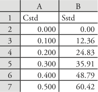
Enter the data into a spreadsheet, as shown in Figure \(\PageIndex{1}\). Depending upon your needs, there are many ways that you can use Excel to complete a linear regression analysis. We will consider three approaches here.
Using Excel's Built-In Functions
If all you need are values for the slope, \(\beta_1\), and the y-intercept, \(\beta_0\), you can use the following functions:
= intercept(known_y's, known_x's)
= slope(known_y's, known_x's)
where known_y’s is the range of cells that contain the signals (y), and known_x’s is the range of cells that contain the concentrations (x). For example, if you click on an empty cell and enter
= slope(B2:B7, A2:A7)
Excel returns exact calculation for the slope (120.705 714 3).
Using Excel's Data Analysis Tools
To obtain the slope and the y-intercept, along with additional statistical details, you can use the data analysis tools in the Data Analysis ToolPak. The ToolPak is not a standard part of Excel’s instillation. To see if you have access to the Analysis ToolPak on your computer, select Tools from the menu bar and look for the Data Analysis... option. If you do not see Data Analysis..., select Add-ins... from the Tools menu. Check the box for the Analysis ToolPak and click on OK to install them.
Select Data Analysis... from the Tools menu, which opens the Data Analysis window. Scroll through the window, select Regression from the available options, and press OK. Place the cursor in the box for Input Y range and then click and drag over cells B1:B7. Place the cursor in the box for Input X range and click and drag over cells A1:A7. Because cells A1 and B1 contain labels, check the box for Labels.
Including labels is a good idea. Excel’s summary output uses the x-axis label to identify the slope.
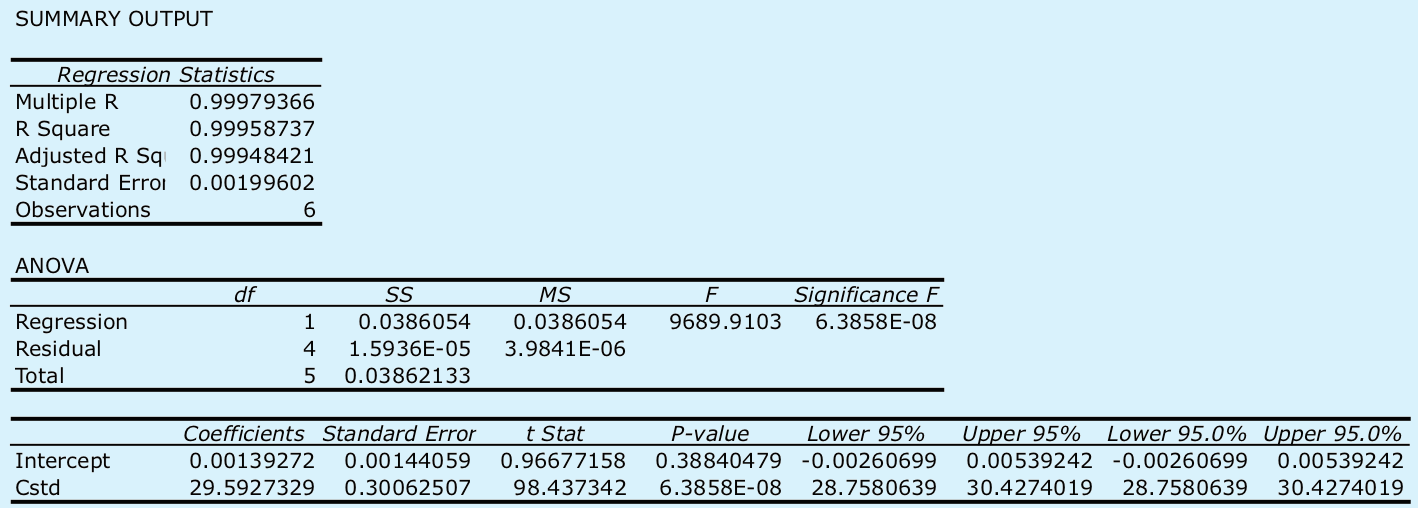
Select the radio button for Output range and click on any empty cell; this is where Excel will place the results. Clicking OK generates the information shown in Figure \(\PageIndex{2}\).
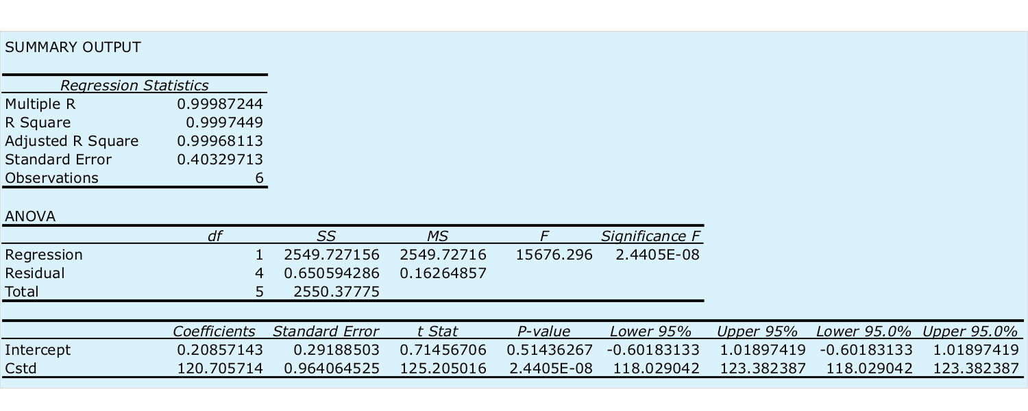
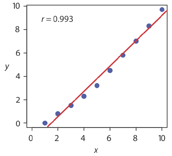
There are three parts to Excel’s summary of a regression analysis. At the top of Figure \(\PageIndex{2}\) is a table of Regression Statistics. The standard error is the standard deviation about the regression, sr. Also of interest is the value for Multiple R, which is the model’s correlation coefficient, r, a term with which you may already be familiar. The correlation coefficient is a measure of the extent to which the regression model explains the variation in y. Values of r range from –1 to +1. The closer the correlation coefficient is to ±1, the better the model is at explaining the data. A correlation coefficient of 0 means there is no relationship between x and y. In developing the calculations for linear regression, we did not consider the correlation coefficient. There is a reason for this. For most straight-line calibration curves the correlation coefficient is very close to +1, typically 0.99 or better. There is a tendency, however, to put too much faith in the correlation coefficient’s significance, and to assume that an r greater than 0.99 means the linear regression model is appropriate. Figure \(\PageIndex{3}\) provides a useful counterexample. Although the regression line has a correlation coefficient of 0.993, the data clearly is curvilinear. The take-home lesson here is simple: do not fall in love with the correlation coefficient!
The second table in Figure \(\PageIndex{2}\) is entitled ANOVA, which stands for analysis of variance. We will take a closer look at ANOVA in Chapter 14. For now, it is sufficient to understand that this part of Excel’s summary provides information on whether the linear regression model explains a significant portion of the variation in the values of y. The value for F is the result of an F-test of the following null and alternative hypotheses.
H0: the regression model does not explain the variation in y
HA: the regression model does explain the variation in y
The value in the column for Significance F is the probability for retaining the null hypothesis. In this example, the probability is \(2.5 \times 10^{-6}\%\), which is strong evidence for accepting the regression model. As is the case with the correlation coefficient, a small value for the probability is a likely outcome for any calibration curve, even when the model is inappropriate. The probability for retaining the null hypothesis for the data in Figure \(\PageIndex{3}\), for example, is \(9.0 \times 10^{-7}\%\).
See Chapter 4.6 for a review of the F-test.
The third table in Figure \(\PageIndex{2}\) provides a summary of the model itself. The values for the model’s coefficients—the slope,\(\beta_1\), and the y-intercept, \(\beta_0\)—are identified as intercept and with your label for the x-axis data, which in this example is Cstd. The standard deviations for the coefficients, \(s_{b_0}\) and \(s_{b_1}\), are in the column labeled Standard error. The column t Stat and the column P-value are for the following t-tests.
slope: \(H_0 \text{: } \beta_1 = 0 \quad H_A \text{: } \beta_1 \neq 0\)
y-intercept: \(H_0 \text{: } \beta_0 = 0 \quad H_A \text{: } \beta_0 \neq 0\)
The results of these t-tests provide convincing evidence that the slope is not zero, but there is no evidence that the y-intercept differs significantly from zero. Also shown are the 95% confidence intervals for the slope and the y-intercept (lower 95% and upper 95%).
See Chapter 4.6 for a review of the t-test.
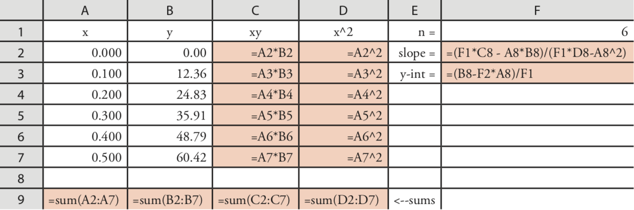
Programming the Formulas Yourself
A third approach to completing a regression analysis is to program a spreadsheet using Excel’s built-in formula for a summation
=sum(first cell:last cell)
and its ability to parse mathematical equations. The resulting spreadsheet is shown in Figure \(\PageIndex{4}\).
Using Excel to Visualize the Regression Model
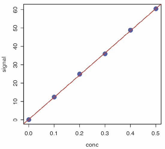
You can use Excel to examine your data and the regression line. Begin by plotting the data. Organize your data in two columns, placing the x values in the left-most column. Click and drag over the data and select Charts from the ribbon. Select Scatter, choosing the option without lines that connect the points. To add a regression line to the chart, click on the chart’s data and select Chart: Add Trendline... from the main men. Pick the straight-line model and click OK to add the line to your chart. By default, Excel displays the regression line from your first point to your last point. Figure \(\PageIndex{5}\) shows the result for the data in Figure \(\PageIndex{1}\).

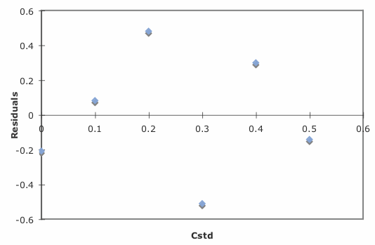
Excel also will create a plot of the regression model’s residual errors. To create the plot, build the regression model using the Analysis ToolPak, as described earlier. Clicking on the option for Residual plots creates the plot shown in Figure \(\PageIndex{6}\).
Limitations to Using Excel for a Regression Analysis
Excel’s biggest limitation for a regression analysis is that it does not provide a function to calculate the uncertainty when predicting values of x. In terms of this chapter, Excel can not calculate the uncertainty for the analyte’s concentration, CA, given the signal for a sample, Ssamp. Another limitation is that Excel does not have a built-in function for a weighted linear regression. You can, however, program a spreadsheet to handle these calculations.
Use Excel to complete the regression analysis in Exercise 5.4.1.
- Answer
-
Begin by entering the data into an Excel spreadsheet, following the format shown in Figure \(\PageIndex{1}\). Because Excel’s Data Analysis tools provide most of the information we need, we will use it here. The resulting output, which is shown below, provides the slope and the y-intercept, along with their respective 95% confidence intervals.
Excel does not provide a function for calculating the uncertainty in the analyte’s concentration, CA, given the signal for a sample, Ssamp. You must complete these calculations by hand. With an Ssamp of 0.114, we find that CA is
\[C_A = \frac {S_{samp} - b_0} {b_1} = \frac {0.114 - 0.0014} {29.59 \text{ M}^{-1}} = 3.80 \times 10^{-3} \text{ M} \nonumber\]
The standard deviation in CA is
\[s_{C_A} = \frac {1.996 \times 10^{-3}} {29.59} \sqrt{\frac {1} {3} + \frac {1} {6} + \frac {(0.114 - 0.1183)^2} {(29.59)^2 \times 4.408 \times 10^{-5})}} = 4.772 \times 10^{-5} \nonumber\]
and the 95% confidence interval is
\[\mu = C_A \pm ts_{C_A} = 3.80 \times 10^{-3} \pm \{2.78 \times (4.772 \times 10^{-5}) \} \nonumber\]
\[\mu = 3.80 \times 10^{-3} \text{ M} \pm 0.13 \times 10^{-3} \text{ M} \nonumber\]
R
Let’s use R to fit the following straight-line model to the data in Example 5.4.1.
\[y = \beta_0 + \beta_1 x \nonumber\]
Entering Data and Creating the Regression Model
To begin, create objects that contain the concentration of the standards and their corresponding signals.
> conc = c(0, 0.1, 0.2, 0.3, 0.4, 0.5)
> signal = c(0, 12.36, 24.83, 35.91, 48.79, 60.42)
The command for a straight-line linear regression model is
lm(y ~ x)
where y and x are the objects the objects our data. To access the results of the regression analysis, we assign them to an object using the following command
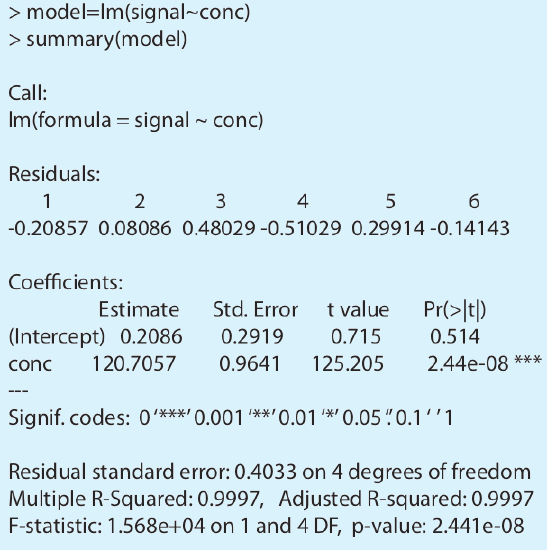
> model = lm(signal ~ conc)
where model is the name we assign to the object.
As you might guess, lm is short for linear model.
You can choose any name for the object that contains the results of the regression analysis.
Evaluating the Linear Regression Model
To evaluate the results of a linear regression we need to examine the data and the regression line, and to review a statistical summary of the model. To examine our data and the regression line, we use the plot command, which takes the following general form
plot(x, y, optional arguments to control style)
where x and y are the objects that contain our data, and the abline command
abline(object, optional arguments to control style)
where object is the object that contains the results of the linear regression. Entering the commands
> plot(conc, signal, pch = 19, col = “blue”, cex = 2)
> abline(model, col = “red”)
creates the plot shown in Figure \(\PageIndex{7}\).
To review a statistical summary of the regression model, we use the summary command.
> summary(model)
The resulting output, shown in Figure \(\PageIndex{8}\), contains three sections.
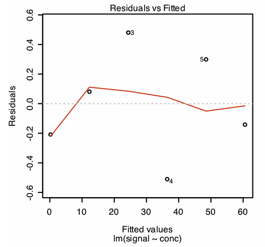
The first section of R’s summary of the regression model lists the residual errors. To examine a plot of the residual errors, use the command
> plot(model, which = 1)
which produces the result shown in Figure \(\PageIndex{9}\). Note that R plots the residuals against the predicted (fitted) values of y instead of against the known values of x. The choice of how to plot the residuals is not critical, as you can see by comparing Figure \(\PageIndex{9}\) to Figure \(\PageIndex{6}\). The line in Figure \(\PageIndex{9}\) is a smoothed fit of the residuals.
The reason for including the argument which = 1 is not immediately obvious. When you use R’s plot command on an object created by the lm command, the default is to create four charts summarizing the model’s suitability. The first of these charts is the residual plot; thus, which = 1 limits the output to this plot.
The second section of Figure \(\PageIndex{8}\) provides the model’s coefficients—the slope, \(\beta_1\), and the y-intercept, \(\beta_0\)—along with their respective standard deviations (Std. Error). The column t value and the column Pr(>|t|) are for the following t-tests.
slope: \(H_0 \text{: } \beta_1 = 0 \quad H_A \text{: } \beta_1 \neq 0\)
y-intercept: \(H_0 \text{: } \beta_0 = 0 \quad H_A \text{: } \beta_0 \neq 0\)
The results of these t-tests provide convincing evidence that the slope is not zero, but no evidence that the y-intercept differs significantly from zero.
The last section of the regression summary provides the standard deviation about the regression (residual standard error), the square of the correlation coefficient (multiple R-squared), and the result of an F-test on the model’s ability to explain the variation in the y values. For a discussion of the correlation coefficient and the F-test of a regression model, as well as their limitations, refer to the section on using Excel’s data analysis tools.
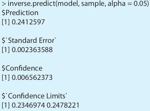
Predicting the Uncertainty in \(C_A\) Given \(S_{samp}\)
Unlike Excel, R includes a command for predicting the uncertainty in an analyte’s concentration, CA, given the signal for a sample, Ssamp. This command is not part of R’s standard installation. To use the command you need to install the “chemCal” package by entering the following command (note: you will need an internet connection to download the package).
> install.packages(“chemCal”)
After installing the package, you need to load the functions into R using the following command. (note: you will need to do this step each time you begin a new R session as the package does not automatically load when you start R).
> library(“chemCal”)
You need to install a package once, but you need to load the package each time you plan to use it. There are ways to configure R so that it automatically loads certain packages; see An Introduction to R for more information (click here to view a PDF version of this document).
The command for predicting the uncertainty in CA is inverse.predict, which takes the following form for an unweighted linear regression
inverse.predict(object, newdata, alpha = value)
where object is the object that contains the regression model’s results, new-data is an object that contains values for Ssamp, and value is the numerical value for the significance level. Let’s use this command to complete Example 5.4.3. First, we create an object that contains the values of Ssamp
> sample = c(29.32, 29.16, 29.51)
and then we complete the computation using the following command
> inverse.predict(model, sample, alpha = 0.05)
producing the result shown in Figure \(\PageIndex{10}\). The analyte’s concentration, CA, is given by the value $Prediction, and its standard deviation, \(s_{C_A}\), is shown as $`Standard Error`. The value for $Confidence is the confidence interval, \(\pm t s_{C_A}\), for the analyte’s concentration, and $`Confidence Limits` provides the lower limit and upper limit for the confidence interval for CA.
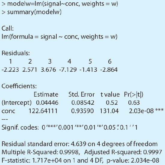
Using R for a Weighted Linear Regression
R’s command for an unweighted linear regression also allows for a weighted linear regression if we include an additional argument, weights, whose value is an object that contains the weights.
lm(y ~ x, weights = object)
Let’s use this command to complete Example 5.4.4. First, we need to create an object that contains the weights, which in R are the reciprocals of the standard deviations in y, \((s_{y_i})^{-2}\). Using the data from Example 5.4.4, we enter
> syi=c(0.02, 0.02, 0.07, 0.13, 0.22, 0.33)
> w=1/syi^2
to create the object that contains the weights. The commands
> modelw= lm(signal ~ conc, weights = w)
> summary(modelw)
generate the output shown in Figure \(\PageIndex{11}\). Any difference between the results shown here and the results shown in Example 5.4.4 are the result of round-off errors in our earlier calculations.
You may have noticed that this way of defining weights is different than that shown in Equation 5.4.15. In deriving equations for a weighted linear regression, you can choose to normalize the sum of the weights to equal the number of points, or you can choose not to—the algorithm in R does not normalize the weights.
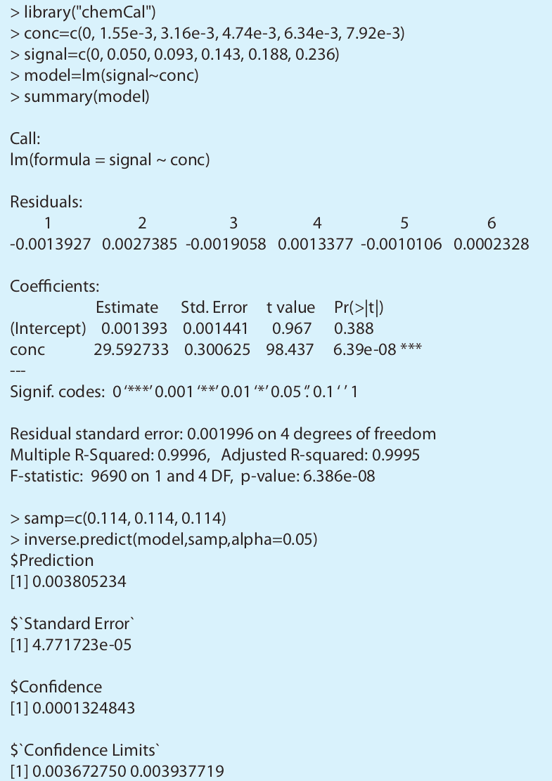
Use R to complete the regression analysis in Exercise 5.4.1.
- Answer
-
The figure below shows the R session for this problem, including loading the chemCal package, creating objects to hold the values for Cstd, Sstd, and Ssamp. Note that for Ssamp, we do not have the actual values for the three replicate measurements. In place of the actual measurements, we just enter the average signal three times. This is okay because the calculation depends on the average signal and the number of replicates, and not on the individual measurements.