
Excel Workshop
- Page ID
- 278761

Excel is awesome and so can you!
Learning Objectives
- Learn basic Excel functionality, including data entry, mathematical manipulations, built-in functions (AVERAGE, STDEV), importing data, etc.
- Use Excel to plot data (scatter plot) and format for scientific reports.
- Find the best-fit line for x-y data using least squares regression. This will be accomplished using two different methods in Excel:
- Add trendline to scatter plot
- LINEST function
- Construct calibration curve
- Assess “goodness of fit” using R2, and uncertainties in m, and b
- Calculate the concentration of an unknown and its uncertainty using a calibration curve
- Determine other “figures-of-merit” for a calibration curve:
- Upper limit of analysis
- Lower limit of detection (LLOD)
- Lower limit of quantitation (LLOQ)
- Linear Range
References
Harvey, D. T. Analytical Chemistry 2.1 [online] 2016 (chapters 4 and 5) http://dpuadweb.depauw.edu/harvey_we...rsion_2.1.html
Harris, D.C. Quantitative Chemical Analysis 9th ed.; W.H. Freeman and Company; New York, 2016.
Schedule
- Day 1:
Work through this handout with others at your table. Everyone is required to hand-in individual work, in digital form one week from today.
Background
In analytical chemistry, one routinely collects large amounts of data, either manually or using software associated with an instrument. This data is then used to calculate new values, determine averages, standard deviations, make plots, and construct calibration curves. In the ‘real world’ employers and PhD advisors expect that all potential employees or students will know how to use a spreadsheet beyond the basics.
Many analytical methods we’ll carry out this semester rely on comparing the signal obtained from an unknown sample to the signal obtained from a standard (known concentration). When many standards (at different concentrations) are run, a calibration curve is usually made in which the signals from the standards are plotted against the concentrations of the standards. Often the relationship between the signal and concentration is linear (i.e., the signal is directly proportional to concentration) over some range of concentrations and a linear least-squares line is used to fit the data. In a least-squares fit, a line is drawn through the plotted data points so that the distance between each data point and the line is minimized.
Workshop Tutorial
Part I: Excel basics
Open Microsoft Excel. Notice that the spreadsheet is divided into cells. Each cell has a unique address given by a letter (column) and a number (row). When you click on a cell, its address is displayed in a small box above the spreadsheet on the left side.
- Inputting numbers: Click on cell A1, type the number “1”. Hit enter. Notice that the number moves to the right side of the cell. This means that Excel has recognized it as a number, not a letter.
- Inputting formulas and referencing cells:
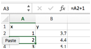
- Click on A2 and type “=”. This tells Excel you’re about to input a formula or function. Whatever comes after the “=” tells Excel what operation you want done. The result is usually a new number in that cell.
- With the cursor (i.e. the “|” symbol) still flashing to the right of the “=”, click on cell A1. This references cell A1. The cell A2 should now say “=A1”.
- With the cursor still blinking to the right of “=A1”, type “+1”. The cell A2 should now say “=A1+1”. This means to take the value in cell A1 and add 1. Hit enter to carry out the operation. Cell A2 should now say “2”. You’ve told Excel to add 1 to the value in A1 and display the result in A2. Congratulations!
- Now click on A2 and copy (command+c on Mac, control+c on PC). Click on A3 and paste (command+v or control-v). Cell A3 should now display the number “3”. Wait. What just happened? Didn’t you just tell Excel to copy A2, which had the value “2” in it? Why doesn’t A3 say “2”?
- To get to bottom of this, notice the box next to the fx above the spreadsheet. We’ll refer to this as the formula bar (the fx itself is the Formula Builder button and we’ll use it later). This box displays the formulas within a selected cell, while the cell itself will display the outcome of that formula. With A3 still selected, you should see “=A2+1” in this box. Ahhh! When you copy a cell with a formula in it, you don’t copy the value in the cell, you copy the formula. By default, all references are relative references. When copied across multiple cells, they change based on the relative position of rows and columns. Make sure you understand what this means before moving on.
- FYI: Excel also allow fixed references by using the “$” symbol. For instance, typing $A$12 into a formula means cell A12 is a fixed value. It will always be used in that formula, even when you copy the formula to a different location. Fixed references will come in handy later, but no need to use them now.
- Shortcuts for copying:
- Highlight cells A4 through A10 and paste again. These cells should now say 4, 5, 6, 7, 8, 9, 10.
- Another quick way to copy: select cell A10 and move the mouse cursor to the bottom right corner on the cell. The cursor should become a solid black “+” sign. Now hold down the left mouse button and drag down to cell A20. Release and be in awe! You’ve copied your formula down 10 more cells!
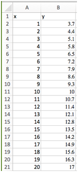
- Now let’s use this column as the x values in a formula for y. Select cell B1 and type “=0.7*A1+3”. Hit enter. Cell B1 should say 3.7 now. Notice we could type “A1” in that formula or select the cell A1 like we did previously (step 4b above). Now copy this formula down to row 20.
- Now let’s label our two columns so we can keep up with them. Proper labeling of a spreadsheet is vital, otherwise we’re prone to make mistakes later on. We’ll first need to insert a new row above our columns. Click on the “1”to the right of cell A1. The entire 1st row show be selected. Right click and choose “insert”. This will insert a new row above.
- Now type “x” above the A column and “y” above the B column.
- Built-in functions:
Excel also has built-in functions. Here we’ll demonstrate how to easily calculate average and standard deviation. We’ll explore other functions later, as needed.
-
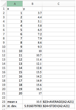
Select cell B23 and type “=average(A2:A21)”. The average value of 10.5 should be displayed. Type “mean x” in cell A23 as a label. In cell C23 type “B23=average(A2:A21)”. This label tells us how the value was calculated without having to look in the formula bar.
-
Select cell S24 and type “=stdev(A2:A21)”. The standard deviation of 5.916079783 should be displayed. Label this cell just like above.
-
- Plotting data:
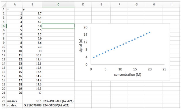
- Select cells A2 across to B21, i.e. both columns of numbers. This should include all your x and y values but not the “x” and “y” headers or the average and standard deviation.
- Go to Insert and choose scatter plot. Do not choose one with lines, only markers. We will use scatter plots almost exclusively in this course and for most scientific plotting applications, in general.
- A plot should appear on your spread sheet showing your x-values versus your y-values. The default formatting of this plot is not adequate for scientific presentation. We’ll need to (i) add axes titles, (ii) remove the gridlines, (iii) remove the chart title, and (iv) change the spacing of the tick marks, and (v) increase the font.
- Select the “Chart Design” tab at the top. Select “Add Chart Element”. A dropdown will appear. Choose “Axis Titles” and choose “Primary Horizontal”. A text box will appear below your x-axis. Double click in this box to add the title “concentration (M)”. Repeat this step but choose “Primary Vertical Axis” and add the title “signal (u)”.
- Click on one of the vertical gridlines to select. Hit the delete key. Repeat for the horizontal gridlines.
- Click on “Chart Title” above the plot. Hit the delete key.
- Click on one of the y-axis tick mark labels (the numbers). If a menu doesn’t pop up on the right side of the screen, right click on a y-axis tick mark label and select “Format axis” from the dropdown menu. Select “Axis Options”. Here we can change upper and lower “Bounds” of this axis and the “Units”. The “Major Units” decide the spacing of the axis tick mark labels. Change this value to 4.
- Based on the task performed above, see if you can figure out how to increase the font size of the tick mark labels and axis labels to 14 pt.
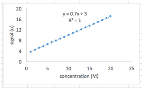
- Best-fit line #1 (the quick way):
As you’ve probably noticed, our plotted data is linear. This is for good reason – the formula we used to generate the y values from the x values was a linear equation (y=mx+b). Let’s have Excel fit this data with a straight line.
-
Right click on one of the data points and select “Add Trendline”. You should see a menu titled “Format Trendline”. Select “Linear” under “Trendline Options”. Also select “Display Equation on Chart” and “Display R-Squared Value on Chart”.
-
You should now see a dotted line drawn through your data points and a text box next to it with the best-fit linear equation and the R2 value. Notice that the best-fit equation is exactly the one we used to generate the y values in the first place (as it should be!), and R2 is equal to 1. The R2 value ranges from 0 to 1 and tells us how good our fit is to the data points. A value close to 1 means we have a good fit.
We’ll carry out the next part in a new sheet. Below your spreadsheet, on the left, you’ll see a tab labeled “Sheet1”. Hit the “+” sign next to it to add a new sheet.
-
Part II: Calibration Curves
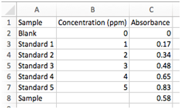
Here we will plot a calibration curve for the concentration of lead as measured by atomic absorption spectroscopy. To generate this data, 5 standard solutions of Pb were made, with concentrations of 1 – 5 ppm, along with a blank (0 ppm of Pb). The absorbance was measured for each standard. You’ll also see in the last row the absorbance for a sample with unknown concentration of Pb. Our goal here is to determine the concentration of Pb in this sample and its associated uncertainty. You’ll carry out a similar experiment later in the semester.
- Importing data:
While sometimes we must manually input the data into Excel, often we can export our data directly from the instrument software into a text (.txt) or comma separated (.csv) file which we can then import into Excel using the following steps.
-
Select the cell where you’d like the imported data to begin, say cell A1.
-
Like always there’s more than one way to import your file, here are a couple possibilities:
- Data dropdown menu at top of screen → get external data → import text file
- Data tab → from text
- Select the following file from your desktop: AACalibrationData.csv
- A Text Import Wizard window will open. We need to tell Excel how our data is separated (or delimited) in the file. In this case, choose “Delimited” and click “Next”.
- On the next screen, choose “Comma”. Click “Next” then “Finish”.
- Excel may ask you where you want to the data. If you’ve already selected the cell you want, i.e. A1, just click OK.
- Go ahead and plot this data with Concentrations as the x value and Absorbance as the y values. Do not include the “Sample” row in this plot, but do include the “Blank”. Format it as we did above, and find the best-fit line.
-
- Best fit line II (LINEST function):
The Excel spreadsheet function LINEST is a complete linear least squares curve fitting routine that produces uncertainty estimates for the fit values. These instructions cover using LINEST as a spreadsheet function. Using LINEST in your spreadsheets is very easy, after you master the concept of an array function. Array functions are functions that, while entered into a single spreadsheet cell, produce results that fill several cells. The steps outlined below take you set-by-step through the process of linear curve fitting with LINEST.
-
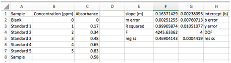
Select cell F1. When we’re done LINEST will output a 5 row by 2 column data array and this cell will be the upper left cell.
-
Click in the formula bar at the top of the screen. Now press the fx button. The Formula Builder will appear with a searchable list of functions. Find LINEST and click “Insert Function”. Click in the box labeled “known_y’s” and select your Absorbance values from the spreadsheet. Do the same for your Concentration values in the “known_x’s” box. Type in "true" in the last two dialog boxes. The first “true” indicates that you wish the line to be in the form y=mx+b with a non-zero intercept. The second “true” specifies that you wish the error estimates to be listed. Hit enter or click “Done”. [Shortcut: You could also just type “=LINEST(y values, x values, true, true)” where y and x values are the cells containing that data. Hit enter.] The cell you chose should now display the slope of the best-fit line.
-
Now here is the important step. LINEST is an array function, which means that when you enter the formula in one cell, multiple cells will be used for the output of the function. Where are the rest of the values? We need to specify that LINEST is an array function:
- Highlight a 5 x 2 array of cells (5 down, 2 across) with the previously calculated slope cell as the upper left cell.
- Highlight the entire formula, including the "=" sign in the formula bar.
- On a Mac with Excel 2016, hold down Ctrl+Shift+Enter.
- On a Mac with Excel 2011 (and older) hold down Command+Enter
- On the PC hold down Ctrl+Shift+Enter
- If this isn’t working, ask you TA. Different version of Excel handles this step differently.
- The array should now be filled with numbers which are labeled below. The labels on the sides must be entered manually.
-
- Least Squares Analysis
You should now evaluate the model that you have built. The R2 (coefficient of determination) value is often used for this purpose, but it is only a rough indicator of the goodness of fit. The R2 value is calculated from the total sum of squares and the regression sum of squares. The total sum of squares, SStotal, is the sum of the squared deviations of the original data from the mean of the observed data, \(\bar{y}\),
\[SS_{total}=\sum_{i=1}^{n}(y_i-\bar{y})^2\nonumber\]
where each yi is a data point from your y values and \(\bar{y}\) is the mean of these values. The regression sum of squares, SSreg, is the sum of the squared deviations of the fit values, fi, from \(\bar{y}\):
\[SS_{reg}=\sum_{i=1}^{n}(f_i-\bar{y})^2\nonumber\]
The value of R2 is calculated from the ratio:
\[R^2=\dfrac{SS_{reg}}{SS_{total}}\nonumber\]
Values close to one are good. Luckily Excel does this calculation for you.
The uncertainties in the slope and intercept are much better for judging the quality of the fit. Equations for these can be found in Chapter 5 of your book, but Excel has done the work for you. In this example the uncertainty in the slope is 0.002513/0.1637*100 = 1.5% and the uncertainty in the intercept is 320%!!! The uncertainties in the slope and intercept are not as good as the R2 of 0.999 might have indicated! Lastly, we’ll also be interested in the standard deviation of our y values, sy, and the degrees of freedom. We won’t worry about the other numbers in our LINEST array output.
- Calculating the concentration of our sample and its associated uncertainty
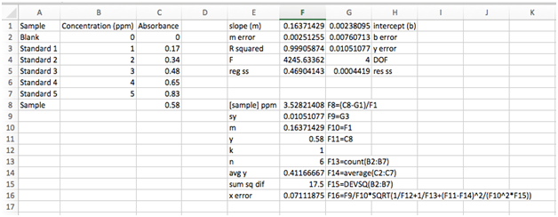
The last row of our imported data gives the absorbance of an unknown sample. Let’s use out LINEST output to find the concentration and its uncertainty.
-
The concentration is easy. Just use your best-fin equation, plug in the sample absorbance, slope, and intercept and solve for the concentration, x.
\[x= \dfrac{(y-b)}{m}\nonumber\]
Note, this could be done without the LINEST function at all, just using the Trendline method, but here we’ll use LINEST.
Use what you’ve already learned about functions and cell references to calculate the concentration and input into cell F8. Be sure to use a parenthesis around the numerator (you must explicitly tell Excel the order of operations, just like on a calculator). You should find a concentration of 3.528214078 ppm. In neighboring cell E8, type [sample]. On the other side, cell G8, type F8=(C8-G1)/F1.
-
Next we must find the uncertainty. Here we’ll need the following equation (textbook pg. 171):
\[s_x=\dfrac{s_y}{|m|} \sqrt{\dfrac{1}{k}+\dfrac{1}{n}+\dfrac{(y-\bar{y})^2}{m^2 \sum_i(x_i-\bar{x})^2}}\nonumber\]
where sy is the standard deviation of y, m is the slope, k is the number of replicate measurements of the unknown, n is the number of data points for the calibration curve, \(\bar{y}\) is the mean value of y for points on the calibration curve, xi are the individual values of x for the points on the calibration curve, and \(\bar{x}\) is the mean value of x for the points on the calibration curve. This is a scary equation but if we stay patient and organized, Excel will make it much easier to solve. The trick is to calculate the various parts first, then bring them all together at the end. We’ll do each calculation in a new cell and label our cells as we go. We’ll also learn some useful function along the way.
-
First, there are a number of variables we already have. Both sy and m are found in our LINEST output array, cells G3 and F1, respectively. The y is the absorbance of our sample in cell C8. For clarity, we’ll copy them under the sample concentration in cell F8 and use similar labels.
-
We’ll also assume k = 1 (only one measurement of the unknown). Enter in the next row.
-
The number of data point, n, is found by simply counting the number of standards + blank (n = 6). For very large data sets, we can use the COUNT function instead by typing “=count(B2:B7)”. Enter this into the next row.
-
The mean value of y can be calculated using the AVERAGE function on the array of y values. Remember, do not include the y value for the sample since it is not part of the calibration curve. You should get \(\bar{y}\) = 0.411666667.
-
Finally, let’s do that pesky sum in the denominator. Luckily Excel has a function for this, too. Type “=devsq(B2:B7)”. You should get 17.5 ppm.
-
Now we’re ready to use the equation above to calculate the uncertainty in x. See if you can figure out how to input this equation into the next row. You’ll need the square root function, SQRT(argument). Remember that an asterisk “*” is used for multiplication, “^” is used to raise to a power, and “/” is used to divide. You should get 0.07111875 ppm.
-
-
Part III: Determining Linear Range
We often are tasked with determine the highest, and more importantly, the lowest concentration our method can detect.
- Upper Limit of Analysis
In many instances, the instrumental signal is not linear at high analyte concentrations. This may be due to chemical effects or limitation of the instrument. Furthermore, there will be a lower concentration limit at which the signal is no longer quantifiable or detectable above the random noise of the instrument. In this section you’ll explore these concepts.
-
Import the file AACalibrationData2.cvs into a new sheet, Sheet3, cell A1.
-
Plot the signal of the calibration standards versus the concentration. Format it as we’ve done before.
-
Fit this data using LINEST method. Based on the R2 value, do you expect this to be a good fit?
-
Use the best-fit line slope and intercept to generate a column of the signal expected from the calibration standards based on the calibration curve. Plot this as a solid line (no markers) on the same plot. Based on what you see, do you think this is a good fit?
-
Notice that at high concentrations, the signal begins to level off. We must decide at which point the data begins to deviate from linearity. Repeat the LINEST function for the following subsets of the data.
- 0 – 125 ppb
- 0 – 100 ppb
- 0 – 75 ppb
- Notice what happens to as we remove the higher concentration data points. We can use this value to make a judgement call about the linearity of the data. Typical minimum acceptable correlation coefficients range from 0.995 to 0.999. We should choose a range of data points that provides the best fit of our data without severely limiting the concentration range over which the calibration curve is valid. In this case 0 – 100 ppb provides a good compromise. The highest concentration used in our calibration curve fit is called the upper limit of analysis. Any sample with a concentration greater than this cannot be reliably analyzed using the calibration curve.
-

- Lower Limit of Detection and Lower Limit of Quantization
Now notice the information that follows the calibration curve data. The analyst has analyzed 7 replicate blank samples (0 ppb Ag) and 7 samples with a low concentration of Ag (2 ppb Ag). This data is required in order to determine the minimum concentration of analyte that may be detected (analyte is present but not necessarily at a concentration great enough to data reliable enough to quantify) and the minimum concentration that is quantifiable (present in a high enough concentration to measure with reasonable accuracy). First we must calculate the lower limit of detection for the signal. This is defined as the blank mean plus three times the standard deviation of a low sample signal:
\[LLOD(signal)=\bar{y}_{blank}+3s_{low}\nonumber\]
-
Calculate the average signal for the blank samples. Be sure to properly label this cell with “average blank” to the left and with the formula to the right, just like we’ve done previously.
-
Calculate the standard deviation for the replicate 2 ppb standards. Label appropriately.
-
Calculate the LLOD(signal). Label accordingly.
To find the LLOD for the concentration we can simple plug in the LLOD(signal) into our calibration curve as the y-value:
\[LLOD(conc.)=\dfrac{y-b}{m}=\dfrac{(\bar{y}_{blank}+3s_{low})-b}{m}\nonumber\]
This is the EXACT form for finding the LLOD of concentration.
Most of the time, this equation is simplified by assuming that \(\bar{y}_{blank}\) and b are the same. Think about why is should be the case. The LLOD(conc.) then becomes:
\[LLOD(conc.)=\dfrac{3s_{low}}{m}\nonumber\]
This is the APPROXIMATE method.
- Calculate the LLOD(conc.) using the EXACT method. Properly label everything.
- Calculate LLOD(conc.) using the APPROXIMATE method. Properly label everything.
- Calculate the % error introduced by using the approximation. Properly label everything.
Now we will calculate the lower limit of quantitation for the signal. This is defined as the blank mean plus 10 times the standard deviation of a low sample signal:
\[LLOQ(signal)=\bar{x}_{blank}+10s_{low}\nonumber\]
- Calculate the LLOQ(signal). Properly label everything.
To find the LLOQ for the concentration we can simple plug in the LLOD(signal) into our calibration curve or, as we’ll do here, use the approximation:
\[LLOQ(conc.)=\dfrac{10s_{low}}{m}\nonumber\]
- Calculate the LLOQ(conc.). Properly label everything.
The linear range is defined as the range over which the instrumental signal is proportional to the concentration of the analyte. The lower end of the linear range is the LLOQ and the upper limit is the upper limit of analysis.
-
Additional Questions
These question pertain to the data from the last section. Type your answers in a Word document and turn in with your Excel file within 1 week. Both your Excel file and Word document should be named “LASTNAME_FIRSTNAME”.
- Generate a calibration curve with a best fit line using the 0 -100 ppb range. What do you notice about the last data point (100 ppb)? If you didn’t have the 125 ppb and 150 ppb data points, would you be sure that this data point’s deviation from the best-fit line was not the result of random error? No need to turn in the plot.
- State your linear range when using the 0 – 100 ppb data points.
- Calculate the concentration of a sample with a signal of 0.532 using both the 0 – 100 ppb best-fit line and the 0 – 75 ppb best-fit line. What’s the % error introduced using the curve with a hint of rollover, i.e. the 0 – 100 ppb curve?
- Since the linear range encompasses the analyte concentrations for which the signal is linear, a signal out of that range cannot be reliably quantified. What can you do to reliably analyze a sample that yields a signal of 0.936?
- What can you do to get a reasonable quantitation of a sample that initially yields a response of 0.010?
- It is possible to fit a non-linear calibration curve. Using the Trendline method, add a 2nd order polynomial trendline to the 0 – 150 ppb data (in the Format Trendline menu you should see an option for “Polynomial” and “Order”. Describe one advantage and one disadvantage of using this trendline.
- Why do you think we can make the assumption that \(\bar{y}_{blank}\) and b are the same when calculating LLOD and LLOQ? To answer this, first describe, in your own words, what that \(\bar{y}_{blank}\) and b are. Based on your results, do you think this was a good assumption to make?
Contributors and Attributions
- Ryan West, University of San Francisco (rmwest2@usfca.edu)