
Atmospheric Gases – CO2 and O3
- Page ID
- 300251

Name:_____________________________________ Partners: ____________________________________
How do we measure Atmospheric CO2 and O3?
Each student should fill out a worksheet for this exercise. As a group, you will plot your data on one graph. This is a group activity but the completed worksheet must represent your own work with answers to questions in your own words.
Objectives:
CO2 and O3 are atmospheric gas that are strongly correlated with global temperatures. In this exercise, you will investigate data sets for each gas. The CO2 data is from Mauna Loa, Hawaii and dates back to the 1950’s, while the O3 is from NASA measurement over Antarctica starting in 1979. These datasets will help you understand: (1) the units used to measure these gases in the atmosphere; (2) the basis about how these atmospheric gases are changing; (3) estimates for how long it will take for these values to change; (4) the effects of looking at only a portion of a data set in terms of describing its properties.
Part I.
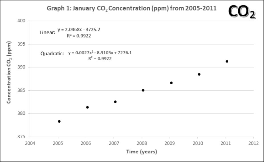
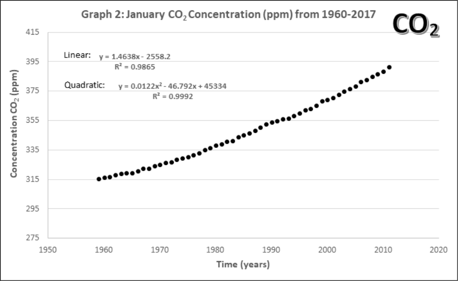
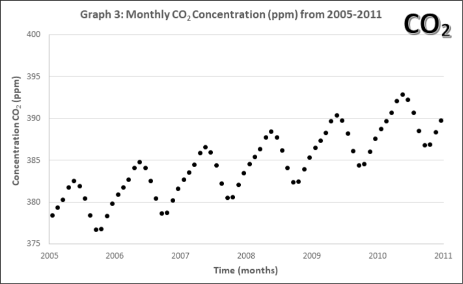
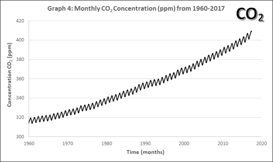
Graphs 1-4 describe the monthly Mauna Loa, Hawaii CO2 levels for: 1) Annual January 2005 – 2011, 2) Annual January 1960-2011, 3) Monthly 2005-2011, 4) Monthly 1960-2011
- The units for CO2 concentrations are ppm, or parts per million.
- Using the first data point in Graph 1, estimate CO2 level in ppm. Then convert this value in a percentage (%) of atmosphere CO2 in 2005.
Atmospheric CO2 in ____________ppm
Atmospheric CO2 in ____________%
- Does your % follow the idea that our atmosphere is mostly N2 (78%) and O2 (21%)? Explain.
- Using the first data point in Graph 1, estimate CO2 level in ppm. Then convert this value in a percentage (%) of atmosphere CO2 in 2005.
- Compare the yearly atmospheric CO2 concentrations (Graphs 1 and 2).
- How does the data change with 45 more years of extra data?
- Lines of best fit. On Graphs 1 and 2, draw a line of best fit. Each graph contains two equations for lines of best fit and an accompanying R2. Circle the one you think would be the best choice for each graph.
- What criteria should be used when choosing a line of best fit? Why?
- How does the data change with 45 more years of extra data?
- Using both equations of best fit in Graph 2, calculate how many years would it take for the maximum CO2 concentration (392.9 ppm) to double to 785.8 ppm? Does this confirm or change your best line of fit in part b?
Using the linear equation, it would take ____________ years for atmospheric CO2 to double.
Using the quadratic equation, it would take ____________ years for atmospheric CO2 to double.
- Look at the monthly atmospheric CO2 concentrations (Graphs 3 and 4).
- Compare this pattern to all of the previous ones. What pattern is now evident in the complete data set? How often does the pattern repeat?
- Discuss with your group and then state, what might account for this pattern? Explain your reasoning.
- Compare this pattern to all of the previous ones. What pattern is now evident in the complete data set? How often does the pattern repeat?
Part II.
In this part, you will shift to another atmospheric gas, ozone O3, which uses a special concentration unit, the Dobson Unit.
One Dobson Unit is defined as the number of molecules of ozone that would be required to create a layer of pure ozone 0.01 millimeters thick at STP. One Dobson Unit would contain about 2.69 x 10¹⁶ ozone molecules for every 1 square centimeter of area that is 0.01 mm tall
- Conversions
- Earth’s ozone averages about 300 Dobson Units (or a layer that is 3 millimeters thick when compressed). How many moles of O3 are there in a 1 cm2 area of atmosphere that is 300.0 Dobson Units?
Result: ____________ moles
- For 300 Dobson Units, what would the volume (in L) of the O3 be? Notes: assume this is a 1 cm x 1 cm x 0.3 cm cube and 1 mL in 1 cm3.
Result: ____________ L
- What is the average molarity of ozone in the atmosphere if it were compressed?
Result: ____________ M
- In reality, the ozone in our atmosphere is located in the stratosphere, which is about 40 km tall. Is the number of molecules stays the same, how does this change the volume and thus molarity?
Result: ____________ L Result: ____________ M
- Earth’s ozone averages about 300 Dobson Units (or a layer that is 3 millimeters thick when compressed). How many moles of O3 are there in a 1 cm2 area of atmosphere that is 300.0 Dobson Units?
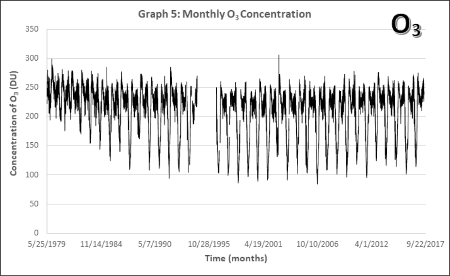
- Look at the monthly atmospheric O3 concentrations from 1979-2017 (Graph 5). Note: There’s a rather large gap in the data around 1995 where NASA’s recording satellite failed. A new one took a year to build and launch.
- Describe the long-term and short-term patterns you see. Are there similarities to the CO2 data (Graphs 1-4)?
- What part of the data would be best suited for describing the “hold in the ozone layer?”
- Describe the long-term and short-term patterns you see. Are there similarities to the CO2 data (Graphs 1-4)?
The ozone hole is not technically a “hole” where no ozone is present, but is actually a region of depleted ozone in the stratosphere over the Antarctic. From the historical record we know that total column ozone values of less than 220 Dobson Units were not observed prior to 1979. Therefore, it is common to define the “hole in the ozone layer” when ozone values drop below this value. It’s a little easier to investigate changes to the ozone layer in Antarctica by measuring the size of this hole in the ozone layer.
- Look at the size of the hole in the ozone layer data from 1979-2017 (Graph 6). Three distinct regions can be seen when 1) development of the hole, 2) a period of rapid growth, and 3) stabilization. Approximately over what times would you define these three regions?
1) The development of the hole occurred between ____________ and ____________.
2) The period of rapid growth occurred between ____________ and ____________.
3) Stabilization occurred between ____________ and ____________.
- In your opinion what does the future of the hole in the ozone look like? Is it getting smaller? Staying the same? Make a prediction on how long it might take to get back to pre-1980 levels.
Data

Contributors and Attributions
- Nick Kuklinski, Furman University (nick.kuklinski@furman.edu)
- Sourced from the Analytical Sciences Digital Library