
Part II: Ways to Visualize Data
- Page ID
- 81497

Use the dot plot in Figure 1 to deduce the general structure of a box and whisker plot, giving particular attention to the position along the x-axis of the three vertical lines that make up the yellow box and the two vertical lines that make up the whiskers on either side of the yellow box. You might begin by tabulating the number of samples that fall to the left of the box, that fall within the box, including its boundaries, and that fall to the right of the box, and the number of samples that lie to the left and to the right of line inside the box.
Of the 30 samples, seven are on the left side of the box, 17 are within the box, and six are on the right side of the box; relative to the box’s middle line, 14 lie to the left and 13 lie to the right. One reasonable interpretation of these observations is that the box contains approximately the middle 50% of the data (17 of 30 samples, or 57%) and that the line inside the box divides the data approximately in half (14 of 30 samples, or 47%, are left of the line and 13 of 30 samples, or 43%, are right of the line).
The two whiskers extend to encompass all but one of the 30 samples. Clearly the whiskers convey information about the overall variability of the data, but there is insufficient information in this one example to suggest exactly how the length of the whiskers are determined (although, at least for this example, the whiskers do not include the one sample that lies at a distance of more than 1.5 × w, where w is the width of the box.
For students who have difficulty accepting 57%, 47%, and 43% as being suggestive of 50%, it helps to have them consider the effect on the percentages of the limited number of samples (30) and the fact that multiple samples have the same result. For further details on box and whisker plots, see https://en.Wikipedia.org/wiki/Box_plot.
There are a variety of ways to define the whiskers and to handle points that fall outside of a whisker. The method used here is to draw a whisker to the data point whose value is no greater than +1.5 × w of the box’s largest value (in this case 17+1.5 × 4 = 23), and to draw a whisker to the data point whose value is no less than -1.5 × w of the box’s smallest value (in this case 13 - 1.5 × 4 = 7). Results that fall outside of the whiskers are flagged using a dot (•), even when individual results are not shown using a dot plot.
The box and whisker plot in Figure 1 is perfectly symmetrical in that each side of the box is two units from the box’s middle line, and each whisker is six units from the box’s nearest edge. What does this symmetry suggest about how the results are distributed? Is the actual distribution of the 30 results perfectly symmetrical? If no, is this a problem?
The symmetry of the box and the whiskers suggests that there is a symmetrical distribution of the data set’s individual results around its middle. The data itself is not perfectly symmetrical—for example, there are five samples within ±2 of the left whisker, but just three samples within ±2 of the right whisker. This difference between the symmetry of the data and the symmetry of the box and whisker plot is not a problem as we use a box and whisker plot simply to develop a general understanding of our data’s structure.
In Figure 1 we see that the result for sample 22 falls outside the range of values included within the whiskers. Why might a result that falls outside the whiskers concern us? Does the presence of this particular point suggest a problem? How might your response change if this sample’s reported value is 0 yellow M&Ms? How might your response change if this sample’s reported value is 45 yellow M&Ms?
If we assume that the box and the whiskers should include all samples for which the results are not subject to an error—then we might wish to look more closely at a sample that falls outside of the whiskers as it may suggest a problem with our data, either in the counting of M&Ms, in the recording of that count, or in the manufacturing process. In this case, the result for sample 22 does not bother us as it is not that different from the next lowest value and, more important, an error in counting M&Ms does seem not likely when the bag contains just 55 M&Ms (a counting error is more likely if a bag has 550 M&Ms). For the same reason, we are not likely to question a result of 0. A result of 45 yellow M&Ms, however, seems unreasonable as it is almost twice as many as the next highest value; in this case we might suspect that an error was made when entering the result into the data table.
Investigation 15 introduces the difference between samples and populations, so this language is not used here; if you wish to discuss this difference here, you may wish to begin the case study with a discussion of samples and populations.
Figure 2 shows box and whisker plots and dot plots for all six colors of M&Ms included in Table 2 (note: even with jittering, you will not be able to see all 30 samples in these dot plots). Based on these plots, where do you see similarities and where do you see differences in the distribution of M&Ms? What do these similarities and differences suggest to you? For those distributions that do not appear symmetrical, suggest one or more reasons for the lack of symmetry. What do the relative positions of the data for brown and for green M&Ms suggest about their relative abundance in 1.69-oz packages of plain M&Ms?
There are many observations we can make using this data, a few of which are gathered here. One observation is that finding a sample outside of the whiskers is a rare event as it happens just once in 180 measurements (sample 22, yellow). Another observation is that the boxes for brown M&Ms and for yellow M&Ms overlap each other but do not overlap with the other four colors of M&Ms (although the upper edge of the box for red abuts the lower edge of the box for yellow); this suggests that yellow M&Ms and brown M&Ms are much more common than the other four colors. Another interesting difference is that the lower whiskers for blue, green, and orange M&Ms are much shorter than their respective upper whiskers; this suggests that their distributions are not symmetrical, a result that is not surprising given that the we cannot have fewer than zero M&Ms with any particular color. Finally, the relative positions of the box and whisker plots for green M&Ms and for brown M&Ms suggests that it is a rare bag that has more green M&Ms than brown M&Ms, which places a hard limit on the data’s lower boundary; indeed, this happens just once (sample 30, which has 9 green M&Ms and 8 brown M&Ms).
Figure 3 shows box and whisker plots and dot plots for yellow M&Ms grouped by the store where the packages of M&Ms were purchased. Based on these plots, where do you see similarities and where do you see differences in the distribution of yellow M&Ms? What do these similarities and differences suggest to you? In what ways might this data be reassuring to us? Give an example of a result that might suggest we look more closely at our data.
Although the box and whisker plots are quite different in terms of the relative sizes of the boxes and the relative length of the whiskers, the dot plots suggest that the distribution of the underlying data is relatively similar in that most values are in the range of 12–18 yellow M&Ms with a maximum of 22 or 23 yellow M&Ms and a minimum of eight yellow M&Ms (setting aside sample 22, which, as noted in the response to Investigation 9, is the only result in 180 measurements that does not fall within the span of its whiskers). These observations are reassuring because we do not expect the source of the bags of M&Ms to affect the composition of their contents. If we saw evidence that the source did affect our results, then we would need to look more closely at the bags themselves for evidence of a poorly controlled variable, such as type (Did we accidently purchase bags of peanut butter M&Ms from one store?) or the product’s lot number (Did the manufacturer change the composition of colors between lots?).
As a reminder, the division of the 30 samples among these three sources is artificial and is done solely to illustrate the concept of grouping and the analysis of a common variable (yellow M&Ms) between different groups.
Draw a box and whisker plot and an accompanying dot plot for the total number of M&Ms. Compare your plots to those in Figure 2 and discuss any similarities and differences.
The total number of M&Ms in the 30 samples are, in order 57, 56, 59, 56, 57, 54, 57, 57, 56, 55, 59, 58, 55, 56, 55, 58, 56, 56, 56, 60, 58, 55, 57, 56, 55, 59, 59, 57, 54, and 56. A box & whisker plot and a dot plot are shown below.
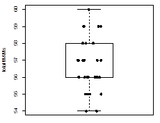
The most interesting observation for this data is that the box does not appear to have a middle line. Of course, it actually does have a middle line, but it simply is the same as the box’s lower limit. We already know from Investigation 7 that the box’s middle line divides the data in half, so we know that half of the bags have 56 or fewer M&Ms and that half have 56 or more M&Ms. We also know that we have a greater number of unique results above the middle value (57, 58, 59, and 60 M&Ms) than below the middle value (54 and 55 M&Ms). Although the box and the whisker plot looks symmetrical, the results are skewed somewhat toward larger numbers of M&Ms.
Students will benefit from drawing this plot by hand. Although Excel does not include a command for drawing a box and whisker plot, an on-line search will yield methods for creating a plot that will mimic the traditional box and whisker plot. The statistical program R has a built in boxplot command.
For the histograms in Figure 4, where do you see similarities and where do you see differences in the distribution of M&Ms? How do the results seen here compare with your interpretation of the box and whisker plots and the dot plots in Figure 2?
The information here is very similar to what we saw in the box and whisker plots. In particular, the colors of M&Ms with the least symmetrical whiskers—blue, green, and orange—have histograms that are not symmetrical and that tend to decrease in value more slowly when moving from the bin that contains the greatest number of samples to bins that contain samples with greater numbers of M&M. The lack of symmetry for yellow M&Ms, which decreases in value more slowly as we move from the bin that contains the greatest number of samples toward bins that contains samples with a smaller number of M&Ms, is more evident here than in the box and whisker plots.
The histograms in Figure 5, from left-to-right, use bins widths of 1, 2, and 3 units, respectively. Note that the x-axis shows the specific results gathered into each bin. How does the choice of bin size affect your understanding of this data? Which of these histograms provides the best representation of the data? As part of your answer, identify what you see as the limitations of the other two histograms.
Using a bin size of 1 unit makes it easy to see that there were no bags with 9, 12, or 14 M&Ms; this information is not available when the bins have sizes of 2 units or of 3 units. The histograms using bins of 1 unit and of 2 units are similar in shape: if we draw a smooth curve through the data—ignoring the noise due to our limited number of samples—both histograms suggest that the frequency of an outcome decreases as we move from the smallest number of M&Ms (four) to the largest number of M&Ms (15); a smooth curve through the histogram using a bin of 3 units, however, suggests that the frequency increases and then decreases as we move from the smallest number of M&Ms (four) to the largest number of M&Ms (15).
Of the three options, the best representation of the data is the one with a bin size of 2 units. Although the histogram using a bin size of 1 unit does show us possible outcomes that did not occur, the resulting histogram is much noisier. The histogram using a bin size of 3 units is the least noisy, but its first bin includes as possible outcomes results that are not in our data (two and three orange M&Ms), which is somewhat misleading.
Draw a histogram for the total number of M&Ms and explain the reason(s) for your choice of bin size. Compare your plots to those in Figure 4 and discuss any similarities and any differences.
The total number of M&Ms in the 30 samples are, in order 57, 56, 59, 56, 57, 54, 57, 57, 56, 55, 59, 58, 55, 56, 55, 58, 56, 56, 56, 60, 58, 55, 57, 56, 55, 59, 59, 57, 54, and 56. Gathering these into a frequency table
|
number of M&Ms |
54 |
55 |
56 |
57 |
58 |
59 |
60 |
|---|---|---|---|---|---|---|---|
|
frequency |
2 |
5 |
9 |
6 |
3 |
4 |
1 |
suggests that a bin size of 1 unit is a good option as a bin size of 2 units has just four total bins, one of which must include a result either less than 54 or greater than 60; the resulting histogram is shown below.
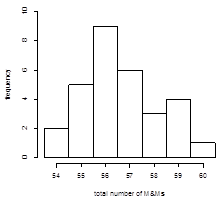
This histogram is consistent with our observations from the box and whisker plot in Investigation 12, but it presents us with a much clearer picture of the data.
Students will benefit from drawing this plot by hand. Excel’s Data Analysis tools provides a method for creating histograms, as does R using the hist command.