
Part II: Ways to Visualize Data
- Page ID
- 81257

Suppose we are interested in characterizing 1.69-oz (47.9-g) packages of plain M&Ms. We obtain 30 bags (ten from each of three stores) and, for each bag, report the number of blue, brown, green, orange, red, and yellow M&Ms—for yellow, the number in parentheses is the number of yellow M&Ms in the first five drawn from the bag—and their combined net weight. Table 2 summarizes the data for the last six samples. The full set of data for all 30 samples is available as a separate spreadsheet or R file.
|
bag |
store |
blue |
brown |
green |
orange |
red |
yellow |
net weight (g) |
|---|---|---|---|---|---|---|---|---|
|
25 |
CVS |
7 |
13 |
0 |
4 |
15 |
16 (2) |
48.212 |
|
26 |
Target |
6 |
15 |
1 |
13 |
10 |
14 (1) |
51.682 |
|
27 |
CVS |
5 |
17 |
6 |
4 |
8 |
19 (1) |
50.802 |
|
28 |
Kroger |
1 |
21 |
6 |
5 |
10 |
14 (0) |
49.055 |
|
29 |
Target |
4 |
12 |
6 |
5 |
13 |
14 (2) |
46.577 |
|
30 |
Kroger |
15 |
8 |
9 |
6 |
10 |
8 (1) |
48.317 |
Having collected some data, our next step is to examine it for possible problems, such as missing values or errors introduced when we recorded the data, or to identify important variables and interesting patterns or trends within or between these variables. Although this information is embedded within the data itself, often it is difficult to see it when the data is displayed as a table, particularly if the data set is large in size. Instead, we use one or more simple visualizations of the data.
Two simple visualizations are box and whisker plots and dot plots, examples of which are shown in Figure 1 using the data for yellow M&Ms. Note that neither plot has meaningful information along the y-axis as the vertical dimension simply helps us visualize the data. The vertical distribution of points in the dot plot, for example, is the result of jittering, which offsets samples that share a common number of yellow M&Ms so that, we hope, each appears as a distinct point.
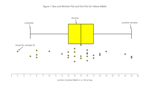
Use the dot plot in Figure 1 to deduce the general structure of a box and whisker plot, giving particular attention to the position along the x-axis of the three vertical lines that make up the yellow box and the two vertical lines that make up the whiskers on either side of the yellow box. You might begin by tabulating the number of samples that fall to the left of the box, that fall within the box, including its boundaries, and that fall to the right of the box, and the number of samples that lie to the left and to the right of line inside the box.
As suggested by the next two investigations, one way to use a box and whisker plot is to look for unexpected features in our data that merit attention, such as an oddly shaped distribution of results or an unusually large or an unusually small result for a variable.
The box and whisker plot in Figure 1 is perfectly symmetrical in that each side of the box is two units from the box’s middle line, and each whisker is six units from the box’s nearest edge. What does this symmetry suggest about how the results are distributed? Is the actual distribution of the 30 results perfectly symmetrical? If no, is this a problem?
In Figure 1 we see that the result for sample 22 falls outside the range of values included within the whiskers. Why might a result that falls outside the whiskers concern us? Does the presence of this particular point suggest a problem? How might your response change if this sample’s reported value is 0 yellow M&Ms? How might your response change if this sample’s reported value is 45 yellow M&Ms?
In addition to providing us with insight into the results for a single variable, we can use box and whisker plots and dot plots to examine differences between variables and differences within a single variable when we can divide that variable into different groups.
Figure 2 shows box and whisker plots and dot plots for all six colors of M&Ms included in Table 2 (note: even with jittering, you will not be able to see all 30 samples in these dot plots). Based on these plots, where do you see similarities and where do you see differences in the distribution of M&Ms? What do these similarities and differences suggest to you? For those distributions that do not appear symmetrical, suggest one or more reasons for the lack of symmetry. What do the relative positions of the data for brown and for green M&Ms suggest about their relative abundance in 1.69-oz packages of plain M&Ms?
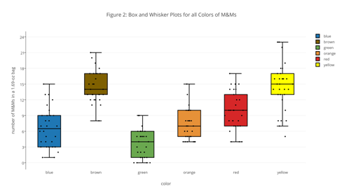
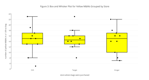
Figure 3 shows box and whisker plots and dot plots for yellow M&Ms grouped by the store where the packages of M&Ms were purchased. Based on these plots, where do you see similarities and where do you see differences in the distribution of yellow M&Ms? What do these similarities and differences suggest to you? In what ways might this data be reassuring to us? Give an example of a result that might suggest we look more closely at our data.
Draw a box and whisker plot and an accompanying dot plot for the total number of M&Ms. Compare your plots to those in Figure 2 and discuss any similarities and differences.
Although a box and whisker plot provides some evidence of how a variable’s values are distributed, it is not particularly easy to see the shape of that distribution. For this we use a histogram, which displays the number of results that fall within a sequence of (usually) equally spaced bins. Figure 4, for example, shows histograms for each color of M&Ms in our data set.
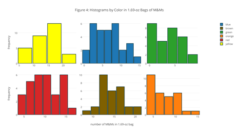
For the histograms in Figure 4, where do you see similarities and where do you see differences in the distribution of M&Ms? How do the results seen here compare with your interpretation of the box and whisker plots and the dot plots in Figure 2?
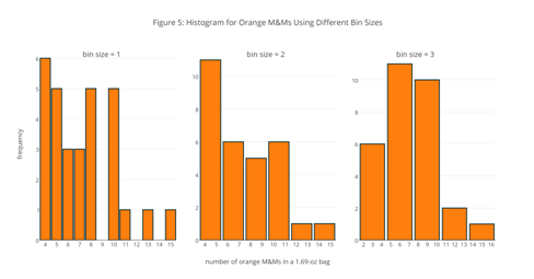
One challenge when we draw a histogram is choosing the width for the bins or the number of bins. In Figure 4, for example, the bins for yellow M&Ms are five units wide—the first bin, for example, includes samples with 5, 6, 7, 8, and 9 yellow M&Ms—but the bins are two units wide for all other colors of M&Ms. There are no simple rules for determining the number or the width of bins, so it is a good idea to try several bin sizes before we settle on a final choice.
The histograms in Figure 5, from left-to-right, use bins widths of 1, 2, and 3 units, respectively. Note that the x-axis shows the specific results gathered into each bin. How does the choice of bin size affect your understanding of this data? Which of these histograms provides the best representation of the data? As part of your answer, identify what you see as the limitations of the other two histograms.
Draw a histogram for the total number of M&Ms and explain the reason(s) for your choice of bin size. Compare your plots to those in Figure 4 and discuss any similarities and any differences.