11.3: Principal Component Analysis
- Page ID
- 292606

The figure below—which is similar in structure to Figure 11.2.2 but with more samples—shows the absorbance values for 80 samples at wavelengths of 400.3 nm, 508.7 nm, and 801.8 nm. Although the axes define the space in which the points appear, the individual points themselves are, with a few exceptions, not aligned with the axes. The cloud of 80 points has a global mean position within this space and a global variance around the global mean (see Chapter 7.3 where we used these terms in the context of an analysis of variance).
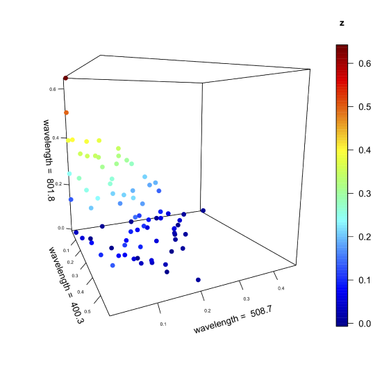
Suppose we leave the points in space as they are and rotate the three axes. We might rotate the three axes until one passes through the cloud in a way that maximizes the variation of the data along that axis, which means this new axis accounts for the greatest contribution to the global variance. Having aligned this primary axis with the data, we then hold it in place and rotate the remaining two axes around the primary axis until one them passes through the cloud in a way that maximizes the data's remaining variance along that axis; this becomes the secondary axis. Finally, the third, or tertiary axis, is left, which explains whatever variance remains. In essence, this is what comprises a principal component analysis (PCA).
How Does a Principal Component Analysis Work?
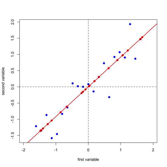
One of the challenges with understanding how PCA works is that we cannot visualize our data in more than three dimensions. The data in Figure \(\PageIndex{1}\), for example, consists of spectra for 24 samples recorded at 635 wavelengths. To visualize all of this data requires that we plot it along 635 axes in 635-dimensional space! Let's consider a much simpler system that consists of 21 samples for each of which we measure just two properties that we will call the first variable and the second variable. Figure \(\PageIndex{2}\) shows our data, which we can express as a matrix with 21 rows, one for each of the 21 samples, and 2 columns, one for each of the two variables.
\[ [D]_{21 \times 2} \nonumber \]
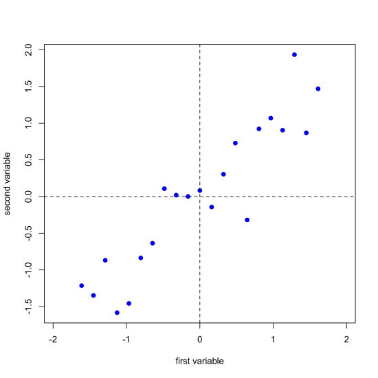
Next, we complete a linear regression analysis on the data and add the regression line to the plot; we call this the first principal component.
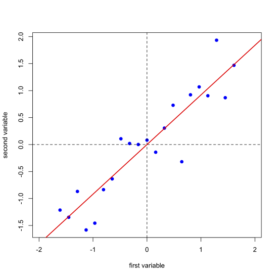
Projecting our data (the blue points) onto the regression line (the red points) gives the location of each point on the first principal component's axis; these values are called the scores, \(S\). The cosines of the angles between the first principal component's axis and the original axes are called the loadings, \(L\). We can express the relationship between the data, the scores, and the loadings using matrix notation. Note that from the dimensions of the matrices for \(D\), \(S\), and \(L\), each of the 21 samples has a score and each of the two variables has a loading.
\[ [D]_{21 \times 2} = [S]_{21 \times 1} \times [L]_{1 \times 2} \nonumber\]
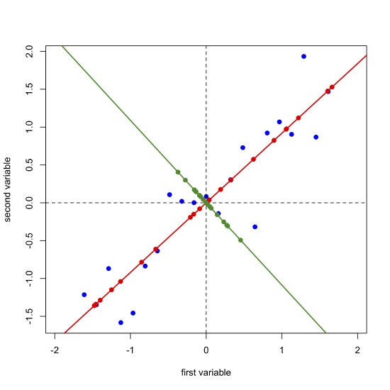
Next, we draw a line perpendicular to the first principal component axis, which becomes the second (and last) principal component axis, project the original data onto this axis (points in green) and record the scores and loadings for the second principal component.
\[ [D]_{21 \times 2} = [S]_{21 \times 2} \times [L]_{2 \times 2} \nonumber\]
In matrix multiplication the number of columns in the first matrix must equal the number of rows in the second matrix. The result of matrix multiplication is a new matrix that has a number of rows equal to that of the first matrix and that has a number of columns equal to that of the second matrix; thus multiplying together a matrix that is \(5 \times 4\) with one that is \(4 \times 8\) gives a matrix that is \(5 \times 8\).
If we were working with 21 samples and 10 variables, then we would do this:
- plot the data for the 21 samples in 10-dimensional space where each variable is an axis
- find the first principal component's axis and make note of the scores and loadings
- project the data points for the 21 samples onto the 9-dimensional surface that is perpendicular to the first principal component's axis
- find the second principal component's axis and make note of the scores and loading
- project the data points for the 21 samples onto the 8-dimensional surface that is perpendicular to the second (and the first) principal component's axis
- repeat until all 10 principal components are identified and all scores and loadings reported
How Do We Interpret the Results of a Principal Component Analysis?
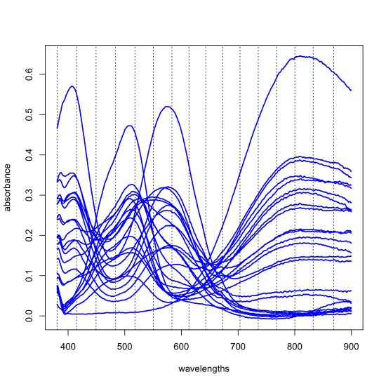
The results of a principal component analysis are given by the scores and the loadings. Let's return to the data from Figure \(\PageIndex{1}\), but to make things more manageable, we will work with just 24 of the 80 samples and expand the number of wavelengths from three to 16 (a number that is still a small subset of the 635 wavelengths available to us). The figure below shows the full spectra for these 24 samples and the specific wavelengths we will use as dotted lines; thus, our data is a matrix with 24 rows and 16 columns, \([D]_{24 \times 16}\). A principal component analysis of this data will yield 16 principal component axes.
Each principal component accounts for a portion of the data's overall variances and each successive principal component accounts for a smaller proportion of the overall variance than did the preceding principal component. Those principal components that account for insignificant proportions of the overall variance presumably represent noise in the data; the remaining principal components presumably are determinate and sufficient to explain the data. The following table provides a summary of the proportion of the overall variance explained by each of the 16 principal components.
| PC1 | PC2 | PC3 | PC4 | PC5 | PC6 | PC7 | PC8 | |
|---|---|---|---|---|---|---|---|---|
| standard deviation | 3.3134 | 2.1901 | 0.42561 | 0.17585 | 0.09384 | 0.04607 | 0.04026 | 0.01253 |
| proportion of variance | 0.6862 | 0.2998 | 0.01132 | 0.00193 | 0.00055 | 0.00013 | 0.00010 | 0.00001 |
| cumulative proportion | 0.6862 | 0.9859 | 0.99725 | 0.99919 | 0.99974 | 0.99987 | 0.99997 | 0.99998 |
| PC9 | PC10 | PC11 | PC12 | PC13 | PC14 | PC15 | PC16 | |
| standard deviation | 0.01049 | 0.009211 | 0.007084 | 0.004478 | 0.00416 | 0.003039 | 0.002377 | 0.001504 |
| proportion of variance | 0.00001 | 0.000010 | 0.000000 | 0.000000 | 0.000000 | 0.000000 | 0.000000 | 0.000000 |
| cumulative proportion | 0.99999 | 0.999990 | 1.000000 | 1.000000 | 1.000000 | 1.000000 | 1.000000 | 1.000000 |
The first principal component accounts for 68.62% of the overall variance and the second principal component accounts for 29.98% of the overall variance. Collectively, these two principal components account for 98.59% of the overall variance; adding a third component accounts for more than 99% of the overall variance. Clearly we need to consider at least two components (maybe three) to explain the data in Figure \(\PageIndex{1}\). The remaining 14 (or 13) principal components simply account for noise in the original data. This leaves us with the following equation relating the original data to the scores and loadings
\[ [D]_{24 \times 16} = [S]_{24 \times n} \times [L]_{n \times 16} \nonumber \]
where \(n\) is the number of components needed to explain the data, in this case two or three.
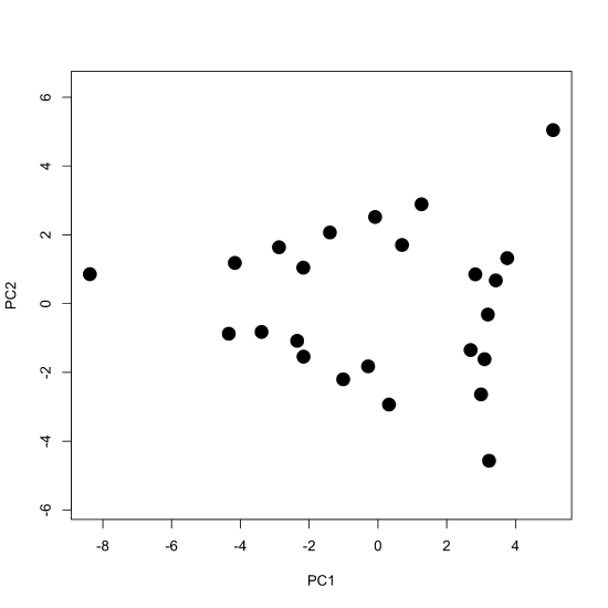
To examine the principal components more closely, we plot the scores for PC1 against the scores for PC2 to give the scores plot seen below, which shows the scores occupying a triangular-shaped space.
Because our data are visible spectra, it is useful to compare the equation
\[ [D]_{24 \times 16} = [S]_{24 \times n} \times [L]_{n \times 16} \nonumber \]
to Beer's Law, which in matrix form is
\[ [A]_{24 \times 16} = [C]_{24 \times n} \times [\epsilon b]_{n \times 16} \nonumber \]
where \([A]\) gives the absorbance values for the 24 samples at 16 wavelengths, \([C]\) gives the concentrations of the two or three components that make up the samples, and \([\epsilon b]\) gives the products of the molar absorptivity and the pathlength for each of the two or three components at each of the 16 wavelengths. Comparing these two equations suggests that the scores are related to the concentrations of the \(n\) components and that the loadings are related to the molar absorptivities of the \(n\) components. Furthermore, we can explain the pattern of the scores in Figure \(\PageIndex{7}\) if each of the 24 samples consists of a 1–3 analytes with the three vertices being samples that contain a single component each, the samples falling more or less on a line between two vertices being binary mixtures of the three analytes, and the remaining points being ternary mixtures of the three analytes.
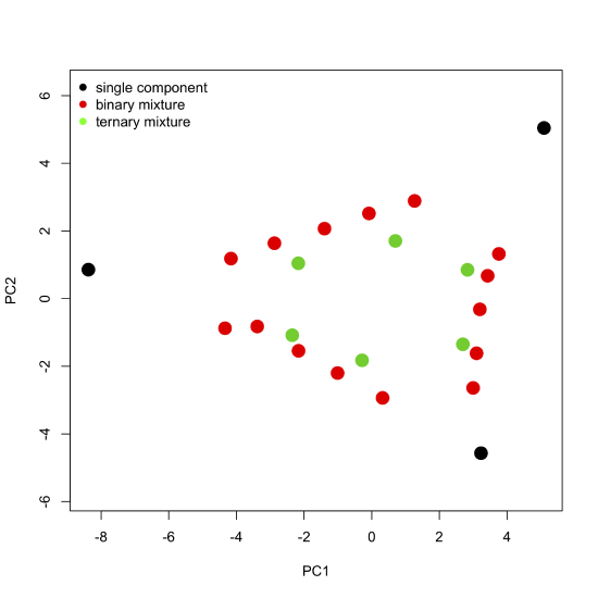
Figure \(\PageIndex{8}\): The scores plot from Figure \(\PageIndex{7}\) color coded to show samples that contain one component, samples that contain two components, and samples that contain three components. Note that the binary mixtures fall along a line (or gently curving arc) that connects two single component samples, and that the ternary mixtures occupy the innermost interior space defined by the single component samples and binary mixtures.
If there are three components in our 24 samples, why are two components sufficient to account for almost 99% of the over variance? Suppose we prepared each sample by using a volumetric digital pipet to combine together aliquots drawn from solutions of the pure components, diluting each to a fixed volume in a 10.00 mL volumetric flask. For example, to make a ternary mixture we might pipet in 5.00 mL of component one and 4.00 mL of component two. If we are diluting to a final volume of 10 mL, then the volume of the third component must be less than 1.00 mL to allow for diluting to the mark. Because the volume of the third component is limited by the volumes of the first two components, two components are sufficient to explain most of the data.
The loadings, as noted above, are related to the molar absorptivities of our sample's components, providing information on the wavelengths of visible light that are most strongly absorbed by each sample. We can overlay a plot of the loadings on our scores plot (this is a called a biplot), as shown here.
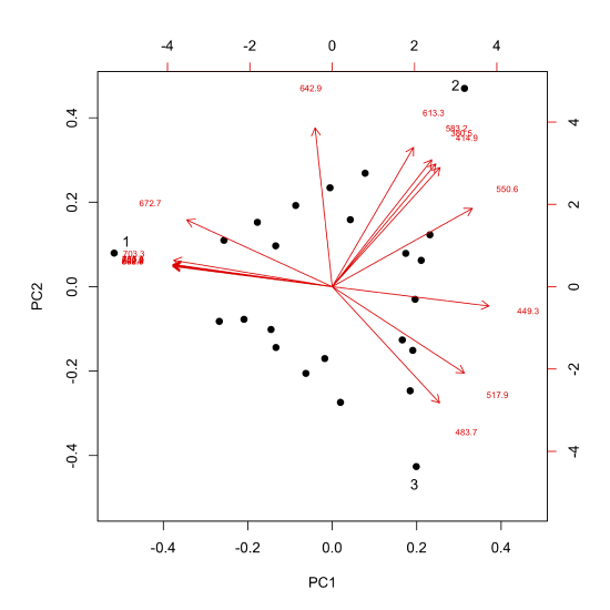
Each arrow is identified with one of our 16 wavelengths and points toward the combination of PC1 and PC2 to which it is most strongly associated. For example, although difficult to read here, all wavelengths from 672.7 nm to 868.7 nm (see the caption for Figure \(\PageIndex{6}\) for a complete list of wavelengths) are strongly associated with the analyte that makes up the single component sample identified by the number one, and the wavelengths of 380.5 nm, 414.9 nm, 583.2 nm, and 613.3 nm are strongly associated with the analyte that makes up the single component sample identified by the number two.
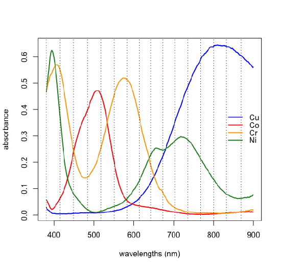
If we have some knowledge about the possible source of the analytes, then we may be able to match the experimental loadings to the analytes. The samples in Figure \(\PageIndex{1}\) were made using solutions of several first row transition metal ions. Figure \(\PageIndex{10}\) shows the visible spectra for four such metal ions. Comparing these spectra with the loadings in Figure \(\PageIndex{9}\) shows that Cu2+ absorbs at those wavelengths most associated with sample 1, that Cr3+ absorbs at those wavelengths most associated with sample 2, and that Co2+ absorbs at wavelengths most associated with sample 3; the last of the metal ions, Ni2+, is not present in the samples