
1.3: Graphing
- Page ID
- 48801
Skills to Develop
- Correctly graph data utilizing dependent variable, independent variable, scale and units of a graph, and best fit curve.
- Recognize patterns in data from a graph.
- Solve for the slop of given line graphs.
Introduction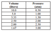
Scientists search for regularities and trends in data. Two common methods of presenting data that aid in the search for regularities and trends are tables and graphs. The table below presents data about the pressure and volume of a sample of gas. You should not that all tables have a title and include the units of the measurements.
You may not a regularity that appears in this table; as the volume of the gas decreases (gets 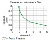 smaller), its pressure increases (gets bigger). This regularity or trend becomes even more apparent in a graph of this data. A graph is a pictorial representation of patterns using a coordinate system. When the data from the table is plotted as a graph, the trend in the relationship between the pressure and volume of a gas sample becomes more apparent. The graph gives the scientist information to aid in the search for the exact regularity that exists in these data.
When scientists record their results in a data table, the independent variable is put in the first column(s), the dependent variable is recorded in the last column(s) and the controlled variables are typically not included at all. Note in the data table that the first column is labeled "Volume (in liters)" and that the second column is labeled "Pressure (in \(\text{atm}\))". That indicates that the volume was being changed (the independent variable) to see how it affected the pressure (dependent variable).
In a graph, the independent variable is recorded along the \(x\)-axis (horizontal axis) or as a part of a key for the graph, the dependent variable is recorded along the \(y\)-axis (vertical axis), and the controlled variables are not included at all. Note in the data table that the \(x\)-axis is labeled "Volume (in liters)" and that the \(y\)-axis is labeled "Pressure (in \(\text{atm}\))". That indicates that the volume was being changed (the independent variable) to see how it affected the pressure (dependent variable).
Drawing Line Graphs
Reading information from a line graph is easier and more accurate as the size of the graph increases. In the two graphs shown below, the first graph uses only a small fraction of the space available on the graph paper. The second graph uses all the space available for the same graph. If you were attempting to determine the pressure at a temperature of \(260 \: \text{K}\), using the graph on the top would give a less accurate result than using the graph on the bottom.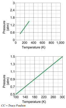
When you draw a line graph, you should arrange the numbers on the axis to use as much of the graph paper as you can. If the lowest temperature in your data is \(100 \: \text{K}\) and the highest temperature in your data is \(160 \: \text{K}\), you should arrange for \(100 \: \text{K}\) to be on the extreme left of your graph and \(160 \: \text{K}\) to be on the extreme right of your graph. The creator of the graph on the top did not take this advice and did not produce a very good graph. You should also make sure that the axes on your graph are labeled and that your graph has a title.
When constructing a graph, there are some general principles to keep in mind:
- Take up as much of the graph paper as possible. The lowest \(x\)-value should be on the far left of the paper and the highest \(x\)-value should be on the far right of the paper. Your lowest \(y\)-value should be near the bottom of the graph and the highest \(y\)-value near the top. Choose your scale to allow you to do this. You do not need to start counting at zero.
- Count your \(x\)- and \(y\)-scales by consistent amounts. If you start counting your \(x\)-axis where every box counts as 2-units, you must count that way the course of the entire axis. Your \(y\)-axis may count by a different scale (maybe every box counts as 5 instead), but you must count the entire \(y\)-axis by that scale.
- Both of your axes should be labeled, including units. What was measured along that axis and what unit was it measured in?
- For \(x\)-\(y\) scatter plots, draw a best-fit-line or curve that fits your data, instead of connecting the dots. You want a line that shows the overall trend in the data, but might not hit exactly all of your data points. What is the overall pattern in the data?
Reading Information from a Graph
When we draw a line graph from a set of data points, we are creating data points between known data points. This process is called interpolation. Even though we may have four actual data points that were measured, we assume the relationship that exists between the quantities at the actual data points also exists at all the points on the line graph between the actual data points. Consider the following set of data for the solubility of \(\ce{KClO_3}\) in water.
The table shows that there are exactly six known data points. When the data is graphed, however, the graph maker assumes that the relationship between the temperature and solubility remains the same. The line is drawn by interpolating the data points between the actual data points.
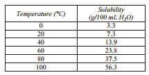
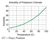
We can now reasonably certainly read data from the graph for points that were not actually measured. If we wish to determine the solubility of \(\ce{KClO_3}\) at \(70^\text{o} \text{C}\), we follow the vertical grid line for \(70^\text{o} \text{C}\) up to where it touches the graphed line and then follow the horizontal grid line to the axis to read the solubility. In this case, we would read the solubility to be \(30 \: \text{g}/ 100 \: \text{mL}\) of \(\ce{H_2O}\) at \(70^\text{o} \text{C}\).
There are also occasions when scientists wish to determine data points from a graph that are not between actual data points but are beyond the ends of the actual data points. Creating data points beyond the end of the graph line, using the basic shape of the curve as a guide is called extrapolation.
Suppose the graph for the solubility of potassium chlorate has been made from just three actual data points. If the actual data points for the curve were the solubility at \(60^\text{o} \text{C}\), \(80^\text{o} \text{C}\), and \(100^\text{o} \text{C}\), the graph would be the solid line shown on the graph above. If the solubility at \(30^\text{o} \text{C}\) was desired, we could extrapolate (the dotted line) from the graph and suggest the solubility to be \(5.0 \: \text{g}/ 100 \: \text{mL}\) of \(\ce{H_2O}\). If we check on the more complete graph above, you can see that the solubility at \(30^\text{o} \text{C}\) is close to \(10 \: \text{g}/ 100 \: \text{mL}\) of \(\ce{H_2O}\). The reason the second graph produces such a poor answer is that the relationship that appears in the less complete graph does not hold beyond the ends of the graph. For this reason, extrapolation is only acceptable for graphs where there is evidence that the relationship shown in the graph will be true beyond the ends of the graph. Extrapolation is more dangerous than interpolation in terms of possibly producing incorrect data.
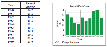
In situations in which both the independent and dependent variables are measured or counted quantities, an \(x\)-\(y\) scatter plot is the most useful and appropriate type of graph. A line graph cannot be used for independent variables that are groups of data, or nonmeasured data. In these situations in which groups of data, rather than exact measurements, were recorded as the independent variable, a bar graph can typically be sued. Consider the data in the following table.
For this data, a bar graph is more appropriate because the independent variable is a group, not a measurement (for example, everything that happened in 1980). The concept of the average yearly rainfall halfway between the years 1980 and 1981 does not make sense, so a line graph doesn't work. Additionally, each year represents a group that we are looking at, and not a measured quantity. A bar graph is better suited for this type of data. From this bar graph, you could very quickly answer questions like, "Which year was most likely a drought year for Trout Creek?", and "Which year was Trout Creek most likely to have suffered from a flood?"
Finding the Slope of a Graph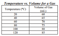
As you may recall from algebra, the slope of the line may be determined from the graph. The slope represents the rate at which one variable is changing with respect to the other variable. For a straight-line graph, the slope is constant for the entire line but for a non-linear graph, the slope is different at different points along the line. For a straight-line graph, the slope for all points along the line can be determined from any section of the graph. For a non-linear graph, the slope must be determined for each point from the data at that point. Consider the given data table and the linear graph that follows.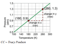
The relationship in this set of data is linear, that is, it produces a straight-line graph. The slope of this line is a constant as all points on the line. The slope of a line is defined as the rise (change in vertical position) divided by the run (change in horizontal position). Frequently in science, all of our data points do not fall exactly on a line. In this situation, we draw a best fit line, or a line that goes as close to all of our points as possible. When finding the slope, it is important to use two points that are on the best fit line itself, instead of our measured data points which may not be on our best fit line. For a pair of points on the line, the coordinates of the points are identified as \(\left( x_1, y_1 \right)\) and \(\left( x_2, y_2 \right)\). In this case, the points selected are \(\left( 260, 1.3 \right)\) and \(\left( 180, 0.9 \right)\). The slope can them be calculated in the manner:
\[\text{slope} = \frac{\text{rise}}{\text{run}} = \frac{\left( y_2 - y_1 \right)}{\left( x_2 - x_1 \right)} = \frac{\left( 1.3 - 0.9 \right)}{\left( 260 - 180 \right)} = 0.005 \: \text{atm/K}\]
Therefore, the slope of the line is \(0.005 \: \text{atm/K}\). The fact that the slope is positive indicates that the line is rising as it moves from left to right and that the pressure increases by \(0.005 \: \text{atm}\) for each 1 Kelvin increase in temperature. A negative slope would indicate that the line was falling as it moves from left to right.
Lesson Summary
- Two common methods of presenting data that aid in the search for regularities and trends are tables and graphs.
- When we draw a line graph from a set of data points, we are creating data points between known data points. This process is called interpolation.
- Creating data points beyond the end of the graph line, using the basic shape of the curve as a guide is called extrapolation.
- The slope of a graph represents the rate at which one variable is changing with respect to the other variable.
Vocabulary
- Graph: a pictorial representation of patterns using a coordinate system
- Interpolation: the process of estimating values between measured values
- Extrapolation: the process of creating data points beyond the end of the graph line, using the basic shape of the curve as a guide
- Slope: the ratio of the change in one variable with respect to the other variable.
Further Reading/Supplemental Links
- Use the following link to create both \(x\)-\(y\) and bar graphs:
http://nces.ed.gov/nceskids/createagraph/default.aspx - These websites offer more tips on graphing and interpreting data:
http://staff.tuhsd.k12.az.us/gfoster...rd/bgraph2.htm and
http://www.sciencebuddies.org/scienc...analysis.shtml